
Here they are, ripped and culled from your submissions: the official nominees in the first category of the 2016 Swamplot Awards for Houston Real Estate. That, of course, is Favorite Houston Design Cliché. Thanks to all of you who contributed! These awards wouldn’t happen without you.
 As in years past, you can vote up to 4 times in this category by 1) leaving a comment below this post; 2) sending us an email; or by expressing your preference on 3) Twitter or 4) Facebook. Make sure your vote counts by reading and following the 2016 voting instructions, and get your vote in by 5PM on Tuesday, December 27th.
Just as important as the votes you cast, though, are the explanations you provide with them. Tell us why you’re voting for who you’re voting for! What you write may sway other readers to vote as you did. And if your candidate wins or comes in second place, your clever comments might be included in our round-up post.
Here, then, are the 2016 nominees for Favorite Houston Design Cliché:
***
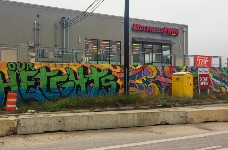
1. Developer-Commissioned ‘Street Art.’ “If you’re developing inside the Loop right now, a wall mural is quickly becoming essential — the more Instagrammable, the better. How do you signal that all the cool people in the know come to your store to buy mattresses and cell phones? Be the store with the biggest mural out front.â€
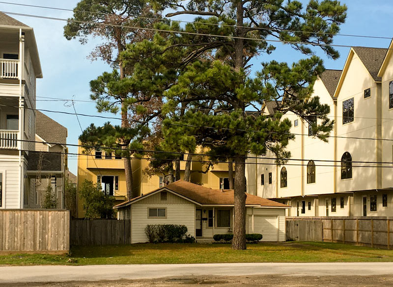
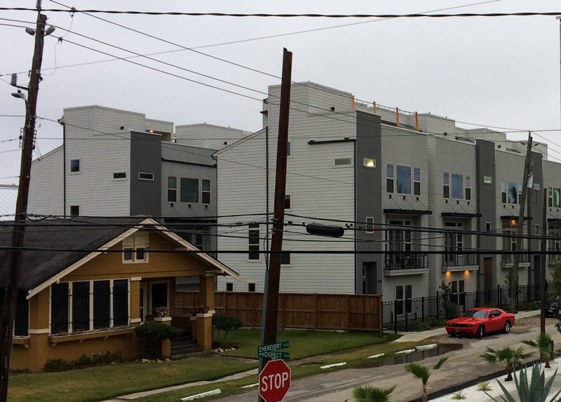
2. The Lone Holdout. “Nestled amid some newly transformed neighborhoods, you’ll find that one older home that refused to sell to the developer. As a result, it’s now surrounded on all sides by 3-to-4 story townhomes or a giant apartment complex. New neighbors are treated to excellent views into the windows and back yard.â€
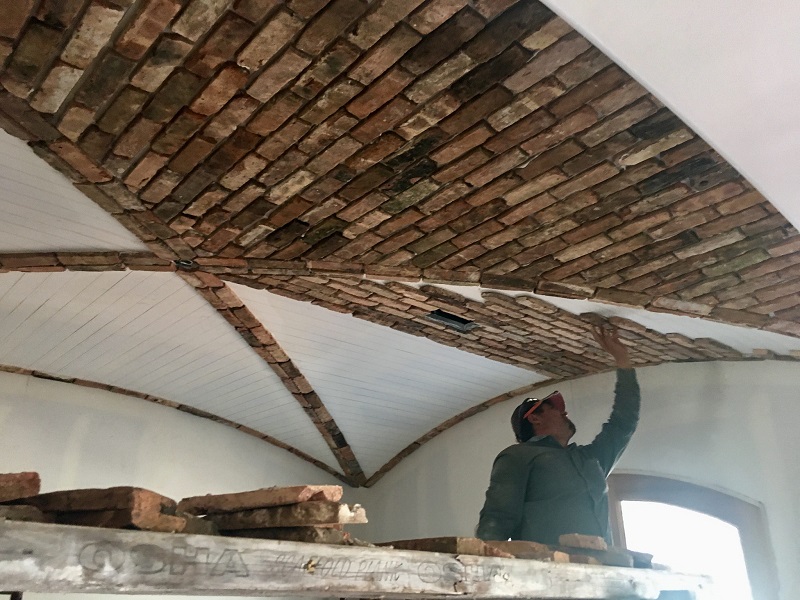
3. Lick-and-Stick Brick. “Lick-and-stick, but with fake brick. Equally lovable indoors and out.â€
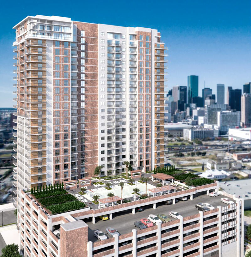
4. Not-So-Lofty Loft Developments. “Loft apartments that are not actually lofts, but new construction aiming for that touch of industrial-chic je ne sais quois.” “Just stick a brick accent wall in there somewhere. Good to go!â€
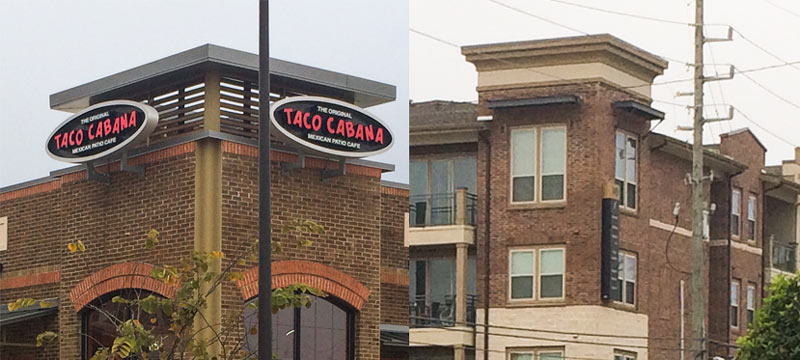
5. Corner Tower Mortarboards. “Flat-top corner roof features. Also called sniper platforms.”
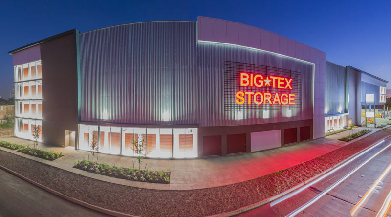
6. The Retail-Corridor-Hogging Self-Storage Midrise. “Dropped in the middle of neighborhoods undergoing a residential or redevelopment boom, these 4-to-6-story flat-faced boxes can eat up an entire block of prime frontage.” “All these Inner Loopers living in new apartments has led to no one having storage space — and now we get the result. How many of these will we need?†“There is a huge trend in ‘smaller living.’ But the trend of ‘having less stuff’ hasn’t really caught on.“
7. The Top Floor Townhome Roof Patio. “For that shining sliver of a Downtown view. Who knew power lines could be so atmospheric?â€
Now, you tell us: which of this year’s contenders deserves the title of Favorite Houston Design Cliché? Let the voting begin!
- How To Vote in the 2016 Swamplot Awards for Houston Real Estate
- Swamplot Awards Ballots 2016Â [Swamplot]
Images: Joe Bielamowicz (1515 Beall St.), Russell Hancock (lick-and-stick brick), EDI Architecture (Ivy Lofts rendering), Big Tex Storage (Montrose storage facility), Swamplot inbox (all others)


voting for #4
Corner tower mortarboards cause it’s actually a design thing, and I’ve never noticed till now. It deserves more attention.
#5 Corner tower mortarboards, the overused mongrel offspring of false fronts and bell towers. Highlights the entrance of everything from sandwich shops to drugstores. May give the mistaken impression of a mini mall inside, when really there’s just the one store and the one entrance.
Definitely #6, mid-rise storage facility. These things keep popping up everywhere. I really love the super-max security levels, especially when you consider that this is where people keep the odds-and-ends that were NOT of sufficient value to keep at home. #3 (lick and stick brick) a strong runner-up.
#6 mid-rise storage facility
Number 7 for me. When 3 floors are not enough! And good luck with that flat roof just under the top level deck. Ever heard anyone say how much they like flat roofs, except roofing contractors?
Before today, I thought that the “street art” was actually street art. These developers had me fooled totally. What a cool and hip strip mall, I thought. Thus, I give this design element my vote.
#4, #6 as runner up
The faux-lauft speaks to our underlying need to feel like we’re somewhere when deep down we know we’re not.
Upside, cleaning dust from exposed ductwork has got to be great stretching.
Meh. This is a bit like the baseball season after the world series was cancelled due to the strike. Just not feeling it the same way with the Swampies before they were skipped in 2015.
I actually like it when developers commission murals. It keeps Houston from turning into the setting for an Ayn Rand novel.
Lick and stick brick was always fake brick. Developers have been doing hats on apartments for over a decade. Big box storage has been around for along time too due to the fact that many Houstonians are energy industry nomads and there is a high demand for storage space when people are sent to Bali or Dubai.
The top floor town home “patio” would have to get my vote. Fire code limits town homes to three stories of living space without having to install fire escapes, etc. So, developers will make the first floor all garage with an unfinished storage space. The middle three floors will be actual living space and the top floor is an unfinished space with a patio of sorts. I think this design is a conspiracy with realtors to maximize turnover in town home sales. Young couples buy town homes because they do not want to be close in but do not have the cash to buy a traditional single family home. When the wife gets pregnant, having to climb four flights of stairs does more to get a couple into a realtor’s office than the realization that the zoned elementary school is 95% at risk kids.
#6
#6.
I don’t find #2 to be an actual “Design Cliché”. Screw the new neighbors as the house and its design were very appropriate when it was built long before the towering single room per floor townhouses.
I vote for #5. They are everywhere. It is just a matter of time before designer who spawned this overused design trend is outed!
5
I still think the Houston Beach House or Above-ground home is appearing everywhere post flood. Awful looking giant houses 5 feet off the ground on small quarter acre lots. With no room to grade the lot you get this weird split level garage and a living room that towers over the backyard.
http://www.har.com/4942-valkeith-dr/sale_88522342
I’ll go with #5, as those corner mortarboard things are EVERYWHERE right now, but those rooftop decks (#7) are a close second. Do people buying these 4-story townhouses realize that any exterior home improvement or repair project they undertake will be significantly more expensive due to how tall their houses are?
I’m wondering how that Valkeith house passed its inspections. The front steps are not up to code; with four or more steps you’re required to have a railing.
7
I agree with Old School about the lackluster choices. I also agree that #2 is not really a design choice. Those ppl live in their home and chose to stay – they didn’t chose to make their house stand out from a design perspective when they first moved in/built the house 40 years ago. And #6 is worded in a way that doesn’t highlight the developers’ design choices as much as it is a referendum against large storage buildings near ppl’s houses and bars.
That being said, I vote for #5, the poorly executed corner towers with their exposed angled supports to signal that your shopping center or apartment building was designed by a theater set designer and not an architect.
#5
The corner sniper nests are waaaay overused here. Seems to be more a Houston thing too, I don’t recall seeing that many when I travel to other cities.
I vote for the fake lofts. All the charm of a new construction with all the inconvenience of a loft. Years ago I told the sawyer lofts folks I would rent a unit if they agreed to put doors to the bedroom. They said I could construct my own if I took them down at the end of the lease. They kept telling me about all these space dividers and beads people could use to make temporary doors-like dividers. I was like “pass. I will live somewhere with doors unless it actually is a real loft.
–
You may mock the lone holdout, but his kids are gonna be richer with every decade he lives in his grandfathered tax value home. By 2035 that big lot in the middle of the city lot is gonna be worth $50M easy. Okay maybe not that much.
–
I will just say this about fake brick. It looks really ridiculous to have a style of fake brick inside that does not appear anywhere on the exterior.
#4 (fake lofts) for the design cliché I hate the most. Builder saves money by not finishing the building, and the result is an un-hip and ugly echo-chamber of a living space.
I disagree with other readers that #2 (lone holdout) isn’t a design. It is, but in this case, there are multiple designers at work and not necessarily working in concert. This one would be my pick for the design cliché that best captures the building laws, current tastes, and demographics of Houston (and maybe the USA in general).
So I pick #4, with #2 as runner-up, but all of them are good. Thanks, Swamplot.
Nothing says millennial quite like #1.
2. The Lone Holdout
#4
#7
1. Street Art
All of the other contestants have around for awhile.
Hands down it has to be the lone holdout. Nothing says eff you to the developers more than the one person that says nope, not going anywhere. Been here this long, why should I go anywhere now? I tittter at the thought of giving my neighbors a free show when I got out to tan my pale white tail off the reflection from the stucco ticky tack boxes they’ve just plunked their hard-earned money on. I’ll be laughing from the comfort of my bunalow while you suckers are scrambling to find someone to sue when that stucco dream becomes a nightmare the minute it crumbles around you the minute the foundation settles. Honorable mention to lick and stick brick.
Developer Street Art. Driving to work in EaDo and seeing “graffiti” artists keeping businessman’s hours is just weird. While I love the flair, much of what is going up is too instagrammable and inauthentic.
Corner tower mortarboards fa sho
#6.
Trend-based urban style lofts with no closet space = air conditioned storage units that are making bank.
#3 ftw
#4. It changes the whole look of the city. They’re huge and everywhere…and they’re going to be so dated in about 10 years, leaving future residents to wonder “what were they thinking?”
I like the “lone holdout”
#4 fake lofts that look like they came from a Perry Homes “designer” . Please Houston can we get some actual architects working on stuff?
6 People just need to let go
THE RETAIL-CORRIDOR-HOGGING SELF-STORAGE MIDRISE.
If only out of morbid curiosity for how long it will take for them to be redeveloped into something else.
And actually townhouse rooftop decks are good. I grow peppers on mine.
#5. They are everywhere.
Voting for #1 but you know what we missed… The RED front door trend… maybe next year. A lot of homes are painting their front doors red before they sell them.