
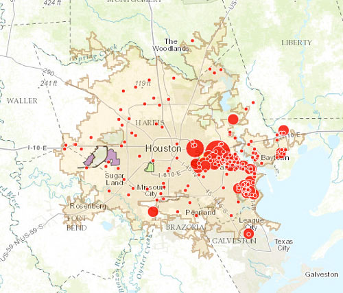
The little and not-so-little red dots on the map above show off sites on the EPA’s list of plants and refineries required to have a Risk Management Plan due to their potential for accidental hazardous chemical releases — with the larger dots showing the places that have already had an accident (or, in some cases, as many as 43). Clicking each dot will tell you what the facility’s name is, as well as how much toxic or flammable material it stores on site (to the nearest thousand pounds or so).
The Union of Concerned Scientists and t.e.j.a.s. put together the interactive map as part of a report released late last week, which compares the EPA’s data on air quality and cancer rates in a few neighborhoods on the west side of town (specifically in Bellaire and in the West Oaks and Eldridge area, just inside Hwy.6 near the Barker reservoir) with the same data in a couple of east side spots (Galena Park and Manchester).
***
The authors notes that the 2 east side areas, both near the Ship Channel and in the thick of most of the chemical facilities, each have a much higher rates of ambient toxic air pollutants than Bellaire and West Oaks, as measured by the EPA’s respiratory hazard index — though Bellaire’s index number is also higher than West Oaks’s, and the air pollution levels in all 4 neighborhoods are actually well above what the EPA considers the minimum for negative health impacts. The authors also note the potential for chronic stress in the east side areas, caused by the constant threat of chemical releases from industrial accidents.
What else is different between the studied neighborhoods? The authors look over the demographics of each neighborhood, noting that the folks in the more chemical-release-prone neighborhoods are much more likely to be poor, and much less likely to be white. The full report cites studies from the last decade or 2 claiming that overall, a disproportionate number of people in poverty and people of color live near industrial facilities, and that those facilities tend to have more chemical slip-ups than the ones near wealthier and whiter population centers.
The report also offer some general solutions, including giving a boost to environmental regulations and enforcement at the facilities, and restricting where things like schools and chemical plants can be built in relation to one another — going so far as to drop the Z word.
- Double Jeopardy in Houston: Acute and Chronic Chemical Exposures Pose Disproportionate Risks for Marginalized Communities (2016) [Union of Concerned Scientists]
- Study Walkthrough Map [UCS/t.e.j.a.s.]
- Previously on Swamplot: Giant Refinery Smoke Plume after Lightning Strike Nothing To Worry About, Says LyondellBasell; What’s On Fire in Spring Branch This Morning And Who the City Says Should Worry About It; This Morning’s LyondellBasell Refinery Fire Put Out 19 Hours after Yesterday’s ExxonMobil Refinery Fire; How You, Too, Can Browse Interactive Maps of Houston’s Cancer Hotspots for Fun and Panic
Map: Union of Concerned Scientists/ Texas Environmental Justice Advocacy Service

If it were me, I would have picked neighborhoods with similar in demographics/social-economic status for the comparison.
I could not agree more… Anheuser-Busch is definitely a hazardous chemical facility.
Huh, based on comments by some regular swamplot readers I was expecting the near east end to be a wasteland of hazardous industrial chemical facilities.
based on some of the regulars on here I would assume anywhere that’s not memorial or bunker hill to be an apocalyptic wasteland where savage tribes of neo-mutants run wild searching for human flesh.