
How do you feel about Houston’s airborne cancer hotspots? That’s easy! Just pick up a copy of the latest issue of Cite magazine and run your fingers over the top of it: Cite 93‘s front cover has been embossed with a map diagramming the area’s cancer risk. The places where airborne toxins mapped by the EPA are most prevalent are in the pits.
The mapped information here isn’t exactly fresh — it’s from the 2005 National-Scale Air Toxics Assessment, and the data only account for airborne known-cancer-causing toxins that are tracked by the EPA. Though it’s posted online, the map version isn’t exactly easy to find. But bravely thumbing his nose at Houston’s proud and longstanding tradition of hush-hushing location-based cancer hazards, Cite editor Raj Mankad gives Swamplot readers the secret recipe for finding the browsable map:
***
1) Go to epa.gov
2) Scroll down to My Environment in the lower left corner. Enter “Houston” and click go.
3) The page that loads has a slider thingy at the top. The cancer map is the fourth item. It is represented by a symbol that looks like a fat asterisk. The title for that link is “MyHealth.” It doesn’t say anything about cancer at first. Click on that fat asterisk.
4) A small mapping tool loads. In the upper left corner, you have to click on the Cancer Risk button for the data to load.This link sort of works.
Now wasn’t that easy?
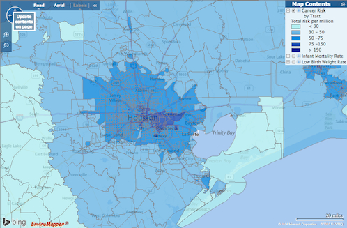
Notably, Houston’s max dark blue zone as mapped by the EPA site extends not just over the sorta-bluish waters of the Houston Ship Channel, but across Downtown as well, and even into the steadily beating heart of the Texas Medical Center. The numbers for this danger zone, 75-150, represent the risk (per million persons) of someone developing any type of cancer over a lifetime — above and beyond, that is, the risk of anyone else not exposed to the same measured toxins in that area.
That broad swath of outcomes, mapped by census tract, paints Deer Park, Channelview, Cottage Grove, and the Galleria the same indigo hue. Meanwhile, there’s a swath of land south of the old Pierce Junction oil fields where the air is looking mighty fresh and clear in comparison.
- What’s your cancer risk in Houston? (Bigger than in Dallas) [OffCite]
- MyEnvironment [USEPA]
Screenshots: OffCite

Like tornadoes, air pollutants magically dissipate when they attempt to cross larger rivers. According to this map, anyways.
Thanks Obama.
Reliant Stadium safer than going to Medical Center….. interesting. Using my FSA account for season tickets!
This is really helpful information, particularly in regard to how to find the source data, which makes it possible to compare one location to another.
Thanks for sharing.
Pollution all over metro area… Check
Extra pollution over areas dirty hipsters want to live… Check
Hipsters want to live in Pasadena and near the ship channel?
Mmmmhmmmm.
Hmm, I knew there was nasty stuff buried in the light-industrial area between Washington and I-10, but what’s causing the spike south of 59? Air pollution from the freeway?
That would make sense except that the prevailing winds are from the South, so you’d think if it was air pollution the spike would be North of 59.
Is there some post-industrial legacy in that area?
@ Semper Fudge: YES! (Although I wouldn’t characterize myself as “dirty” on most days, I would probably fit commonsense’s profile of me as a hipster; albeit perhaps nobody else’s.) I’d live in the East End (again) in a heartbeat if I had to live in Houston (again). The pollution wouldn’t bother me unless I had a kid or pregnant wife, given that their systems are a bit more susceptible than an adult’s.
Two reasons you see such high standards for the 5th ward. On the south side, The KBR lot and MDi lot used to have high concentrations of Benzene and other bad chemicals. Both have now been cleaned up and approved by the EPA. 5th ward north had issues with the railroads up on the NE side of the area dumping oil and chemicals for years. Thats going to have to be a major clean up
Context is important. According to the website cancer.org, a male in the US has a 43.92% chance of developing cancer at some point in his lifetime. That’s 439,200 in a million. Even in the most dangerous zone in this map, we’re varying that number by 75-100 per million, or 0.0075% to 0.0150%. If you want to reduce your risk of getting cancer, there’s not much you can do with your genetics, but there’s a lot of other great advice you can follow regarding diet, exercise, and other life choices that swamp out the cancer risks of living in certain Houston neighborhoods.
Quote:
“NATA assessments should not be used for any of the following:
As a sole means for identifying localized hotspots*
As a definitive means to pinpoint specific risk values within a census tract
To characterize or compare risks at local levels such as between neighborhoods
As the sole basis for developing risk reduction plans or regulations
To control specific sources or pollutants
To quantify benefits of reduced air toxic emissions”