- Canadian Investor Buys GEICO Building at Mason Creek [Realty News Report]
- City Approves Plans for Academy Development’s Marcello, a 3-Part Residential Development on 546 Acres of Farmland Near the Grand Parkway and I-10 [HBJ]
- Light Hill Partners To Demolish 3 Montrose Properties on Mt. Vernon St. Along the Southwest Fwy., Build Midrise Apartments in Their Place [HBJ]
- Pearland Issued 571 Single-Family Homebuilding Permits from January to May, Up 43% Over Same Time Last Year [HBJ]
- Kingwood Location of Two Men and a Truck Grew 133% Between 2014 and 2015 Thanks in Part to Grand Parkway Expansion [HBJ]
- More Details on That Greek Restaurant Taking Over the Kahn’s Deli Space at 2429 Rice Blvd. Next Month [HBJ; previously on Swamplot]
- Immobilized Rice Box Now Open in Greenway Plaza’s Underground Food Court [Culturemap; previously on Swamplot]
- Frank Lloyd Wright-Designed Home and Add-on Owner’s Center in the Bunker Hill Area Relisted at Lower Price, Just Under $3 Million [Houston Chronicle; previously on Swamplot]
- Veteran Chain-Store Developer Don Mullins Recalls Life During the 1980s Real-Estate Funk [Houston Chronicle]
- FEMA Disaster Recovery Center at Leonel Castillo Community Center, 2101 South St., Opens Today [Houston Chronicle]
- Texas Supreme Court Finds City Did Not Adequately Describe Rebuild Houston Drainage Fee, Sends Lawsuit Back to Trial Court [Houston Chronicle; previously on Swamplot]
- What Elon Musk’s Hyperloop Could Look Like in Houston [Houston Chronicle]
- Reverse Commute to The Woodlands Is ‘Nasty’ Now Too [Houston Chronicle]
- Tales from Commuting on the 53 Briar Forest Limited Bus for 4 Hours a Day [OffCite Blog]
- EPA Mapping Tool Shows Houston’s Toxic Risk Hot Spots [Houston Public Media]
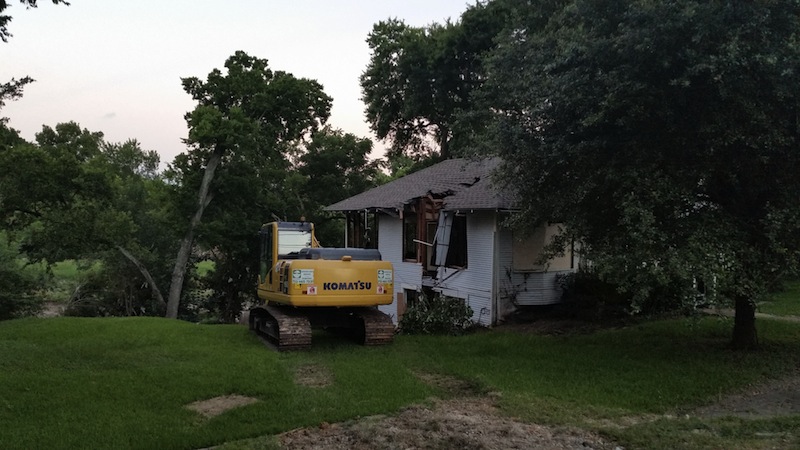
Photo of demolition at 315 Goldenrod St.: Marc Longoria via Swamplot Flickr Pool
Headlines


So how does that EPA map work? I mean, I figured out how to overlay layers, but it doesn’t appear to be very accurate.
.
If you overlay ‘traffic proximity’ for instance, the galleria area (up and down 610 corridor between 59 and i10) is completely devoid of any issues related to being around traffic proximity and volume.
.
That’s pretty far from the mark.
The EPA map fuels misinformation about the real risks of regulated entities. Unless you have a lot of experience with federal environmental rules, you will not know how to correctly interpret the data. You could sure scare a lot of ignorant people with it, though.
Most of the data sets do not at all correlate to actual risk to human health. Areas (like the Galleria) with lots of offices, pavement and traffic, appear pristine. Meanwhile, rather clean industrial or service company sites appear horrifyingly “toxic” because they have to have a storm water permit due to their SIC code, or have drums of paint waste that are not an imminent spill threat, but nonetheless trigger hazwaste rules, etc. Not all dots on the map are equally “toxic.”
That looks like Komatsu Heaven. Nice open green pastures and a delicious little Bungalow to snack on.
Sounds like a continuation of EPA’s transition from a regulator to an advocate against industry.