Frequent visitors to this site will notice that Swamplot looks slightly different today. The layout’s been rejiggered a bit — to make things easier to read on tiny handheld screens, and to open up better opportunities for advertisers. The Swamplot logo’s been polished up, so we can all see through those odd letter-shaped windows a little more clearly. We’ve also made some minor adjustments to page navigation and how the information that surrounds each post is organized.
If something about the new layout doesn’t look like it’s working quite right on your screen, please let us know. There are so many different versions of different browsers running on different operating systems on different screen sizes — it’s impossible to test them all without your help. You may see more adjustments in the next few days, as we try to steam out the wrinkles.
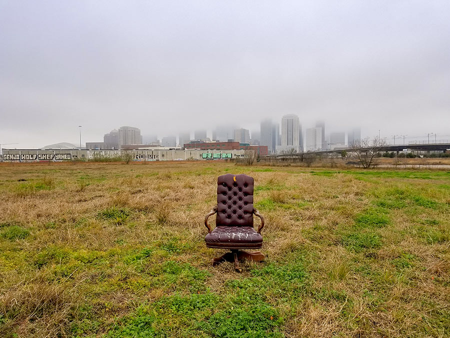
As with any rearrangement of furniture, what’s most exciting about the new design is what it sets up: a better place to hang out. And more room, to add new features, as Swamplot grows.


It’s bee-yoo-ti-ful, Gus! I love it! Nothing like a little spring…er…fall cleaning to spiff a place up!
The layout is good. Works well in Firefox and on my mobile phone/PDA.
Excellent update. Keep up the good work. I use FLOCK (descendent of Firefox).