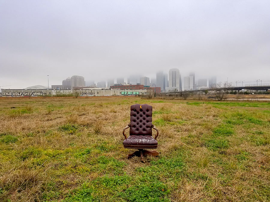
 It’s time to begin the nominating process for the second annual Swamplot Awards for Houston Real Estate. The awards cover the best and most of Houston Real Estate over the past calendar year. To make these awards the best they can be, we need your input!
Our first category this year: Favorite Houston Design Cliché. Last year’s winner, you’ll recall, was “Tuscanization,” with home turrets coming in a close — and only partially redundant — second place. What Houston building, shopping center, streetscape, home, interior, neighborhood, or yard cliché deserves recognition this year? Your suggestions may be inspired from stories on Swamplot or from your own keen eye.
Nominations for this category are now open! Enter your nomination in a comment to this post only or — more privately — to the Swamplot tip line, with the subject line “Nomination: Favorite Houston Design Cliche.†Nominations will be accepted for one full week, after which the best-presented choices will be opened for voting.
You may submit as many nominations as you like in this category, but your choices will have a better chance of succeeding if you use your nomination to make your point in a clever and convincing way. When the actual awards are open for voting next week, each selected nomination will be introduced with some edited bastardization of the arguments readers made in the nomination — so be eloquent and persuasive! Submitting photos in support of your nomination is encouraged — illustrations will likely help make your case to voters. Send them to the Swamplot tip line; be sure to identify them and indicate what they’re for.
Comments to this post will be counted as nominations only. Nominations may be seconded, expanded, or improved. Even simple “me too” posts will help an entry find a place on the actual ballot, but they won’t be counted as votes for the winner. The actual voting in this category will begin next week. Stay tuned!
- Swamplot Award Nominations 2009 [Swamplot]


for us inner-loopers i haven’t seen anything nearly as ubiquitous as the stop ashby high-rise yard signs, does that count?
“Luxury Condo”. If I ever saw a condo advertised as “sensible and comfortable” I think I’d buy it solely for novelty purposes.
Corrugated metal buildings with one-pane, square windows scattered randomly on the non-street-facing side of a condo. Plz to be going away.
Rough-cut limestone or other quarry stone blocks seem to be the current way to tack on a little quasi-regional (well, Hill Country, anyway) reference to one’s generic McMansion or uncompromisingly modernistic series of boxes. I’m with Dani on the corrugated metal, by the way. It was edgy and cute back in the 70s. Now it just looks like it should be part of a tire shop in a rundown part of town. My other dis-honorable mention, (sorry, Lauren) is concrete floors in residences, which are great at breaking things, like dishes, glassware, and foot bones.
Generic McMansion floorplan: Entryway, dining room on the left, home office on the right, living room ahead, kitchen ahead left, master ahead right.
Best (worst) use of architecture to convey a theme/movement not representative of the rest of the surroundings.
a la Tuscanization, international theme in a bungalow community,contemporary in a traditional neighborhood…
We’ve witnessed more cancelled projects and a greater drop-off in speculative homebuilding in 2009 than has occured in decades. We also witnessed the tail-end of a demolition boom, which left our city and its suburbs pock-marked with vacant plots of land that should’ve been something, but weren’t.
.
Examples include Turnberry Tower, Sonoma, Regent Square, numerous scraped lots in Bellaire and the Heights, and Road Warrior-like conditions in a multitude of suburban subdivisions, all stories that were covered in gory detail on Swamplot.
.
I’d submit to you all that this is the only distinctive trait that was uniformly witnessed among urban/suburban and residential/commercial real estate in Houston this year and that the choice of a design cliche ought to reflect such an appropriately nihilistic perspective.
.
That’s why I am nominating the **VACANT LOT** as the ‘Favorite Houston Design Cliche’ of 2009.
“Lick and Stick” – all forms of thinset stone that don’t belong installed on a facade.
Coming Soon: Lakes of Eutrophica!
In the vast expanses of grassland prairie once surrounding Houston (now covered with cookie-cutter houses), you will note “waterfront views” and fountain-injected “private lakes” for fishing, boating, and God-forbid swimming. Is it only in Houston that a developer can turn a clay borrow pit (used to elevate new foundations out of the floodplain) into a selling point by allowing it to fill with muddy rain water? Of course, sometimes they dye it a cloudy blue to take some of the ick-factor away, but does that really help?
Having grown up on the west side when it still retained a bit of wild nature, I can attest that any surface water that lasts longer than one month before evaporating tends to become prime habitat for water moccasins, mosquitoes, and roosting bird colonies (think feces, lots of feces).
Every time I see a billboard for a new “Lakes of (fill in the blank)” subdivision, I have an instant vision of a soccer mom spilling her Starbucks all over her outdoor kitchen furniture when she spies a nasty-looking snake taking a nap on her doormat…and it makes me giddy.
@ Superdave: LOL! My parents used to live in one of those subdivisions (in Tulsa). Though it was pretty, there were some mishaps with snakes (including one getting in their house!)