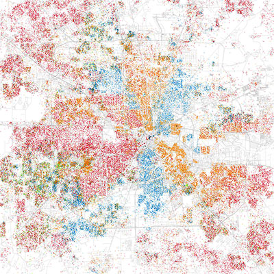
Inspired by a similar map published earlier this year and meant to help visualize the segregation of Chicago’s neighborhoods, dot-happy data explorer Eric Fischer has now produced similar maps for 102 U.S. cities. Here’s his map of Houston — which we’ve taken the liberty of darkening a bit to make patterns more apparent. The maps are based on ripe old data from the 2000 Census, the dots colored according to the racial and ethnic categories provided by respondents. Each red dot represents 25 White people, each blue dot 25 African Americans, each green one 25 Asians, each orange one 25 people identifying themselves as Hispanic. “Others” are rendered in gray.
- Race and ethnicity [Flickr, via Gizmodo]
- Chicago Boundaries [Radical Cartography]


There’s a lot of empty white space. Shall I assume that’s Fire Ants?
jk
I love colorful maps like this, for what it’s worth.
So, the map shows what everyone pretends does not exist but everyone knows does. Races tend to stick together. Furthermore, the not “red” dotted areas are generally crappier. In your face political correctness!!!
That’s funny, I was able to associate the colors with the races without even reading the caption or legend. 2 things I noticed: 1) Southwest Houston is the most diverse, and 2) White people sure do love the ‘burbs!
Is it just me or do Asians seem under-represented here?
I think the Asians are under-represented because they don’t clump together as much as other groups (can’t call it race because only three race truly exist on this planet).
Each dot represents 25 which means if you are spread out, you won’t get represented as much.
Anyone else think the red dots should have been used to denote the Indian population?? NTS, IJS
Whites in the burbs, Bellaire and West U.
Asians in Alief. Hispanics not in the burbs, northside, eastside, 290 NW. African Americans similar – northside and eastside of downtown and a growing trend moving to south along 288, HWY 6, etc. Been in H-town all my life and I love the diversity!
Sure there are racial clumps, and some may take it as opportunity to reaffirm their notions on race, society and tolerance, but also keep in mind how much more tightly the clumps would have been bunched 50 or 100 years ago, and also, how more dispersed they will be 50 and 100 years from now.
I would theorize that if all humans looked identical (color and appearance) but still had the current differences in culture, behavior, and values, the map would look exactly the same.
i think the map could be seen more as how income levels separate us rather than how common races tend to unite. it’s obvious where the higher and lower property values reside in this map.
last i heard our county was more than 50 percent hispanic so it’s surprising to see the red still dominating.
Is it just me, or does the inner loop the most obviously divided part of town here?
Speaking generally, of course, northern cities are the most segregated, and, guess what, Boston, Chi-town, Detroit, Philly, etal are where we hear about the most racial tensions and in-fighting.
Houston – the tolerant, more evolved choice.
Just check the Flickr site. It is amazing.
When can we expect a 2010 map which is more accurate?
I lived in Detroit from 1997-2000, and it is easily the most segregated place I’ve ever lived or been to in my life (and I’ve lived many places). All Blacks inside 8 mi road, and all Whites outside 8 mi in the ‘burbs. And there were hardly any Hispanics, except in the area they called “Mexican Town”, which should have been called “Mexican 2 Blocks”, where you could get the worst Mexican food in the whole world. It was so awful because it looked a lot like Mexican food, but it had no cumin, no jalepenos, no chili powder, no garlic, no flavor (bear in mind that in the Midwest they generally think that salt and pepper are spices). Oh how I missed Houston’s diversity, and oh how I missed cilantro (which you could not even buy in the grocery stores there), but I digress…
I really liked looking at all the other cities. Houston is clearly more spread out than places like New York, Chicago and San Francisco, and it’s a bit more integrated I think. Detroit was the most obviously segregated but Cleveland and Philadelphia weren’t that far behind. I think this is a pretty cool project. Kudos for his work.
I lived in Moscow for a couple of years and even though everyone looked exactly the same, people still managed to segregate themselves based on education, income levels, religious and political beliefs. I suppose segregation is a natural default for humans.
The word you are looking for commonsense is “de facto” segregation. Where natural patterns and choice segregate society.
“De jure” segregation is akin to apartheid or any situation where a government entity enforces segregation.
Some people hate de facto segregation with a passion because it reveals a truth about society. They’ve over the years tried legislate around with silly concepts as school busing to force diversification of schools.
Almost forgot… What are those two pink dots that seem to be on fire? … oh wait, that’s Montrose. *rimshot*
Awesome map. It will be interesting to see how things have changed in the city with the 2010 census.
Definitely worth checking out the detailed map on Flickr.
I wonder how it would look if it were based on ownership of property.