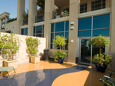
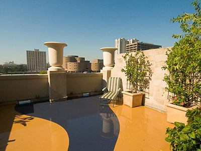
That’s no flood — just a meandering pattern on the terrace of this two-ish bedroom condo in Il Palazzo on Calumet. This 1,914-sq.-ft. space on the 5th floor of the Museum District building with the light Mussolini-era styling went on the market over the last weekend, for $425,000. The patio view is to the south, but there’s so much more to look at inside:
***
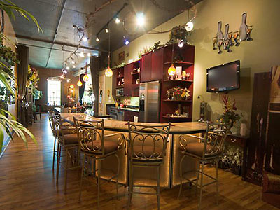
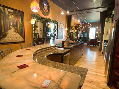
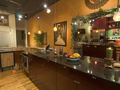
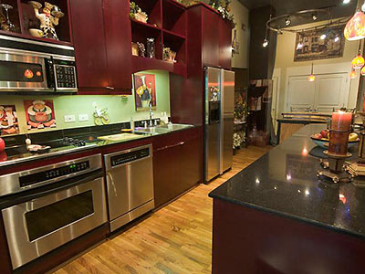

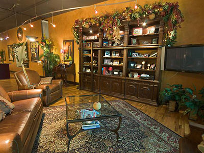
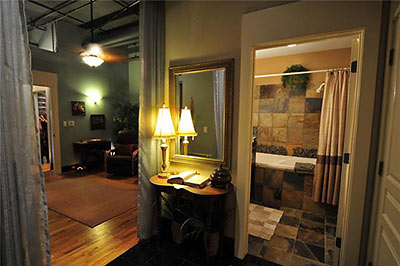
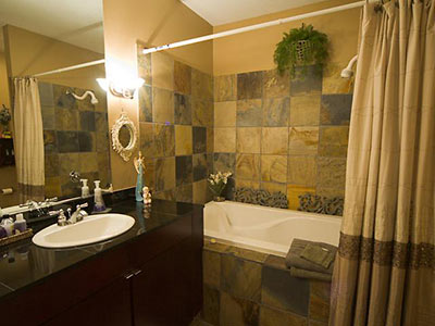
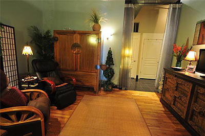
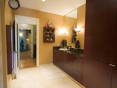
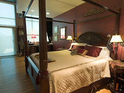
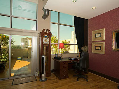
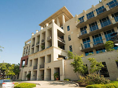
Comes with 2 parking spaces and a $599 monthly fee.
- 1401 Calumet Unit 501 [HAR]



$599 per month for two parking spaces alone? That’s as much as my one bedroom apartment rent.
Can you imagine the trophy wife a man can get if he can afford a place like that? Hey I buy it too, just need to work more and smarter to earn a place like that.
i always expected that the museum tower would be more expensive than that, but that pricing looks on par with some of the other luxury towers in the area.
I’ve always wanted to snatch up one of the cheaper places at the Renoir, but my issue with these places is that regardless of how big your unit is, it seems you pay the same maintenance fee as the larger units. So basically you’re paying the same fee for a cramped 1bd that the larger units up top are paying despite only having a third of the same space.
What’s with the bed in the living area? Is that the two-ish?
Puts a whole other spin on entertaining.
@PYEWACKET2
Upon closer look at the picture, you’re right! What’s up with the bed in the living area? It can be a master bedroom sitting area because it’s too big of an area.
You would think with 1900 SF to work with, they could have squeezed two legitimate bedrooms in there.
But then they probably would have had to sacrifice the walk in pantry/wine cooler.
The decor is awful! You couldn’t pay me to live there.
That’s an intriguing bizarro world kind of lifestyle. Put a media room in the “bedroom” and the bed in the living room. Awesome. If that marble bar area doubles as a walk-in shower then I’m sold. La dolce vita, indeed.
So. Much. Lighting.
Most of the units in that building are open plan loft-style apartments. Very few invidivdual rooms unless they’ve been added in by the homeowner.
Beautiful house. I love it.
Decor would be much improved if they got rid of all the fake foliage inside, especially the stuff adorning the bookcase.
Only thing that comes to mind is chi-chi tacky…
I agree with Jro and Balthazar: that crap decor has got to go! It’s like Kirklands or Garden Ridge exploded inside. This place will sell better absolutely bare, as the colors and surfaces are modern/popular.
Garish comes to mind.
Chi-chi tacky = garish but garish is more polite I guess.
Editor:
Please clarify Mussolini-era styling.
Don’t think this qualifies, but do tell(?)
Check the cartoon-Eyetalian-chef kitchen decor mini-plaques on the kitchen backsplash.
The styling is reminiscent of the Palazzo del Rettorato on the campus of the University “La Sapienza” in Rome, by Marcello Piacentini, 1933 – 35.
Decorated by rick, mark or steve.