Note: Voting for the Swampies has ended. See the bottom of this post (above the comments) for a link to the results!
And here they are! The official nominees for the first category of the Swamplot Awards for Houston Real Estate: Favorite Houston Design Cliché. Thanks to all of you who submitted suggestions!
 You can cast your vote for this awards category by adding a comment to this post indicating your choice. Or you can send a secret ballot to the official judges by email.
 We’ll post the official rules shortly. The official rules are spelled out here.
And the nominees are . . .
***
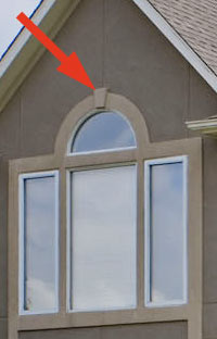 1. Keystone Details on Wood Buildings. “Sure, God made Houston without any stone. But who says we can’t put little Heinz Ketchup label-shaped doodads above our windows and fake arches — just to show we really wish we had some?”
2. “Tuscanization.” “First came the interior Venetian plaster effects. Then the Tuscan-themed homes and shopping centers. Now the “we’re in Tuscany” fantasy is taking over entire swathes of Houston.”
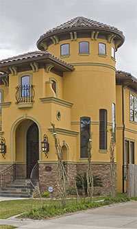 3. Home Turrets. “These suckers are popped onto nearly every new home going up in Bellaire to add to their ‘European appeal.’ Swamplot had an entertaining article about some of these houses which you can see here.”
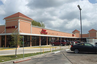
4. Shopping-Center Towers. “Nothing is more placemaking than a tower in the crotch of a strip mall with bloated Italianate surround details on unopened openings. Developers, if you’re going put a tower in the project, at least make it accessible to more than the birds you want to keep out!â€
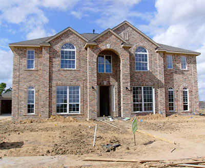
5. Two-story McMansion Entrances. “Nothing says, ‘I have a bloated sense of self-worth’ better than one of these ginormous and utterly non-functional sallyports. They look all the more ridiculous when the front door is normal sized. The best of them are no wider than the double front door, go up at least two stories, and are topped with an arch, giving them the outline of an enormous phallus.â€
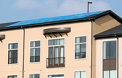
6. The Blue FEMA Tarp. “It is ugly, cheap, and ultimately temporary, though unlike much ‘design’ here it doesn’t pretend otherwise. Bonus points for actually being functional.â€
Which of these fine nominees truly deserves recognition as Favorite Houston Design Cliché? Let the voting begin!
Update: The winners have been announced!
- How To Vote in the Swamplot Awards for Houston Real Estate [Swamplot]
- Swamplot Awards Ballots 2008 [Swamplot]
Photos: Bellaire Home Tour (keystone and turret); Buena Vista Management (Airline Shopping Center); HAR (2614 Rose Bay Dr., Pearland); Flickr user M Sarz (blue tarp)


5. Two-story McMansion Entrances.
I’m going with the McMansion Entrance as well. Oh how they suck.
2. Tuscanization
2. Tuscanization. If I see one more triple-arched tower with mediterranean tiles on an apartment building in this town I’ll projectile vomit. The fun thing is that they all think they’re unique!
As much as I love the real thing… Tuscany, be gone.
Oh and don’t get me started on the Interfin properties and the tuscanization.
You think with the President of Interfin being Italian, he would abuse the style like he does.
Maybe he just doesn’t have any creativity?
Its a tough call between the turrets syndrome and the Tuscanization.
Okay, I just watched the Tuscan Lake video and that just threw me over the edge (& gag a little too). “….Look for the yellow signs to know what region you are in…” Yeah, because that is the only way to tell since EVERYTHING looks just the FRIGGIN same!
The picture of the FEMA tarp has a non-nominated, but still worthy, design cliche – the “micro balcony”.
Oh, and the home turret photo has a micro balcony too!
i will vote for myself of course, being such an egomaniac and NEVER having won your contest!!!!!! The turret craze! Come on people – vote for the turrets! It actually encompasses the Tuscany craze which is vile too.
Tuscanization for sure
2. Tuscanization
ugh! where are the vineyards and rolling hills??? where are the big cypress trees and vespas??
#3 Turrets
Bonus points if they have aluminum framed windows and Eldorado Stone!
#3 turrets
Tuscanization. Save us!
#5 Two-story McMansion entrances, quintessentially Houston.
Tuscanization. Hideous. Bonus because it does so often include turrets!
Tuscanization hands down. Of course, turrets and McMansions and keystones are all interchangeable with this category. For a real laugh, drive down Augusta and note all of the red bricked late 90s generic apartment building called Tuscany Row, Tuscany Point blah blah blah. They are about as Tuscan as a Whataburger.
Number 3, “Home Turrets” gets my vote. It’s uglier than My Ranchburger.
Tuscanization. But I think the micro-balcony deserves an official Honorable Mention of some kind.
Tuscanization …. We are surrounded by people stressing out to be wine experts, buying ugly poster art and now Tuscanizing their homes.
It is a tough choice between the turrents and Tuscanization. Please mark my vote for the turrents. Are the turrents only used for stairwells?
My vote is for Tuscanization
Tuscanization. I happen to like my phallus shaped sallyport, of course it has double doors. Width is more important than length. :)
Well, I nominated it, so I will vote for Mcmansion entryways. That is a perfect photo to illustrate this blight. It’s even weirder when you have a whole neighborhood full of them–a veritable “dick army,” so to speak.
Oh the turrets! They remind me of the people that (likely) live in the houses. Sort of round where they shouldn’t be, showy when they shouldn’t be, wearing too much decoration…you get the picture.
Scott’s comment made me laugh, my vote is for 3. Home Turrets. The picture is great too!
Every time I drive by those funky colored “ponds” I feel so Tuscanated. Gee, I really want to spend $600K to live in a gated community with non-functional gates. And who are you going to gate out – the cows? The only reason I play the lottery is a dream of buying it all up, tearing it down back back into the peaceful pastures of my youth. And returning the cows would bump the area IQ back up a bit too.
Having lived in several places other than Houston, I have noticed several things here that seem “quintessentially Houston.” Of the nominees, “Tuscanization” gets my vote. However, if I could have a write-in, it would be for corrugated metal siding. Are these townhomes considered “modern”? Because nothing says “I think outside the box” better than a house shaped like one…just sayin’
Nothing says “I’ve never actually seen a real Tuscan kitchen” than having what you call one in Houston.
Tuscanization sucks. Outlaw Tuscanization and bring back the big inflatable balloon gorillas instead.
I vote for two-story McMansion entrances.
I vote for the mcmansion entrances, only because i dislike them so much.
McMansion entrances. Who comes up with this stuff?
The ‘keystones’ crack me up. How frustrating for a pivotal architectural element to be relegated to a ‘design’ stick on after thought (much like the micro balcony).
Tuscanization.
Turrets.
They make me want to cuss.
The two-story entrances are not smart use of space or energy. It is plain excessive and ugly!
Turrets
Tuscanization-emcompasses the tower thing and the big arched (sic) door way. can you say tuscanostentation? Where is Howard roark when you need him??
I’m going for the McMansion entrances. They are ridiculous: ugly, vaguely obscene, non-functional…
Phallic McMansion entrances, micro-balconies (with leaky doors you can bet, turrets – I hate them all!!!
Another fave of mine are window frames that touch the bottom of the eaves. Very 50’s Houston – you see them all over River Oaks but never in Virginia…
I’m sticking by Tuscanization.
The video was sickening. Blarf.