Ripped and culled from your submissions, here they are: the official nominees in the first category of the sixth annual Swamplot Awards for Houston Real Estate. That would be Favorite Houston Design Cliché. Thanks to all of you who contributed! These awards wouldn’t happen without you.
 Here’s the cool thing about voting: You can do so up to 4 times in this category (and in each of the others too) — by leaving a comment in the post, by sending us an email, expressing your preference on Twitter or Facebook. Each will count as a vote — as long as you follow the voting guidelines. Oh, and don’t just tell us which choice you’re voting for, tell us why!
Here are the nominees for favorite design cliché around hereabouts:
***

1. Subdivision waterfalls. “One only need to drive south on 288 or FM521 to see that things are getting really out of hand on the entry mountain / fountain front. Rodeo Palms springs to mind as one of the worst offenders. Must there be one of these increasingly ostentatious entry waterfall things in front of every new subdivision? ‘Oh darling! Just look at that pretentious waterfall thing by the highway! I simply MUST live way out here!'”
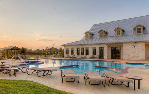
2. The Texas Hill Country look. “There is an unsettling amount of new development coming in the outer fringes of Houston that is billed as ‘Texas Hill Country’ inspired — see the Rock Creek and Towne Lake developments in Cypress, for example. Yes, Texas’s Hill Country is a beautiful place. But can we leave it there? There aren’t any real hills around here, for one thing — And no stone, either. Houston has its own style and its own natural beauty — from the coastal plains, to the oak savannah, to the piney woods. We have a cool mix of ‘vernacular’ here, too. How about we work with some of that?“
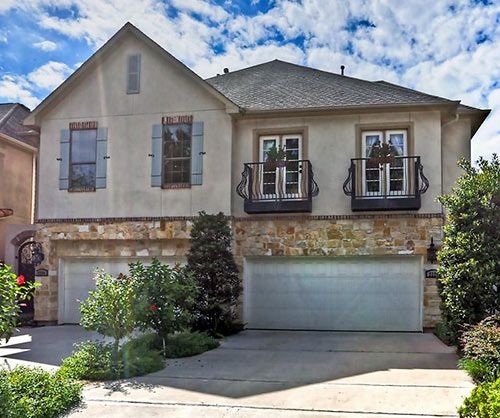
3. Juliet balconies. “They’re just like real balconies — except there’s no place to stand on them. Sure, railings mounted on the outside of your townhouse or apartment are necessary to prevent folks from falling out of your upper-story French doors. But what’s the point of having doors instead of windows up there in the first place? You can’t step out of them, and you can’t screen out bugs if you leave them open. They do help you safely clear out the air in a jiffy when you burn a pie, though. And they lend a home the unfathomable air of their namesake’s doomed romance.“
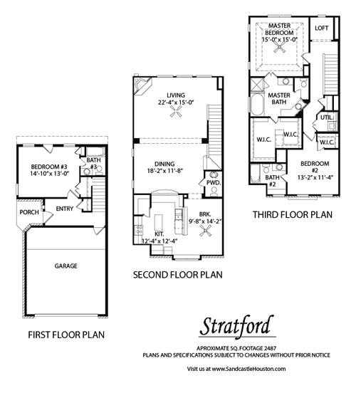
4. The typical Inner Loop townhouse plan. “Start with a 3-story stucco exterior. The first floor gets the garage, an office/third bedroom, and a full bathroom. The second floor will be the living-dining-kitchen open area with a powder room tucked in there somewhere. The third floor will have the master bedroom with en suite bathroom with a plastic whirlpool tub plus the second bedroom with its own bath. Round that out with a tiny patch of grass or rocks on the side and a 2nd or 3rd floor balcony measuring maybe 2 ft. by 4 ft. and, voila! You’ve got yourself a $300K townhome. Did I miss anything?”
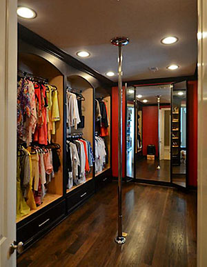 5. Stripper poles. “Actually, they’re called ‘fitness poles.’ They help keep the home in shape too, by um, holding up the ceiling. And they add visual interest.”
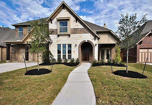
6. Polystone-al architecture.“It first started showing up as a patch of limestone on what was otherwise another mind-numbing page from a builder’s form book. Usually over the front entryway, a panel of limestone siding is used to break up the brick siding. But it’s evolved into a kind of ‘put a bird on it‘ form of home design. Take another boring new house in the burbs and put some slate here, some limestone there, a keystone here, some stucco there, and you have a polystone-al home. The look is starting to creep into some recent midrise apartment complexes too. The mishmash of different stone, brick, and stucco combinations create an ambiguous style that looks a little bit Hill Country, a little traditional southern, a bit New England-y, and everywhere else in between.”

7. Inflatable lawn art. “They’re a constant from mid-October to New Years in some Houston neighborhoods — first inflatable Halloween decorations (the next door neighbor had a giant black cat whose head swiveled back and forth), then inflatable football players (of course, the suckitude of the Texans this year has minimized that particular abomination), and finally Christmas in all its inflatable glory.“
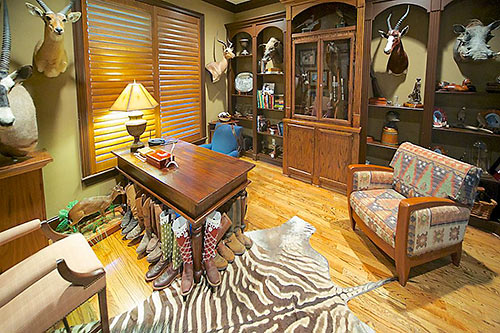
8. Dead-animal decor. “I’ve seen listings with hunting trophies in a child’s bedroom, the dining room, and in one case, right above the toilet (a head over the head, get it?). With real-estate agents always advising you to de-personalize, there must be something special about taxidermy in Houston that exempts it from this advice. Is it now considered art?”
There you have it. Which one of these stellar nominees deserves the title of Favorite Houston Design Cliché for 2013? Let the voting begin!
- How To Vote in the 2013 Swamplot Awards for Houston Real Estate [Swamplot]
- Swamplot Awards Ballots 2013 [Swamplot]
Images: Johnna Johnson (Rodeo Palms waterfall); Caldwell Companies (Heritage Lodge at Towne Lake); HAR (Juliet balcony at 2220 Morse St., stone-and-brick facade at 11710 Leonessa Dr., animal study at 7819 Bryonwood Dr.); Sandcastle Homes (Stratford); NuHabitat (closet at 1921 Spann St.); Jay Lee (lawn Santa)


voting guidelines page – 404 not found.
@detroux: Whoops! Should be up now. Try again!
While I hate #3 (which also makes me think of non-functioning decorative shutters, another ubiquitous design abomination), I’m voting for #7. I don’t hate inflatable lawn decoration. I’m kind of charmed by them, actually. And one of my favorite local artists, Sharon Engelstein, makes giant abstract versions of inflatable lawn decorations. Plus they have a great deal of poignancy when they deflate. In Houston we can’t make snowmen, so these feel like a reasonable substitute.
Haha, stripper pole. Gotta go with typical in the loop townhome, even though i live in one…
4. THE TYPICAL INNER LOOP TOWNHOUSE PLAN… the new vernacular for Houston :(
Subdivision waterfalls
6. POLYSTONE-AL ARCHITECTURE
This. Oh this. I drive by a house that was under construction until a week or so ago just about every morning, and as I watched it go up I thought, “oh, what a cute little house. It’s actually keeping with the look of this neighborhood.” Then, one day I saw that they were using red brick and I thought, “Oh, well, most of the other houses have wood siding with cute colors, but that’s okay, it will still be nice.” Then one day I saw that they were putting some ugly, big stone facing on the front porch area and columns, and I thought, “Oh, ugh. Nevermind.”
#1. Love Water Features. Hate Rocky waterfalls where none could possibly exist.
Absolutely #4. I can think of at least 3 of my friends who own townhouses with that have that exact floor plan. Mine is different, dammit. It has the whole top floor as the master suite and a huge balcony. That makes it different enough right? Right?
1. Subdivision Waterfalls
#1. Just love those versions of the Roaring Fork Falls at the entrances to land sites flatter than a pancake.
Wow! Truly an embarrassment of riches! However, I have to go with number 4, the “typical townhouse”. We saw a ballizon of these several years ago when we were looking – even had a contract on one that could not be closed (thank you, Urban Living!). The Baby Boomers may have these now, but there will be plenty on the market when they start to bail out into one story plans.
Favorite is a bad term. I actually like #4 the typical townhouse plan. When I came back home after living in the Bay Area, I was amazed that Houston was filling up with its own cookie cutter version of the cookie cutter houses in the unhip parts of San Francisco. The ones that inspired the song: “Little Boxes”.
Next year you should have a category for worst design cliche. The stripper poles are horrible, but I don’t have to see them except on swamplot and HAR. So the polystonal architecture is the most evil newish trend.
#4 The Typical Inner Loop Floorplan. I am not sure how many of my friends in their 20’s own/rent these townhouses. I don’t even ask where the powder room is anymore because it’s always in the same place.
#6 It is nuts. It is like a building-materials buffet table. Can’t stand it.
I vote for Poly Stone-al. It’s pervasive.
I like 3. Nothing says “lipstick on a pig” like a Juliet balcony. They are used as architecturally randomly as columns are in Houston. They are like the cheap pin striping dealerships do on cars to justify selling you some “sport” package. No. 4 is just too easy and could be the design cliche for the last 15 years and the next 15 years.
4. The typical Inner Loop townhouse plan
# 6 Polystone. There are countless of these beauties sprucing up in Oak Forest! Subdivision waterfalls is a close second. Just north of I-i45N and Beltway 8 there is one that gives me a chuckle every time I drive by
http://search.har.com/engine/1729-Du-Barry-Lane-Houston-TX-77018_HAR26509034.htm
http://search.har.com/engine/1323-Lamonte-Ln-Houston-TX-77018_HAR5607135.htm
#4. It’s so tired.
#3!!! I absolutely hate these and have always been confused about why anyone would spend the extra money for these silly in functional things. I cannot see why countless developers spend all the extra money on all that metal when you can’t use it?? Makes no sense, and it can’t be cheap. Why do they do it? It looks ridiculous too so it can’t be looks, right?
#6 in all its pervasive, un-ignorable, horrible-ness.
#4 – Townhome plans
#4 – Townhouse. Put an automatic gate around 3 of these babies on a 5K sq ft loot, and presto! Your very own, super-exclusive gated community inside the loop.
Last year was so easy – the humping bungalows are such a uniquely Houston architectural anomaly. Most of these options can be found in a great many metro areas. But as for which of these invasive species is most in need of containment and eventual eradication, #4 gets my vote.
I’m going with #6. Such little imagination.
Number 4. Although none of these are unique to Houston. Maybe we need new categories for next year?
#4 – and yes, I live in one.
#1. Subdivision Waterfalls
#6 by far. Coco Chanel once said “before leaving the house, a lady should look in the mirror and remove one accessory.”
#1 Waterfalls OR #3 Juliet balconies
4) THE TYPICAL INNER LOOP TOWNHOUSE PLAN, not because it is cliche’, but because it offends my Feng Shui sensibilities and good common sense: Loos that open up to a dining area. For the love of all that is sweet and pure, please stop doing that.
6 – Polystone-al: Is it expensive, so they use just a little (in some cases, not all), or is it cheap, and builders use it because buyers think it is a touch of luxury?
Juliet balconies– same questions as Polystone-al, plus they are absolutely non-functional: ostentatiously face the street and not some private area (the backs of these houses appear to all be siding) where one might actually throw open (actually in many cases you would have to pull open) the doors to enjoy a bit of fresh air.
I think there are new builds in Oak Forest that incorporate a triad of design clichés: 6, 3 & 2.
#6 – Polystone-al architecture. The upscale, mutant offspring of “Lick ’n’ stick†fake-rock siding.
I vote for #2 – the faux Hill Country.
#6 – Torn by all the choices and #3 would be a close second.
Been gone for awhile but have turrets ever been nominated? They make me crazy. Last time I checked Houston’s invading hoards had all been quelled rendering turrets and arrow slits superfluous.
I am laughing so hard; the choice is really tough! I vote #2!
3. Juliet balconies!
#1 – waterfalls where they can’t possible exist.
I vote for #4. After I’ve visited oh so many friends in their cookie cutter ITL townhomes, I come home to my 1934 original 1-story and revel in the fact that 75 years ago, my home was once like theirs – the same floorplan over and over again in Montrose. The only differences are that homes like mine are becoming few and far between, and mine just might last another 79 years.
Wow, LOTS of good choices this year! And good photo examples of each, too. I’ll have to throw my lot in with #4, the typical inner-loop townhouse floorplan. Like several others have stated, I became most familiar with these when house-hunting ITL a few years ago… it got to the point where we didn’t have to go in the house because they were essentially the same! And when friends start to describe the new place they just bought, I can stop them when they start with, “well, the garage and third bedroom are on the first floor…”
All that said, I actually do like the floorplan. For a young professional ITL couple, they make a lot of sense for the footprint. Maybe not the prettiest, or most authentic, or charming, or highest quality (depending on the builder), but hey – people gotta live somewhere. And it beats the pants off a 4500 square foot monstrosity with a maintenance-heavy yard in the ‘burbs.
#4 fo sho.
#3 the balconies to nowhere. This isn’t Spain or Italy. Though the waterfalls on the Katy prairie make me laugh too.
#4!!!!
#6 – I’ve got nothing clever to say. It’s just ugly!
Despite #1 Subdivision Waterfalls, I’m going with my #2 as that’s very Houston exclusive.
8 and 5 may be unsettlingly common in new construction, but not really a cliché. 7 is pretty much everywhere (not just in Houston, and I’m betting 8 and 5 aren’t).
I vote #4. Recently construction on a new group of these has begun in Shady Acres near my house. They advertise two floor plans……and the only difference between the plans…..and this is for real……the shape of the front porch. Such variety!
Def. #1. While subdivisions around the coutnry all have entry signage… Houston goes way over the top with these riddiculously huge subdivision waterfalls…
I like #4, but I live in one, and coming from Arlington, VA, lots of new townhomes there also have the same layout, so not really uniquly Houston.
Because we sold one earlier this year and because so many of my friends and acquaintances own or have owned one, I will go with #4. My husband and I mixed it up a bit – ours had Hardi-Plank siding, not stucco. So glad we didn’t make the mistake of buying a stucco house in Houston.
#4 is this generation’s ranch. After you’ve visited enough of them you can walk through them blindfolded.
#4 – the vertical mobile homes – (VMH) – what a pathetic design – do they know they’re paying for approx 175SF of unusable SF – i.e the stairways – but, hey,they sell, so what do I know!! If I wanted to climb that many stairs day in and out, I would join the gym!
#7 Inflatable Lawn Art. It’s a topic of endless mirth among my children to guess whether the various pieces of Christmas or Halloween lawn art along our morning or afternoon commutes will be functional, deflated, or lying sideways. I can forgive a house with a design cliche because the owner may have liked the other 99% of it, and purchased the house because “you can’t win ’em all”, but inflatable lawn art is an unforced error. Call me when Sharon Engelstein makes a museum-worthy Santa or Great Pumpkin. Wait. Actually, no. Don’t.
#6. While waterfalls and townhomes can be found everywhere, Houstonians seem to have a unique love for maximizing the number of different building materials per exterior facade.
4. There’s a block of these that just went up a block over from us in Brookesmith, and I get douche-chills every time I look at them.
THE TYPICAL INNER LOOP TOWNHOUSE PLAN, for certain. Though this is a Cliché in too many cities to list here. YUCK!!!
Well, it did say we could vote up to four times per category. I must vote for typical townhouse again, after reading MaxC comment…. the vertical mobile homes – (VMH)….love it. Though these are not only found in the inner loop.
#1 – Seems like most of these things can be found anywhere in America and aren’t particularly “Houston”-y. That said, we are ground zero for soul-destroying planned communities so gotta vote for the tacky waterfalls. Nothing says home like fake rocks and dirty water after a 2 hour commute.
Definitely #4, the ultimate would be a townhome with a #3 Juliet balcony. Do builders know how unsuited that clichéd floor plan is for a family dwelling? I know they’re aiming for couples, young and old, but there are families who want to live in Montrose too and finding new construction with a good floorplan is tough.
Polystone. They’re the popcorn ceilings of today!
4. THE TYPICAL INNER LOOP TOWNHOUSE PLAN
Number 4
4. Innerloop townhome plan, it all looks the same. Moreso than the McMansions in suburbia.
typical townhouse
Polystone-al architecture because it is so horrendous. Great postmodern architecture it is not. I don’t even think we should call it architecture.
#1 Subdivision waterfalls.
POLYSTONE-AL ARCHITECTURE
#1! Subdivisions and their “waterfalls” and “lakes” are ridiculous.
1
#6 faux rock – it’s like living on a movie set.
#6–This is awful.
#1
Typical inner loop townhouse plan.
#4: Typical inner loop townhouse plan. Me and all the other boomers are too frickin’ old to climb all those stairs every day, and keeping the top floor cool in the summer will be very expensive.
followed closely by #1: What a waste of water in a drought-prone state. If you’re gonna have a water feature, at least make it habitat for birds, fish, etc.
subdivision waterfalls!
Oh god … the dead animals for sure. And as an aside – I had a job interview once in an office filled with dead heads. I knew before I sat down I didn’t want to work for that person.
#4 townhouse plan. They are as omnipresent, and as annoying, as mosquitoes.
#3 Juliet Balconies
#4 – and fearing for the future