Here they are, culled from your contributions: The official nominees for the very first category of the fifth annual Swamplot Awards for Houston Real Estate. And that would be: Favorite Houston Design Cliché. Thanks to everyone who submitted tried-and-true suggestions!
 You can cast your vote for this award category simply by adding a comment below indicating your choice. But why not make it more fun? Don’t just tell us which choice you’re voting for, tell us why!
And pay attention to the Swampies’ quirky voting rules: You can also vote up to 3 more times — by email, on Twitter, or from Facebook — as long as you follow the listed guidelines.
The nominees are . . .
***
1. “Urban-Style” Neighborhoods in Far-Flung Communities. Out in Houston’s new-settlement frontier, a few developers claim they’re modeling newer neighborhoods after the ‘classic’ feel of the Heights and West University — with smaller, friendlier, front porchier homes. Isn’t that the same character those 2 Inner Loop neighborhoods have themselves been working so hard to jettison in recent years? What better says ‘I’m a cool urban trendsetter’ than choosing to live in a new-construction box wrapped with a bungalow look and surrounded by miles of grazing land?”
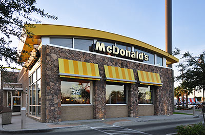
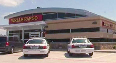
2. Gentle Arc Roofs. “Before it got swallowed up by Wells Fargo, Wachovia brought what had been an affectation of cutting-edge design-y office buildings to the ubiquitous suburban corner bank building. That cool arc-top look has since spread to McDonald’s, Walmart, and the occasional modern house.”
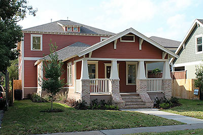
3. Humping Bungalows, aka Humper Houses. “They look like a McMansion or awkwardly proportioned 2-story bungalow went into heat and decided to mount an old bungalow from behind. Many preservationists consider this sort of ‘back door’ addition a way to ‘save’ an old house by, uh . . . pumping new life into it. City design guidelines for historic districts actually encourage this renovation strategy, though they refer to it more gently as a ‘camelback’ addition. Whatever you call it, the resulting indignity is usually difficult to ignore — though it’s often not entirely obvious who’s getting screwed.”
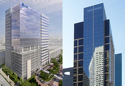
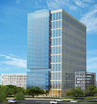 4. The Mixed Glass and Concrete Gridded Look for Highrise Office Buildings. “Several distinct patterns of alternating glass and precast concrete panels are combined on a single facade to make a single building appear as if it were constructed from a combination of separate building types. It provides some visual interest, but kinda looks as if someone chopped a few different buildings in pieces and recombined them to form some sort of Frankenbuilding. If the current construction building boom continues, this design trend appears on track to look tired and overused in about 10 years.”
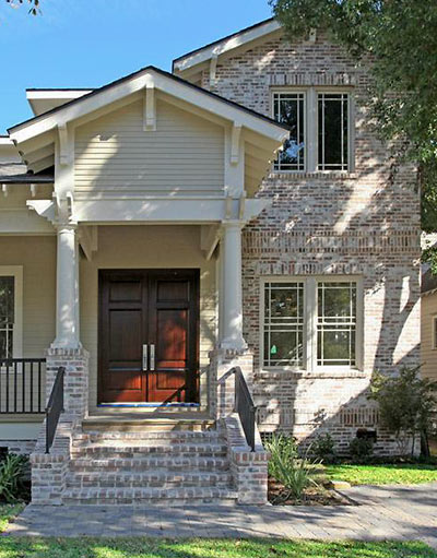
5. Whitewashed and Partly Whitewashed Brick. “How to one-up older brick homes in neighborhoods where the ‘original and authentic’ look is all the rage? A contrasty brick mix masked ever-so-subtly by a little splotchy whitewashing brings an aura of instant historicishness to brand-new construction — and with it, a much more palpable sense of the past than the one needlessly endured by its older, smaller, dowdier, and less compelling neighbors.”
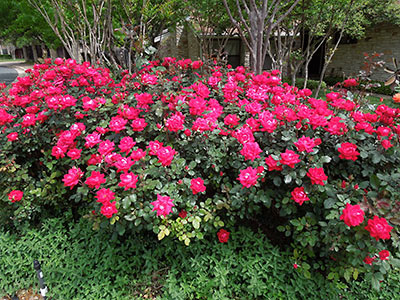
6. Knock Out Roses. “These roses are very tough and need little water. Commercial and civic landscapers love Knock Out roses for that reason, and indeed a mass planting of them can be quite lovely at times. The problem is their ubiquity, and the fact that after dropping their first blooms they become scrawny and leggy, produce crappy looking miniblooms, and require severe pruning — labor that commercial and civic planters can usually afford only, say, once per year. Different types of Knock Out roses vary in color only slightly, and in any event the only ones commonly used are the bright pinkish reds, so there isn’t the variety you see in azaleas. Knock Out roses provide easy and lazy landscape solutions, and discourage even thinking about native plants that would be nicer and just as easy to maintain.”
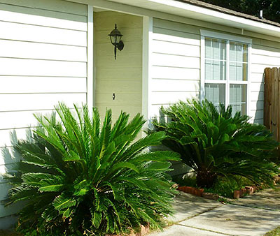
7. The Sago Palm. “Ubiquitous, indestructible, smelly, and poisonous. They’re the ugly equalizer — you find them in every neighborhood: old and new, Inner Loop and far-out suburb. Taste is subjective, of course, but please don’t eat one. Throw some Knock Out roses, crepe myrtles, and maybe a Bradford pear in there for good measure and you’ve got your basic palette of ‘staple’ Houston landscape plants — even though none of them are even remotely native to our region.”
So . . . which of these fine nominees truly deserves recognition as Favorite Houston Design Cliché for 2012? You tell us. Let the voting begin!
- How To Vote in the 2012 Swamplot Awards for Houston Real Estate [Swamplot]
- Swamplot Awards Ballots 2012 [Swamplot]
Video: Bridgeland. Images: abc13 (Wells Fargo); Candace Garcia (Woodland Heights McDonald’s); HAR (1615 Columbia St.; brick at 1634 Harvard St.; sago palms at 5435 Cherie Crest Ct.); BBVA Compass Bank (BBVA Compass Plaza); Michael Heisel (Reliant Energy Plaza [license]); Elkus Manfredi Architects via PM Realty (3333 Richmond); Rachel Bosworth (Knock Out roses); HAR (sago palms at 5435 Cherie Crest Ct.)


7
Excellent selection–they all deserve to be winners. But forced to choose, I’m going with #2.
well, since I really like sago palms and roses (and haven’t been educated on what’s negative about them), I’ll vote for the humper houses. They just look silly when overdone.
FIRST!
.
#7 The Sago palm. What a horrid, prickly eyesore. I can’t trim mine without the paralyzing fear that I’m going to have my eye gouged out. Gotta love those builders and remodelers that plant them right next to walkways, too!
Humper houses!
Vote goes to the Humping Bungalows. One can find the weird arc, fake antique brick, etc. in places across the country. The Humping Bungalow is a uniquely Houston design atrocity.
#3: The Heights bungalow orgy.
We are proud to have built the Heights’ only non-humping addition to a bungalow in 2012.
#3. Terrible
the humper houses!
#3 The Humping Bungalows. As a Heights resident it saddens me to see a perfectly good bungalow ruined if it’s not enlarged in proportion with the rest of the house.
#2, what I would call the Roof-Brow. Every now and then you find one that looks like it was plucked a few too many times. These roofs are everywhere – city, suburb, country, you name it.
Despite a burning hatred of Sago Palms, gotta say #3, the house humpers. Silly looking on the outside, awkward on the inside.
#3 Humperlows
It takes a good architect to make one work. Sadly, good architects are not being hired very often.
Humping bungalows are happening here in Austin too, perhaps even moreso because of the “McMansion Ordinance” that prevents almost any other kind of expansion. So that’s my vote.
Dang… I thought I had coined the term “McCamelbacks” (seemed to be the term widely used on HAIF and here) but humper houses is probably better. Poor lil old feeble practically useless bungalows don’t stand a chance against the mighty two story add-on, they’ll just have to sit there and take it (much like the residents in the Historic Districts had to take the ordinance changes)
So yeah, my vote is for #3.
#3 humper houses! Love the modern, updated bungalow with the lines and backside of a shipping carton.
#3 (Humpalows), if only for the lesson in the law of unintended consequences.
#3 – HUMPING BUNGALOWS
I refuse to design these. I always tell my clients they should just buy a different house in a different neighborhood because they obviously don’t like bungalows or historic districts.
I have to vote for #7 because they are truly everywhere. Unfortunately, now that the Cycad Scale has arrived in Houston, we could see the numbers decline greatly like they have in Florida.
#3
#1 because if you move out here to the burbs, you most likely want a yard for your kids to play in and a driveway big enough for your wife’s SUV and your F-150.
#7. The humpbacks of heights may be ubiquitous there, but the sagos are everywhere and practically unkillable (my house came with three). No more sagos please.
Sago palm. I spent a sweat filled afternoon digging out my sago palm and putting it out for yard waste day when I caught my dog chewing on a seed one day. They are awful plants. They are poisonous to pets and will sting you with their needle tipped leaves if you get too close. They attract no wild life. No humming birds or butterflies will come within 50 feet of these things.
As for the camel back, they are not really a design cliche. They are more of a lack of design cliche, which in Houston is a design trend. They are basically the SUV of historic home renovations. Just as the US automakers convinced people that the gas guzzling and roll-over proned SUV was better than the safer and more fuel efficient sedan, builders are trying to foist onto homebuyers the idea that an extra 100-1500 sq feet contained in an ugly box crammed into the lot behind a bungalow to get 3800 sq ft is better than a tastefully done addition of 2000 sq ft that is seemless and could pass for the original on first glance. But, like SUVs, people are buying them so builders will continue building them.
#3, easily
the sheer inefficiency and waste of space is really insulting. you can tell these people could care less what the property taxes are cuz whatever they are they ain’t high enough.
No question in my mind, Humpers take the prize.
Humping bungalows!
#1 If I were going to live on a Disneyfied movie set I’d chose a better backdrop than “urban living” – why not Bedrock or Orbit City a la The Flintstones and Jetsons, respectively.
#1. Because it is the new normal, we are going to see this for a long time, and it just started. In 50 years we will know these were signifigant. Too bad they are usually so cheaply built.
The humper is just the latest form and revival of the camelback shotgun, it is just being done to bungalows now. my grandmother was living in one during the Mississippi flood of 1927, so it is an old solution.
#7 – In not so loving memory of the enormous sago in the backyard of my childhood home. No one liked it except the wasps. RIP Stabby.
True, neighborhoods like the first one are theme park versions of places like the Heights. But you kinda grasp the appeal when you realize that for under $200k you can buy a nice, new little house there. In the Heights you cannot even come close to buying a pre-Humped bungalow for that.
If you are going to pay $350-400k for a dilapidated 1920’s era bungalow that you want to expand and remodel, you ought to be able to shell out a few bucks for a decent architect.
7
3. Humpalows
Gotta go with the humps. Tho, the sago palm runs a very, very close second.
#4. Go big or go home.
No question! Though I nominated lick’n’stick stone facing, “Urban-Style†Neighborhoods in Far-Flung Communities is the retarded Victor of the category! (oxymoron?)
Sure… ‘when some giant infrastructure is complete we can walk to get an ice cream cone!’ ‘modeled after a actual neighborhood! full of people living actual lives! unlike this place which is scheduled to have actual people soon, pretty soon.’
#3
Humper houses!
Number 2. This will be the most lasting design cliche of the first decade of the 2000s.
Options 3 and 5 are both on my jogging route. Go Heights!
I vote for #7 because somehow giant metal chickens didn’t make the final cut.
Humpalows. No contest. Massive McMansion rebuilds in mid-century neighborhoods would be my first choice, but it’s not on the list yet…pushed off by the humpalow behind it, I’m sure.
I’m a little confused why people are voting for things they apparently hate as their favorite over-used design in Houston. I like the white washed brick design cliche, so I’m voting for #5. Or do I have that all wrong?
#2, because it has become ubiquitous in certain commercial architecture in Houston, and just look at both those pictures, it is almost always accompanied by lick and stick brick.
Whitewashed brick: I remember whitewashed brick going up on quite a few West U homes in the eighties. I admit that I like it. The problem with the stuff is that it’s like wide bottom pants. It comes back in style perennially, but then goes really far out of style in between.
#3 – it’s occured on some of the homes along 43rd in Garden Oaks, too, although usually they are just torn down for something that incorporates past design cliche winners.
#5 – I really really like the whitewashed brick look. If you are going to build new construction in an older neighborhood I think it adds a little character without detracting.
#3 …. build around the old house then tear down from the inside so nobody can see …. the double hump.
#40 wasn’t posted by me, but I am also voting for #3. And hear, hear to the poster above who refuses to build these monstrosities.
#2 FOR SURE! Those annoying small arches signal immediate boredom.
4 – Frankenbuildings
3 Humping bungalows
#1 just because I’m completely creeped out by the Stepford wives in the video.
#3, definitely
Torn between humpalows and the weird urban settings out in the middle of nowhere.
Will have to go with humpalows!
Humping houses. How else can you have a 1910 bungalow with 90% new construction?
Heights!
4 or 7.
Sago palm. I have 2 in my front yard and I hate them.
#3 Humpers
#1
Humping bungalows for sure.
#1
That video pushes it to the top.
Sago palm. So ugly and all over the place.
3. HUMPING BUNGALOWS, AKA HUMPER HOUSES
#3 Humper Bungalow.
#3 HUMPER HOUSES
Camelbacks are the worst.
#7
I am going with number 1. I think the humper houses are pretty awkward looking, but it is better than tearing the old house down and building town houses.