Here they are, straight from your submissions: the official nominees in the first category of the seventh annual Swamplot Awards for Houston Real Estate. That, of course, is Favorite Houston Design Cliché. Thanks to all of you who contributed! These awards wouldn’t happen without you.
 If you’ve voted in the Swampies before, please note we’re making a slight tweak to our voting rules this year. You can still vote up to 4 times in this category by 1) leaving a comment below this post; 2) sending us an email; or by expressing your preference on 3) Twitter or 4) Facebook. This year, however — to encourage signups — we’ll only be counting votes submitted through the first 2 methods from voters who’ve signed up for the Swamplot email list. (If you haven’t done so already, you can through this link or the box at the top left of this page). Make sure your vote counts by reading and following our voting instructions.
Just as important as the votes you cast, though, are the explanations you provide with them. Tell us why you’re voting for who you’re voting for! What you write may sway other readers to vote as you did. And if your candidate wins or comes in second place, your clever comments might be included in our round-up post.
Here, then are the 2014 nominees for favorite Houston design cliché:
***
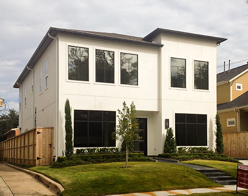
1. Minecraft Windows. “Oversized rectangles installed in-plane with stucco. They are eerily dark and shadowless — a favorite of 5th-grade designers. Some of these houses have actually scared me when I came upon them.”
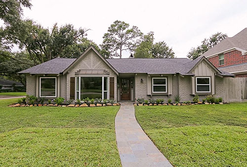
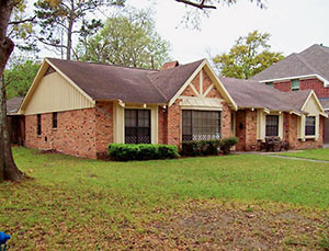 2. The Painted Brick Flip. “A technique once used occasionally to mask flaws in the brick of older homes has quickly become the sine qua non of any Ranch flip. They all seem to come in shades of gray, with brown or black shutters. It brings to an otherwise maintenance-free exterior all the advantages of having to paint every few years. On one house I saw they got a little crazy with the paint sprayer and painted over the bottom of a couple of the street-address numbers, but didn’t bother to replace them. I guess they didn’t want new numbers eating into their margins. Someday, when gray is no longer the new neutral, people are going to want their brick back. Maybe if we called used brick ‘reclaimed brick’ it might be cool again, and people would stop painting over it.”
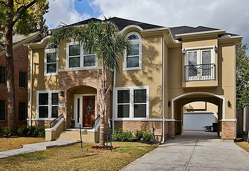
3. The Side Porte-Cochère. “A result of the quest by developers and builders to maximize square footage (aka profits these days), this strange appendage has begun to infect many new-build single-family homes inside the Loop. That extra room you always wanted but didn’t know where you’d fit is now suspended over the driveway. Awkwardly perched on often spindly legs, these rooms make the house look like a dog lifting its leg. Under some of them, there might even be enough clearance to open a car door.â€
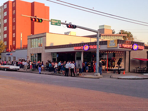
4. The Trying To Be Like Austin. “Sure, a rash of Hill Country limestone still regularly infects Houston building projects, but the bigger problem is the notion that Houston has to have [insert idea here] because Austin has one. Remember the ‘Houston needs a Barton Springs‘ campaign? What about the Galleria Whole Foods’Â Beer-On-A-Trike? This purportedly pro-Houston, anti-Austin infographic? The 2,572,154,847 Torchy’s Tacos that opened in Houston this year?”
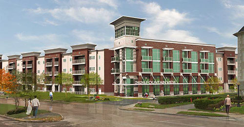
5. The Midrise Woodframe Apartment Building, aka the Texas Donut. “With advances in woodframe construction, pretty much every new inner-loop apartment development consists of a five-story wood-frame structure around a concrete parking garage. While the facades and ornamentation may differ from project to project, the basic construction is always the same. The parking garage is pushed to the interior, so you can’t see cars from the street. The facades are some mishmash of ‘traditional’ materials, and there is ‘articulation’ in the facades and/or rooflines. The repetition of windows and entrances is ‘human scale.’ Just on a 2-mile drive from Yale and Sixth to Waugh and Gray, you’ll pass six such projects, either in process or recently completed.”
“These new mega-complexes going up inside the Loop all look the same: hulking, sunlight-blocking cubes with no exterior doors, little or no green space, and tiny, useless balconies (if they have any at all). Some even appear to have windows that don’t open. Attempts to make the exteriors look ‘luxurious’ don’t hide the fact that they are depressing human beehives. Something inside me dies a little every time I drive by one of these complexes.”
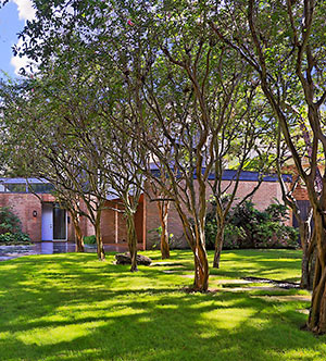 6. The Crape Myrtle, the Bradford Pear, and Other Overused Non-Native Trees. “Bradford Pear is the main offender. Other popular choices are Crape Myrtle, Chinese Pistache, and Chinese Elm, not to mention a pretty significant number of palm trees. A staple of the typical Houston strip center — or house. I always wonder why people keep planting all of these, when so many attractive natives are available.”
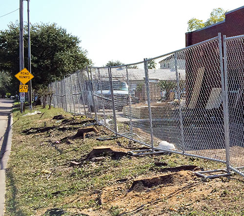
7. The Oak Tree Stump. “An emerging cliché, especially around fast-food franchises and new-home sites.”
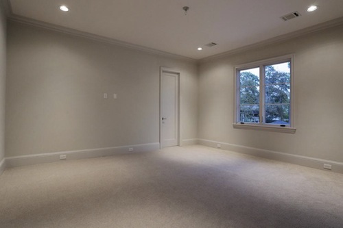
8. Monochromatic Interiors. “Brown for the ’burbs. Gray for the urban ’burbs. Every freaking room the same freaking color. Let’s recognize ‘Fifty Shades of Grey’ for what it is: a raunchy update of the romance novel, not an interior design movement. What is the point of having a sprawling mansion if every room is the same damn color?“
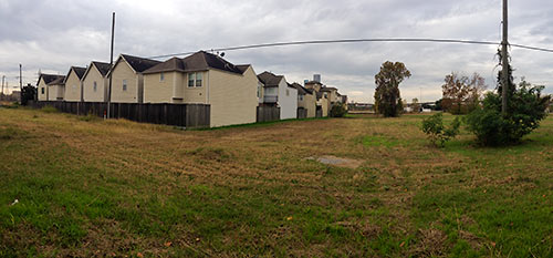
9. The Townhome Farm. “The momentum of residential housing inside the Loop has finally started to push out many of the odd industrial sites that are sprinkled all over our Inner Loop neighborhoods, a task made easier by the lack of zoning. This has freed up properties inside the Loop that can actually be measured in acres. Of course, the townhome was the perfect way for builders to redevelop a single-family-sized lot or small strips of land inside the Loop and maximize the square footage within the space constraints. But what do developers do when these space constraints do not exist with larger lots? They just keep cramming them full of townhomes. The result looks like developers simply planted townhome seed on a large vacant lot and grew a crop of townhomes.”
Now: You tell us. Which one of these oft-seen nominees deserves the title of Favorite Houston Design Cliché for 2014? Let the voting begin!
- How To Vote in the 2014 Swamplot Awards for Houston Real Estate [Swamplot]
- Swamplot Awards Ballots 2014 [Swamplot]
Images: Carolyn Foug (1712 Marshall St.); HAR (4403 Arnell Dr. painted and unpainted; 1510 Marshall St.;Â 5308 Woodway Dr.); Swamplot inbox (Torchy’s Tacos on 19th St.; tree stumps on North Blvd. at Kirby Dr.; townhomes on Clinton Dr. near Sydnor St.); Alliance Residential (2626 Fountain View); Sotheby’s International (crape myrtles at 6127 Riverview Dr.)


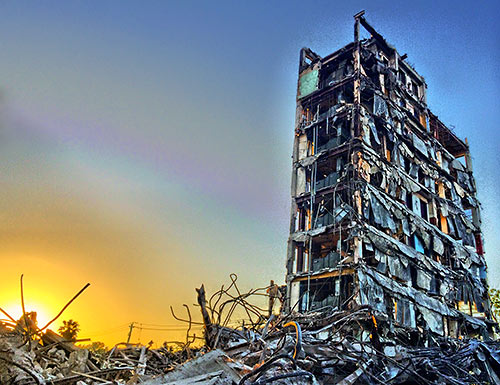
Oak tree stump – we need more!
Townhouse farms.
#7, in honor of the 150 year old oak tree at Waugh and Peden, cut down this week with glee by Carnegie Custom Homes all in the name of PROGRESS!!!!
The townhome farm
Gotta go with #7. I fully expect to see the Lorax standing atop one of these next time I drive by. This might give rise to its own category in next year’s swamplot: The Once-ler Award for the pointless destruction of Houston’s natural resources. And this year’s winner for the Once-ler award has got to go to Mohammed A. Dhanani and Haza Foods.
3. THE SIDE PORTE-COCHÈRE, if Houston was a house this would be it, including the huge hole in the left side as a symbol of Galveston Bay and The Ship Channel.
Sadly, I vote for #7
This year, they all make me equally sick. Can’t wait to see how we outdo ourselves in 2015.
Trying to be like Austin is a category so large that it subsumes other categories of whining and snark that were available for a vote, including knee-jerk tree outrage.
Minecraft Window Homes.
They seriously freak me out. They are so ugly but I can’t stop staring.
The oak tree stump. There’s a lot on my street that had a 100+ yr historic oak. Developer came in, didn’t even bother trying to design around it (despite other local builders who said you easily could). Just hacked it down and threw up a couple drab townhomes. Lost count how many times I’ve seen this throughout the loop.
Townhome farm!
The Townhome Farm.
I cringe a little every time I see a Variance Application sign go up, because there’s a good chance it’s preceding another one of these.
minecraft windows. My kids built that same structure in the game.
The townhouse farm. Ubiquitous, and ugly!
why cant my minecraft make a hip roof? this is exactly what i wanted to build with some piggies in the claw-foot tub! #1
The townhome farm, for sure. Terrible and pervasive.
Oak stumps!
Painted Brick Flip… the typical character removal to be “trendy”.
On another note, I think it is unfortunate that Swamplot is using its end-of-year contests to augment its email list. I get all the email I need, thank you, and I know how to find swamplot.com when I want to. If you want to require it, go for it, but I will not be participating in the sign-up, nor asking anyone I know to do so just so they can vote. Hmm, sounds like less traffic to me!
The townhouse farm! They’re ugly and most look tacky and cheap…
Gosh, so many worthy choices…but I vote for #8, monochromatic interiros.
This is tough. The porte-cochere is very compelling (I recently moved out of a neighborhood where every other house looked just like that), but I have to go with the crepe myrtles, number six. I grew up with those trees and I swear I have had the same conversation with my mother-in-law about five times about what kind of trees to plant at my new house:
“You should plant crepe myrtles.”
“Nah, I want to plant natives.”
“Do you know what they look like? They’re pretty.”
“I know. They are pretty. I’m just sick of them and I want to use native trees.”
“. . .well, I think they’re pretty.”
#3, the side porte cochere, if only for the description of a dog lifting its leg. #4 trying to look like Austin was a close second.
The townhouse farm by a mile. On the bright side, their shoddy construction / permeable stucco facades will ensure their early demise at the hands of Houston’s brutally hot and humid climate.
“4. The Trying To Be Like Austin.”
.
Austin is great, but I don’t want to live there. If I did, I’d move to Austin.
#9 The Townhome Farm.
Before the recession these larger parcels used to sprout detached larger homes in a gated community ( i.e. Heritage Creek on West 12th at Ella) or large deep but narrow faux-Victorians with a detached garage in back ( i.e West 22nd at Couch). Now it’s just townhome boxes everywhere.
Trying to be like Austin.
There is so much development criticism over the years as to what is taking place and more over the last year that it is in everyones and media discourse.. My question is what can we all do to try to change it…Is there nothing? Who in our govt has the ability and so on?
The Townhouse Farm gets my vote – hands down.
It’s like a cancerous growth popping up all over Houston. We can’t get enough of these, can we? A mediocre mash of 2-3 story cubes, quickly and poorly baked comfortably together en masse, cozied up with your favorite estranged and antisocial neighbors, iced with the developer’s choice of cheap siding or fake stucco, and wrapped up nicely in 3-4 appetizing variations of “tan”, “grey”, or “creamâ€. Additional amenities include premium views of the garbage littered overgrown lot behind you, as well as prime location in close proximity to the recently constructed development on the other side of the fence line. Impress few – yet alienate no one.
The Midrise Woodframe aparments
#4 – way too much Austin
I have to vote 8, if only because monochromatic interiors so often don’t get get changed by home buyers. I’m in new homes every day, because of my job. And all too often, those folks bought their new house precisely because they “love the color choices”.
It damages my soul.
555555555555555555555555555555555555555555555555555555555555555
#5. The Midrise Woodframe Apartment
When taken as a whole, these things represent the most recent and most radical change to the look of the entire west-inner loop. The townhouse phenomenon has been going on for a while now.
#5 because “These new mega-complexes going up inside the Loop all look the same” and I live inside the loop ….
It was a close one, but I vote for #5 aka The Texas Donut.
Painted brick gets dishonorable mention.
For me, the winner has to have something to do with the uglier side of densification inside the loop; a perfect metaphor for profit over quality, sq footage over aesthetic proportion and developers over community. It boils down to #3 and #9. I’ll give my vote for #9.
It was a tough choice, but I’ll go with the townhouse farm. A close second is the oak tree stumps. Both are a condition that is increasingly being inflicted on my old neighborhood. So sad.
There are 3 weeks till the end of the year, Houston could still come up with a new cliché.
Townhouse Farms
#1 Minecraft windows gets my vote.
.
I submitted the Austin one, but Minecraft windows is just so much better. Oddly enough, being an engineer – I LOVE them. To each his own…
Townhome farm!
Al……..I’ve been “signed up” for several years and have NEVER gotten unsolicited email from Swamplot.
.
But to vote, I have hated the painted brick homes in my neighborhood for over 20 years. You can never get the beautiful old brick back again.
.
We have a flipper in our ‘hood that loves to do this. Ugly ugly ugly.
.
#2–even though it’s already clear that it will never win.
Thank you for the “encouragement,” but I do not wish to join an e-mail list so that my inbox can be filled up with notifications about these articles – I already come here to the page to read them! I won’t be voting this year. Have a happy holiday.
The Texas Donut…ghastly, anti-pedestrian…look like fortresses.
The townhouse farm hands down
THE TRYING TO BE LIKE AUSTIN
Karma:
I too have not gotten any unsolicited emails from swamplot (and I love the site, by the way), but it looks like the business plan may be changing. Why would someone build a list if they did not plan on making use of it? Just asking.
@Al and @Sihaya: Swamplot is not currently sending out regular story emails yet (though we plan to begin doing so next year). If you want your votes here in the comment section or submitted to us over email to count, you might consider signing up for the Swamplot list, casting your votes, and then dropping out of the list or turning off delivery after the awards are over or after we begin sending emails. If you don’t want to do that, you can still vote from Facebook and Twitter — though that of course would require you to have signed up (with an email) for those services, and have been receiving whatever emails they send. The full array of voting opportunities is described in exhaustive detail in the post linked at the top and bottom of this article. Thanks for participating!
Many good nominees, but #7 is not only increasing in frequency, it seems, but it is also the most unforgivable.
Most townhomes will be consumed by mold inside of 20 years. The fast-buck flippers will always do the minimum necessary to make it look like they did something. However, the only way you get a 50 year old tree is to plant one and wait 50 years. We don’t own many of these trees, we are merely caretakers.
Re Swamplot’s email list:
I’ve been signed up for a long time now and have never received anything. Of course, I signed up one of my spamy accounts. The Swamplot emails, if they ever materialize, will be mixed in with the Harbor Freight coupons and ThinkGeek sales.
Tough call between 2, 3, 5 and 9. I’ll go with number 9, townouse farms!
#5, it’s a wrap
2. Painted Brick Flip – I once lived in a loft apartment with a painted brick wall in the living room. I always thought how cool it would have looked unpainted. Unfortunately, once painted, there is no going back.
Townhome farms. More of a bad thing is a really, really bad thing.
I think side porte a cochere should get red-shirted and have another shot next year. I have just recently noticed a bunch of them in the Heights by a certain building. On most of them, they do not bother putting in a side entrance. It is just a way to slap on more square footage. Eventually, houses will look like Dr. Suess houses with odd bulges, turrets, porte a cocheres and outcroppings to try to smoosh as many extra sq ft into a small lot as possible.
It was a hard decisions between #5 and #7, but the tipping point for me to push me to #5 is to consider how many years those trees have stood and how hard they will be to replace. Houston doesn’t have a lot of natural beauty, but our trees are really it!!
I haven’t been so torn between two options since I watched “Sophie’s Choice.”
Half of me wants to go with Townhouse Farm, particularly since three of them are currently under construction ON MY BLOCK. (Note: I mean THREE SEPARATE PROJECTS, not a mere three homes. Heavens no! It looks like they’ll total 16 to 18 homes.) The Carnegie ones — which are replacing what was a perfectly fine pre-war eight-plex apartment building — “start in the $800s.”
The other half wants the Texas Donut. As a relative newcomer to Houston (moved here in 2012), I was flat-out SHOCKED at the number of those suckers that have gone up, not to mention their sheer size. And they’ve KEPT ON BUILDING THEM! Who the f*** LIVES in these shoddy, ridiculously overpriced pieces of crap?? People who are too g**damn lazy to actually *look* for an apartment, so they go with the first place they see?
As a tiebreaker I’m going to use a richly satisfying, deeply symbolic event from earlier this year: the infamous fire of the Texas Donut Under Construction at Montrose & W. Dallas. Thanks to its shoddy, 100% plywood construction, that sucker was destroyed in barely half an hour (and even landed on the national news). Bonus points for it being built literally FIVE FEET from the edge of a historic graveyard.
Texas Donut, by a tinge (of fire).
(Side note: the Painted Brick Flip isn’t even remotely unique to Houston. I’ve seen a ton of them even in Austin, but also throughout ’50s- and ’60s-era neighborhoods in the South.)
The Texas Donut
Nothing more ugly or pervasive it seems these days…
#5 – The Texas Donut.
Agree with tacotruck that the townhouse farm is not a 2014 phenom, though it is a huge Houston design cliche.
Alternativemike, I like your prose!
#7 – sick of the tree stumps
#7. Houston has too much green space, we need to embrace our concrete heritage
I think #2, the painted ranch flip is the biggest cliche in the Houston market. Most of the others are merely cliches. I figure if I see them up here where I live now – Baltimore they are not unique.
Monochromatic interiors? They’re everywhere.
Oak stumps? Maybe but hardly unique to Houston.
The Porte cochere actually has what passes for historic precedence in Houston. My in-laws’ old homestead built circa 1910 had one. Way to narrow to accommodate a ’58 Caddy but it still stands.
Also here in B’more a group of developers are attacking a huge tract of industrial land just East of downtown and building, not exactly town homes but what passes for them up here – row homes.
The crepe myrtle argument might hold some sand but they are cliche everywhere from here to CA.
Yep, my vote still goes for the painted ranch flip.
I vote for THE SIDE PORTE-COCHÈRE with the Texas donut apartment complexes at a close second.
I have to say the Texas Doughnut. Nothing screams rising rents and gentrification like a midrise. Every time a midrise is built, the character of the neighborhood dies in its wake. I understand the true purpose is to protect the developer’s bottom line. A flooded car in a basement garage is a hell of a lot cheaper to replace than an entire flooded complex. We learned that after Allison amd again when Ike hit.
As for the proliferation of townhomes, decorative Hill Country Flares, and painted brick, they’re more of a passing fad. That new townhouse with its soulless Minecraft windows and shitty stucco finish won’t last after one of our epic floods.
Painted brick only hides the cracks in the masonry and won’t do much good when the foundation crumbles underneath it. It’s a temporary fix until a McMansion usurps it and dominates its poatage stamp sized lot.
Those Austin businesses will dry up once the novelty wears off and the yuppies retreat back to Suburbia when Inner Loop living becomes too high foe them too. They’ll just find some other city to infect. Hopefully they’ll take their Hill Country flare with them too. Once water seeps into the limestone and stucco, or the fad goes out of fashion, they’ll replace it with something even gaudier.
#2. The ugliest color combination yet just appeared in my neighborhood, which is full of houses just like the one pictured.
First comment- why all the hating on crepe myrtles and the like? According to aTm, everything listed (including palms) except the Bradford Pear IS a native plant! http://texastreeid.tamu.edu/content/listOfTrees/
Second comment- as a designer, I get it, it’s supposed to be sacrilege to paint old brick. As a homeowner, I get it, my old brick was HIDEOUS! Everyone who looks at a painted brick house and imagines that perfect shade of red and curses the homeowner for painting…you just don’t know. Shades of yellow, bright pink, BROWN. Paint covers a multitude of sins.
With that said, my vote goes for townhomes. Apartments, by definition are temporary living. People don’t need or want all the community/culture/green space that are complained about. But with townhomes it’s a different story. This is supposed to be your HOME, and their shoddy construction and sheer volume make them almost uninhabitable. Neighborhood deed restrictions is all I’m going to say about that!
hands down, the TX donut!
I was thinking of submitting the painted brick flip, since it’s happening all over the neighborhood (and it is sort of a continuation of the monochromatic interior theme – greys w/white trim, or olive-y browns with cream trim, and yes, they do all seem to have shutters). But the only new build on 3 blocks stretching from TC Jester West to Rosslyn just got the brick that wrapped around the entire first floor painted white! Holy crap! It was really nice brick, soft muted rosy beige and grey tones that looked vintage and made the home sort of fit in with the surrounding brick ranches. I don’t know if it was an error or not because after all, this is the house that has the only operating (as in that open) windows above the garage, so who knows.
So I guess I will vote for #2, but know that it’s spreading to new houses, too.
#4 Trying to be Like Austin
The winner has to be the wood framed, multi story apartments. They’re ubquitous. And they’re everywhere. When the apocalypse takes place, they will be the last structure you’ll want to take shelter in from zombies. Too flimsy.
#5 because nothing has become more pervasive than these on this list
If we are truly thinking of this year – the Texas Donut seems to be the new guy on the block. Unfortunately we have been building town home farms for years now and the oak tree murder, too, has been going at a steady pace for a while now. So, my vote is for the donut we have too many same same inner loop people-hives going up!
#5 Texas doughnut. They are literally everywhere this year, and are ruining perfectly nice neighborhoods.
Townhouse farm. Its as common as cockroaches and totally unnecessary. I can’t imagine the type of person who looks at a complex of 50 town homes and gleefully slaps down hundreds of thousands of dollars in an attempt to secure their very own 50×30 ft lot (or whatever it is).
*To be fair, I equally dislike single family home plots in the same format, just with a larger total area.
#9. There’s the future of EaDo, y’all. Enjoy!!!
How about the painted brick flip WITH Minecraft windows? Typically, the flippers want the glory of touting “new low-e windows” without the expense of anything operable or multi-paned. See example above. I’m just hangin’ tough until all the Texas donuts start dragging down inner loop house prices so that I can afford to move back in!
out of the entire list, #4 is the only one I can identify that isn’t just a standard national building trend. but in reality, every city lives under the shadow of a regional cultural power house and will in some way look to reap similar rewards by using the same playbook, also not unique to Houston.
#5, then #4. #9 just depresses me.
Definitely #5 the donut apartments–you can’t turn a corner in Houston now without seeing these horrific people warehouses–soon to be the tear downs of the future. But #7, the oak tree stumps are the companions to these apartments. It seems to be the rare developer who recognizes the value of trees to the City’s future. Even fining these guys doesn’t stop the onslaught of illegal tree cleaning.
9!
It’s Crepe Myrle, with a circumflex accent on the first “e” for the love of God. Like the fabric, dammit. Don’t tell me that “crape” is correct ’cause you saw it in a flyer. You gonna order crapes suzette for dessert? Same damn word. Learn it. Live it.
#5. Everywhere you look.
#5 Texas donut please. This is a major change to alleviate the inner loop housing constraint and it is adding population density to the urban core.
#5 Texas Donut –Mmmm… delicious homogeneity. But at least it’s a bitter denser than the townhouse farms.
#9, townhouse farms.
#8
such a toss up between the Texas Donut and Townhome farm, both sides of the same short sighted developer coin…
But I have to vote #5
#2 tired of the painted brick.
We’ll regret “5. THE MIDRISE WOODFRAME APARTMENT BUILDING” for many decades.
#9
The Texas Donut, because I have lost count years ago and they are making their way west, H6 apartments and hunington ten oaks development