
A reader writes in to poke fun at a few “awfully massaged” charts included in last week’s monthly MLS report from the Houston Association of Realtors, calling them “the unintended consequences of crazy average-it-all-together-to-create-a-veneer-of-stability reporting”:
….the latest monthly sales numbers for single family and condo/townhomes are ACTUALLY OFF THE BOTTOM OF THE CHARTS!!
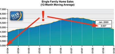
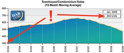
HAR’s sales-volume charts show 12-month moving averages, but even that isn’t enough to keep the latest numbers from dropping through the floor:
The unintentional comedy arises from the fact that the latest values very prominently highlighted in the boxes (2,827 & 203) are well below the scale on either of these sales volume graphs. . . .
It also reveals WAAY TO MUCH data smoothing on their part which calls into question their credibility. Their charts convey almost no information -on purpose.
Okay, but if you’ve got any actual information to share, break it to us gently, please:
***

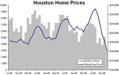
Same data as HAR, presented a different way, and PRESTO!! –it looks totally different.
The HAR graphics, complains the reader
are designed to make everything look flat and slightly rising. This keeps buyers and sellers interested at all times throughout the year. Imagine if they were publishing my chart. The Realtor’s slogan “Now is a great time to buy or sell a home!†….would be replaced by sellers thinking “only sell in the summer!†and buyers thinking “only buy in the winter!!†it would be a mess. So I understand why they smooth things so much.
To get rid of this seasonal trend, an analyst would typically compare the same month (eg. January 2009 to January 2008) It would be unfair to compare a June home sale with a November one. HAR, however, goes one big leap further: they take the average of ALL of the previous 12 months –completely smoothing things out –but also concealing the recent drop off in volume/prices.
What’s the reader’s take on the data?
Our market has held up better than most, but it looks to be turning down quickly –their data, not mine. Really, we are on the same rollercoaster as the rest of the country –just on the last car. Look at the trend in the grey bars, volume has been dropping since 2006! We have all been buying into this “not in Houston†BS and lower prices have always, always, always followed weaker volumes around the country. Now oil is under $40 bucks. “It’s a GREAT time to buy or sell a home!!â€
Originals of top 2 charts: HAR


Brilliant observation!
har har har
Good one Ian!
That’s great. I love that HAR wanted to quiet down their chart to spare us the noise of small-increment fluctuations, and yet still included the blaring January boxes. Counterproductive to say the least. I guess next we’ll be seeing 24-month moving averages? Or better yet, charts starting with the 80’s bust?
The 3-month avg chart at the bottom makes me want to see a monthly average chart.
Well, this is the profession that redefined “cute,” “cozy,” and “just needs a little TLC!”
In all seriousness, it’s a pretty inexcusable bit of misrepresentation by HAR. You’d hope that an organization of people we’re supposed to trust to help us with the largest purchase of our lives would be more careful to be honest.
Saw that HAR got some new charts for the February numbers!
http://www.har.com/mls/dispPressRelease.cfm
Nice work, all.
I wonder if a chart that measured the delta between same month sales (as a percentage of the earlier sale) would make more sense. So if 2827 houses were sold in Jan 09 and 3250 had been sold in Jan 08, the graph would record that as -13%. This would probably remove (or at least reduce) the seasonality.
(Obviously it wouldn’t be very good propaganda though.)