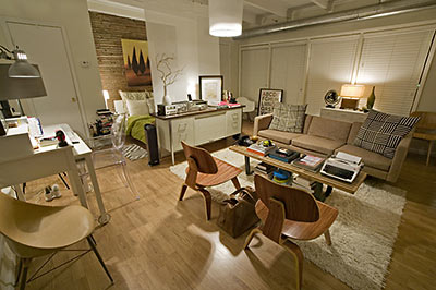
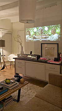
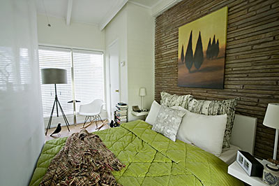
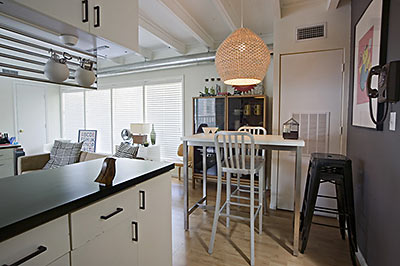
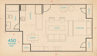
 Unfazed by Swamplot’s now 0-and-2 record in promoting local Apartment Therapy design contest submissions (no, that Venue Museum District apartment we showed last week didn’t get too far either), reader Chris Nguyen writes in to ask for votes in the finals of that website’s Small, Cool 2010 design contest. That’s right — entries in 4 divisions have been whittled down to Nguyen’s 450-sq.-ft. Westmoreland district apartment shown here (originally entered in the “Tiny” division) and some other dude’s Brooklyn flat from the “Little” division that’s more than a third larger. The final voting takes place this weekend. Can this tiny Houston pad win it all?
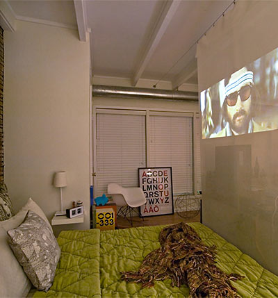
Win or lose, we hope to reveal a bit more about Nguyen’s certifiably small living space later. For now, though, have a look at these pics and the floor plan:
***
You can vote in the Apartment Therapy contest here.
- Final Four Round 2, Match 1 [Apartment Therapy]
- Small Cool 2010: Chris’s Furniture Tetris Tiny Division #2 [Apartment Therapy]
- Previously on Swamplot: The Art of a Small Apartment in a New Venue, Just a Hop Down Fannin and Living Little in Midtown: Isabella Court in the Court of Public Opinion
Photos: Chris Nguyen


Nice. The banks of windows on two sides make this tiny place livable, and Nguyen’s design makes it light and easy.
What a brilliant use of space. He has turned an ordinary “one-room efficiency” apartment into a spectacular “mini-loft.”
Who needs to get out of bed at the foot of it, anyway?
Just put a wall there with the TV screen instead.
Brilliant!
Anyone watching The Royal Tenenbaums gets my vote!
So you can watch tv from both sides of that screen. Very cool.
Is this guy an architect with the MC2 firm?
I also appreciate that the bathroom is on the opposite end of the apartment from the bedroom.
Fellow Swamplotters, this is Chris and I wanted to thank everyone for the comments. Design is, of course, subjective so I won’t explicitly ask you to vote in one direction, but if you care for what I’ve done in my small space, please cast a vote for me by 2PM today!
Dana Jennings – I’m a graphic designer for Judson Design.
You know, if you can watch TV from both sides of that screen, one side will be backwards.
pretty awesome? what material/screen did you use for the projector?
Wow, Mark Judson. Now that’s a (name) blast from the past, as in the eclectic 1980’s advertising world. What happened to Miller and Ford?
markd – Movies backwards isn’t so bad unless it has subtitles. Then, I hope it’s a language I speak or I have fun guessing what’s going on.
rl – The movie screen is a completely unfurled Tupplr roller blind from Ikea. It’s about 75-85% opaque, which allows light to be filtered through.
MarketingWiz – Yes! Mark Judson is my creative director. From what I understand Miller and Ford are also off doing their own thing, which has been the case for quite some time now.
creativeintheory –
I’ve watched my share of backwards flicks too, and you’re right – but it’s always the backwards billboards and signage in the movie that get to me.
Some projectors can switch between rear projection and front projection mode.
Nice little apartment.
Cool little apartment. Very efficient use of space, and so full of style! It proves that we can live comfortable in a small space:)