 Channeling Sarah Susanka, writer and architect Duo Dickinson snarks colorfully on Dumb Renovation Fads for Money magazine. Here’s some of what sucks about “the Great Room Craze of the 1980s”:
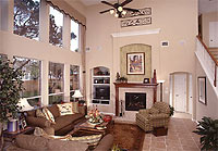
Weird Windows: All these windows and doorways are on the ground level and . . . also floating up on the second-story space, somehow reminiscent of a burned-out building. Also, how do you light such a space without it looking like a lobby in a Marriott?
Funny, but Dickinson’s targets aren’t just renovation fads—they’re staples of most current Houston new construction. That Great Room Craze may have arrived here late, but it’s making up for it by hanging around for a while. Dickinson’s improved proposal for great rooms (two attached, lower-ceilinged spaces) though, is Not-So-Small: “as much square footage as in a great room but with a more intimate, livable feel.”
Onto the next complaint: Oversized kitchens. “The distance between surfaces and appliances in this kitchen approaches the ridiculous,” reads the caption to a kitchen you might see featured here in, say, Paper City. “You’d need a map just to find the olive oil.”
Dickinson’s suggested remedies are more Susanka-like, but without the cloying detail. Keep kitchen counters no more than four feet apart. Get rid of overhead cabinets and add a pantry . . .
Other complaints include “The Garage That Ate Your Home,” porches that block living-room light, and bad overhead lighting (“Recess Time Is Over . . . the end result of such an installation is a pockmarked ceiling that looks like a meeting room at a convention center.”)
Good luck bringing your fad-stopping sense to Houston homebuilders, Mr. Dickinson. Houston isn’t exactly the trend leader. We’ve still got a real-estate boom going on here, remember?
- 5 Dumbest Renovation Fads [Money]
Photo: David Weekley Homes


