
")
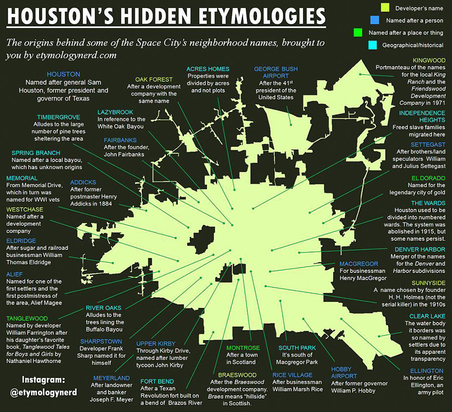
Extracted from a national map by datavisualization wiz John Nelson, here’s a map of Texas showing where votes for Romney and Obama came from, plotted point by point, by county. Using data from the Politico website, Nelson plotted a red dot for every 100 Romney votes and a light blue dot for every 100 Obama votes. Clumped purple masses fill the counties that envelop the state’s major metropolises.
Nelson tells future-fan website io9 that more typical red-blue political maps accentuate geographically large but population-light areas. “This method avoids the geo-social visual bias of large geographic areas having small populations overwhelming the overall picture. In this way both the relative volume and geographic distribution are apparent, as well as the partisan proportions throughout,” Nelson wrote of his national map, pictured here:
***
")
High-res image here.
Their mapping software got a little screwed up around Abilene.
Val Verde County gets sort of blurred out as well considering its huge size compared to the urbanized area around Del Rio.