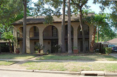
Oh, to be a fly on the heavily patterned wallpaper when statesmen and royalty make their appointments! In this home on Richelieu Ln. in Shepherd Park Plaza, for instance — what sage counsel was offered, followed?
A look at the royal treatment:
***
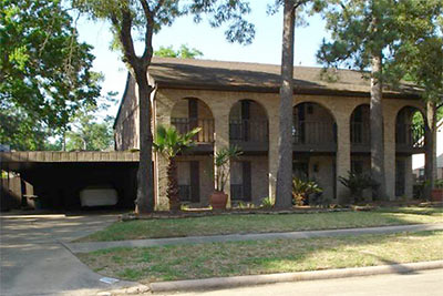
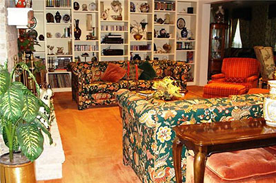
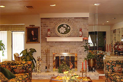
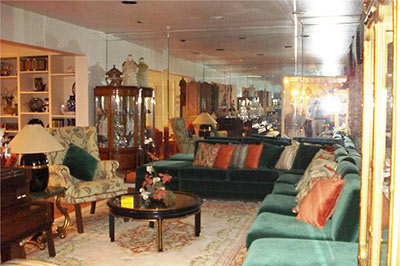
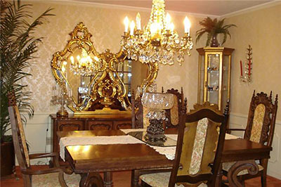
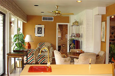
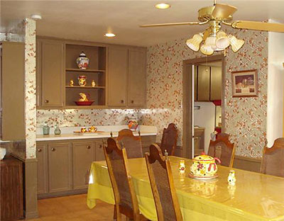
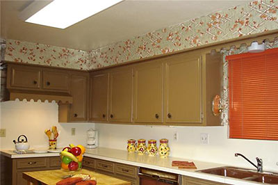
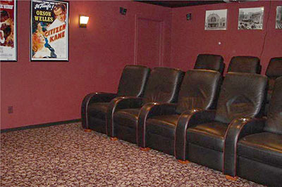
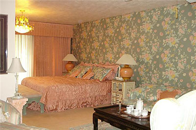
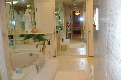
The 4,615-sq.-ft. home dates from 1965 as well as a few subsequent eras, and sits on a lot twice its size. It has 4 bedrooms and 4 baths, a 2-car garage plus four carport spaces. Listed just a week ago — for $399,000.
- 1118 Richelieu Ln. [HAR]


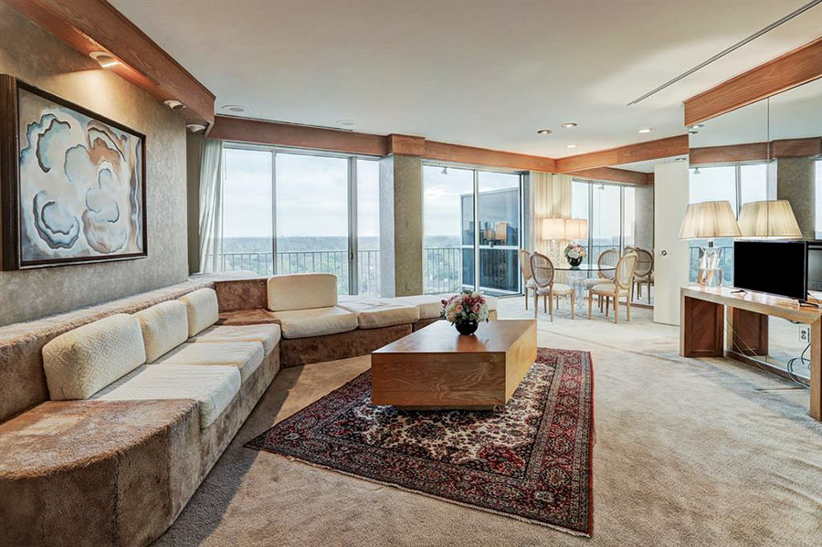
This came up a few days ago on our automated search engine via HAR. We saved it as a favorite so we could have a good laugh once in a while. The money shot has to be the dining room or the facade, which makes me think of Gallery Furniture in the Galaria.
Ewww, that’s nasty!
I thought the yellow tablecloth was the money shot, but it’s acutally the DUCK faucet in the bath tub. I can’t wait for the open house!
I missed the duck faucet and went back for a second look. WOW Oh man, I gotta have one of those!!!!!
It’s a swan. Not a duck. But the house itself quacks me up. Dated is a compliment.
It looks like it would be a nice house if it weren’t so tackily decorated.
I was right in the middle of a thought like, “that’s a lot of wallpaper!” when I saw the chairs with 2 different stripe patterns and switched to, “OMG EW EW!”
Just before this went on the market, I posed the question to my husband of how future owners might update the facade. We were stumped. You can’t see it very well from the front, but the sides are vertical brown siding with badly weathered paint. If anyone has any creative ideas, I’d love to hear them.
PS, to all the haters – this was really fancy once! I can only imagine what future generations will say about our faux Tuscanization.
Thanks, LilDebbi, for your posting to the haters. Brings to mind what Thoreau said: “Every generation laughs at the old fashions, but follows religiously the new.â€
There was a time when people didn’t have quite enough stimulation to totally tax their brains, so, they covered every surface of their environments with color, texture & pattern.
Today we just multitask like Quakers on crack and, so, choose to return to minimalist architecture/surroundings.
(It seems like a trend but it’s just self-preservation.)
@ Lil Debbie
Re: updating this facade,
the only thought I have is to minimalize the arches by adding a new element. Say, build outward on the axis of the entry, including a gable-end to the existing roof:
There would still be roman arches at the sides, but they’d be subordinate to an American Gothic motif.
Years ago at Space Design in Cincinnati, I had this very chore: to update the 1970, archy facades of several mid-west mall anchor stores. Our company choice involved paint and lighting – low cost, to say the least.
Shall we do a home theater or update the wallpaper and appliances? Home theater it is!
It appears that the popcorn machine has been assigned laundry duty.
It Nottingham Forest someone took the “Spanish” facade (arches and all) off a 1965 two-story house and it looks real nice. And they didn’t go the faux Tuscan route.
And the mirrors everywhere make it so, so much more so.
I was just about to go to bed when I thought I’d pull up Swamplot one more time today to see what’s new. Thanks. Now I’m going to have bad dreams about swans and mirrors.
I just like the expression “like Quakers on crack.” Can I borrow that sometime?
Between the mélange of patterns & colors, looking at the interior photos makes me feel like I rolled down a hill inside a box of cowbells.
PS, to all the haters – this was really fancy once! I can only imagine what future generations will say about our faux Tuscanization.
______________________
Probably the same the current generation is saying.
I’d love to see a total redo a la the Nottingham Forest number. Let’s see, how would they choose to support the roof overhang–Georgian columns? But I think that movocelot’s paint and lights are the best we can hope for here. I am reminded of a house on San Felipe just east of Kirby that went through several shades of paint in an attempt to deal with their ‘Spanish’ columns, starting with golden yellow and electric blue and ending in brown and red. I guess if you are trying to minimize an architectural detail electric blue is the wrong color.
Pardon me, that’s San Felipe just WEST of Kirby where the formerly golden arches live.
i can’t see the siding, but everything else people are picking on seems pretty minor. get rid of the wall paper, new carpet, new faucets, and new furniture and it would be a nice house.
i imagine that if you put the White House up here, people would bash it. post like these always make me wonder what wonderful homes swamplot readers live in.
No accounting for tastes. My abode rather resembles the interior of Brian O’Neill’s pub – lots of green, old curiosities and dark wood, but not the square footage. Some friends more accustomed to large bright spaces say a Hobbit would feel right at home.
This has to be a hard house to market – how about Brady Bunch Dream House?
The house on San Felipe belonged to Fernando Segura as I recall. He probably regrets selling it. Or even building it.
A testament to how even the most careful among us forget certain things when putting together deed restrictions.
And then we have “Bellaire” on Chevy Chase brought to us by none other than Andy Fastow who thought “Prairie Style” would fit in nicely. Some were sorry the fire trucks go there so quickly when someone tried to burn it down. It’s so awful it makes all the “West U” contributions look like John Staub. People in River Oaks of course didn’t learn from the people of Beverly Hills when a certain house on Sunset belonging to a certain Saudi prince who painted the house pea green, and painted all the statuary so everyone would know which was a boy statue and which was a girl statute, myseriously caught fire. You call the fire department after the fire has reached the second floor.
River Oaks. It ain’t what it used to be.
The “redo” of the facade to Georgian actually isn’t such a bad idea for this house although for someone who liked the “faux” Spanish hacienda look they could easily get rid of the “faux” by “stuccoing” the exterior and replacing the windows in the front with nice “real” Spanish, or more preferably Mexican, hacienda double doors stained in a dark wood and replace the carpet, which is probably over concrete, with some equally nice Saltillo tile. Maybe even replace the front door with an antique Mexican door and really run with the look.
The Georgian look would probably be cheaper.
LilDebbie:
I think the fix would be to put it on the daily demolishion report. This house represents everything that was bad about that period in architecture, both inside and out.
If not a total demo, then I think if those columns are not structural, they gotta go…If they can’t go, I suggest squaring the arches. The brown exterior only makes the problem worse. The balcony lines are not to horrid. They could be up-played a bit with a facade treatment.