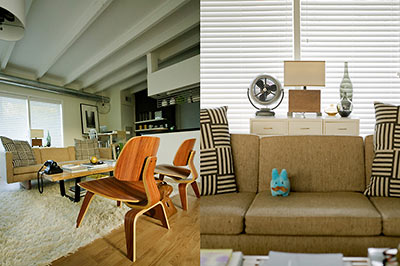
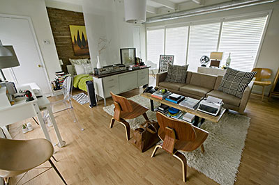
Well, whaddya know? Graphic designer Chris Nguyen’s tiny Marshall St. apartment (featured on Swamplot just last week) ended up as the grand U.S. prize winner in Apartment Therapy’s Small, Cool 2010 design contest. No fluke: Nguyen was, uh . . . thinking small from the get-go. Intrigued by the design website’s annual competition and the idea of living in a tiny space, Nguyen began his search for an apartment in Houston last July:
I really wanted this to be about a different way of living and not about compromises, so it was important that all my furniture remained real-sized. I carefully selected what I thought I needed and put away in storage extraneous collections and junk that we all end up hoarding over the years. . . .
I think the bedroom in the house I was living in last was the same size as this entire studio. It was a big room in a big house that was filled with an incredibly increasing amount of big things. That’s how we do it in Texas, right? All the while, I always held an admiration for smartly designed small spaces more commonly found in highly urban dense metropolises or cool under appreciated neighborhoods. Houston is not the first of those things, so I looked for something purposefully small in the latter.
And he found . . . ?
***
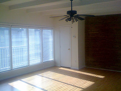
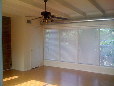
After a month or two of searching I stumbled across a neatly preserved 500sqft space that leaned on the modern side of the mid-century in Westmoreland. The exterior was nondescript, but the interior was just up my alley. Slanted roof, exposed beams, roman brick wall and just enough space to mill about and entertain comfortably. It’s been interesting going from many rooms to essentially just one room, but, it’s worked well enough to convince several friends to consider going smaller.
I was always curious about this neighborhood. Duplexes, complexes, high rises, townhouses, bungalows, grand mansions (one of which is resided in by the mayor) – new and mostly historically old all mixed and all within less than a square mile with views of the downtown skyline. I wonder what the driver was to interrupt the “private place neighborhood” concept originally laid out at the dawn of the 20th century by Julius Pitzman. Seems there were many Victorians razed to put up multi-family homes during the 1950s.
As for my own unnotable building, I don’t know much about it other than that it was allegedly the target of a tornado once upon a time. Historic photographs show that it sits where three larger homes once sat in an L formation on a corner. I am also almost certain that my little slice may have been a breezeway that was enclosed to make a small apartment (perhaps a product of this tornado?). It’s interesting what you’ll find nestled in unlikely places around town. The outside looks like a painted factory with a mishmash of pipes and random additions, but I’m glad I didn’t end up judging this book by its dusty cover.
- Small, Cool 2010 [Apartment Therapy]
- Previously on Swamplot: Now on the Small Screen: A Tiny Westmoreland Place
Photos: Chris Nguyen


The efficiencies in that complex are all configured well and lend themselves to creating a “loft space” which most don’t.
The complex itself was one of the best “renovations” in Montrose and gave new meaning to “upgraded” although the outside doesn’t give any indication of what lies inside. The owners decided to “modernize” while still retaining the “50s touches” and is one of the jewels, really, of Westmoreland.
Your idea of “bedroom” is truly brilliant. Bedrooms are the most wasted space in most homes.
Very cool studio! I walk by this complex daily and the outside definitely doesn’t reflect what is available inside.
Westmoreland is such an amazingly diverse neighborhood, it is good that complex owners have realized this and their properties embrace it.
nice job!