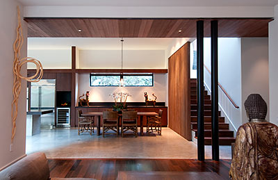
 Included in the $1,470,000 asking price of this just-finished 3-bedroom, 3-1/2 bath house in the northern reaches of Boulevard Oaks: a pair of doors from a 19th-century house near Osaka; that Chinese wine pot (of similar vintage) sitting at the end of the central hall by the kitchen; a 46†Sony Edgelit TV; those planters on the back terrace; the dining room table and chairs; and of course the coffee table, upholstered pieces, and Buddha in the living room. “Many of my buyers have relocated to Houston without anything to sit on,” explains developer Carol Isaak Barden.
Barden’s house replacement at 1916 Banks St. is the 15th project she’s built to sell — if you count each townhouse in her earlier multi-unit ventures separately — and the second one designed by Seattle architect Rick Sundberg. Sundberg, who’s since left to start a new firm with his daughter, was still with Olson Sundberg Kundig Allen when he designed Barden’s Wabi Sabi house a few years ago (they’re now down to Olson Kundig without him). Barden called this house Wabi Sabi II until she started spending a lot of time coordinating the work of local designers and craftsmen on the project.
***
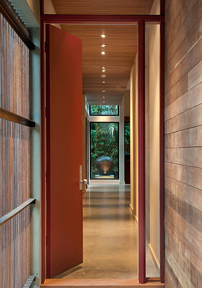
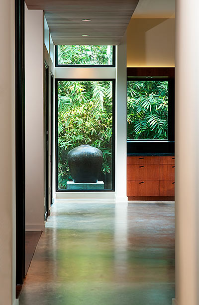
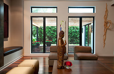
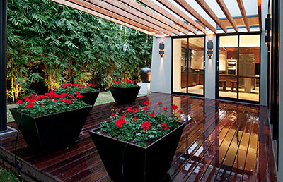
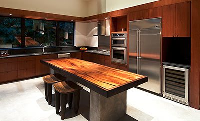
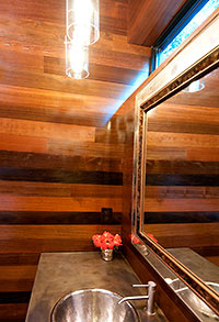
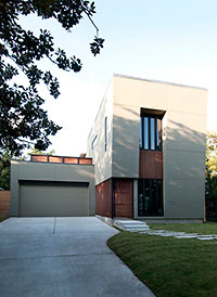
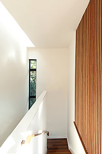
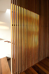 Barden now calls the 4,517-sq.-ft. property (3,337 if you’re only counting air-conditioned space) the Handmade House. She says she would have used cypress instead of stucco on the exterior (like the Wabi Sabi) if the Ormond Place deed restrictions had allowed it. But nothing — despite the grumbling of the trim carpenters trying to work with it — stopped her from using Brazilian Massaranduba inside and out: on ceilings, on the deck, and in the slotted walls around the stairwell and at the entrance.
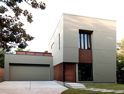
- The Handmade House [Carol Isaak Barden]
- Houston’s Handmade House [YouTube]
- Previously on Swamplot: Wood and Fruit in Place, the Tree House Is Ready for Its Photo Shoot, Wabi Sabi: Sold!, Inside the Wabi Sabi House, Not Lived In Yet: The Wabi Sabi House, Menil Townhome Sales Looking for a Lift, Menil Townhouse: Almost a Quarter Off
Photos: Don Glentzer


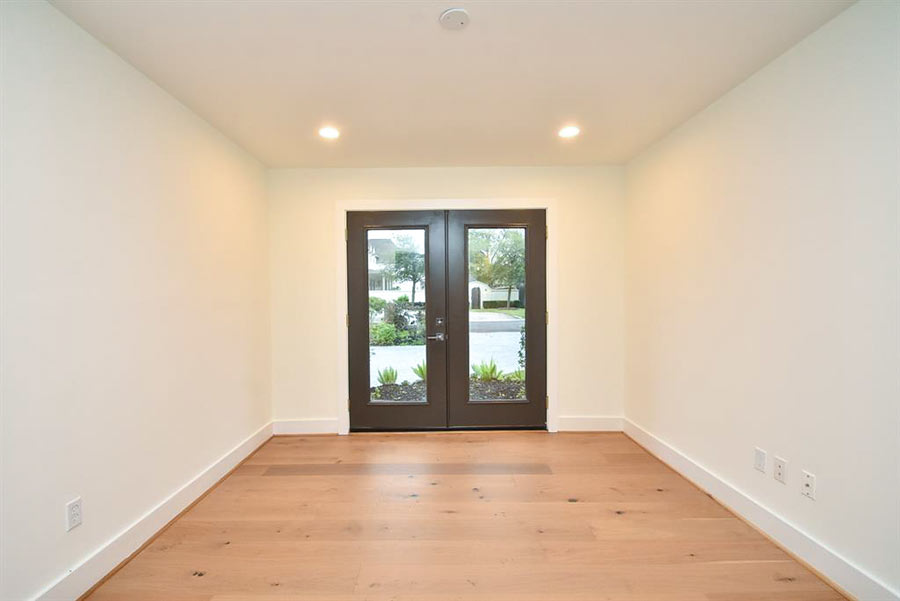
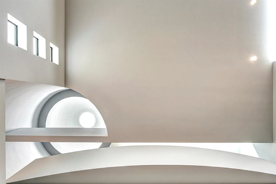
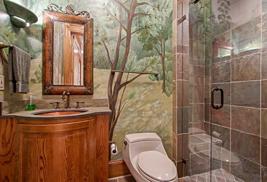
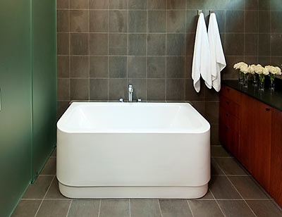
What’s up with the placement of the tub in the bathroom? Also, what is the logic of the ovens and fridge right next to eachother, with no real counter space dedicated to either– I mean, who is going to put a hot cookie sheet on that island? I guess whomever moves into this house won’t actually have to put the linens away or cook, so who cares, right? Even so, if they’ll cut $1MM off the asking price, I’d take it.
Love. What a beautiful calming place to live. The polar opposite of those awful overwrought Tuscan monstrosities. I feel soothed just looking at the pictures!
Yeah, but where would I put my Hummel collection? Guess she didn’t think of everything, did she?
Seems a little cold to me.
I would like to see the upstairs though. Maybe it looks more lived in.
Cold? Maybe if you turn the thermostat down. I toured this new construction last weekend. It’s the most soothing, serene, domestic environment I can imagine– and I’ve recently spent a few nights and days in Kyoto’s Ryokans Tawaraya and Hiiragiya!
Good for you. Different tastes.
Just goes to show people seek serenity, openness and organization… to escape the clutter and hodgepodge mishmash of all the piles of DVD’s, holiday decor and other tchotchkes the American spirit seems to demand we amass as a sign of success and key to acceptance. People love the museum look because in a museum everything is organized, orderly and clean.
Sorry, but the Massaranduba doesn’t hide the fact that this is really nothing more than another garage mahal. 1/3rd of the front lawn is paved over and it looks like all the trees that previously existed on this lot were torn down and replaced by sod and bamboo. And people wonder why some property owners want historical preservation?
“Garage Mahal” — I love it. It’s the new McMansion.
From SL:
Just goes to show people seek serenity, openness and organization… to escape the clutter and hodgepodge mishmash of all the piles of DVD’s, holiday decor and other tchotchkes the American spirit seems to demand we amass as a sign of success and key to acceptance. People love the museum look because in a museum everything is organized, orderly and clean.
+++
But who lives like that?
How original!
Mel – it sure would be fun to try. Sent the link to Mr Kuningan2 and suggested it would be a bargain because we wouldn’t be able to buy anything else that would clutter it up. Think of the savings! :-)
Currently live in an apt in Australia where minimalist applies to everything including storage space. Bedroom dresser brought from Houston is in the living room as it can’t fit in the master, and half our kitchen stuff is in boxes in the car park closet. Can’t buy anything because there’s no place to put anything else. I consider it a great exercise in self control.
Kunigan– I hadn’t thought of that. I suppose on a fifty year note we could buy that little jewel, so long as we sold all of our belongings and went without such luxuries as gas and water! Now that’s minimalism!
Yeah – Mr. K didn’t go for my rationalization either ;-)
Remember – this is a SPEC house. Congrats to the whole team for not dumbing down the design to appeal to a broader audience.
Yes, it’s beautiful BUT who wants to live in Houston of all places. Hot, humid and just an awful parking lot of jammed traffic. No thank you. I’d rather see that home in a gentle calm environment away from blistering heat and humidity.