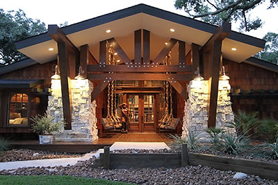
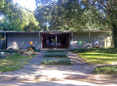
Here are the after and before on a 1959 once-flat-roofed mod in Meyerland, 3 doors down from an entrance to St. Nicholas School, a block north of the tall power lines that parallel Willowbend Blvd. A redo by Resto Homes made sure water wouldn’t pool on top anymore — and made a few more changes while at it. The redone 4-bedroom, 3-bath home, which now features oversized Craftsman-ic details and an encyclopedic home-furnishing set in its 2,500 sq. ft., made its MLS debut last Friday, at a stylish $687,493.
***
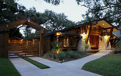
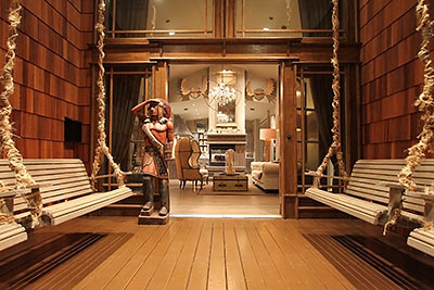
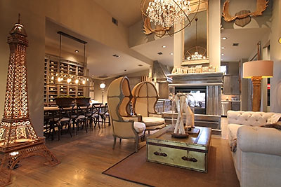
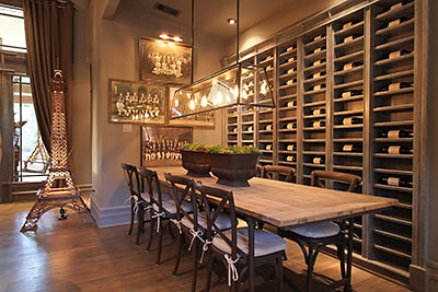
The friendly-as-a-back-porch front porch now accommodates 4 sets of swingers. Inside, Klieg lights, tripods, and Bellocq tea tins are all in place for 3 coming open houses — as they were, along with hundreds of other accoutrements, for these carefully staged photos. Living, dining, eating, and hangout spaces maintain an open plan beneath the newly raised multi-level ceiling.

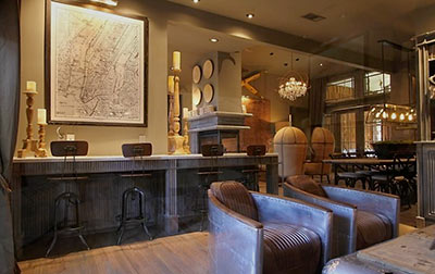
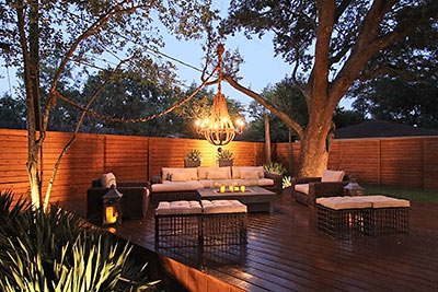
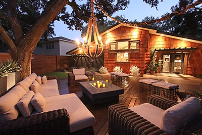
At the back of the space, a long bar stretches from French doors facing the rear deck . . .
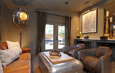
to a kitchen view:
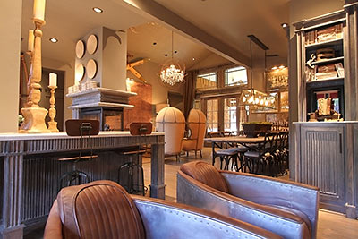
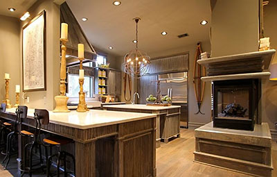
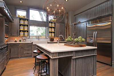
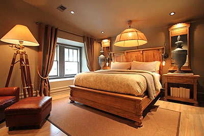
- 5654 Lymbar Dr. [HAR]


I am not sure what it is (“Restoration Hardware gone wild”?) but at some point I think I like it.
I shake my head every time I drive by this place. Flat roofs are definitely problematic in a climate like ours, but jeeze-louise, this is ugly. Glad to see from the pictures that the interiors are just as bad. It looks like Restoration Hardware’s dinner didn’t agree with it and it barfed it all up inside this house.
Nothing says craftsman like a six-foot-tall Eiffel Tower with a light shining up its skirt.
Agree. Didn’t realize Restoration Hardware had a furniture leasing program. I don’t even know what to say about the house itself.
Man.
Great house….for Colorado…..
Totally out of place for the neighborhood, but it is nice for the mountain time zone.
WTF? WTF.
Everyone here knows I’m not a preservationist, but if you’re not going to knock it down, why do this to it?
As a side note, I think reclaimed wood is the ugliest and most ridiculous trend I have seen in a while.
Do we know what the mod looked like on the inside before. This restoration looks like its tring to appeal to everybody BUT mod aficianados. I see a little 1920’s noire, some country schtick, denver cabin, and some new york lower east side. What I don’t see is really any mid century modernism or even a little bauhaus. It might be there, but its subtle if it remains.
This is Beautiful! One of the most amazing homes I’ve ever laid my eyes on. I live around the corner and have watched the whole thing go up for over a year now, It is more amazing in person. Surprised anyone could have anything negative to say about this house, they must not get out much, lol! If only more Houston builders would build like this instead of the stucco boxes we seam stuck with. Congrats on a job well done!
alrightythen,
After gazing at the pictures all I remember is building an Eiffel Tower utilizing every piece of my Erector Set, still came up short of theirs.
I guess the interior designer read Fifty Shades of Gray.
Picture #12 includes a jar labeled “Gunpowder”.
???
A few other comments:
1. WHAR IMPORT CRYSTALS WHAR
2. Am I hallucinating or is the garage door broken (last picture)?
3. An old-timey map of Manhattan makes perfect sense to stage a house in Houston.
4. Why is the house landscaped like it’s in New Mexico? There will be weeds all through those rocks before May.
Beautifuly home! I’ve been shopping for a house for the past year and heared about the neighborhood. Drove by the house while under renovation and was excited to see the results. Beautiful job!
People can be negative about it because they have taste.
Great looking house! Love craftsman homes, does this company build for other people, have a lot in memorial i’d like to have something like this. Sensational!
Wow – those are some intimidating spotlight lamps in the living room.
i think i’m gonna throw up!
Gus, do “gretchen”, “Tim McHenry”,and “Derek” all have the same IP? I guess this must be attractive to someone (and of course the property owner should be free to do whatever they want), but it just blows my mind how dichotomous the reactions are here.
Absolutely stunning! West coast architecture finally reaches Houston – may be too much for the local flip-flop crowd, but I bet all the Bimmer and MB shoppers get it.
If it doesn’t sell it can always be turned into strip club or steakhouse.
So twisted, two thumbs up. (I’d think about living there, but I’m not twisted enough to pull it off.)
you folks do realize that the house has been staged, right? the house itself looks great and much better than what was there before.
As a native Houstonian I’ve always hated those flat roofed eyesores, so to the original I say good riddance. But that thing is giving me some serious Boise flashbacks.
The “Craftsman” style house (more like Craftsman on steroids) is interesting but way overdone for the lot and neighborhood (and this is not Meyerland). As for the interior, looks like decorators gone wild for the sake of decorating. What’s with the chairs.
yikes–when I first saw the pics I was very excited and still am. Then I read these comments and I’m shocked it seems that many of the posters don’t understand modern design…Houston and some of great architecture in our beautiful city. I checked out the company and found their facebook and can’t believe how many followers they have – I’m curious if they are connected to a larger builder or design company. At any rate, the property is truly a great piece of art!
“Welcome to the Steampunk Lodge. Shall we retire to the lounge for a glass of absinthe?”
.
Not really my thing, but +10 for originality.
Looks like they left all the trees intact. And if you take away the excess decor, it’s a nice little shake-shingle house (remember when we had those?) with wood floors, Texas stone, a porch and a useable single-story layout. I have no complaints.
Cowabunga dude.
Is it just me, or do the super positive comments just seem…I don’t know…planted? Or am I just being a crank ’cause I’ve had a crappy day?
Horrid. Absolutely horrid. And the developers shills are absolutely hilarious. Pity the poor neighbors that have to look at this POS.
Wow, the MOD wasn’t anything to crow about, but this is weird.
DOUCHE-TASTIC!
Thanks for sharing this–we’ve been following the site on fb for a while–lots of funny post and informative, too. The wife and I just moved from Austin and are in the market for a place—this fits right in with us–looks like there’s an open house this weekend. We’re going to check it out and see if it fits our needs. On anther note, when did Trader Joe’s open in Houston–so great to have a better selection than the tradition grocery stores here.
Spoonman, “Gunpowder” is an old Chinese tea variety. But this is Texas, so it could go either way.
WOW! great looking house-when looking over the negative feedback sounds like some jealous people-I wish I could afford it
It’s faux something-or-other…
This staging is confirmation of an earlier thread about some interior designers.
Finally someone builds a cool house outside of the heights or montrose. As a medical prof we have been looking for a long time for a nice home near the medical center. West Univ is too expensive & most of Meyerland is very run-down. the few houses we have seen in that area are so drab. Kuddos to the builder for being creative. Love it and may try to go to the open house
@ Thomas…. if you’re going to write fake posts to bury the negative comments, try a little harder to be realistic.
Meanwhile, the wife and I are going to mourn the loss of scale-appropriate architecture.
I might not like the personality that it has, but at least it has one.
Anyone who buys that house is not going to care what negative comments are left on this website about it. In fact, most potential buyers probably don’t even know about this website. This isn’t HAR.com.
The redesign is inventive and striking. If I was in the market, I would definitely look at this house, although I’d probably kill myself before I lived in Meyerland.
Love it! weird comments! These pictures look like they are from a magazine.
Saw your post on Facebook and I’m in love with the house–I’ll make sure to pass this on to my friends
Fake comments are so 2006.
It is a little odd that all the positive comments are by people who have their first and last names as their username…
I always thought Restoation Haedware was just a hardware store, never been to the place, but just googled the them–sure is pricey but they have some cool furniture items, they’re kinda like Pottery Barn it looks like
It’s not my taste, and that is some fugly lighting. But hey! At least it’s not a Mediterranean stucco!
I like the higher ceilings but the scale of that fireplace makes it look like a hotel lobby.
Finally!!!!!!! Something in Meyerland that doesn’t step in line with every other drab 1960 era tract home in the area. It sits so well off the street with the trees and the landscaping. The builders definitely have a vision that Houston needs. I can’t wait to see their next project.
I vaguely remember this home being for sale a few years ago and at a great price! While I’m not a fan of the lodge like appearance out front or the entire catalog of Restoration Hardware inside the house, I like what was done. Take away the furniture and look at it, its way better than most flips. I love the openness of the living/dining room/kitchen and the see thru fireplace. Kudos for thinking outside the typical house flip box and taking a risk.
Will be out of style in 6 months.
LOL at the obvious spin posters.
Frankly, the house isn’t terrible other than the fact it looks like it should be located in Steamboat Springs rather than Meyerland. However, the staging is atrocious. It’s hard to focus on anything other than the lighting, art, and tacky stuff that seems to be everywhere…
Absolutely breathtaking. BUT It seems they send me those bulky 3 lb catalogs all the time-I wish they’d stop and save the environment from adding to the excessive landfil.
Agree, there are so many pseudo posters on this thread it’s not even funny.
I’d much rather see the house empty. It would still be beige/brown bland but at least then, I could see the rooms and not all the “stuff”.
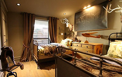
And, what’s with the animal remains? Is that the trend now?
It looks like Dudley Do Right was the builder and Snidley Whiplash decorated.
Somebody will love it, and that’s what’s important.
heh heh heh. He said swingers. heh heh heh.
Isn’t this house zoned to Westbury? Good luck finding a buyer that so loves this design (and has 700k to blow) that they’ll ignore that negative. There is a good point that most of the jarring features are the strange furniture choices (which seem determined to achieve every genre in a single house), but what gets me are the heavily detailed paneling and fixture choices, which would definitely limit appeal solely to achieved their desired aesthetic. To me it just looks like a house created and staged to sell the individual pieces in it (like a catalog), but I could never picture myself and my lifestyle in there. It would just look odd and disproportioned. But I don’t wish the remodelers any ill luck. Hopefully they’ll find a buyer with that particular taste willing to be very bold (and has alot of money).
Strange how all the names of the fake comments link to ‘facebook’ without a real url. Gee I wonder if it’s all the same person.
yes it is zoned to Westbury. It is not in Meyerland.
Weird, but I’m going to watch for an open house to see this thing in person. The best I can say so far is I’ve never seen anything like this before…
Someone will love this house, even in spite of the douche-tastic staging. But when that person does, will they ever be able to get a conventional mortgage on it? I would be afraid that it would never appraise. Ask price is $275 a foot, and there are going to be right at zero comparables south of Braeswood and zoned to Westbury HS. These builders have balls, thats for sure…….
Add some taxidermy and the people at Bass Pro Shops might be interested in opening a new store here.
I’m a fan of staging but this is a ridiculous and excessive amount of staging. Anyone who likes this decor and buys this house will walk into it after closing and it’s going to seem horribly empty. And I think that serious buyers who can look beyond the movie set staging will be few and far between. Another poster said it looks like a steakhouse and I agree. All of that stuff is nothing more than a serious distraction.
I have a hard time seeing past the decor. I can only handle Restoration Hardware in small doses. This is definitely an overdose. It’s too bad, too, because I actually kind of like the house. I’m really curious, though, how much they spent on staging. I wasn’t aware of any company that would stage using only RH goods. I imagine that would come at a steep price…..
Too funny, I actually own those two chairs (the look like aircraft pilot’s chairs)
If Hughes’ Hangar built an upstairs lounge and living quarters…
I made the mistake of looking at these photos before going to sleep last night. The horrible oversized decor gave me nightmares. It’s hard to imagine the house behind all those massive lamps and hideous furniture.
I like the exterior. It’s not my personal favorite syle-wise, but I think it’s pretty (except for those awful swings and wooden Indian).
But even overlooking the overdone staging, there’s nothing appealing to me about the interior. I think all the cabinet work is butt-ugly. And what’s with matching the trim to the wall color?
Well, lookee here! It’s on my street; my family and i have been watching the construction over the last year. It looks absolutely nothing like anything else in the neighborhood, and not necessarily in the good way. It reminds me of the old Legion Of Doom flying HQ from the Superfriends cartoon. I’m all for contemporary design; i’m just not sold on this one. It does look better once they finished staining the beams and the weird fence.
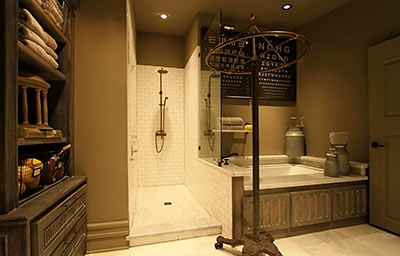
A 20×16 bathroom? I’m afraid I don’t get this giant bathroom trend. Is it now meant to be a place to hang out or entertain? Or do people just need more room to do their business, these days?
Technically, the carving on the front porch is a cigar-store Indian. Have a cigar!
Staging is a bit much but I like the rest of the house. I would really LOVE something like this as a vacation home up in the mountains of Colorado…
A 20×16 bathroom? I’m afraid I don’t get this giant bathroom trend.
.
Accommodates the most discriminating restroomeurs, even those with uncommonly wide stances.
The outside reminds me of Doc Browns house in Back to the Future. “MARTYYYY!!!!!!!”
No way I can read through all of these comments to see if it’s been said…but this looks just like a Bass Pro Shop.
Wow, a lot of hate for this one. I think it is damned incredible and salute the vision and effort of the builders. Truly creative and beautiful.
The outside reminds me of Doc Browns house in Back to the Future. “MARTYYYY!!!!!!!â€
It does make me say “GREAT SCOT!!!”
I don’t think this house is in Meyerland, although it might be closeby. I live in Meyerland and love it. What’s with the hate for Meyerland?
Very risky move by the builder. In some businesses Early Bird does get the Worm but in real estate it’s usually The Second Mouse that Gets The Cheese from the Trap.
This is what happens when bad taste has a huge credit line at Restoration Hardware…… The Room Store idea of how to furnish a home should never be used even if the furniture is expensive…..matching everything just ends up as a hot mess……. Also the oversized “Craftsman” like details are beyond odd when the original Mod lines of the home were already more striking…..a flat roof is an easy fix these days, so why the new owner felt the need to add such a huge new pitch to the roof is another mystery……wow wish they had restored the home and used the savings t restore ten other homes instead of busting so much money on one home making it in to another over priced piece of BS inside the loop…….what a joke these type of rehabs and builds are becoming these days
The first thing I thought was that Restoration Hardware was the builder… “Resto Homes”?? Maybe just a coincidence.
That being said, the house itself is definitely different, but something about it is definitely strange. Can’t put my finger on it though…..
Hover your mouse over the comment author’s name, if it has a bizarre link to ‘swamplot’ or ‘smaplot.com’ or ‘facebook’, it’s a fake comment, even the almost negative but ‘I really like the house’ comments are clearly the same person, this time pretending to blend in.
I usually check this site out for a good chuckle but I have to say I like this one kind of looks like mountain fever
Cool digs bro!
Um. No.
I can hardly tell what the house looks like under all that staging. Good Lord, no.
And I’d never spend that much money for a those cabinets.
Just say no.
I did notice a lot of dislike on the property. I think it’s great, I don’t think a region has to necessarily define what kind of property is built (to an extent); that said this house in my opinion is not out of bounds.
One thing though, let’s face it W. Bellfort and Chimney Rock is the hood. This once older money stately Meyerland area has been encapsulated by thug life. You can bring the Mansions in all you want but west of 610 South of Braeswood and North of Main, you are still 5 minutes from crack dealers.
I like the style of the house but several things bug me. One, this has to be the most expensive house in this neighborhood (at least per square foot). Second, it is not inner loop and it is not Meyerland. Cedar shake is a nightmare for maintenance.
his property intrigued me so I did a little research on it. The house is not showing up as a closed property on HAR (I’m a realtor and have access the realtor’s side of HAR-maybe they bought it without it being listed?) but the average house in that area and for the square feet would be $270,000 to $340,000 for an original condition prop. I’m sure they spent at lease $250,000 building it and an additional $100,000 from Restoration Hardware (I tried to go through the pictures and add up the prices from Restoration’s website). I really don’t get how the builder is even going to profit from this house even if they get their asking price. It seems to me they should have spent less on the build and just did a redo like other houses in the neighborhood have done. Is my math off – am I missing something?
Bass Proshops finally comes to Meyerland.
Super looking house! I’m sure the people who thrive to live in Houston’s inner-city neighborhoods will find this home quite attractive. It’s too bad this home is not in Montrose, but i suppose it would cost a lot more money if it was.
A+ for curb appeal and originality.reviewed the virtual tour on har listing…definately going after the luxury buyer. The back yard is fantastic.
What a Head Turner(in a good way)
Reminds me of Apen.
It’s a shame “y’all texans” think you know what a good looking house is. 85 percent of the city is covered in a sea of beige houses. You want to talk about ugly? Man, get some culture in your life. There’s more to a house than a lone star branded on above every houses front door. Do some traveling and just maybe you’ll get a better understanding and appreciation for archetecture and design. This is art. Res
On a positive note, all the good comments are much obliged. Thank you everyone!
What’s the over/under for days on market for this thing to sell? Consider the facts mentioned by others already:
1. Location — outside the loop, south of Braeswood (but north of Bellfort)and zoned to Westbury High School. It is not in Meyerland — the MCIA would never have allowed the builder to do this, as it is out of character with the rest of the neighborhood.
2. Price — at $687k it is twice the price per square foot of anything else in that “neighborhood”. This house is located in an area with very little new/recent construction, and is (for better or worse) a “one of a kind.” For the price of $687k, a person could buy a much larger home, much closer to downtown. Granted they may not get as much “character” as they would with this one…..
3. It won’t appraise – There is not a chance that anyone will get conventional financing on this. At $275 per square foot, there will be no comps. I sold a house three blocks north this past summer for $115 a square foot, and bought another home near Meyerland Plaza and the highest comp my appraiser included was $190 a foot. The only thing that may save them here is if the appraiser is green enough to throw in comps from nearby neighborhoods zoned to Bellaire High School. But even then they won’t be at $275 a sq ft.
So, all “taste” issues aside, where will they find a buyer who can/will pay cash for a poorly located “one of a kind” at a cost of twice the area average?
I am betting 200+ days on market and a price reduction to the low $500k’s
This one was reduced by 17% this week (the one following T-day). Not quite low 500s, yet.
This house was eventually sold at 18% down from the original price. The same developer has a new project for sale in Woodside, at 3606 Sun Valley, and it’s listed at an even more eye-popping price, almost $2M. The next most expensive sale in this area was an MCM redo at 9231 Fordshire, $661k. The Sun Valley house appears to have been on the market since February with no takers; I’m curious to see how this plays out.
whoa that 3606 Sun Valley listing mentioned above is ridiculous. swamplot needs to hurry up and get back to work so they can post pics of it for us to make fun of.
This house is HIDEOUS in every way.