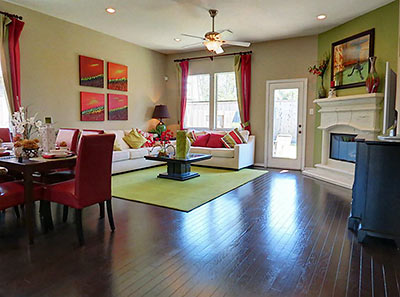
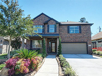
It’s in a newish neighborhood of Western-themed street names north of Louetta near SH 249, but a former model home for the Vintage Royale subdivision appears more city mouse than country mouse (one particularly fond of its berry-pistachio-chocolate diet). Built in 2010 and yet-to-be occupied, the tropical punched promo home was listed last week, with an asking price of $269,900.
***
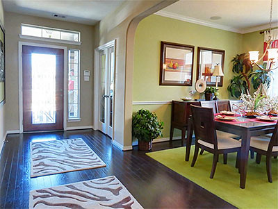
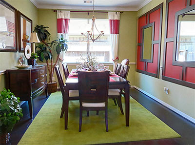
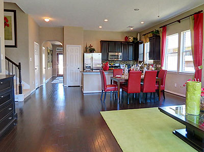
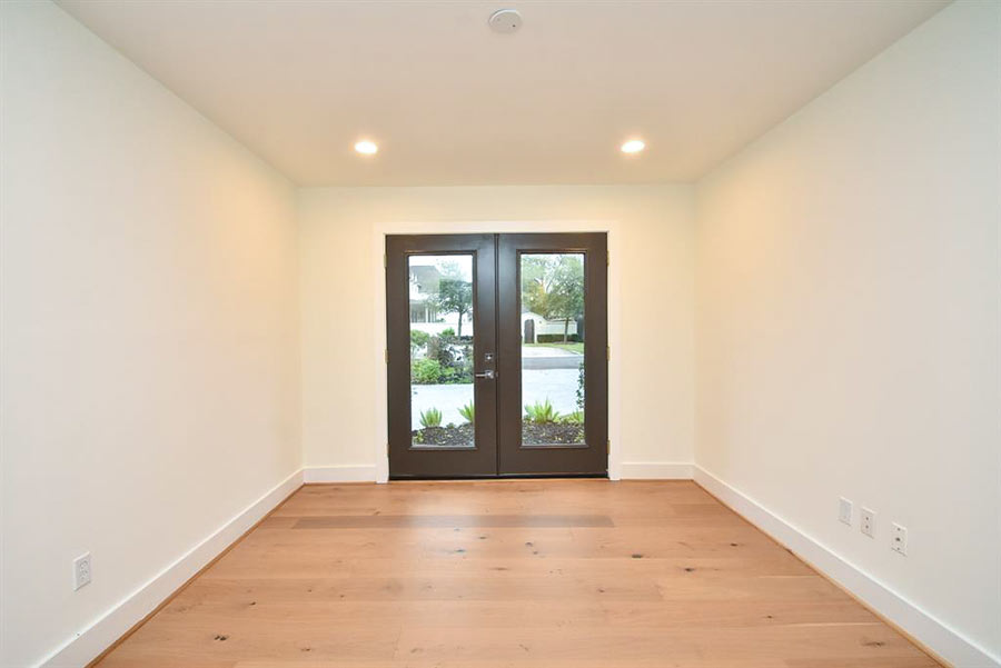
Off the foyer (above), the study gets some of the only doors on the Skittles-toned mostly open plan layout downstairs.
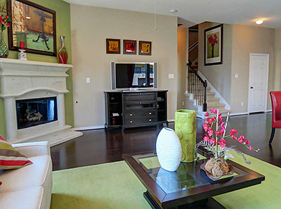
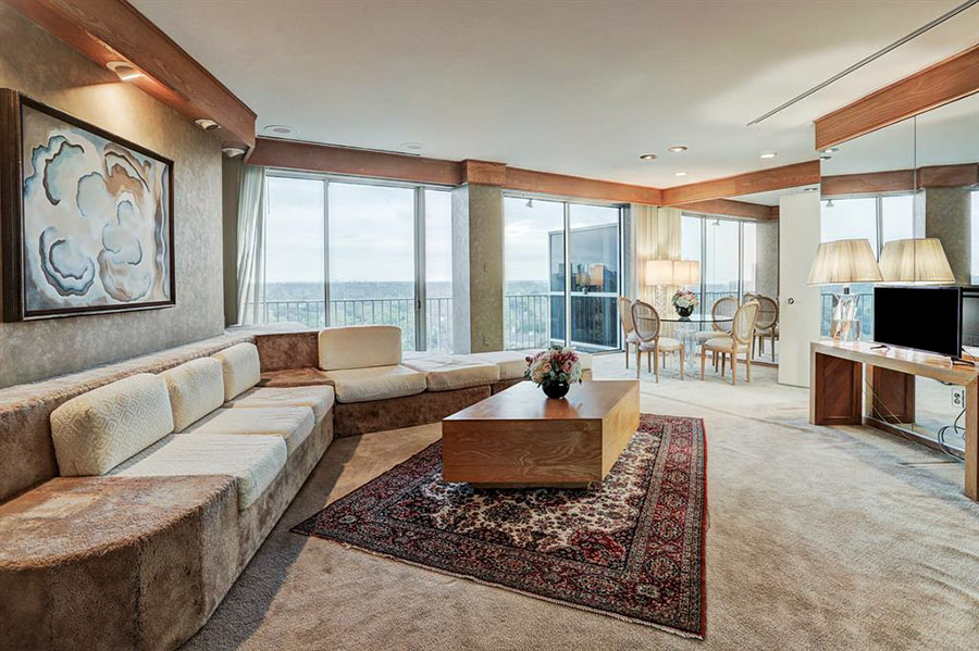
In the living area, a “cast stone” fireplace is a gas-log model.
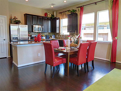
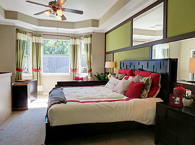
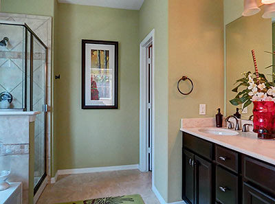
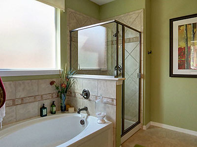
Downstairs roomage also includes the master bedroom suite, which bays out into a sitting area and blings up one of the walls:
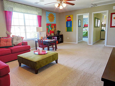
Upstairs, there’s a shared game room off the 3 secondary bedrooms:
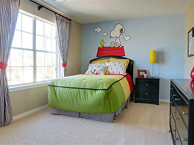
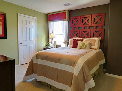
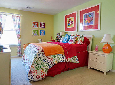
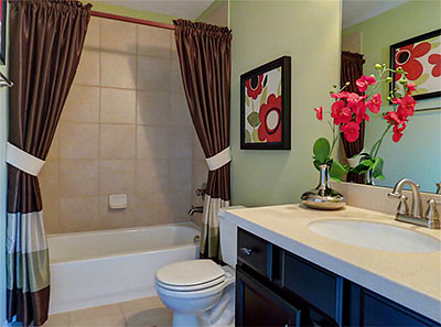
The 2,577-sq.-ft. home’s other full bath (below) is also upstairs. And there’s a half-bath downstairs.
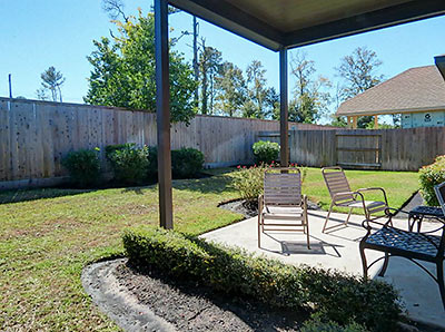
Finishing out the back yard, there’s a bi-level fence, starter landscaping, and a covered patio, all on the south side of the 5,500-sq.-ft. lot. Across the street and up a lot or two, there’s a fountain-centered retention pond serving as a water-feature focal point for those entering the neighborhood from Vintage Preserve Pkwy.
- 9123 Durango Point Ln. [HAR]


Aside from the colors, backyard meh.
Well, it’s simultaneously hideous and boring.
The floors are nice though. Not the carpet. Never carpet.
I question the wisdom of having a noisy game room adjacent to three bedrooms. In fact, it’s a terrible idea.
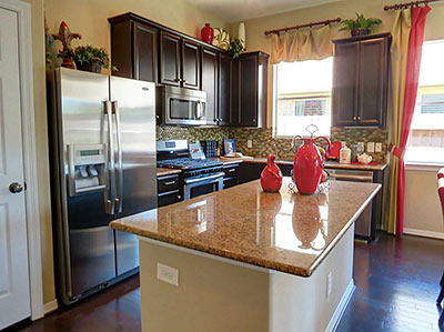
Wow, that kitchen is inner-loop townhome small.
Nice colors
I like seeing color instead of all neutrals. A little heavy on the greens overall but refreshing. Meh kitchen seems awfully small for the overall space. Maybe why it is still vacant.
It’s very close to the railroad tracks. I wonder what the noise is like when a train goes by in the middle of the night?
My uninformed opinions.
Color & Finishing:
I like the pastaschio color in the living room and master, it may be a bit too much for the dining room though. The bright red was nice but too much of it with the sofa in the game room. Otherwise good color scheme.
The first floor hardwood floors are great! I really liked the color of them with the paint.
Windows:
I like the master bay window. It lets in a lot of light. Front elevation is nice too with good, large windows.
Floorplan:
Since I’ve gotten used to my new house I really enjoy having an open dining room. That one feels too small to me, but I understand other people don’t use it as frequently as I do.
Also I noticed a study or something in the front of the house I didn’t see any photos of. I think it would have looked nice. I bet there is a floorplan similar to knock out the wall between that and the
dining room to open it up like I prefer.
Game room next to kids rooms fine by me.
2 car garage is good.
Landscaping:
Front yard landscaping is fantastic! I like the flowers in front. Back yard meh. I would like trees but its probably done that way to feel large. I like the back porch. Front walk is a bit close to the driveway. I would have just looped the front walk to the drive.
Location:
That lot wouldn’t be for me though because it looks like the wooded lot behind it on google maps is destined for a future as a strip center. It looks relatively close to a railroad but it looks far enough away so noise wouldn’t be a problem unless you are a very light sleeper. Easy access to 249 and close to vintage park is a plus. Don’t know about the schools. My guess is Spring HS.
Overall:
I really like the house. Would do a few things different if I was making a new build.
My worthless 2 cents.