Here they are! The official nominees for the very first category of the 2011 Swamplot Awards for Houston Real Estate. That would be Favorite Houston Design Cliché. Thanks to everyone who submitted suggestions!
 You can cast your vote for this award category simply by adding a comment below indicating your choice. But why not make it more fun? Don’t just tell us who you’re voting for, tell us why!
And pay attention to the Swampies’ quirky voting rules: You can also vote up to 3 more times — by email, on Twitter, or from Facebook — as long as you follow these rules.
The nominees are . . .
***
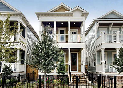
1. The New Charlestorleans Style. “Take a 2,400-3,200-sq.-ft. box, stick on a Federal roof with some Italianate brackets on the cornice, Greek columns, a bit of French Quarter wrought-iron railing, and maybe a few Gothic Revival or Craftsman odds and ends and you have a New Charlestorlean home ready to sell to the couple that loves the look of historic homes but doesn’t want the burden of authenticity — or of keeping up repairs. Always 2 stories, porches on the first and second floors, and an odd mashup of historic references. Going up like wildfire on the peripheries of the new historic districts. Basically, the architectural version of Mr. Potato Head.”
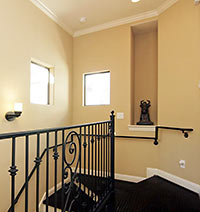 2. Art Niches. “At last, suburban homebuilders have caught on to the vast numbers of avid and sophisticated art collectors among their target market — who before now had no suitable place to display their Precious Moments figurines or Thomas Kinkade prints.”
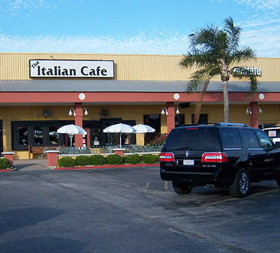
3. Parking-Lot-Facing Restaurant Patios. “Who’d have thought watching arriving diners try to find a parking place in front of a strip mall could become such a compelling urban attraction? The view, the fully paved outdoor experience, and the automobile-scented air together bring an upscale-authentic feel to what would otherwise certainly be drab dining experiences.”
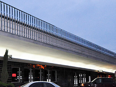
4. Outsized Strip-Center Foreheads. “What took strip-center developers so long to recognize the traffic-attracting properties of the gigantic tack-on parapet wall? No need to go through all the trouble to get a sign permit when you can just prop one of these up over the front and tack on the store logos. These days, when they say they want to give an older strip mall a face lift, they really mean it.”

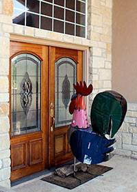
5. Giant metal chickens. “As home-decor whiz and former Pearland resident Jenny Lawson (aka the Bloggess) can attest, these sharp sculptures fashioned from rusted oil drums make the perfect 15th anniversary gift, either in your front yard or perched in front of your front door. And they’re apparently [link slightly NSFW] taking the lawn-ornament market by storm. ‘Knock, knock, Houston!'”
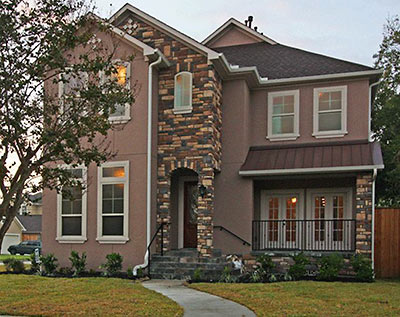
6. “Lick ’n’ stick†fake-rock siding. “It started on small commercial structures several years ago (see bank branches) and has now spread into the residential marketplace. In a city built atop clay and sand it always just seems a bit odd, like it’s trying to evoke ‘Denver on the Gulf’ or something. . . . Sure, the phrase ‘lick ’n’ stick’ sounds a bit exaggerated, but if you’ve ever seen it put on a house, you’ll attest to its appropriateness.”
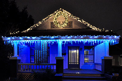
7. Icicle Christmas Lights. “The ‘white Christmas’ theme is weird but quaint enough in Houston. Now our wish-we-weren’t-here neighbors want us to up the ante of our collective climate fantasy by imagining a snowy holiday shopping season followed by several weeks of sunny but below-freezing weather.”
Which of these fine nominees truly deserves recognition as Favorite Houston Design Cliché for 2011? You tell us. Let the voting begin!
- How To Vote in the 2011 Swamplot Awards for Houston Real Estate [Swamplot]
- Swamplot Awards Ballots 2011 [Swamplot]
Photos: HAR (New Charlestorleans, art niche, stone siding); Swamplot inbox (Italian Cafe); Candace Garcia (River Oaks Shopping Center parapet construction, icicle lights); the Bloggess (chickens)


Tough to decide, but I’m going with 6.
During a remodel on a 50’s era ranch on Cheshire, a curved red ceramic tile roof and oversized (for the house) sinuous columns flanking the front door to support the small part of the roof that projects over the entrance led one to believe that it was turning into a really sweet little California Mediterranean casa. Then came the lick n stick stone–probably the one house in the whole neighborhood that stucco would have been desired and appropriate–over the entire facade.
It’s close between 1 & 6, but 6 it is.
Lick and Stick for sure. $600K+ for added outrage. 77079 is being overrun by these monstrosities.
#1- mr. potato head architecture.
All worthy competitors! But I choose 6.
My vote is for #1, the architectural style mash-up.
I think 6 hands-down. Of course, I have to give credit to Swamplot for expanding my vocabulary some time ago with the term “lick and stick stone.” and I’ve succeeded in turning many friends off of that trend through use of that term.
I have go with #2. I went to an open house earlier this year in the burbs near my parent’s house, and it had them all over the place. I normally could look past this, but now I can’t help but imagine cheap terrible prints and god aweful statues displaying in them.
As much as I enjoy the Bloggess, those damn metal chickens have overrun every antique store on Westheimer. 5 gets my vote.
I choose 6
I am going with #6 because it will most certainly be the design feature people are trying to reverse in 15 to 20 years.
Yes, time for a little love for #2, so to speak. We used to call these “telephone alcoves”, but now the telephone wanders about with us. Art niche, forever!
#6, because lick and stick stone is becoming the “Tuscan” of 2011 design!
Hang on. Does this mean I can add “Designer” to my resume?
Yeehaw.
I’m going with #1 because I actually like them. Yes, they are the Mr. Potato Heads of architecture. But let’s consider what was there before. Usually Mr. Potato Head’s pop up where a run down ranch or bungalo existed in a transitioning neighborhood (East Sunset Heights is a good example). The run down bungalo sat on a 6 or 9 thousand sq/ft lot and was tax appraised at $150k – $200k. Then along comes a developer who scrapes the aforementioned ranch/bungalo, double or triple divides the lot, and puts up 2 or 3 Mr. Potato Heads that each sell in the low $400’s. So, whenever I see a Mr. Potato Head house, I see the city getting 5X the tax revenue it was in the past and a neighborhood that is on the upswing. So while the Mr. Potato Head concept is a little cliche, the Potato Head’s are actually doing some good for Houston – unlike any of the other nominations.
#6 which I would truly love to spit on. I sort of like “New Charlestorleans Style.”
This is totally off-topic, but Swamplot should start a new feature, inspired by Fashion Police on E! (yes, I watch trash TV). It’s called “Gotta have it? Make it stop?”
Charlestorleans? Gotta have it.
Lick & stick stone? Make it stop.
#7 for me. 1-4 and 6 are by no means unique to houston, these are national trends, and i’ve never seen a #5.
I’ll have to go with #7 because i really do miss the old days when Houston would at least have one good ice storm every year. Sliding down bridge overpasses and stuffing the freezer full of the biggest icicles one could find is something i enjoyed thoroughly but something the kids don’t get experience.
#6 makes me laugh. Guy above talked about 77079 filling with these —
I’ve seen this, too. While I don’t expect the area to ever get a historic designation for their 1970s “styles across America” feel, there is a continuity there that is a shame to backfill with sore thumb stylings.
Not to ever say somebody can’t build what they deem to be awesome (it IS their dreamhome, after all, and a big deal) but it’s still a shame that the new houses can’t be bigger, badder versions of the originals. They truly are cool looking (personal opinion).
#6 needs an additional laugh item – when I see construction and a varying ratio of stone to brick. You can gauge the limits of somebody’s spending power by it. I find myself actually wowed when the stone wraps the entire house.
#6, but only under protest that my nomination of LEED certified buildings (seconded by others) was not included on the ballot.
I actually like the ‘Charlestorleans’ style; but then, I like exotic women for the same reason. The best qualities from different ethnicities come together in one package. Sure, it’s impure; what do I care? I’m not a Heights Nazi or a prototypical Nazi, my architecture and my women needn’t be pure or Aryan.
Have to go with 1… These things are popping up everywhere.
Honorable mention for #1, but #6 is rampant in 77018 and splattered so randomly on the structures that it usually looks launched from a trebuchet a couple of blocks over.
I vote for #6, lick and stick stone. The picture from last year is perfect. (stone chimney on second story over a 4″ post on the bottom floor) Builders using this material in this way have lost touch with the point of stone.
The “Lick and Stick” stone facade gets my vote too. Who do they think they are fooling?
I’d love to have a #5 peeking in my window! Might get my two toddlers to eat something other than chicken nuggets … ‘Look boys, Mama Chicken is outside to collect her little chicken souls’.
#6 Lick and Stick Stone. It rarely looks good, let alone real.
TheNiche – I’m with you on the New Charlestorleans style. Why not take the best other cultures have to offer & then kick it up a notch? And I was going to vote for the LEEDs cert nomination. Reliant moved into the Houston Pavillions touting its LEEDiness…temps at some of the desks were over 85 degrees this summer. They had to paper the windows.
#5? Why not have REAL chickens? Softer, friendlier, and you get eggs besides.
#6 gets my vote. Tacky, tacky, tacky. And you can add the mismatched windows to that as well – 5 different window styles on the example photo! And two roofing materials. This looks like “leftovers” night at the construction company.
The icicle Christmas lights also say “straight up lazy” to me, like its a way to look fancy without doing anything fancy, but I have to say the best/worst cliche is the parking lot patio. Nothing like asphalt in a 100º summer.
#6 – will eventually hold the same stigma as Perma-Stone and fake wood paneling.
#7
#6
My vote goes to #6 -“Lick ’n’ stick†fake-rock siding. The anti historical district folks should love this. I do not forsee any group wanting to save these structures in the future. BTW, the giant metal chicken thing is just strange.
#1, for the sheer originality of the nomination and the sheer eclecticism of the design.
#6 – super glue and fake stones. Wow, what have we come to. . . .
My vote is for the parking lot patio, despite the fact that it has its own category this year. I feel like every time the weather turns pleasant my wife and I have the same conversation: where can we sit outside, but not sit in the parking lot?
Parking lot-facing patios – this is so Houston!
#6 for sure.
.
With regards to #1, there are some townhomes of that style in the Westmoreland subdivision of Montrose. The 200 block of Hawthorne and the 200 (300?) block of Westmoreland.
.
I had no idea what the guy who made the suggestion for #1 was talking about until I saw the photo, but now that I see it — yeah, there are some by my house.
.
I was told that that style had to go up to replace any house in this area since it’s historic and they couldn’t build anything too modern. Not sure if that was true.
#6
There’s a Lick n Stick at 16th street and Ashland that has a chimney smack dab and center above the garage door.
I vote number Sex, I mean six. Lick and stick. Sounds like a fruit-roll up sex clothing store. Plus, it is a truly ugly thing to do to a building.
My vote is for #4, Strip Center Foreheads, because Houston’s strip centers continue to set cutting-edge style standards.
.
[But really I’m with TheNiche that LEED certified buildings are the biggest cliché, and, I’m sorry I didn’t support his nomination :-( LEEDiness, per Flake, is the biofuel boondoggle of architecture.]
Chickens! I have been wondering about those for a while….
I vote for #1, is that even a word “Charlestorleans” ?
6, without a doubt.
The New Charlestorleans Style. They are all over the Heights. I don’t think they are terrible, but the ridiculous proliferation of them has made them a cliche.
I nominated #1, but concede that #6 is the winner. But, I do want to clarify that my main beef with Mr. Potatohead/New Charlestorlean homes is not necessarily that they are a favorite of the bungalow crushers. What really gets me is that they represent the death of architecture in the age of photoshop. Instead of doing a quality reproduction/reimagination of a particular period (there are plenty examples in the Heights), designers just click and drag various columns, trims, etc. from their little tool box and come up with a mish-mash of styles so they can call it a “custom” home and give people the feeling that it is historic-ish. To me, they represent the banishment of architecture from our daily lives. Architecture doesn’t matter any more when you can just slap dash elements from different periods on a big box. Architecture should still matter and still mean something. With the New Charlestorleans houses, Architecture just ends up being for old ladies on vacation tours in Paris.
OldSchool, I certainly see your point about the mishmash of styles on this new construction. And I agree with you that much of it is lazy design work that is geared to making a quick buck for the developer, and a good feeling for the purchaser that they bought something that looks “historic”. But who knows, maybe 25 years for now the New Charlesorleans style may come to be viewed as a design vernacular for housing in Houston. Charleston and Savannah homes with their double porches, raised foundations, floor to ceiling windows and french doors were originally considered “West Indies” architecture in their day, but today you call it the Charleston style. In 2025, maybe these homes will be considered “Heights Style” or something.
“Bungalow crushers”? Oh, give me a break! Such houses are a vernacular architecture unto themselves. They’re no more or less thought-provoking than a patio home in Katy. Get over yourself, OldSchool.
This is a tough one. However, I think the Parking Lot dining should win because H,IWI! Nothing says, “I live in a car-centered culture” like exhaust, asphalt, and fine cuisine.
Lick ‘n’ Stick for sure. Sounds like a lollipop.
The Charlestorleans ones are at least trying to be conscious of historical styles even if they are a mishmash. And they have color.
Gotta go with #6. Adding the lick-n-stick stone to the 60’s ranch in Westbury does not give you a CO chalet.
Must say THE “Midcentury Moderns” in Glenbrook Valley are true eye candy for a home owner today! Great space with a YARD I might add. Some homes have a special touch only the 1950’s could bring. Original tile bathrooms with extravigant colors, and flagstone floors as if it was the common cermaic tile of the time! GLENBROOK VALLEY its time!
#6!
Yes, Mr. Homebuyer that will add $$$ to the price of your home for that custom feature.
Gotta go with #3
#6 – David Weekly is working it in 77079!
#1
#1- we are surrounded by it.