 Here they are! The official nominees for the very first category of the second annual Swamplot Awards for Houston Real Estate: Favorite Houston Design Cliché. Thanks to all of our readers who submitted suggestions!
You can cast your vote for this award category simply by adding a comment to this post indicating your choice. Or you can send a secret ballot to the official judges by email. And yes, this year you can even sneak in a second vote by voting from Twitter. Just be sure you’re following our official voting guidelines.
And the nominees are . . .
***
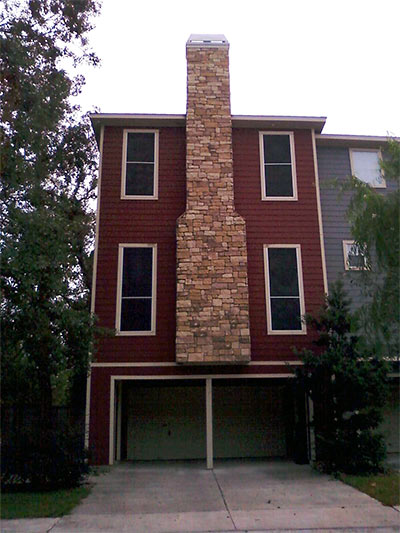
1. “Lick and Stick” Stone. “A little thinly sliced stone or facsimile, stuck on with a little thinset mortar, can solve a lot of problems for a builder — including gravity.â€
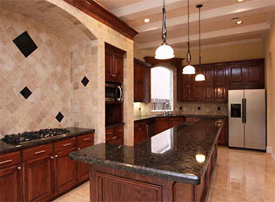
2. Multitone stone-look tile kitchen backsplashes. “This awkward style must have come in vogue during the early wave of Tuscanization (last year’s winner in this category), but now it’s everywhere. Will probably follow the fate of the avocado-colored appliance craze.”
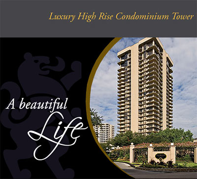
3. Condominiums advertised as “Luxury Condos.” “If I ever saw a condo advertised as “sensible and comfortable†I think I’d buy it solely for novelty purposes.â€
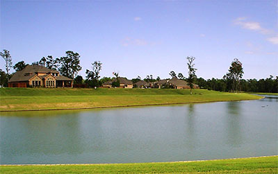
4. “Lakes of†subdivisions. “Is it only in Houston that a developer can turn a clay borrow pit (used to elevate new foundations out of the floodplain) into a selling point by allowing it to fill with muddy rain water? Of course, sometimes they dye it a cloudy blue to take some of the ick-factor away, but does that really help?”
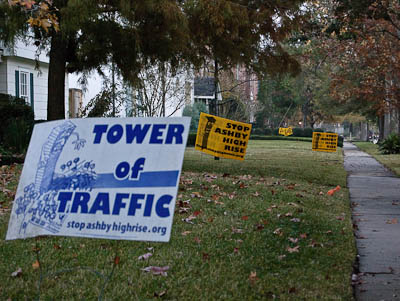
5. Stop Ashby Highrise Signs. “I haven’t seen anything nearly as ubiquitous in the Inner Loop as these yard signs.â€
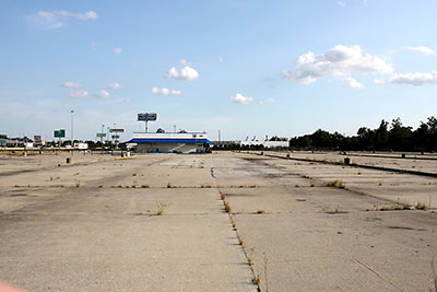
6. The Vacant Lot. “We’ve witnessed more canceled projects and a greater drop-off in speculative homebuilding in 2009 than has occured in decades. We also witnessed the tail-end of a demolition boom, which left our city and its suburbs pockmarked with vacant plots of land that should’ve been something, but weren’t. (Examples include Turnberry Tower, Sonoma, Regent Square, numerous scraped lots in Bellaire and the Heights, and Road Warrior-like conditions in a multitude of suburban subdivisions, all stories that were covered in gory detail on Swamplot.) This is the only distinctive trait that was uniformly witnessed among urban/suburban and residential/commercial real estate in Houston this year.”
Which of these fine nominees truly deserves recognition as Favorite Houston Design Cliché for 2009? Let the voting begin!
- How To Vote in the 2009 Swamplot Awards for Houston Real Estate [Swamplot]
- How To Vote a Second Time in the 2009 Swamplot Awards for Houston Real Estate — Using Twitter [Swamplot]
- Swamplot Awards Ballots 2009 [Swamplot]
Photos: Swamplot inbox (chimney), HAR (Kitchen, 3203 Cloverdale St.), Bristol Condominiums, Hendricks Interests (Lakes of Cypress Forest), Swamplot inbox, Flickr user meltedplastic (Landmark Chevrolet; license)


#4 – Very tough category… but all these “lakes” remind me of Dubai’s “islands”.
I agree with Brian. It’s a tough choices but I’m voting for #4. As if anyone gets in these “Lakes” except the Nutria Rats that now call them home.
I absolutely love the poster-child project for the ‘Lick and Stick Stone’, but the zeitgeist is screaming for NUMBER 6, the EMPTY LOT. Time to party like its 1985…
Of course, a hybrid vote might work too, for the ’empty luxury condominium’.
#3 I want one of those “Luxury Condos” and the monthly maintenance fees that come with them.
My vote is for #6, the vacant lot. It’s what this year was all about. Project cancellations, accidental demolitions, the quintuple decimation of the real estate development industry, and the forced career change of *yours truely*.
.
As far as I’m concerned, numbers one through four are insufficiently unique to or characteristic of 2009, and there are far fewer incidences of them actually being built in 2009 than in years past.
#4. Standing water is not an amenity.
#3 – If it’s not a luxury condo, it must be a high-rise loft…that looks exactly like an apartment, but with more luxurious stone backsplashes.
#6 Empty Lot – they seem to be the icon for 2009.
The Empty Lot
“Lakes”!!!
The empty lot seems so 2009. I have tried to understand the appeal of the ‘lakes’ for a couple of years now.
It’s a tough choice between “lakes of” and “luxury condo apartment home whatever.” I’m going to go with luxury whatever.
Agree that the vacant lot sums up The Year in Real Estate very well, but I can’t call it a ‘design cliche,’ as vacancy is not intentional, and design is. (Unless I suppose it’s done by an experimental avant-garde type, in which case it sure ain’t being built in Houston.) So I vote for number 1.
After all, today’s design cliche is tomorrow’s vacant lot. It is the circle of life. One day, hopefully soon, the ‘lick and stick stone’ will be in heaven with the stucco turrets and craft rooms.
I vote for #4. My brother used to live in one of these things. All it did was make the neighborhood more likely to flood.
Since I live in the loop number3 is my choice – but “Lakes” is a close second.
#2 is really the only “Design” item in the list. The rest are not really something that was designed per se.
#2 is in houses all over the area and in all price ranges; I see it frequently in houses over $1.5m
#2. I hate to admit this, but this one hits closest to home. My mom did this to her kitchen last year.
#4, because if it’s too oxygen-deficient and/or chemically dyed to support carp it’s not a lake.
You can find vacant lots, luxury condos, stone backsplashes, and protest signs in plenty of places….not just Houston.
So #4 (lakes) is the winner since it appears to be the most homegrown example.
you just have to have a good sense of humor to live in this ugly, ugly city!
I was leaning toward lot but Shakes changed my mind. Lots, while representative of Houston’s real estate landscape in 09, are not a design cliche to me.
Official vote: Lakes. Ew.
It’s true the Lot
is not
a planned design,
but it is so
two-thousand-nine
#6
Ashby Signs. But the lakes are nasty, the lots so 2009, and the luxury, laughable.
#2. Everywhere with no indication of slowing down.
“Lick and stick” stone is not for me, but it will get my vote. This material can be found from the burbs to the Heights, Montrose, River Oaks, and beyond! No one is safe!
*Numero Uno
I live in Pearland, so I’ve gotta go with the Lakes. They’re everywhere down there!
Let’s go with No. 4. And really, how can something as “unique” as No. 1 be a cliche? Tryin’ to have a trick question here?
#4 Lakes. It has the ring of the Allen brothers’ swindlery to it.
@ Scott: These lakes are just government-mandated flood control. If developers could get away with it, there wouldn’t be any. There’s no swindling to the phenomenon at all.
My vote is for #4.
Gotta go with “Lakes of *random nature element/exotic-sounding locale*”
Lick and Stick Stone is my vote. It’s everywhere, not just a suburbs or ITL cliche.
Gotta go with lakes on this one.
Heck, even our “real” lakes are man made.
“lick and stick” instant Hill Country for the win.
#4 for sure.
I vote for “Lakes Of” which has become the “chi-chi” standard for many of the newer subdivisions in the boondocks. They at least have gotten more skillful with the dyes although the odd lime green of some of the ones in the Memorial area still are quite, well, interesting although it does make it easier to see the water mocassins. My favorites are the real lakes in Missouri City and Sugar Land that really should be “Alligator Lakes Of.”
Stone look back splashes for sure. I spent 3 days chipping out the crap the prior owner put up. Ugly, poorly done and cheap. But if you really want the Tijuana look, cover your fireplace in the stuff.
I have to vote for #2. It’s hard to keep watching these kitchens pass for “luxury” when it’s clearly just a horrible trend.
Definitely “lakes of.”
My favorite part is when they go all the way overboard with the “lakes” and turn the lands into “islands,” like in Pearland’s Shadowcreek Ranch. The lakes are coming! The lakes are coming!
I guess it’s a “turning lemons into lemonade” thing. When you live in a swamp, you may as well excavate enough fill to raise the houses above sea level, then turn the excavated surrounding lands into moats around your McCastles.
“Lakes of…” I like to call them scenic detention ponds. If they are done well, they add to subdivision curb appeal. Shadow Creek Ranch has the detention banks sloped so steeply that only an alpine cow with one pair of shorter legs can walk the banks of the “lake”. The real kicker for me was the thousands of acid loving pine trees they slammed into the alkaline banks of the lakes so the treetops are at street level. I give those trees a life span of about development completion.
LAKES!!!
Lakes, for sure!
I vote for “Lakes of”. I have been is some of these lakes for the swim leg of a triathlon. The water had a “earthy” smell and you could not see more than a foot in front of your face. A few times I swallowed a mouthful. Ugh! The neighborhoods were nice though.
I vote for the Ashby highrise signs. Since I’ve realized that the “traffic” issue is a farce all I can do is roll my eyes at them.
“Lick and Stick” faux stone because it’s not just for the outside of your house anymore.
NO.1 Lick ‘n Stick Stone is my favorite but at this level of execution, merely a cliché wannabee. NO. 2 Stonarama is a design cliché of our fair city and many other locales, therefore, we can’t lay claim to it.
NO.4 The Lakes – now that’s a winner. Pass off awkward flood planning to unsuspecting clients as a “uniquely designed nature santuary” feature, and you got yourself a CLICHÉ!!
#2 Stone backsplashes gets my vote because the photos I see these days show the rest of the country’s kitchens are sporting subway tile.
Stop Ashby Highrise signs.