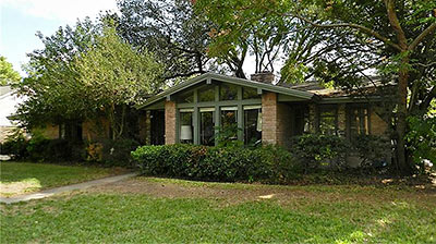
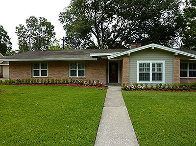
Yes, the shots above are front-yard views of the exact same house on Kimberley Lane in Memorial Hollow, before (at top) and after a thoroughly de-Modernizing revamp completed earlier this year. Just about every sixties-era feature of the original home has been scrapped and “corrected” with — well, something else. The ask for this brilliant flip: a $224K premium over the sales price of the home from December of last year. You are so welcome:
***
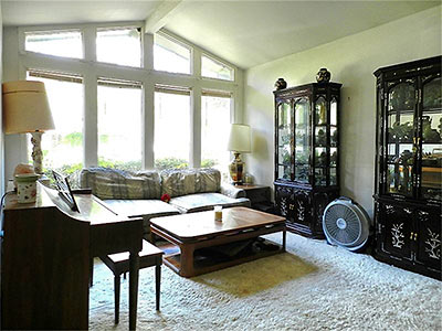
The light-filled den above? Let’s not even start with the problems with it. But note the remarkable improvements made in the remodeling, simply by getting rid of those non-standard “windows,” and replacing them with windows that look so much more — how-to-say? — window-like:
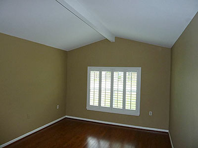
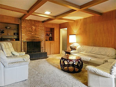
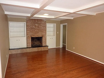
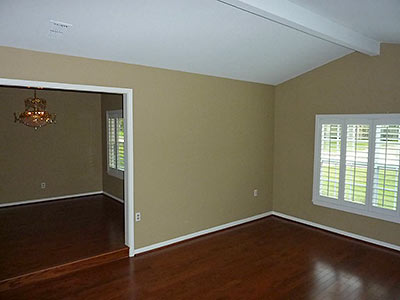
Plantation shutters are included! More direct before-and-after shots of the living room, instantly cozified with the addition of paint, contrasting trim, and wood flooring:
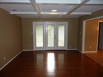
It’s not clear from the photos what these new French doors on the other side of the room replaced, but whatever it was couldn’t have been this French:
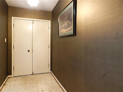
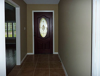
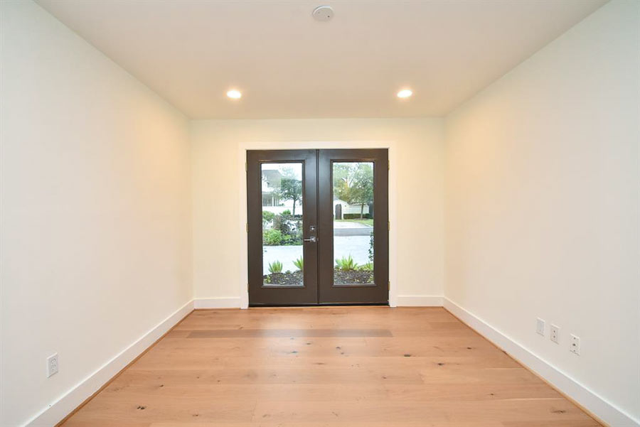
In the entry, away went the double doors:
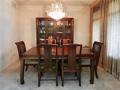
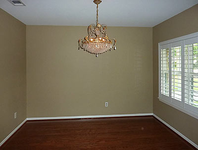
In the dining room, only the chandelier survives:
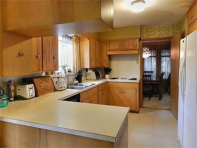
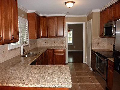
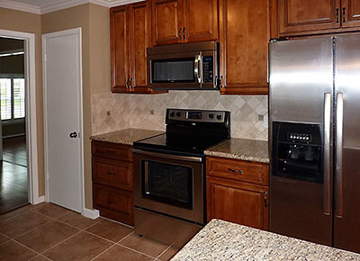
In the kitchen: presto, granite-o:
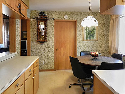
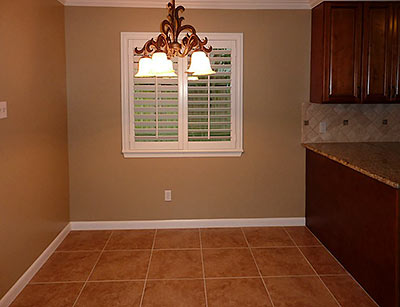
Breakfast area before and afters:
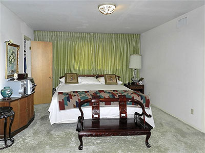
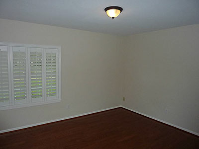
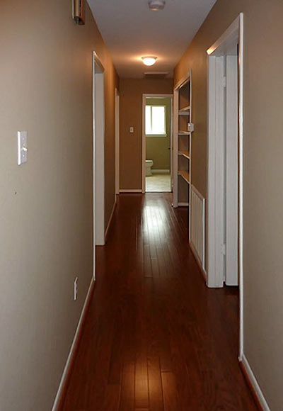
It’s hard to tell from the photos which of the 2,381-sq.-ft. 1962 home’s 4 bedrooms ended up as which, but here are the ho-hum, circa 2011 originals:
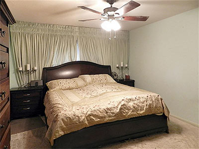
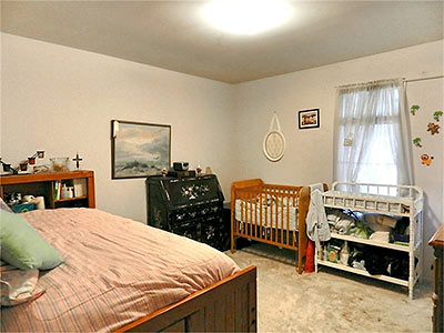
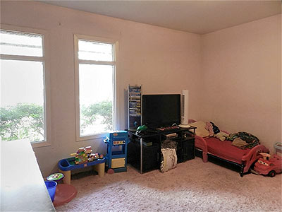
And their far more refined and cheerier replacements:
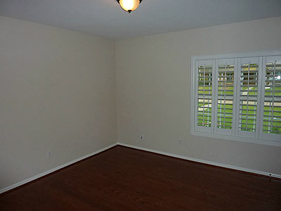
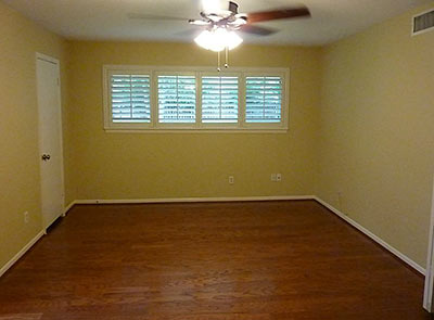
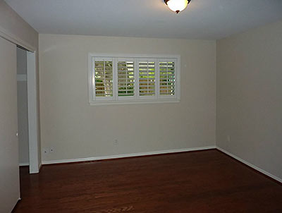
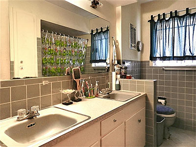
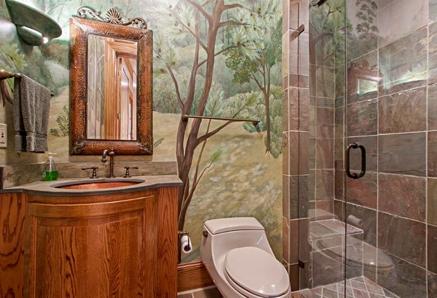
In the bathrooms, tired and cliched tilework . . .
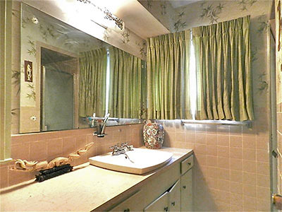
gave way to these distinctive updates:
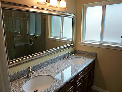
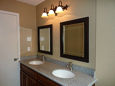
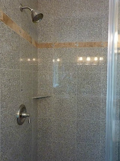
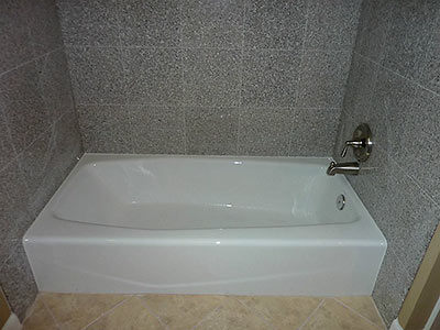
In the back of the 8,800-sq.-ft. lot, a pruned version of this original tree remains!
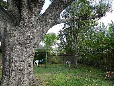
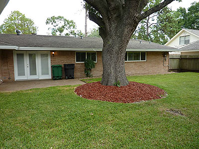
Isn’t that mulch better?
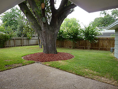
The home sold for $425,000 in December 2011. After the renovations, the new owner put it back on the market in June for $679,000. It’s been listed for $649,000 since mid-July.
- 12327 Kimberley Ln. [HAR; earlier sale]


wow. great example of how to turn a mid-century modern into a tear down. very sad :(
What a travesty.
This makes me want to cry.
Ew…the door! (at least that’s not a permanent issue). Surprising they didn’t heighten the roof line, too :-o
Yuck
Unbelievable that anyone would actually do this. But they did. Instead of adding $224,000 to the price, they should have deducted it.
Thwap!!!! (the sound of me throwing my mouse at the wall)
Brilliant writing. The house is tragic, but what they did to that poor tree is almost worse.
Hahahahaha! ~vomits~
What sort of cheap !?$&@/; gets rid of the cleristry windows and puts a small box window in it’s place??? This is an example of how NOT to flip a house. The character has been sucked out and replaced by “beige”. I also would pay more for the original than the “upgraded”.
What the …..? I’m all for a new coat of paint on an old place; however that house has been changed, from a decent place to live, into “yuck”. It now looks like government project housing for the poor.
That before and after of the living room is horrific! Those large open windows were wonderful, now it looks like a dark, narrow cave.
Being young and naive, I did not appreciate the sarcasm in the OP until I got to the comments. Here I was, thinking myself crazy for not knowing the allure of olive drab walls and dim natural lighting.
The only thing that seemed an actual improvement was the bathroom. The rest? You’ve got to be kidding. The finished outside looks like a “before” picture.
Fans of midcentury architecture can breathe easier knowing that Glenbrook Valley’s protected historic district status will keep those types of travesties out.
Ouch. This has got to be a case study on how NOT to renovate a house.
I knew I was in for a treat when I saw the “upgraded” front which removed all curb appeal and charm this house had. The windows are the worst change, other things are just ‘bad’.
First, remove any and all character the home once had. Next,remove the landscape that was destroyed in the process. Then “replace” the mature landscape with small one gallon plants. Finally, garnish with a little “Whataburger Orange” mulch and wallah….transformation complete!
LOLZ. Idiots.
Even the before bathrooms were better.
As for the rest of the house. FUBAR.
Who did this? Name names.
It’s mind-boggling that someone would remove those front windows to make the room feel smaller and darker.
Maybe this house did need some fresh paint, but these “after” photos could be from a builder’s generic spec house.
Ugly made uglier. It was downhill both ways after the home’s front was ‘improved’.
They dare defy current elitist thinking! This will not be tolerated; we must decry louder! In all seriousness, obviously some of the the changes here are pretty horrendous no matter what architectural style you prefer. Those windows were fantastic; the new ones aren’t just different (which, despite the frothing vitriol being spouted here, is not necessarily bad…things change. welcome to life.), they simply don’t fit a space designed specifically for the windows. But let’s be honest with ourselves, if we can step out of our trendy mid-century loving selves for a moment…just because something was original doesn’t mean it was good, or desirable. Let’s not fall into that elitist trap. Honestly, I’;m not crying over replacing that gawdawful carpet with anythingbutthatgawdafulcarpet. Yes, a lot of the updates are generic “what’s popular/mainstream right now” sort of stuff. But what they’re replacing is the exact same sort of mainstream styling, just with a healthy dose of nostalgia wrapped around it. Let’s not kid ourselves…as much as I personally like midcentury style, most of these houses were just as generic as the pseudo Tuscan places going up all over the area. They simply have the benefit of being fewer in number these days. There is nothing inherently better about one era’s overused style elements than another. Novelty is not the same thing as absolute superiority.
Kitchen is better, bathrooms are better, the rest is pretty sucky. Seriously, they think someone would prefer less window area? The house faces North, it’s not like the sun is going to be blazing in and heating everything up.
Whoa, that *is* bad. Even if you don’t like modern, you would have to admit the remodeling of the living room is pretty bad — it’s like someone is trying to market this house to a family of vampires or something or something.
By the way, about the tree that used to be in the front…maybe it’s the angle of the photograph but it looked like the tree was very close to the house. There might have been a legitimate reason for removing the tree. But that doesn’t excuse the rest of the “re-landscaping”, though. For example, the hedges just needed to be trimmed.
I’m surprised they kept the fireplace. I want to see the attic…
Though I live in a MCM, I appreciate that not everyone loves the architecture – or the pink bathroom title that typically goes along with it. Totally get that. But windows? Who is against windows? On moral grounds? In what world was replacing those windows a good idea?
If someone had done this in Trousdale Estates in Beverly Hills they would be on a “missing persons list.”
If I had to guess, I bet the existing floor to ceiling windows were rotting and needed to be replaced. They went with the cheaper option of putting in standard windows rather than rebuilding it like it was. We are going through the same thing with our sunroom right now. Of course we love the wooden paned floor to ceiling windows we have right now, but it would probably cost 2x as much as building the up the wall and putting in standard windows.
They forgot to paint the fireplace brick.
Lauran,
If you planned to sell your house for 600k, the extra cost of floor to ceiling windows in one room would be worth it. Making the house look cheaper and more generic would be more costly than keeping the proper high end aesthetic. This house sells, but whereas a proper restoration gets them there price, I’d say it goes for 50k less purely because of their terrible design choices.
@ Lost_In_Translation
Completely agree. For a half mil $ house, they should have put up the extra money to restore the windows. For our
Pretty bad. That’s got to be one gloomy house, now that they’ve gotten rid of all the natural light.
But don’t cry for the tree. Looks like an Arizona Ash, which are crap trees planted by builders who wanted them to grow fast, but didn’t care that they would inevitably be hollowed out by beetles in 20-30 years. I had to cut down two of them at my old house. Bleah.
@32 Lauren H
What were you going to say?
I hope you don’t change your front windows.
We remodelled our 1956 ranch due to a fire, and opted to replace the original steel casements with energy efficient windows. We chose aluminum frames to avoid that awful glaring white this flipper did on his house. The floor to ceiling glass we had in the front stayed, despite its terrible hot and cold leaking problems, because the replacement with a newer product broke the budget. We love the light and wouldn’t give it up for a smaller window – it’ll get done right, eventually. The improvement in our comfort from the new windows is really great, not to mention the reduced heating and cooling bills.
And horror of horrors to some of you – we raised our roof (but kept the hips) so we could have 9′ ceilings instead of 8′ in most of the house. One day we’ll sell it and hopefully the “market” will approve of our changes.
And horror of horrors to some of you – we raised our roof (but kept the hips) so we could have 9′ ceilings instead of 8′ in most of the house. One day we’ll sell it and hopefully the “market†will approve of our changes.
How difficult was it to change the wall heights to accomodate this change. The only issue I could see with raising the roof (and really is a foot change that noticable) is that the windows will look abnormally low. 9 foot ceilings are great though when you’re 6 foot tall. I bought the house I did because the vaulted ceilings really gave an openness I liked.
A foot increase is really noticeable and yes, we are a tall family.
We had to keep a soffit around the perimeter because of the hipped roof; that kept the rafters inside the attic and out of our living space. Our windows don’t look any different because the effective ceiling height at the outside wall is still 8′.