
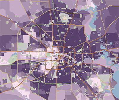
Here’s a tool likely to be useful to armchair developers interested in the lay of the land. PolicyMap is a new GIS website that allows you to view a range of local market and demographic data for Houston or any area of the country. You can see how local crime statistics, an interesting array of mortgage categories (such as the percentage of piggyback, subprime, and refi loans), income distributions, and even donations to presidential candidates look on a map. (Big surprise: Pearland and the Energy Corridor really like John McCain!)
PolicyMap is a project of The Reinvestment Fund, a non-profit community-development financial institution from Philadelphia. Some of the advanced features require a subscription, but there’s plenty to play around with for free.
The quick map above shows what Houston areas took out the most subprime loans in 2006. (The darkest purple means more than 50% of all mortgages funded that year.) If you discover more interesting neighborhood stories demonstrated nicely in PolicyMap maps, share your finds in the comments.
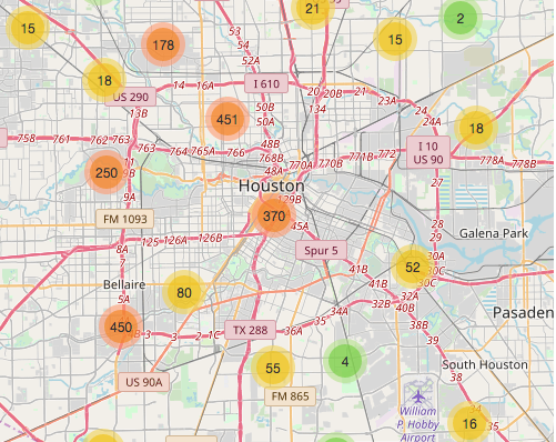
At SpotCrime, we’ve been mapping crime incident data for Houston for the last three months.
Houston is on of the most open cities in the US in terms of sharing crime incident data.
Our map currently has over 150 k incidents for Houston.