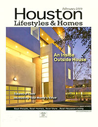
 It sure is hard to keep straight all those white-stucco Modern homes a few Houston architects keep churning out. Which probably explains the big “oops” in the latest issue of Houston Lifestyles & Homes magazine, a free publication distributed to “45,000 upscale homes in the Houston area.”
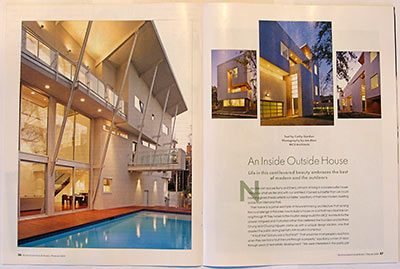
February’s cover story, “An Inside Outside House,” centers around the somewhat spectacular home local architect-builders MC² built for Barry and Sherry Johnson, along the edge of a fault line on a small lot adjacent to Memorial Park. The tall and narrow home, which features a three-story living space, slanted columns holding up a V-shaped roof, and third-floor balconies looking out over a pool, was featured in a Houston AIA home tour last year.
***
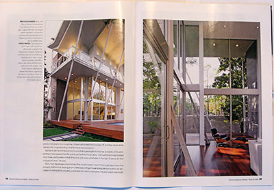
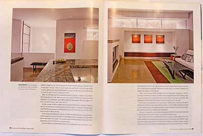
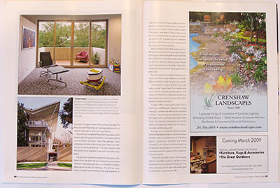
But the magazine story is illustrated with 8 photos of an entirely different residence: a townhouse project James Evans of Collaborative Designworks built for his own family on South Shepherd just south of 59, which happened to be on the same tour.
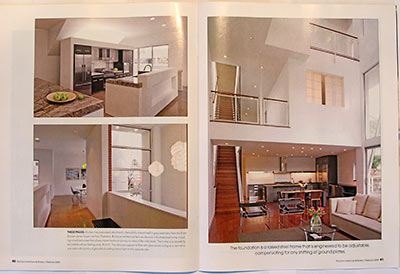
Actually, the article places photos of both houses side by side, and captions describe them as if they were the same home. Apparently, the presence of two different kitchens on a single spread didn’t draw much attention . . . until the magazine was distributed.
All is fixed now (except for those 45,000 copies), because in the online version of the magazine — which just went live, a little behind schedule — all images of Evans’s home have been removed. The cover (shown above) originally featured a dramatic photo of Evans’s townhouse (which he calls House X2), but it’s been replaced in the online version by a photo of the Johnsons’ house.
- February Issue [Houston Lifestyles and Homes]
- 2008 Home Tour [AIA Houston]
- Johnson Residence [MC² Architects]
- Collaborative Designworks
Images: MC² (top spread left page, second spread both pages, right page only on third spread, bottom of left page on final spread); and Collaborative Designworks (cover, top spread right page, third spread left page, fourth spread, and top of left page on final spread); all credited to Joe Aker


It doesn’t matter. Most of the residents of the zip codes in which this magazine is distributed don’t know crap about architecture and probably didn’t even read the article.
How funny! In fact I pored over that magazine last week, trying to figure out how the house was laid out. I managed to figure out how some of the interior shots fit the building, but ended up scratching my head and wondering whether the house had two kitchens or something. It never occurred to me that “mistakes were made.” How hilarious is that?