WHAT MICHAEL GRAVES BROUGHT TO HOUSTON  Is Michael Graves personally to blame for the infestations of flattened pediments that began appearing on commercial building façades in the early nineties, and later morphed into the default “look” for the standard midsprawl shopping center?
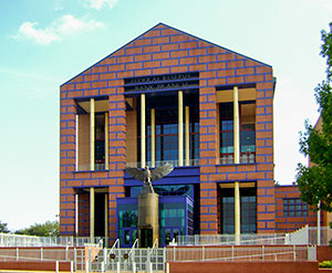
Not really. But the early acclaim his variety of postmodern design received did play some role in the license now apparently felt by thousands of lesser architects (and developers) to festoon dull commercial designs with all sorts of cartooned classical elements — and declare the result to be “traditional.” By the time the New Jersey-based architect designed his 2 Houston building projects in the early naughts, he had moved on to super-scaling other building elements: His Martel College and Master’s house at Rice and the Federal Reserve Bank (of Dallas!) on Allen Pkwy. (pictured above) are both dressed in a sort of Lego-like big-brick wallpaper, but one “drawn” using actual-size bricks. After an infection he contracted in 2003 left him paralyzed from the waist down, Graves became an outspoken champion of universal design. Graves passed away last week at the age of 80; Writer Michael Hardy has a remembrance of the man he calls “the architect Houston loved to hate.” [Houstonia] Photo: John D. Cramer


I’m not quite sure why “(of Dallas!)” was included after “The Federal Reserve Bank.” People tend to point this out as if it means it’s not the real Fed, just some fake, lowly Dallas bank capitalizing on the Fed name. There isn’t a single central Federal Reserve Bank, instead it’s separated into 12 regional banks. The branch here in Houston is one of four branch banks that make up the Eleventh Federal Reserve District which just so happens to be headquartered in Dallas.
I know, I know, it hurts my Houstonian pride as much as the next guy’s when we’re passed up in favor of Dallas for anything of national importance. The simple truth is that Dallas was (and still is?) a more financially important city than Houston in 1914 when the bank was established.
The works of Michael Graves makes me shudder.
Speaking too soon?
I know most people prefer the Danzig era to the Michael Graves era, but I have to disagree. Danzig may have been the inspirational heart and soul of the Misfits, but Graves was a much better singer.
@manbearsteak-
I think the “(of Dallas)” refers to the sign debacle that occurred when the bank first opened. The initial sign proudly proclaimed “Federal Reserve Bank of Dallas” for all to see, and a much smaller continuation “Houston Branch” was placed far below, completely hidden by the large eagle statue. I’m sure it provided a lot of double takes from drivers on Allen Parkway, momentarily questioning if they had missed an exit and ended up much farther north. Months later, the signage was reworked (I’m sure taxpayers footed the bill for an entirely new sign, since surely someone had approved the working drawings) to make it clearer to all that the branch location was in Houston.
looking on wiki at his more famed projects and they’re all complete abominations. is there anything for us non-architectural/design folk to applaud his efforts for? it seems he certainly found ways to make a fortune off of peddling cost-efficient/economical designs that keep with a unique flare, but I’d have to put a bullet in my head before saying any of them have provided a long-term beneficial aspect to the projects or the surrounding landscapes.
The Graves buildings at Rice are quite nice, less known but perhaps better than the Federal Reserve.
I disagree Walt. Michael Graves may have been better live, but no one tops Danzig in the Misfits. He wrote all their songs. However, they may have enjoyed more success in recent years if Graves had been more welcomed into the band.
I HATE Michael Graves! His Federal Reserve Branch Dallas (Houston Division) is hideous. It’s the Barnacle of Allen Parkway. His Humana Building in Louisville is about the ugliest thing I’ve ever seen. Seriously, he is a terrible! designer.
(I hate his work at Rice as well). Oh and the Federal Reserve is in Dallas, Houston is just a Branch of the Dallas Federal Reserve.
@shannon- so harsh but, not unexpected. Didn’t your mother ever say, “hate is such a harsh word.”? The man just died and unless you personally knew him, show a little more respect, empathy and grasp on humanity.
The Houston branch of the Dallas branch of the Federal Reserve is an abomination. That said, I like the stuff he designed for Target. Especially that cute little tea kettle. Amiright?
Such strong emotions posted by Shannon. Why get so worked up about a few buildings with less then desirable architecture. In a matter of only 50 – 75 years, most of us will have passed on anyway, and a lot of these Houston buildings will have probably already been torn down. As they say, “Life is Short”.
Still remember the day I first drove past the bank building on Allen Parkway – – wondering what the heck they were thinking…. Not sure about the interior, but that exterior will never be loved.
The Federal Reserve Bank is about as Federal as Federal Express. It’s a fake ass moniker, the Fed is really a private banking group which screws Americans by loaning us money..
@vwgto The interior that I have seen is quite nice.
Not only is the building hideous but so is the big bronze chicken in front…
MarkD: I’m not fan of the fed, but the story has nothing to do with them. I think a lot of people who are blindly anti-fed (most couldn’t give you real reasons beyond generic talking points) have some knee jerk response that forces them to make comments like yours in any store that mentions “Federal Reserve”. I’ve literally seen that same thing said over and over.
.
Again, I’m not defending the Fed — “The Creature from Jekyll Island” is one of my favorite books to recommend — but there is a time and place for everything.
@HigherDensity
Oh please. You can’t say that you hate someone’s work if they are dead? Do you know how f-ing ridiculous that is?
Higher Density: at least Michael Graves died at home, surrounded by loved ones; not on the toilet in a grungy men’s room at New York’s Central Station, like Louis Kahn.
.
But I digress.
.
I liked Michael Graves’ work for what it was: a conscious rebellion against the obsessive reductionism of later modernism. But just like Modernism got bastardized by people who didn’t know what they were doing, so did PoMo.