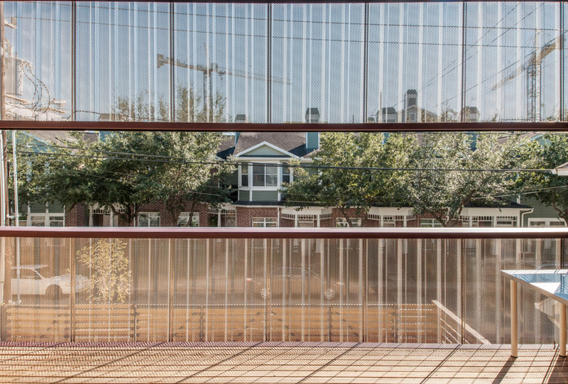
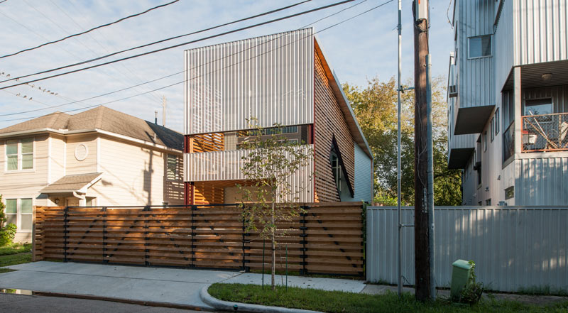
From the inside out and the outside looking in, here’s a peek through the semi-see-through mesh facade of University of Houston architecture professor Zui Ng’s Shotgun Chameleon house, located just east of the intersection of Cleveland and Gillette streets in the Freedmen’s Town National Historic District. The 2-story 3-bedroom home was named Architectural Record‘s house of the month last month, and was originally designed for a 2006 expo of building ideas for post-Katrina New Orleans. The space can be used as a duplex or a split home-office setup thanks to a set of exterior stairs leading to the upper floor.
The design’s appearance can also be adapted to blend in with different neighborhoods and urban settings. The metal mesh, which covers most of the upstairs balcony on the street-facing side of the building, could provide a scaffolding for leafy cover, or could get wooden siding tacked over it to help the structure fit in with similarly-adorned neighbors. Ng says the front could even go commercial, with the upstairs hosting a billboard for a downstairs business, or go high-tech, with options ranging from solar panel arrays to breeze-catching louver arrangements.
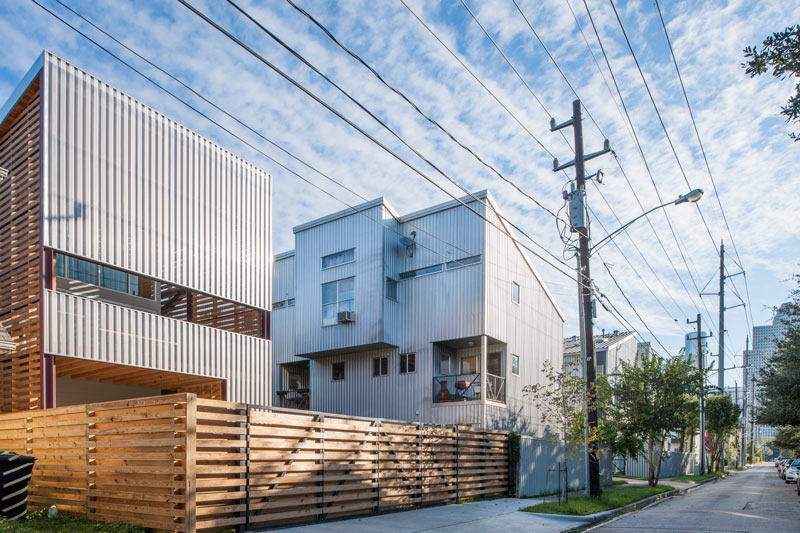
The Chameleon is shown above between a metal-skinned contemporary house and an older wood-sided home. Here’s a view from the back side, which is shorter due to the structure’s sloped roof:Â
***
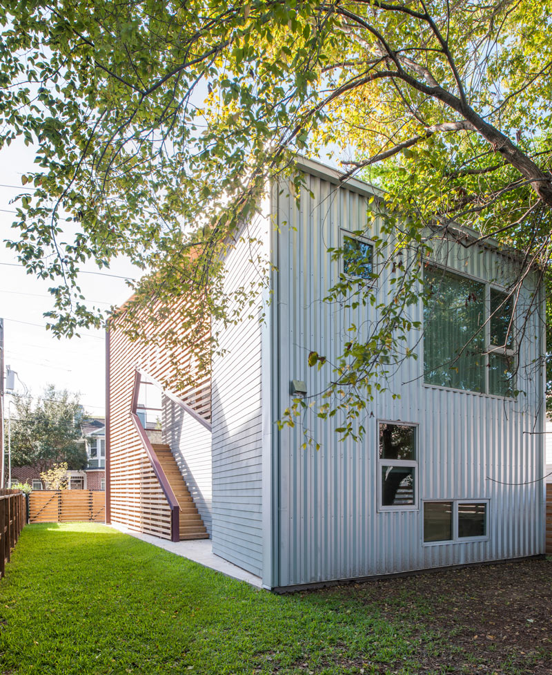
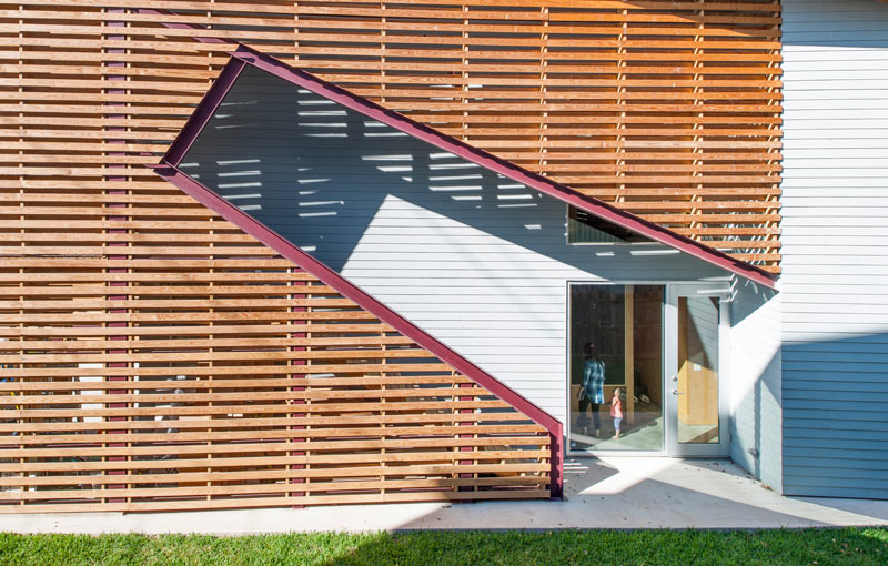
Ng says the house is also designed with shifting seasonal weather conditions in mind — the roof is angled to block out sun in the summer but let it in during the winter, and all of the rooms have multiple windows for cross-ventilation, which isn’t blocked too much by the mesh or by the wooden slats that cover the outside stairs and the side of the home:
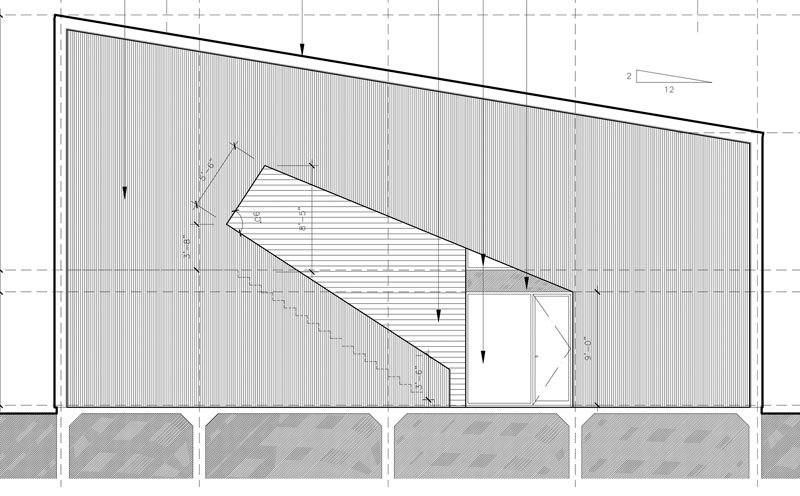
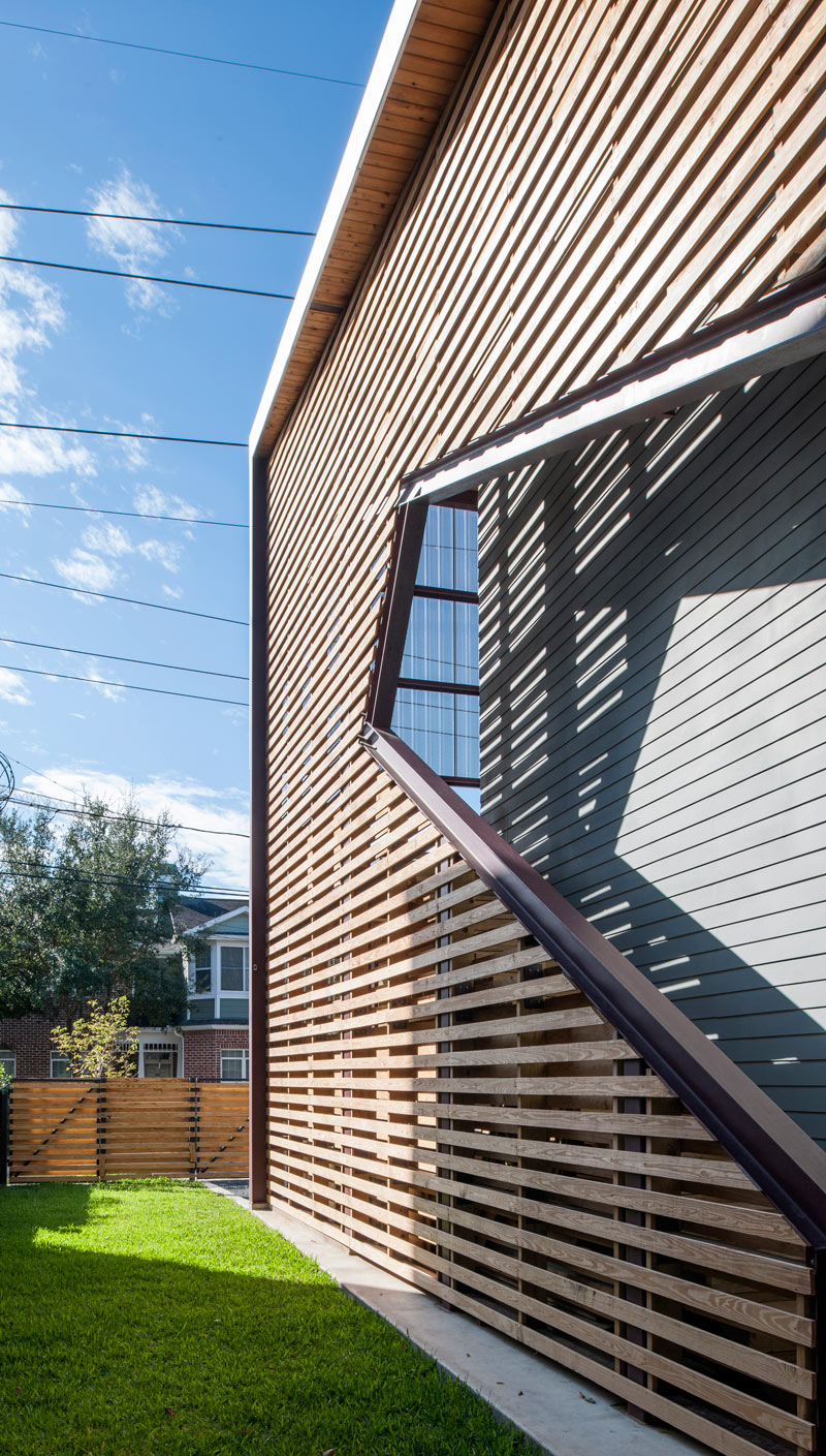
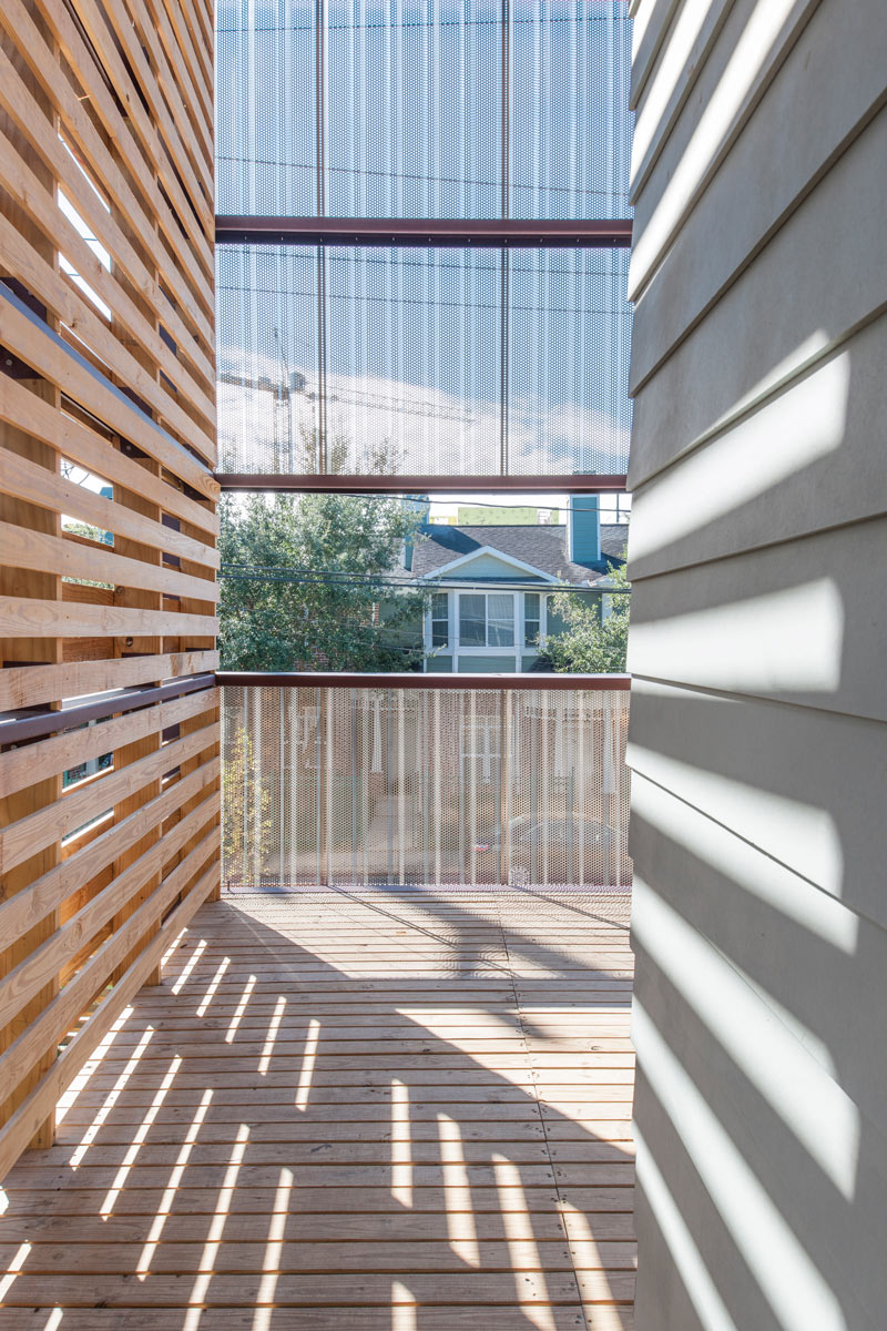
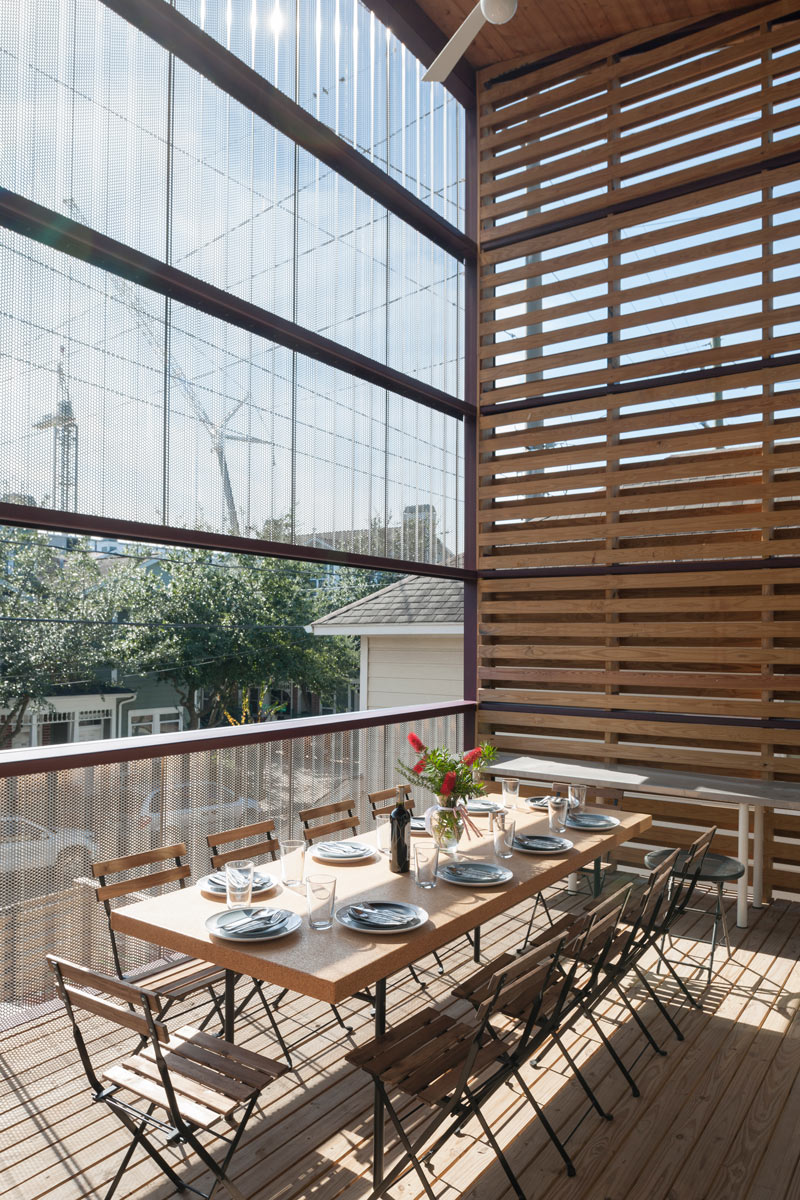
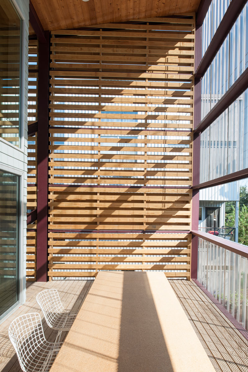
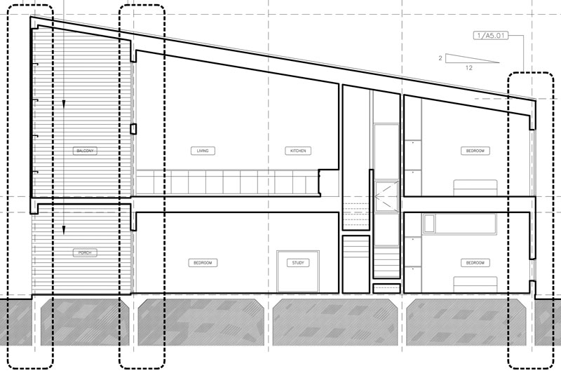
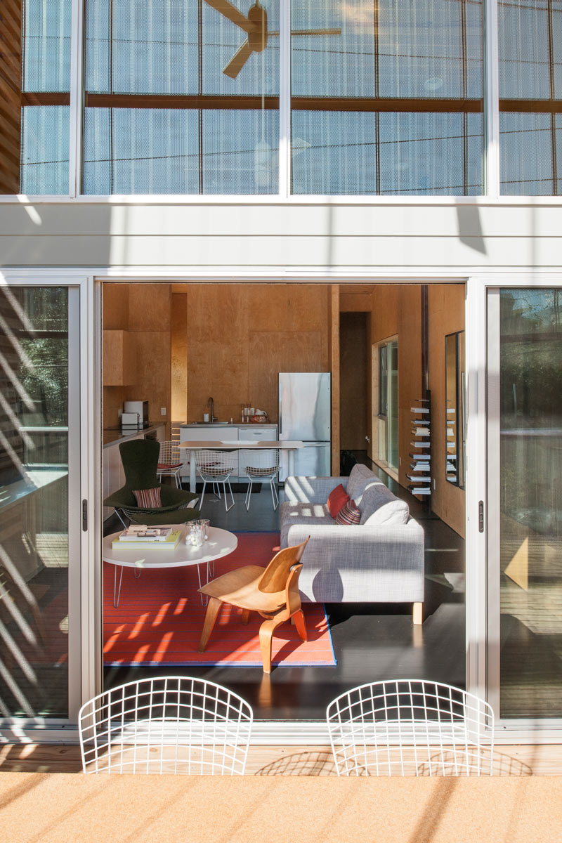
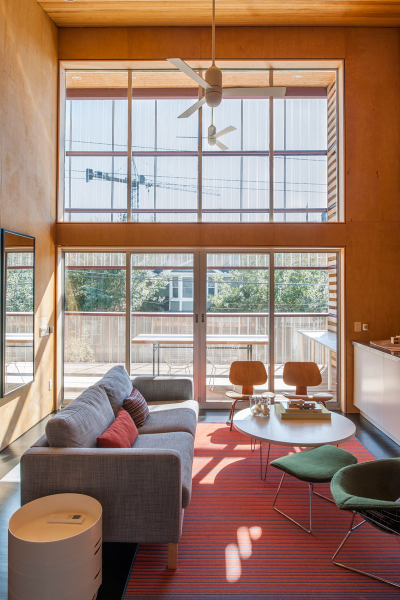
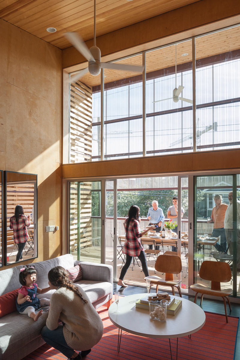
The high-ceilinged upstairs balcony seen here at the front of the house sits atop a much shorter porch, and opens into a living room and kitchen space on the second floor:
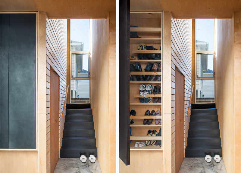
The interior staircase contains some built-in storage spaces:
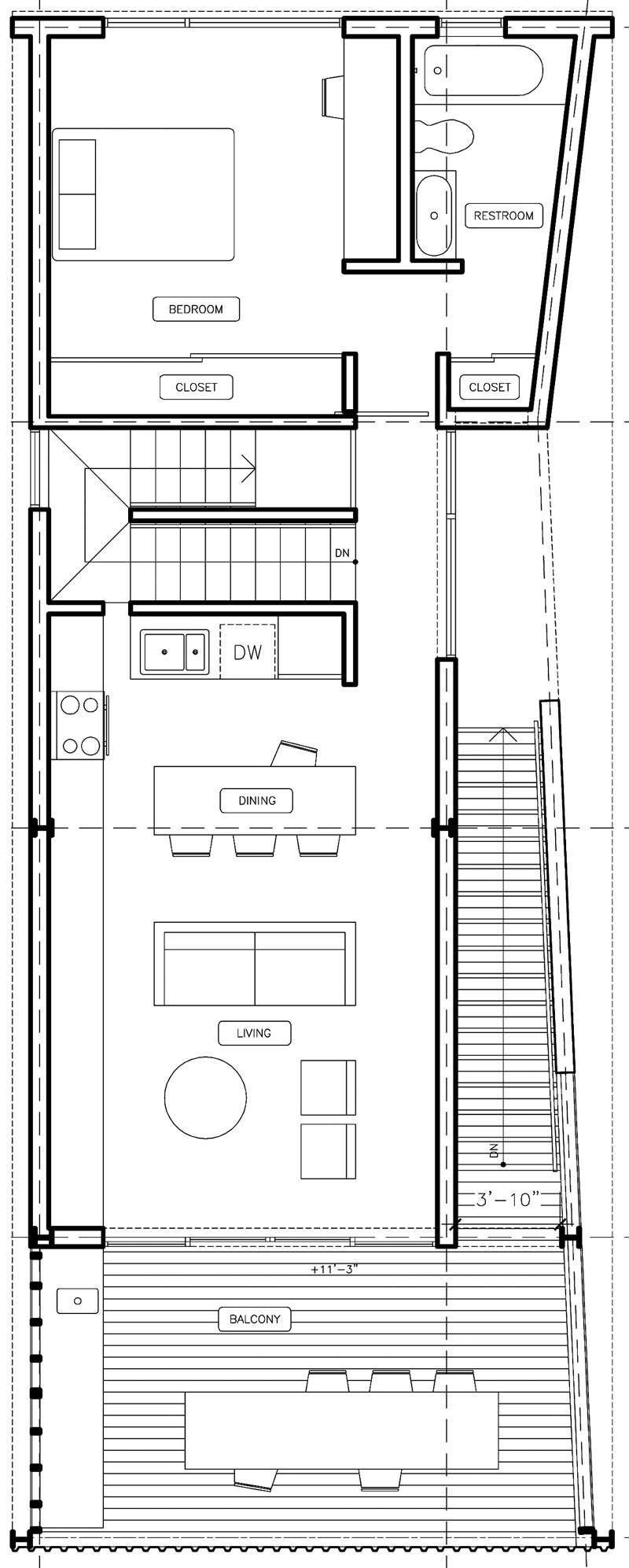
Here’s a look at the upstairs floorplan, which includes a master suite:
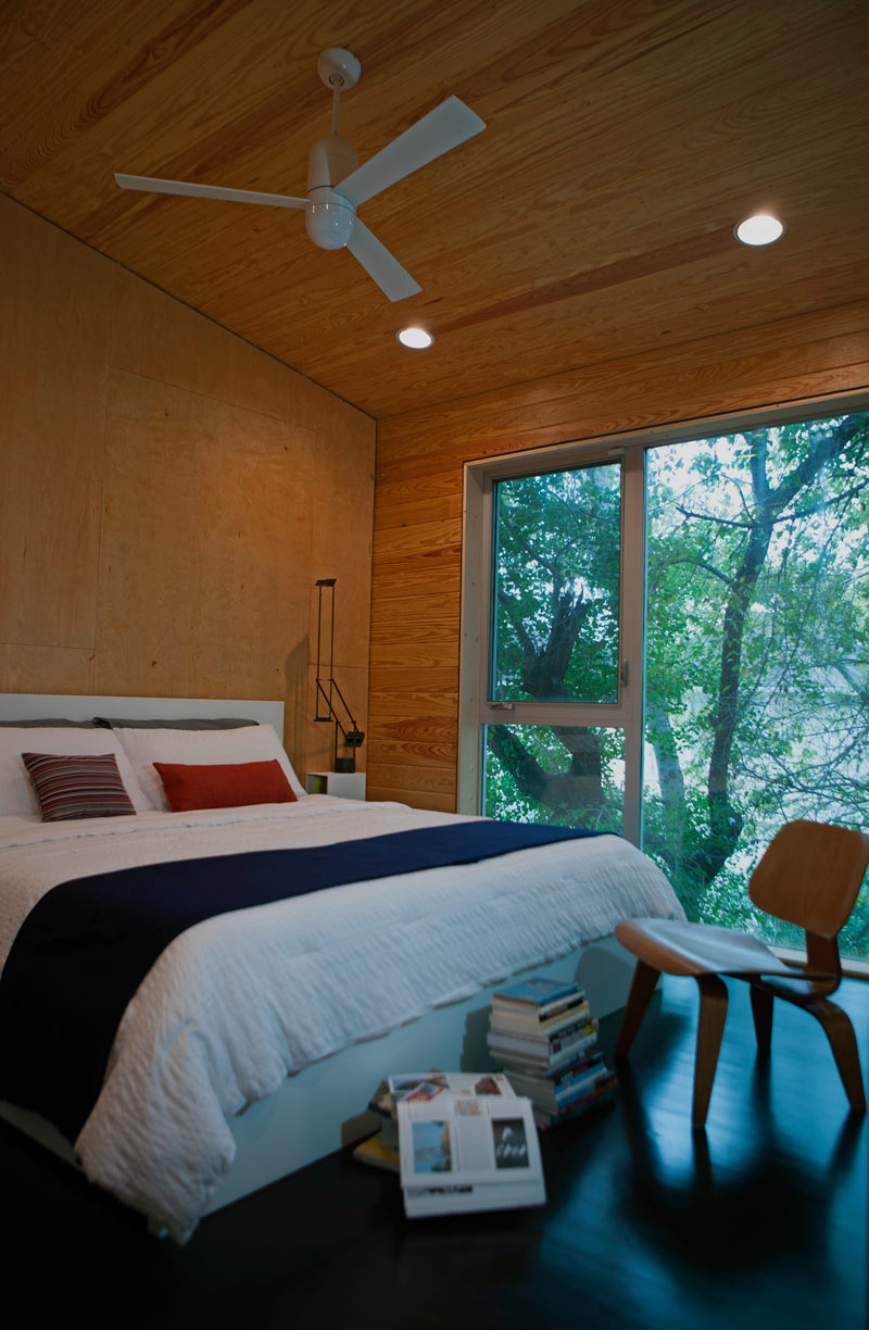
The master bedroom looks out over the back yard of the house:
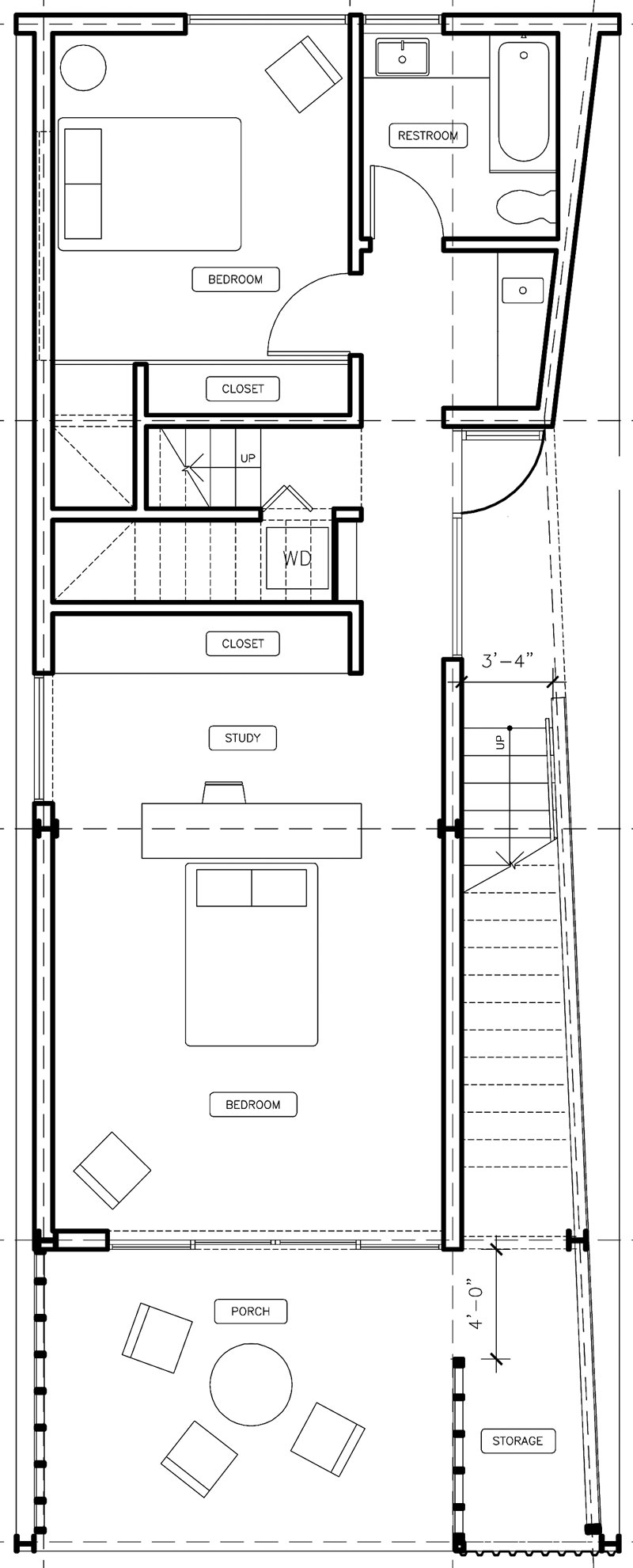
And here’s the downstairs layout, including the other two bedrooms and additional storage space by the porch:
- Shotgun Chameleon [Architectural Record]
Images, courtesy of the architect: Paul Hester (photos), Zui Ng (plans)


Very cool house, but its directly across the street from the housing projects…no thanks
Just looks like a decorated box, do not really see any true architectural innovation. Further, not really a master suite but just another bedroom.
Wonder if the metal skin / mesh provides freedom from intrusive and extrusive cell phone and wireless signals.
Or if the Faraday cage environment is by option.
@JT – I think it’s fabulous that this house is located where it is. Is your judgment based on the aesthetics of the housing projects themselves, the folks who live in them, or both? If it’s the latter, I would argue that a person’s “worthiness” as a neighbor shouldn’t depend on these stereotypes.
Despite the negatives already noted, I give it +100 pts for not being “faux Tuscan,” +50 for not being covered in sheet metal, and +150 for not looking like all the other houses around it. I think the charm in this one is that it is something “different” for a change.
I would consider the 2nd floor layout as a master suite. . .although to make it work as a duplex it would have to lose a bedroom on the first floor to gain a kitchen / dining / living area. A duplex like this for be great for singles or couples with no kids.
@rgrhourgr: “Architectural innovation” is overrated. Most of the principles of architecture for a given area and set of materials are already well understood. Innovation for innovations sake should be avoided.
.
The house looks nice. I’m not sure why it needs the ability to “be adapted to blend in with different neighborhoods” if it isn’t mobile. Also, if it can blend with neighborhoods, why didn’t it blend with the one it is in?
great job! Love the use of vertical wood which is very in style today and cool use of photos of the people enjoying the home, makes the house not look stale. Great selling idea! The builder should be proud of the gem. I’m glad Houston is getting brave and stepping outside the comfort of boring box-style homes that always get build whether the city or the suburbs as it seems that’s all houston builders know what to build.
There’s nothing wrong with the neighborhood, except the drive-through “drug store” a couple blocks north of here, for all the white collar workers that need their fix to help them survive suburban life when they get home. The worst thing about the area are those blasted powerlines, and the never-ending construction on the Dolce Vita apartments that has kept Bailey Street closed for more than a year.
Only architecture professors would like this design for the Gulf Coast. For $200+ per sq ft I would expect covered parking, a swimming pool and less cramped living spaces at a minimum. The house seems to be designed for Southern California, where you could use the porch + dining table year round.