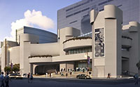
BREAKING DOWN STUDIO RED’S ALLEY THEATRE REDO  The $46.5 million that the Alley Theatre is spending on a remodel drawn up by Studio Red has created a plan that threatens to “muddle” the Ulrich Franzen-designed space’s “magical” effects, writes local architect, homebuilder, and mod fanatic Ben Koush. Though Koush concedes that changes to the main stage, seats, and lighting and sound systems are necessary to meet the demands of more elaborate productions — including the decision to increase the number of stalls in the women’s restroom from 13 to 24 — Koush wonders whether the “smooth, corporate image” proposed for the interiors won’t ruin a good thing: “At the street-level ticketing lobby, the architects propose to cover the concrete floor with terrazzo. Franzen integrated seemingly opposite sensations of closure and openness in a building with very few windows by cutting out strategic and rather large floor to ceiling openings at the entrance and at the upper level balconies. . . . To further this intentional ambiguity he continued the concrete of the exterior steps not only on the floor of the lobby but also on the battered surfaces of the banks of ticket booths. The drama of the red carpet cascading down the upper lobby stairs is [heightened] by the contrast with the humble concrete below. By covering this floor surface, an important part of the design concept will be lost.” [Studio Red; Arts + Culture] Rendering: Studio Red


Thank God someone is calling out this stupid and horrible redesign by Studio Red. The changes to the lobby are very tacky.
Sorry, Ben, but I wouldn’t trust the opinion of anybody who thinks mods are anything special.
Wow, that redesign is really tasteless. It looks like a suburban office building.
Houston sets out to ruin another monument of architectural design with banal blah designed to appeal to those who like drywall and laminate floors. Shame on the Alley for approving horrid crap.
Well, its a shame but to be expected. Its clear the company is not all that inspired or inspiring. The other projects on their web site (computer-generated pictures) might as well be first-year architecture student drawings. No real meaning, just “borrowed drama” from weird lighting effects and other gimmicks.
These days the better architects go for authenticity – would immediately reject this clumsy attempt to layer terrazzo over concrete. That’s just silly.