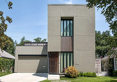
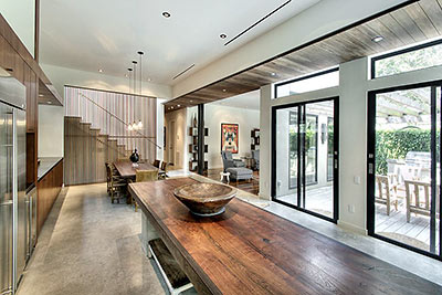
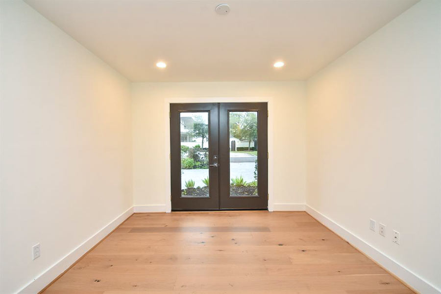
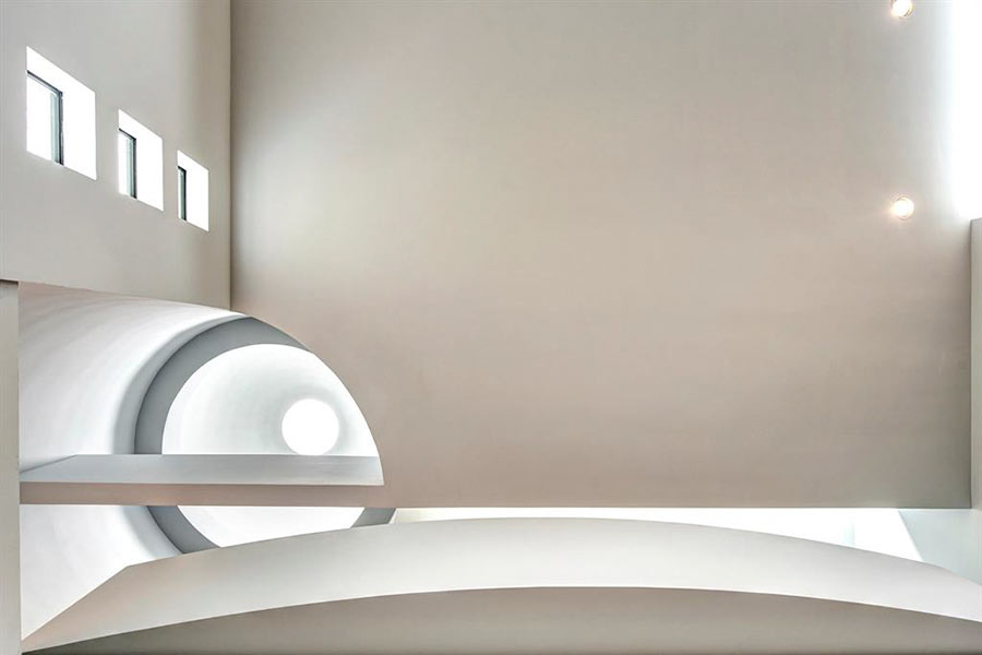
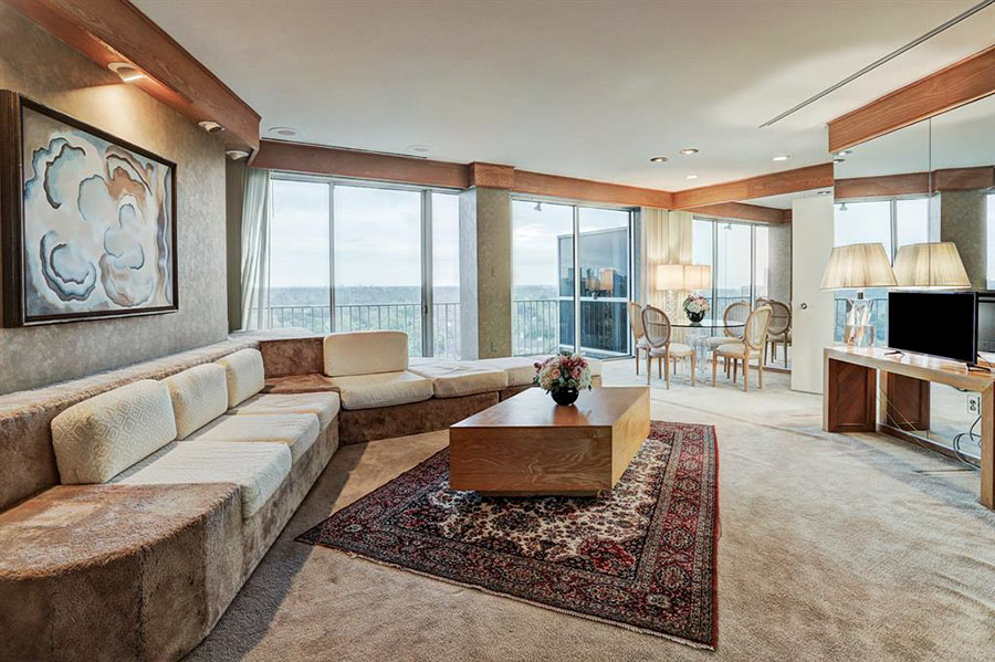
A different style of furnishings and a new set of HDR-ish photos that focuses on the home’s outdoor areas show off another side of Rick Sundberg’s “Handmade House,” which has been up for sale since September for just shy of $1.6 million. Developer Carol Isaak Barden brought Sundberg to Houston to design a couple of high-end Boulevard Oaks-area homes in the late noughts. The listing for 1916 Banks St. credits the design to Sundberg’s longtime firm, then known as Olson Sundberg Kundig Allen. But Sundberg went out on his own while the home was under construction, and it’s now featured on the website of his new firm, Sundberg Kennedy Ly-Au Young Architects.
***
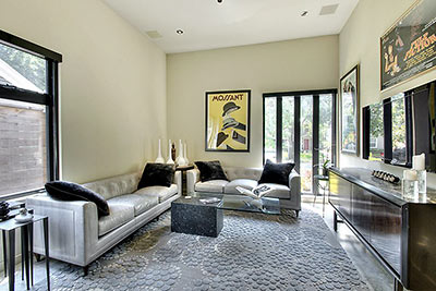
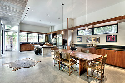
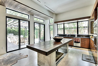
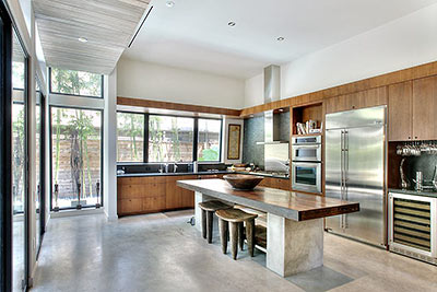
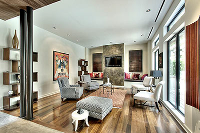
Barden worked extensively with local craftsmen and artists to refine the crisp details of the home, which was built by Mainland Construction and completed in 2010 but didn’t sell until the middle of last year — when it went for $1.35 million. In the meantime, it showed up in the Rice Design Alliance’s 2011 home tour, which focused on Houston homes by out-of-town architects.
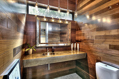
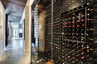
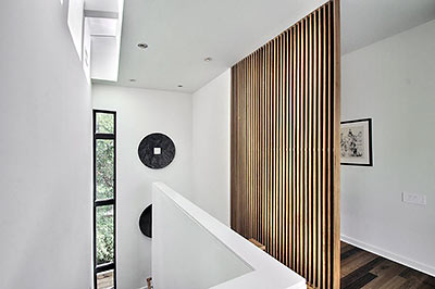
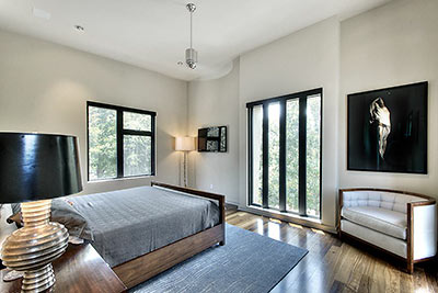
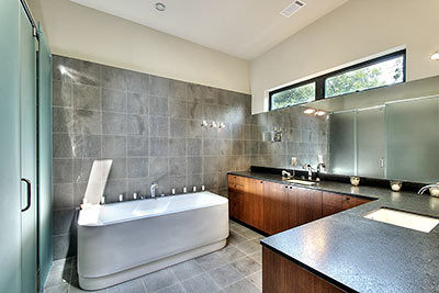
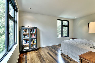
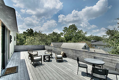
Extensive installations of Brazilian Massaranduba wood are used inside and out of the home, which measures 3,338 sq. ft. but includes another 1,180 sq. ft. of outdoor deck space. Here’s an area for treetop lounging over the garage:
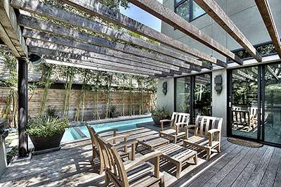
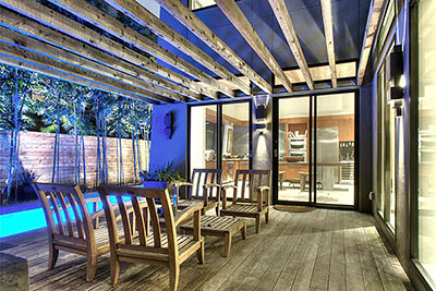
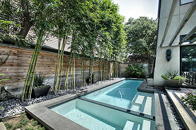
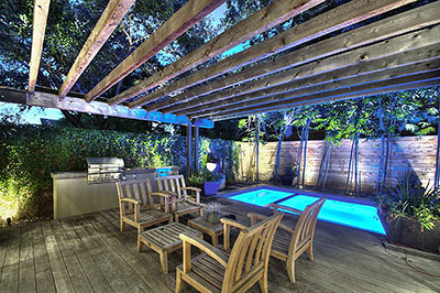
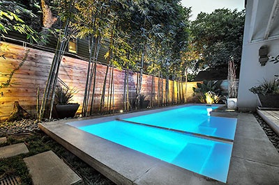
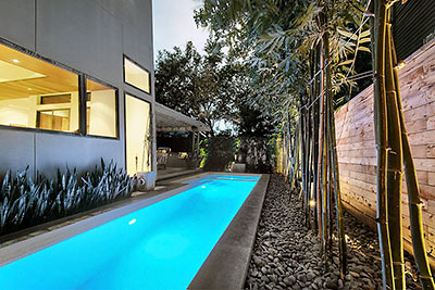
And the space out back, by a small pool:
- 1916 Banks St. [HAR]
- Handmade House [Carol Isaak Barden]
- Handmade House [Sundberg Kennedy Ly-Au Young Architects]
- Previously on Swamplot: For Just Under $1.5 Million, Handmade House Includes Kitchen Sink, Wabi Sabi: Sold!, Inside the Wabi Sabi House, Not Lived In Yet: The Wabi Sabi House


Love all of the wood and hand-made furniture, but what’s with the lack of counter space in the kitchen? I guess the kind of people they are targeting with this house don’t do a lot of cooking?
I’ve been inside this place. Pictures don’t do it justice. It is beautiful, serene, and lux to the max.
I’ve built many homes, can’t say I designed any from scratch, but I fail to see anything special in this one… all it is just big square rooms with square windows, I mean, where’s the “Architecure”?
I have family that lives on this street so I love making fun of this house when I drive by.
The thing sat unsold for nearly two years when it was brand new. They finally sold it for around 1.2 million.
Now after less than three years the current owners think they can get 1.6 out of this over hyped cube? Maybe after another few years on the market.
Don’t worry about lack of counter space in the kitchen, “Drone”. “cause whoever’s maids are hired to work there will handle those inconveniences for everybody, it won’t be a problem.
Wow, have those pics been photoshopped, the colors are so vivid. Cool house, ultra elegant interiors, I too have been in thus house, unfortunately all wrong for the neighborhood.
Is sarcasm a new art or what?
“My HDR goes to 11!”
all the negative comments on this website crack me up.
beautiful home.
House looks pimp, but I had a hard time getting past “Olson Sundberg Kundig Allen” and then “Sundberg Kennedy Ly-Au Young Architects”
This house would be beautiful if it were in the Hollywood Hills or overlooking the Puget Sound off of a bluff. But it looks peculiar on Banks St. surrounded by cute bungalows, English cottages, and a few traditional two stories. It stands out, but not in a good way. It’s like a giant pimple on prom night.
To say this house has no Architectural merit is ridiculous and yes, perfect for Los Feliz, La Jolla,
I’m glad to have learned there is such a thing as Massaranduba wood. Oh, and don’t trip over the animal hide.
Yeah, this is a gorgeous house. I can see that it’s not everyone’s taste, but I can’t understand anyone saying it has no architectural merit. In this price range I would worry about the proximity to 59, though–you’re definitely going to get a ton of highway noise in that location.
I never understood how Carol Barden gets the price she gets for her boxes, I mean houses. And the cheesy names “The Hand Made House” etc. are nuts. Just my humble opinion. Obviously some buyers are drawn to them, and it works.
It’s hilarious to read people complain that this house doesn’t fit into a Houston (American) neighborhood in part because it’s not a faux “English” cottage.
I love the warm, yet open interior space.
In the context of my earlier post, I do not know why people who love modern (or worse, Tuscan or new Charlestonian “architecture”) buy into neighborhoods with a more traditional feel and then place a concrete box or stucco mansion in the middle of an otherwise homogenized street. I know, I know, property rights, blah blah, but the people that commission these boxes and mansions only get to look at their creation as they pull in and out of their driveways, the rest of the time they are looking at bungalows or tudors or ranches or whatever. In fact, I can’t even really see my own homogenized house unless I walk completely across the street and look back because of the orientation of my driveway and front yard, but I sure do see the property across from me all the time and I sure don’t like the view. I guess the answer is for modernists and stucco mansion people to buy the house across from the new build with the exterior you like so you can actually see it or, if you insist on living in the new build box or stucco mansion yourself, simply install a mirror of equal dimension to the house, facing the front of the house, so you can look at your creation while also obscuring the view of the homogenized people that hadn’t planned on your creation when they purchased their homes. Eureka! Problem solved.
Mel, that’s so true. I walk across the street and look at my house all the time. There are a few other modern homes in the area to drive around and look at. Thanks for the laugh.
Dream
@16- Does the simple fact that the cottage isn’t in England make it “faux?” If so, does that make the obtrusive box a “faux” Seattle modern?
Mel, some people love modern architecture. Others don’t. The beauty of a city like Houston is that you can build what you like on your own property.
What you’re proposing is a kind of ghettoization of modern architecture or “Tuscan” architecture, simply because you don’t like to look at it. I’d suggest that the onus is on the people who don’t like diverse cityscapes to move to gated communities or places with stricter building codes. That way, everything can appear quaint, historic, perfect, and without flaws. But I’ll take the weird diversity of a neighborhood like Montrose any day–where concrete boxes rub elbows with bungalows and faux Stucco castles.
I too find it laughable this idea that older neighborhoods must be homogeneous. Has anyone seen Timbergrove (at least the part East of the bayou) where those half brick half shingle ranchettes all look the same regardless it they are plan 1, 2,3, or 4? And don’t even get me started on those ticky tacky frames boxes in The Heights with no discernible style.
What is so wrong with mixing it up a bit? Granted many new homes are of monstrous scale (God knows I hate the size of the behemoth looming under construction behind me)but does a modern thrown in really upset the balance so much? Two blocks of my street in Montrose has a mix of original Craftsmans Spanish Colonials, new Moderns and European McMansions, 1960s Georgians and 1970s soft contemporary townhomes and its eclecticsm makes for a visual feast. Houses are like fashion–wouldn’t it be a boring world if every woman wore a gray skirt and white blouse and every man wore a blue buttondown and khaki pants?
Took a trip to Oak Park, Ill, this summer (part of my trip to Chicago that inspired my windy rant about rail a while back) to check out Frank Lloyd Wright’s studio and take a tour of the neighborhood. It’s an old community of incredibly luxurious, classic 19th century Victorian homes, one after another, and then bam! You see one of Wright’s beautiful structures, and it makes the rest of those lacey get-ups look ridiculous. I’m not suggesting this house rises to Wright’s level of artistry (though I do like it), but I don’t put any special importance on homogenization. The key is to make beautiful houses if you can. If they all look the same, then you’ve basically got the same situation we complain about in the suburbs.
People laughed at Galileo too, JT.
Personally, I don’t give a you know what whether all the houses look the same in the suburbs, in fact “I” think (notice I didn’t say “we”) a certain level of homogeny creates a sense of community. Also, I do like modern architecture, a lot, but in the right environment. When people choose to plop a cold box in the middle of an otherwise estbalished traditional homogenized neighborhood, it really stands out… almost like a middle finger.
Well logically speaking, all Houston neighborhoods are majority “traditional” architecture. A modern would have to be hidden behind a wall on acreage or be part of an all modern style neighborhood in order to blend in. Guess that rules out Galileo Estates…..and every other plot of ground
in the City.
“…its eclecticsm makes for a visual feast.” Could not have written a better line for this civil debate, JT. Bravo! Mel, while I respect and understand your view on the “sense of community”, might I add my view here? Bullocks, “concrete boxes or cold boxes” can be seen as such or can be seen as the neighbor who’s just different. A bit like the gal next door who’s skirt is too short or long for your taste. Jk Haha Though I agree with your thoughts on stucco, or any facade, mansions but only because they’ve changed your shade/sunshine ratio. I feel that’s very unfair and selfish of a neighbor to do anywhere. I may add, as someone who believes in the small house movement, I’m sure your home is larger than your needs and more inline with your wants? IMO I don’t feel like your home is a “middle finger” to the rest of us on this planet. And no, I don’t want us all to live in apts or shotgun homes. I’ve just never grasped the thought process of further out or larger homes anywhere. Wasted water, wasted grass (unless your eating it for salads hehe), wasted gas, etc. humans in general are a tad selfish and wasteful species of the animal kingdom.
JT, yeah, people seem to forget there is a whole other half of the “loop” in which to buy and build. Anyway, who’s to say a homeowner can’t buy an existing house and go modern inside or simply build something not quite so… aggressive? Again, I like modern construction.
Glen, actually I am the proud owner of two different The Not So Big House series of books and live in a rather modest bungalow.
Mel, I’d argue back at you that the general quality of modern houses in Houston isn’t that high. They tend to be white stucco arrangements of cubes, again and again, which is both conservative and blasé. I don’t think the Handmade House is any exception (oh, except the stucco is grey.) Given Olson Sundberg Kundig Allen’s other work–and especially Tom Kundig’s houses–this is a real disappointment. It’s fine as a stereotypical modern house, but there’s nothing really innovative about it.
Houston needs better examples of modern residences–ones that truly innovate at the level of materials, systems, and space. We tend to get the same old thing, over and over, whether it’s Tuscan or modern.
On your other point, you are in fact calling for a ghettoization of architectural types. You say “I do like modern architecture, a lot, but in the right environment.” What’s the right environment? Certainly Montrose seems appropriate for both diversity and experimentation. Does the Menil do it for you? It’s in an “an otherwise established traditional homogenized neighborhood.” As such, it’s a great example of how good (better?) modern architecture can transform a neighborhood completely, without being an eyesore.
So Mel, it is okay to plop a big modern down in The East End or in The Third Ward or 5th Ward or some other transitional area just not in the inner loop neighborhoods with the highest demand? I guess those few people that have Spanish Colonials from the ’20s and ’30s should bulldoze their homes so a more conforming neo-Sears catalog bungalow can re-homogenize the neighborhood.
At first glance I thought this post was about the house at 4710 Yoakum in the Museum District; that one made me do a double-take when I first passed it.
MW, the Menil plays a clever trick with its boundary layer of bungalows, preserved but monochromatic.
JT, there are plenty parts of town where this sort of construction is appreciated or fits. Alternatively, there are some really great examples of modern construction in the heights that aren’t so, oh, I don’t know, aggressive in its style. A lower profile modern made from wood and other natural materials is going to fit in quite nicely with mid century and bungalow homes. You want to argue with me to make some sort of point, but you have yet to actually address any of my points.
@ Mel. You haven’t made any points other than stating moderns are not welcome in certain neighborhoods and that you like moderns. I already agreed that many new homes (of all vernaculars) are out of scale. I’m just curious as to why these new homes are, in your opinion, welcomed to be built in unnamed neighborhoods outside of the one in which you live?
Nice looking home. Mirror in the bathroom is terrible!