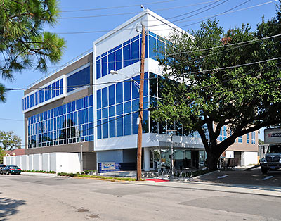
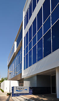
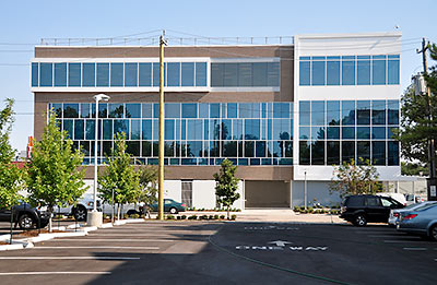
Legacy Community Health Services’ Montrose Clinic building opened last month at 1415 California St., consolidating in its new site the operations of 3 previous locations. The 40,000-sq.-ft. facility provides primary health care services, as well as a dental clinic, pediatric care, optometrists, adult behavior health services, HIV and AIDS treatment facilities, a gym, and — yes — a ground-floor Walgreens pharmacy, all under one flat roof.
***
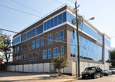
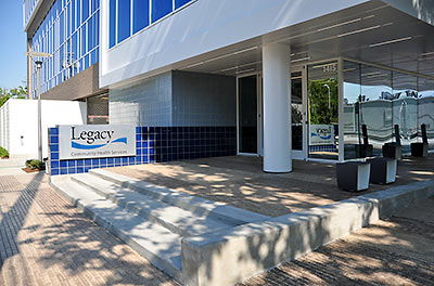
Sited on the former location of the 1415 Club, one block behind the Radio Shack and Nidda Thai Cuisine on Westheimer, the new building designed by Gensler has high-efficiency glass windows facing north, east, and west, shielded from the southern sun. According to Legacy spokesperson Eric Roland, a water collection system harvests rainwater and condensation from the air conditioning system.
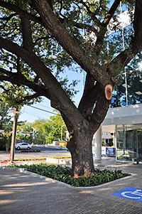 The parking lot just west of the building (there are 3 more — including one for staff located on the ground floor beneath the building) uses brick pavers that allow water to reach the ground beneath. Three oak trees west of the building were preserved during the construction, and now benefit from a specially designed drainage and irrigation system.
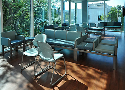
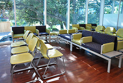
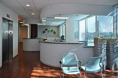
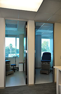
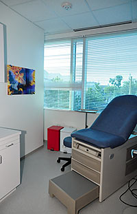 The interiors were designed to provide patients comforting views of the Montrose outdoors. Reversing a common practice in clinic design, the exam rooms all have windows, while the doctors’ offices are nested within.
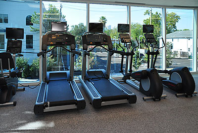
Here’s the “body positive” center, a gym tailored to HIV and diabetes patients looking to build body mass:
 Artworks, like the conference-room painting shown at left by a local neurosurgeon, were donated to the clinic. Skyline Art Services commissioned works by a dozen other artists, 8 of them local, who also donated their works.
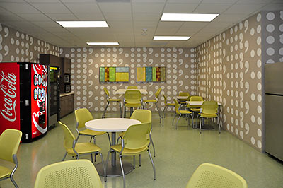
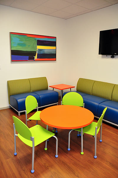
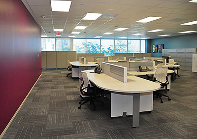
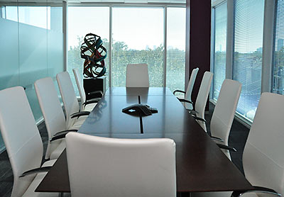
- New Legacy Community Health Services Montrose Clinic [OutSmart]
- Legacy Community Health Services builds a new legacy in new Montrose headquarters [Culturemap]
- Legacy health services grand opening Oct. 16 [Houston Chronicle]
Photos: Candace Garcia



How wonderful to see such a progressive statement in all regards: design and purpose. Congratulations.
Gensler also did the Hess Tower. Excellent leadership in sustainable design.
Love the loud furniture – that is enough to brighten up anyone’s day – even those not feeling well. Too often a medical centre is drab and as a consequence the people sitting in the waiting room have a drab look also.
The doctors are off to a great start here even before the patient sits down…
The only problem with this building is the back of the building facing Westheimer is poorly thought out. It looks horrible.
What a great building. I really like the interior design and layout, though the exterior looks a bit thrown together.
Cool looking building. Glad to see it finished/open
A welcome addition to the neighborhood.
perfection…..congratulations
Thank goodness they SAVED the trees: the lame COH NEEDS to pass a Save the TREES ordinance that would prevent any further CUTTING down / DESTRUCTION of the trees we have left.And another ordinance that requires any new/updating of off street driveways be done with the paver bricks that allow water to drain through ,instead of running into the gutter/storm drain .I would love it if architects/interior designers QUIT using that gross/boring/bland/vile/atrocious avocado /puke green on furniture(see pics of the large waiting room ; the break room pic w/CocaCola machine)..It is depressing putrid – I know some self important architects /designers deign it one of the important colors which PROVES they DO NOT know what they are doing…..I DO like the brighter ,electric green(see chairs around bright orange round table);people are coming to this clinic with living threating situations and anything t o even temporarily brighten them up for even a little while would be helpful. I like the sculpture in the corner of the board /conference room & the colorful abstract painting in the room w/ the bright orange round table.Love the LEED features of this bldg. And of course the mighty old oaks are the icing on the cake. Thank goodness someone MADE sure they would be SAVED !!!!!