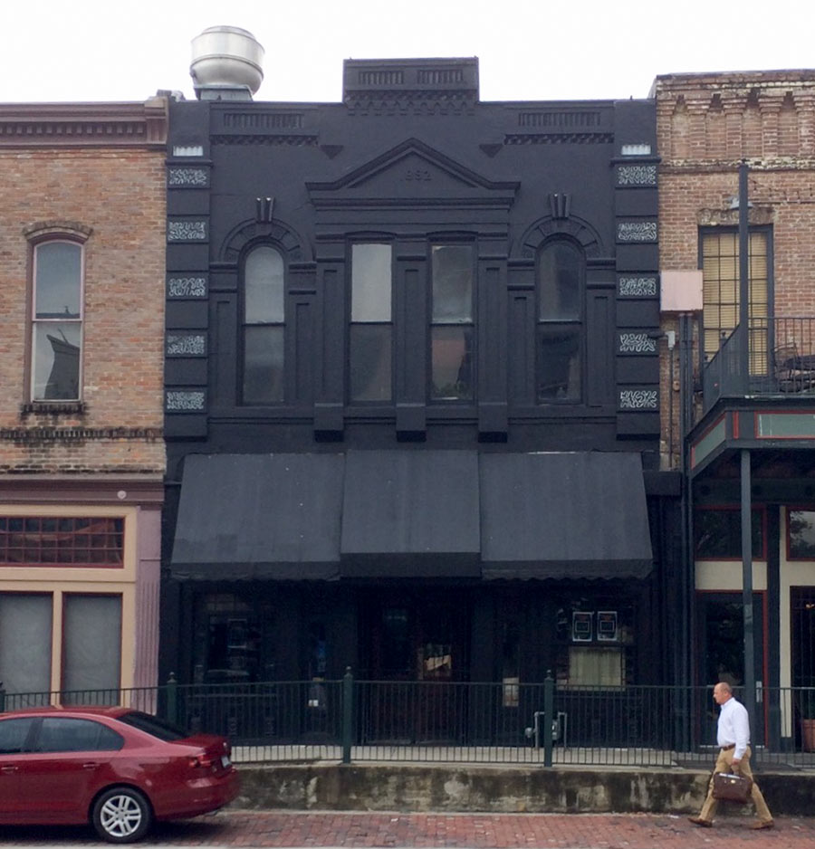
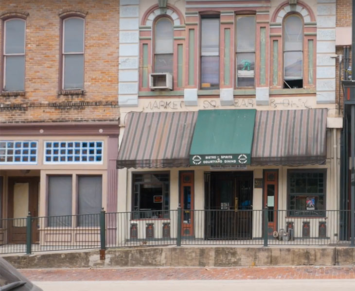
After and before views show off the dramatic change of face that’s transformed 311 Travis St. as part of the prep-work for its new Tiki-themed bar occupant Kanaloa. The monochrome makeover began on the lower façade a few weeks ago before proceeding upstairs where it wrapped up last week. “We want this to be a hidden oasis in downtown,” the venue’s owner told Eater in March, hinting at plans to renovate the 126-year-old Alltmont Building. Its canopies, window arches, and pediment are pretty well-hidden now — though the building does seem to stand out a bit as a whole amid the row of adjacent lighter brick structures fronting Market Square Park.
When Kanaloa opens, it will pick up where Market Square Bar & Grill — pictured below — left off last year:
***
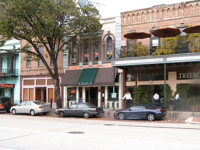
Photos of Kanaloa: Swamplox inbox. Photos of Market Square Bar & Grill: Downtown Houston Live (close); Robert H. (far)


What a monstrous thing to do to an historic building. I will never even consider going in that hell hole
That bar takes “getting blacked out” to a whole new level!
Just F’in Awful. Are they leasing the space or do they own the building itself ? When did Tiki bars go dark ? That hardly evokes a sense of Polynesia.
I walked by and peaked in the other day. The interior renovation looks cool. This paint job is absolutely hideous . Pretty similar to 410 Main St around the corner when that bar changed hands. Still, if they make a good Mai Tai, I’ll probably be in there.
I hope they make good use of the backyard patio area. Otherwise, I agree, this paint job is just wrong.
C.L. wrote: That hardly evokes a sense of Polynesia.
Post H-Bomb testing, maybe.
Why, just why people… Just when I thought this town couldn’t care less about architecture and/or historic preservation and respect? I get one upped.
Well played ‘H’, well played.
Ooooh! How edgy!
That looks awful.
.
And what’s up with the proliferation of tiki bars everywhere around this city? They seem so out of place here, especially in downtown. This fad cannot die out soon enough.
Y’all need to get a grip. The brick was already painted those gross faded pastels, they can repaint it all they want at this point without any loss of architectural integrity. FYI, repainting a hundred-year-old building and keeping it in use is the best thing that any city can do for preservation. Get over yourselves.
That’s horribad terrible. Can’t wait for the tiki bar’s inevitable flop.
I kinda like it. It’s got a little goth/haunted mansion vibe going on.
Actually like it. Should be a great addition. Don’t confuse Tiki/exotica with Jimmy Buffet
T/Beach Party. Dark, mysterious and exotic is the goal.
Can not wait. It’ll be a great hit. Watch.
what in god’s name…Then again, if we saved more historic buildings, we’d know that this is dead wrong
Maybe people will think it’s an alley at night and walk right into it (I think that’s their plan).
Ah, tiki bars. Where someone else’s religion is used to market rum.
Did the Addams Family move in?
I like it
If you don’t have much money to spend and you’re sitting next to that place with the patio’s next door I’d try to do exactly the same thing.
.
It calls attention to a building that is otherwise bland and completely drowned out by it’s neighboring re-development. If passing by I don’t know who would even notice this building without turning the entire awning into a giant tacky sign.
.
This is a better eye grabber and gives you tons of great lighting options.
I can imagine a painted brick exterior in black that would look super cool, clean and modern. I don’t get why they painted the old awning? Replace it with a new all white or cabana stripe awning, add some natural greenery via landscaping (ivy, topiary, etc.) and finish with some exterior statement lighting. Voila! the place would look amazing (all at a relatively low cost)
***** The current effect makes it look like it caught on fire and as soon as road runner taps it with his beak it will fall to the ground in ashes. Meep Meep.
I like it. Sets it apart from the attached structures.
Gawd, that’s hideous. What a shame to do that to that building. When will the shroud be blasted off to reveal the original brickwork again?
@ joel
“a building that is otherwise bland”? Are we looking at the same building? This is one of the most ornate 19th century structures remaining in downtown Houston. If anything, the flat black paint obscures the architectural details.
I’m reminded of the former Houston Sign Co.’s building on Westheimer which was also painted flat black and barely registered on anyone’s radar. When Slick Willy’s took it over and gave it a more appropriate paint job, it was like seeing Lazarus raised from the dead.
(And what’s up with painting every other quoin with those wacky-ass white designs? Rookie mistake.)
What is with so many restaurants and bars going with a dark grey or black exterior? Now defunct Southern Goods, Snooze on Durham, and this one downtown. Not appetizing or inviting. Reminds me of Numbers. Dark colors hold heat, increase A/C costs.
Black, white, and fifty shades of gray covering buildings, houses, and cars… color can’t come back soon enough.