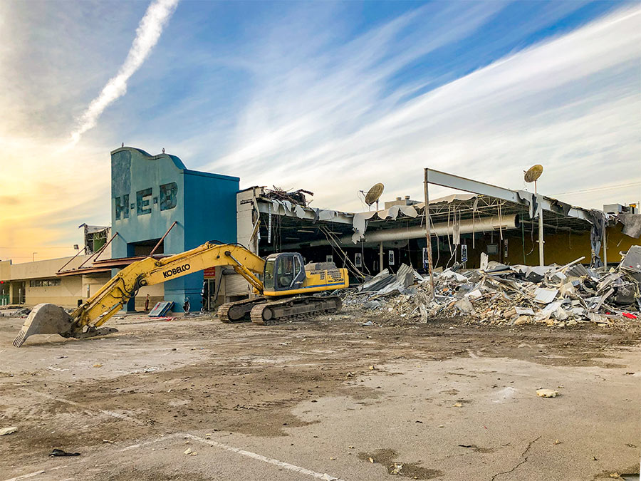
Update, 5:14 p.m.: Today’s demo is just of an exterior canopy. But the entire building will likely be demolished next month.
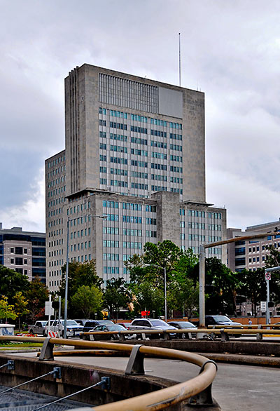
The Rice Design Alliance is reporting that M.D. Anderson has begun tearing down the former Prudential Life Insurance building at 1100 Holcombe St. in the Med Center. Since 1975, it has served as the “Houston Main Building” for the medical institution’s campus. The 18-story limestone tower was constructed as the centerpiece of Houston’s first suburban office park in 1952, from a design by Kenneth Franzheim. For almost 10 years, the M.D. Anderson Cancer Center has been floating plans to knock it down and replace it with a new medical facility. Got any pics of the action, or images of the building’s notable interior to share? Send them in! We’ll publish updates as we get them.
- Prudential/Houston Main Building [arch-ive.org]
- Preservationists oppose plan to demolish historic building [Houston Business Journal]
Photo: Candace Garcia


Sad to see this one go. Really a beautiful building. Hopefully what they put in its place will be significant.
Was it really so bad they couldnt have just sandblasted the exterior and updated the interior?
I bet they put up a gaint stucco building.
There was actually a lot of discussion about this a few years ago. IIRC there are simply too many interior structural walls in the wrong places to be able to convert the interior into the kind of clinical and treatment spaces they want. Remember it was built to be insurance offices, not doctors’ offices. I think there are other issues with plumbing and electrical capacity also.
Are they going to keep the sculpture in the front at least? That seems like the most sensible thing to do.
What a waste. A stunning bldg. Would have made such an awesome dorm (something the TMC needs), hotel (again, something the TMC needs more of), or even condos/apartments (location can’t really be beat for health professionals or short term stays).
The last round of bldgs. that MD Anderson has constructed fall WAY short of the beauty this old gal is graced with.
One man’s “icon” is another man’s eyesore.
If if were worth keeping it would have been kept. A property owner–even one as rich as MD Anderson–doesn’t tear down millions of dollars in improvements and spend tens of millions more putting up new improvements–if they have’t run the numbers a hundred different ways.
And when you’re having major surgery or chemo, you don’t really care what the history of the building you are in is–or how beautiful or ugly it is–you just want the best treatment and the best doctors possible. I’d rather be cured in a Brutalist vault than die in a Beaux Arts temple. :)
The funny thing about Houston is that there is such a dearth of interesting or important architectural landmarks that we tend to mourn that loss of ANY building even remotely interesting or unusual. And the fact that most of the new buildings going up are so generic and boring only adds to the dread we feel when we see the wrecking ball swinging from a crane around town.
Houston never learns. Just knock it ALL down and be done with it.
Jared: I hate to see old buildings go but this paragraph of your comment might be the best thing I’ve seen on swamplot.
.
“If if were worth keeping it would have been kept. A property owner–even one as rich as MD Anderson–doesn’t tear down millions of dollars in improvements and spend tens of millions more putting up new improvements–if they have’t run the numbers a hundred different ways.”
“The funny thing about Houston is that there is such a dearth of interesting or important architectural landmarks that we tend to mourn that loss of ANY building even remotely interesting or unusual.”
Well, there is a saying that 100 miles is a long distance in England, and that 100 years is a long time in the United States
Although I am a huge proponent of keeping architecturally significant buildings intact and committing to their re-use, this building is an exception. I worked on some interior spaces in this building and although it was beautiful on the outside (as beautiful as a limestone monolith can be) the interior, with the exception of the first floor was awful. Low ceilings, large thick structural walls and narrow passageways gave it a feeling somewhere between a habitrail and a cave. It is also loaded with asbestos. MD Anderson is committed to keeping functional buildings, as they showed by adding to to top of the existing Alkek tower last year, rather than tearing it down. Houston Main Building really did have to go.