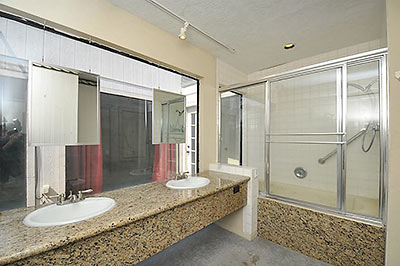
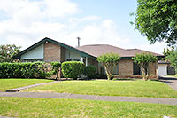
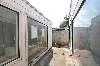
 A reader asks us to check out the views from the large windows in the master bath of this 1959 Woodshire 4-bedroom. Looks like you can see out, across a little inside court to the red curtains of . . . the master bedroom? Oh, and back atcha! Similarly, uh . . . inspiring views from behind those red curtains, into the bathroom and shower:
***
Interested in taking a peek at this 3,400-sq.-ft. mod yourself? It’s been on the market for about a month, for $350,000.
- 4031 Leeshire Dr. [HAR]


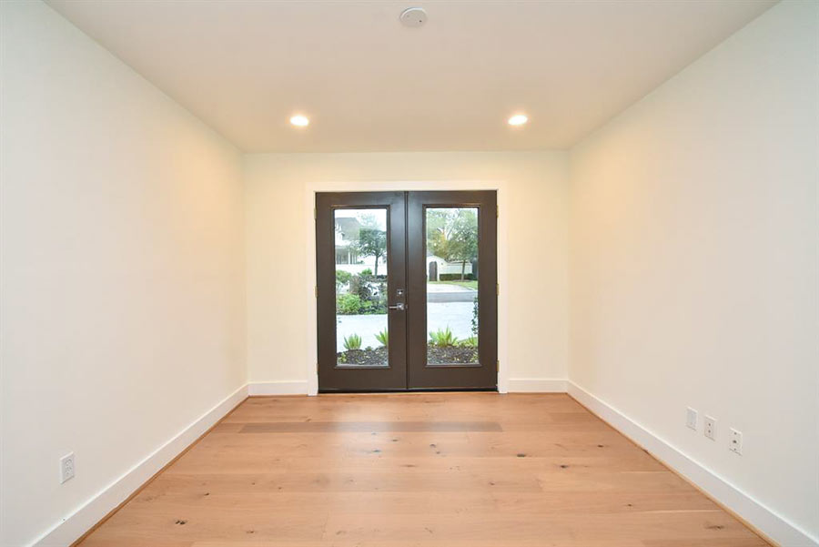
The downside of memorializing…whatever kink this is in the design of your home is that people figure out about it when you move out.
At least, I assume nobody would do something this weird on spec.
Ick – one would think someone could be bothered to spackle some holes and clean the carpet.
Why?
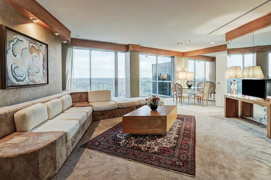
I want to say this was probably originally a 5th bedroom or something converted into a master bath (as MB’s never appeared to be this big in the 50’s). It also looks like from the ariel view that there were some additions made to the house at some point. The design to me makes me believe it was originally a 3/2/2, converted, probably in the late 70’s given some of its disco flair in other rooms.
So why the blue wall in the bedroom?
Actually, I think the mirrors floating in glass concept is kind of cool. Maybe for a house with a VERY secluded exterior or out in the woods somewhere – but yeah, facing the bedroom is a little strange. Who wants to look out the window and see a headless and bottomless torso standing at a sink brushing their teeth? Is a belly button that sexy?
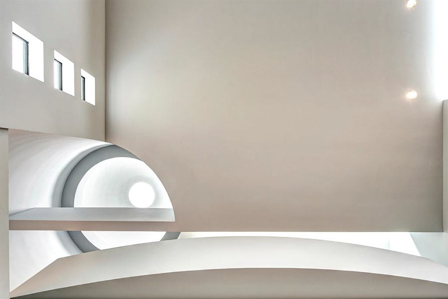
To be honest…other than that master bedroom/bathroom (one of the oddest things I’ve ever seen), the house does look cool, like that round skylight. As for the master bathroom, it looks like it was an add-on. Maybe it started out as something else and got re-purposed as a bathroom, I don’t know.
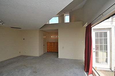
I went to the estate sale. It’s a late 1980’s add on to a 3/2. The MBR/MB occupy what was the back yard with some additional space added to what was the breakfast room as well. I think the plans said Bailey Architects did the addition. Very post modern. The bed in the MBR sat against the big blue angled wall, with storage behind. And yes, the carpet was filthy.
I also went to the estate sale there. I was actually quite charmed by the living areas and kitchen. The Weird Blue Wall was a bit confusing but I liked this house quite a lot in spite of some of it’s quirkier aspects.
The owners either have (an) incontinent dog(s), they are BIG spillers of brown substances or they change the oil in their cars inside. That carpet is disgusting. When I saw that first photo of the MB, I mistook it for a concrete floor with oil stains and wondered why the flooring had been left unfinished.
So THIS is where the architects in Australia got their inspiration. The disturbing lack of privacy between master bedroom and bathroom is a feature in many high end residences here. No doors between the bedroom and bath – often glass walls with full visibility to bath, shower, and sinks. There really is such a thing as TMI about your bed mate.
Isn’t that the Brady Bunch house?
Sold!