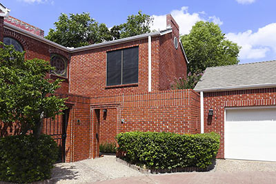
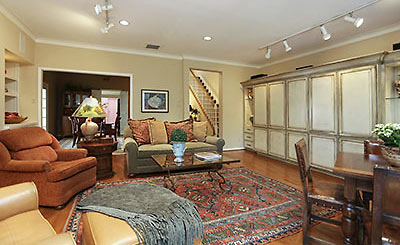
In the earlier waves of West U’s great residential reboot, before the 21st Century stucco surge, ruddy brick finished out a fair amount of the city’s new housing. The townhomes of Rutgers Place, for example, worked bricks, bricks, and more bricks into the development’s exteriors, fencing, and patios. An oft-updated corner unit in that street-straddling enclave, which dates from 1981, popped up on the market last week. Asking price: $484,500 — plus a $120 monthly maintenance fee.
***
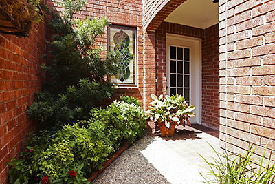
The home’s courtyard entry (above) is off one corner of a cul-de-sac within the 18-home development. The entry’s ceiling tones off the courtyard wall, visible through the glass panels of the front door. Stained glass in the powder room also catches southern light.
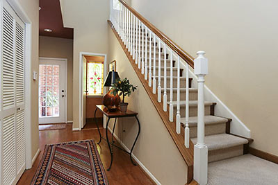
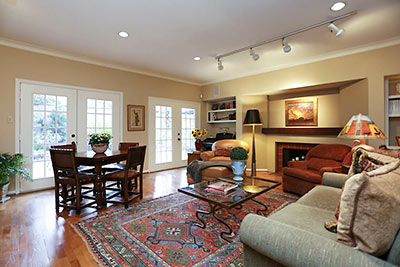
In the living room, rustic tiles in the fireplace surround add a little red clay to the space.
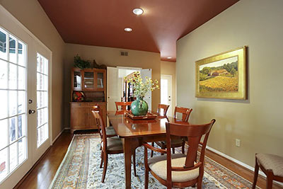
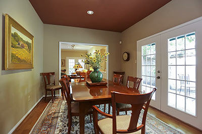
The appetite-inducing red of the dining room ceiling continues the front hall’s bleeding edge:
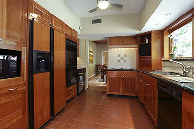
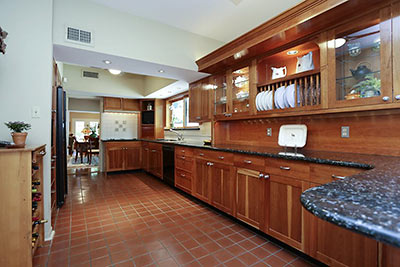
In the kitchen, earthen red undertones are underfoot and (indirectly) in the cherry wood cabinetry installed as one of many updates over the years.
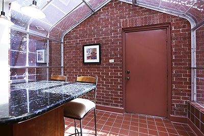
A glassed-0ff space off the kitchen’s breakfast bar added a greenhouse effect at some point; its enclosure appears to end at the exterior wall of the 2-car garage.
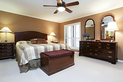
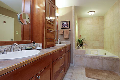
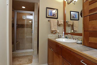
The 2,324-sq.-ft. home’s second floor has the bedrooms. Here’s the master suite, its double-sink bathroom updated:
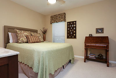
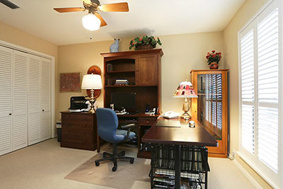
The two secondary bedrooms . . .
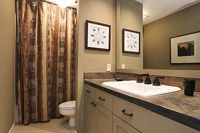
share the second full bathroom, also redone:
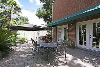
Outside, the larger of the 2 patios runs along the north side of the property:
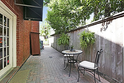
The narrower patio, located off the east-side dining room, abuts a single-story (for now) single-family home.
Rutgers Place sits behind an ivy-covered brick wall on the north side of W. Holcombe Blvd. near Buffalo Speedway and across from St. Vincent de Paul Catholic Church.
- 7 Rutgers Pl. [HAR]


How come masonry fire breaks (like this complex appears to have) are no longer required in common wall townhomes?
I toured this house this weekend, and you should definitely use the words “updated” and “redone” loosely. Nothing about the kitchen or bathroom sinks says anything more recent than 1991.
This is nice. It could use some accent colors. I like brick, personally.
Per HAR today, OPTION PENDING now!