
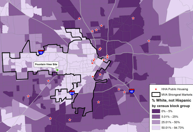
The pale arrow pointing from W. Beltway 8 to Downtown in the map of Houston above is made up of census blocks recorded as more than 50 percent white, according to a post by Will Livesley-O’Neill for Texas Housers yesterday. The Austin-based nonprofit, which researches low-income housing policy around the state, published yesterday’s article as a followup to some previous posts about the mixed-income housing complex that HHA is planning for the site of its own office building on Fountain View Dr. in Briargrove. The demographic breakdown on the other 3 shades shown on the map, from lightest to darkest: 50 to 25.01 percent white, 25 to 5.01 percent, and 5 to 0 percent.
The map also marks the locations of existing Houston Housing Authority public housing developments as red stars, mostly outside of or skirting the majority-white census blocks; the proposed Fountain View housing site is singled out, tagged, and marked with a green star. Meanwhile, the black outline looping mostly around the majority-white areas is lassoing the market areas deemed strongest by the Reinvestment Fund‘s Market Value Analysis for the city.
- Video: Anger over proposed public housing in high opportunity Houston neighborhood [Texas Housers]
- Previously on Swamplot: The Mixed-Income Housing Project That Would Replace Houston Housing Authority’s Own Office Building in Briargrove
Map: Texas Housers
I’m not sure what I’m supposed to be outraged about here. Let me know and I’ll jump in.
Although this piece and accompanying map doesn’t make an important distinction between the approximately 3,000 public housing units developed using an old model and an additional 3,000 relatively new units located in mixed-income communities whose financing includes public-private partnerships through the use of tax credits —- all 6,000 owned by the Houston Housing Authority — it is a fairly objective representation of last week’s meeting. The authority’s next step is to honor the purpose of the meeting and answer the many questions asked including, especially, project cost and value. Given time constraints, the meeting’s format was present and then listen —- with answers to follow.
@commonsense -This project is in fact within the pale arrow and not ensconced in a grape jelly zone.
Pointed EAST!
Map pretty much shows Houston as a diverse place. Even the light areas or only 50% white at the higher end…
Agree with commonsense, no outrage here can be found.
The pale arrow points east. Sorry but this super confused me when I began reading the article.
Wow, where I grew up at Parker and 45 ( born at Parkway Hospital) it’s not white anymore. I guess those guys at Sam that beat the hell out of me at Airline Skate Rink for “stepping on their Stacys” are laughing now.
Good catch, Amory and John – it’s been fixed!
Coming from an area of town with 3 of these stars close to my home, we can pinpoint with 90% accuracy where the folks that break into our cars and homes come from. Problem is HHA will not do anything about the residents, even when we track them down on camera and video tape them in the act. Look for crime to spike in this area and residents to lose value / move
Has anyone seen the maps for other major cities in Texas? The Texas Tribune ran them back in 2012. http://www.texastribune.org/library/data/tax-credit-housing-locations/. With the exception of San Antonio, all the major cities in Texas have segregated their low income housing to poor, non-white areas.
.
For giggles I looked up the two big housing advocacy groups that have been vocal on the Fountainview project. John Henneberger’s group (the Texas Low Income Housing Information Service) in Austin and Betsy Julian’s group, (the Inclusive Communities Project) in Dallas. Neither of them have low income housing in their census block, though to Ms. Julian’s credit there is housing in the surrounding blocks. John Henneberger’s office is firmly in the white, housing-less part of Austin.
.
You all can draw your own conclusions on that.
It may be instructive to see maps that provide an overlay for “opportunity” in different forms. Variables such as household income broken out by age of householder, adult educational attainment, the proportion of single-parent households, standardized test performance metrics, high school dropout rates, and commute times to work might provide better indicators than simply “% non-Hispanic white”. Which…I mean, racial segregation is unpalatable, but look at Fort Bend County’s demographics and it doesn’t seem like Asians are at any race-based disadvantage, and to the extent that Hispanics are disadvantaged, its something that occurs in some places and not others and so other factors are clearly more germane to the issue.
I agree with Niche. I was thinking about it when I was looking at the maps for San Antonio. Unlike most US cities, San Antonio has a lot of wealthy Latinos. So while they don’t have affordable housing in the handful of census blocks that are majority white, they do have housing in wealthy, non-white areas.
.
It would also be interesting to see a map with layers that indicate parks, grocery stores, transit, and other important neighborhood features, along with subsidized housing. Oh to be in grad school again….
This is just a liberal guilt trip because people don’t want to live next to housing projects. People naturally aspire to get away from the problems associated with low income areas. The reason the nice areas are nice is because people are doing that. The social engineers want people of different incomes living side by side to create a more upwardly mobile society. But, this does nothing to achieve that. Putting people in a project down the street from mansions in no way serves a higher societal goal. It just ticks off the people who see crime increase
One can look at this map as completely racist and a war plan by the social justice league. Let’s look at statements made in the media… all the societal ills today are fault of rich people, most rich people are white people… in order to fix inequality, social injustice, or whatever the term de jeur is, the offending group needs to give up some of their privilege… Lets create a map outlining the enemy camp position and shame them in public for having more and better stuff, and now let’s plan precision strikes at their camp by forcing projects that will take away their property values, school positions for their kids, and general peace in their community.
—
That was exactly what the Social Justice League thinks unwrapped from it’s PC wrapper and convoluted justifications of their actions.
Nice color scheme.
This is meaningless without context. A map of 2010 census tracts means nothing without historical information on those same census tracts, available updated demographic information, the construction date of each housing project, and the type of housing project. Only once you provide that information can you begin to have a meaningful discussion on the impact of any new development.
there’s also two that are planned to be built in the East End. One on Harrisburg, and one on 45 near Cullen.
.
The NPR article I read today was pretty good at marking these people for what they are.
.
there are plenty of apartments being currently built, or planned to be built on Fountain View. over 700 units, yet this particular one which will house poor people is the only one being fought against.
.
It helps paint a pretty clear picture of specifically what they are fighting against.
.
https://www.houstonpublicmedia.org/articles/news/2016/03/16/141560/some-galleria-residents-oppose-plan-for-a-mixed-income-apartment-complex-in-the-area/
for the record, our authority doesn’t rely exclusively on race based mapping as it makes decisions about where to build. although “racial diversity” is one of the components integral to obtaining HUD’s approval for our use of funds, we have been somewhat —- not entirely successful — in getting HUD to look at and judge our authority’s activities as a whole versus on a project by project basis. in that context, we have obtained permission to build in Independence Heights and hope to obtain permission to build in Acre Homes. (we’re also building in the Fifth Ward) further complicating HUD’s review and approval on a site by site basis is their mapping tool doesn’t work well in a majority minority city like Houston. it also doesn’t appropriately, in our opinion, weigh the Hispanic community’s impact on “diversity.” as we (those of us who live in Houston) know and as alluded to above, our city’s Hispanic residents represent some of our wealthiest families and some of most impoverished. even the census bureau struggles with what to do with citizens with Hispanic surnames. mapping diversity based simply on white versus non-white doesn’t work in Houston. …. but that’s my opinion …. Lance
If there’s a Social Justice League I get to be Batman in it. During the day I will be a guilt ridden trust fund billionaire philanthropist that flies around in his private jet giving talks about environmentalism and equality of opportunity. At night, I will stalk the night, looking for social injustice, and hand out pamphlets in a brutally condescending way to anyone I see transgressing.
@Lance G: I hear you. You’d think with a former Mayor of San Antonio at the helm, HUD would be looking at addressing those issues. After all, San Antonio is a major center of Latino wealth (and wealthy Latinos) in the US – more so than Houston. But apparently not.
I’m tired of maps of white people live here, brown people live here, and black people live here. Can we please move beyond race?? Map out INCOME and WEALTH disparity–the color of someone’s skin is about as meaningful a characteristic as the color of their car, house, or dog. Why is it okay for only rich people to live in River Oaks or The Woodlands while the poor folk are relegated to the Third Ward or Acres Homes? What’s wrong with having those with less living next to those with more?
Did they consider putting the new housing near one of the new light rail lines? Also, given the current Houston economy and all the new apartments coming online, I don’t see how they are going to attract tenants who will pay regular market rates to live in a building with a lot of lower income subsidized tenants. The scale of the purple graphic is distorted to skew the numbers and even if it is based on 2010 census data is already severely out of date. If you look at the map, it looks more like a chronological timeline of Houston’s growth – the “white zone” is really about the size of what Houston was in the early 1960’s with growth west into the 1970’s. Those areas were developed as traditional subdivisions of homes. Some were upper income, but a lot of them were very middle class or lower middle class for there times – but there were not a lot of apartment complexes. Over time some of the older areas became run down and are now being rebuilt, and a lot of the original home owners are no long there. A lot of this has occurred in the last 10 years. The demographic makeup of areas like Spring Branch is very diversified now and certainly not “all white”. Most of the darker purple areas have received a large growth in residents in the last 10 to 20 years. They start out more diversified and stay that way.
So i was looking at this the other day and a thought just hit me based on a comment on another thread. Is this trend of gentrification following the bayous? Seems like that is a major draw to new development and with the transition on the east end and 3rd ward, it looks like a possibility.