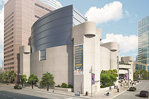
BEN KOUSH: ADDING A 4-STORY ‘GAS TANK’ TO THE ALLEY’S ROOF NOT MY IDEA OF PRESERVATION  Citing it as epitomizing Houston’s ineptitude in historic preservation, architect and former Houston Mod president Ben Koush soundly lambasted a May rendering of the Alley Theatre’s ongoing renovation by Studio Red, of Summit-into-Lakewood transformation fame. Koush saves most of his bile for the planned gridded fly-loft rising 4-stories above the theater’s roofline. “The original building evoked a castle,” Koush writes. “In the drawing, the new fly loft looks looks like a gas tank or grain storage bin dropped atop that castle. One can only wonder why Studio Red’s insistent design was not more restrained.†Studio Red has since pulled the rendering from its website, calling it “a terrible fisheye view of the fly loft that completely distorts what it will look like.” Distorted or not, the fly loft’s metallic appearance will contrast with Ulrich Franzen’s Brutalist concrete design, and Koush contends that such an essential alteration of the Alley is not the sort of project that groups like Houston Mod and the Texas Society of Architects should be lauding. [Gray Matters; previously on Swamplot] Photo: The Architect’s Newspaper.


Koush is 100% right on this one. I’m surprised that opposition to this vandalism of the Alley by Studio Red is just now emerging. The lameness of the design was apparent the moment it was unveiled. The proposed changes to the lobby finishes are especially bad.
How about bulldoze the building and start from scratch? Hard to polish a concrete turd.
The brutalist style is generally an embarrassment to design and an affront to aesthetics and, subjectively, that applies here.
looks pretty innocuous to me. You could barely see the addition from street level and contrasts well with the original design so as not to take away from it while adding the space that the Alley needs. There is so much bad architecture in Houston to be upset about but this addition to the Alley is quite alright with me.
Maybe they couldn’t tell it was supposed to look like a castle either?
I always thought that the Alley resembled WWII Nazi u-boat pens.
it’s hard not to laugh at “design professionals” claiming Soviet architecture should be “preserved”.
I agree with anonymous, and Ben Koush. Studio Red’s design for the Alley Theater leaves much to be desired. Granted the massing of the fly loft is driven by the auditorium and stage layout inside the building, but they could have done a way better job detailing it.
.
Of course using cast in place concrete for the fly loft probably isn’t feasible, but why not plaster textured and colored to match the concrete of the existing building? Use the same aesthetic so it’s less like a silo sitting on top of the building and more like an extension of what was already there. It would be a lot less obtrusive.
I was always fascinated by this building for being unique.
.
I never thought it looked like a castle, it always reminded me of a wwii bunker. Not a bad thing, just different.
.
This addition just helps to solidify that uniqueness. It doesn’t distract from the original design, it just changes it.
While I really like Brutalism, the original design of the theater isn’t that great. The only good part about it is the entrance facing Jones Plaza. Adding some blue glass will be a nice contrast. Infact, some Ivy or some more plants on the buildings would really help it.
The original architect Ulrich Franzen is dead, but I wonder what would have happened if one of his former associates would have been contracted to design the addition?
It looks like one of those collapsible camping cups…… And I don’t think those cups fall within the brutalist style.
Koush and Studio Red are two naked Emperor’s arguing about the how much finer their own fake clothes are.
That pile of concrete resembles a castle to the extent that a wooden fence resembles the Great Wall of China, and that addition looks like a septic tank.
Yeah, maybe it’s not the most graceful form. But you have to meet the needs of the client. The Alley needs a fly loft in order to put on the types of shows they would like to produce. A 4-story, windowless box in the shape of the stage below, located above the stage below. Regardless of what you clad it in, it will still have to fit these requirements. The only other option is to demo the building and build a new one, hardly an option the author would be a fan of either. I think cladding it in a different material to differentiate the addition from the existing is the correct approach. And zinc is a beautiful material that will patina nicely.
Actually agree with Koush on this one, but then again, look what Pei did to the Louvre? As for the brutalist architecture, I’m glad to have this downtown. It’s one less glass box to have to look at. Without buildings like this, a city is just a copy of any other city, and Houston, which used to have unique and great architecture, is becoming just a copy of any other city.
It’s an incredibly ugly building any way you slice it, giant glass loft or not. Brutalist architecture is just a disgusting form with no regard for the street and little to no aesthetic appeal. Frankly, it’s too bad they’re not just tearing this thing down and replacing it with… Well, just about any other style would be architecturally superior.
It’s hardly valid to compare Studio Red’s grain silo atop the Alley Theater, to IM Pei’s Louvre Pyramid. The Louvre Pyramid means something: it hardens back to the fascination that 18th Century Royalty had with Egypt; it’s a nod to the Illuminati. And it’s well detailed and executed. It is certainly a striking contrast to the old Louvre buildings, but it works with them. I don’t see Studio Red’s grain silo in the same light. It’s more a cancerous growth than a contrasting design element.
,
Now to be fair, Studio Red had less flexibility on form and massing than IM Pei did. Their design was largely driven by the complex technical requirements of a top-of-the-line theater fly loft. But still, I really don’t think it’s too much to ask for them to detail it better, and make it harmonize with the original building. I don’t think they even tried to do that.
They should have made the fly loft look like a giant fly.
It was always odd to me that that such a good theater company operated out of such an ugly building. The best improvement would be tearing it down, but this is the next best thing. It looks like it will finally have lighter colors and not look like something out of a bleak WWII documentary.
Yeah, this isn’t great. I agree with the idea of making it look like Concrete. This may not be my favorite building, but it certainly is unique. I think Pei’s Pyramid was a cheap looking disaster for the Lourve. None of Mitterrand’s “Grand Oroject’s” were great. I guess the library was the best and it’s not great. I know all about Pei’s BS about why a Pyramid, but Paris isn’t Cairo and Pei wasn’t even the best architect in his firm, that title belonged to Henry Cobb.
It may have been interesting to see how the same addition would look were it to be clad in something translucent like textured or striated glass . It would reveal the inner workings and expose lighting/color from withing .. at least that would reduce the solid mass.
Personally I like and appreciate the old brutalist architectural style and have always been a fan of the look of the Alley Theater! I think the alterations aren’t so bad, considering they needed the space, I’m just glad they kept the original front facade like it was.
I’m not a big fan of Brutalist architecture, but every complete zoo needs a warthog. The addition’s design is basically functional, so I’ll wait & see until it’s finished.
Another boogering up of an interesting building just as it’s gaining some mildly historic mojo in its middle age. Shades of the Main St. Sears and many other foul works. I expected more from creative types.
It’s Brutalism. It is what it is. Just clean it up and enjoy it for what it is.
I LOVE brutalist architecture! There is certainly a more creative design out there to compliment the structure like the Peninsula hotel or Louvre Pyramid in Paris :)