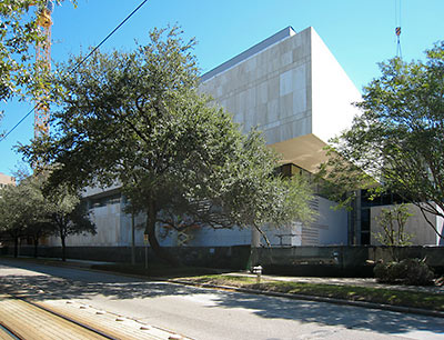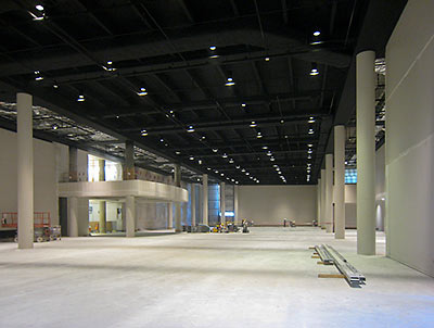
Outside along San Jacinto St., the scaffolding is down. And inside the new Duncan Family Wing of the Houston Museum of Natural Science, the Hall of Paleontology is looking close to ready for some big-toothed residents to move in:
***

- Expansion Update! [Beyond Bones]
- Previously on Swamplot: Made in the Flashing Shade: HMNS’s Dizzying Expansion, Warwick Towers Survives Dinosaur Attack


More boring, bland beige Houston boxes! Looks like a giant convention hall! No surprise though…yawn…
@Eddie
The science museum actually has some neat architectural features, but they are hidden by the large live oak trees and azalea beds surrounding it. Personally, I’d rather look at those than a sleek stone and steel building, especially one dedicated in part to nature and science. My point is, I guess the beige box argument doesn’t bother me in this case.
As for the convention hall look (I assume you mean the interior photo), it will surely go away once they pop a few dinosaur skeletons and exhibits in there. If that room is to look anything like the existing paleontology exhibit, it will be completely transformed by the exhibit contents, and you won’t even notice the columns or walls.
Perhaps the point of a museum is to focus attention on the objects inside, and not its own architecture…just sayin’…
@Eddie: It’s a science museum, not a museum of modern art. The facility is functional first and foremost, and the important stuff is on the inside.
Do you even understand the point of a museum? The building isn’t supposed to wow you, it’s supposed to provide a place to put a bunch of stuff that wows you.
Why shouldn’t a museum building wow you? We have education buildings that wow you, churches that wow you, office buildings that wow you, libraries…why not museums? Ever been to the Chicago Field Museum? Wow!
That said, I don’t mind the minimalist exterior so much, but why not some natural light somewhere in all that ceiling?