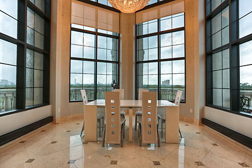
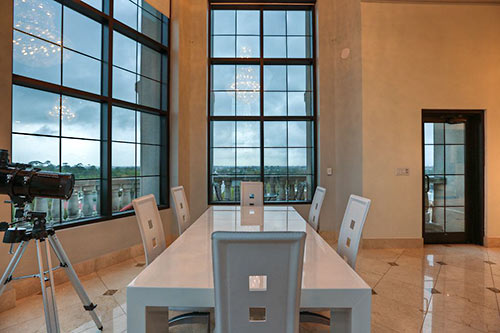
There’s a balcony off the dining-room prow in the corner penthouse for lease in the midrise Renoir building north of River Oaks Shopping Center. Up on the 8th floor of the Randall Davis project, the 2-story condo unit has views on 3 sides, sweeping from the Galleria area to downtown. The $7,500 per month rate appears to include the furnishings — but don’t assume pets are OK, the listing says.
***
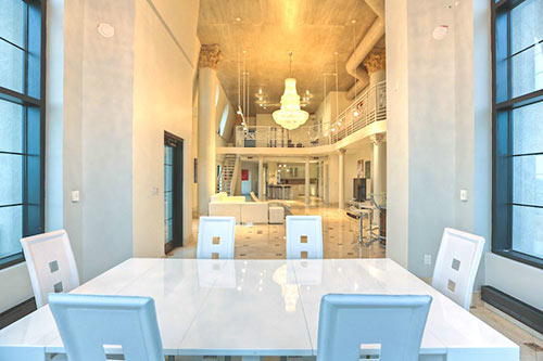
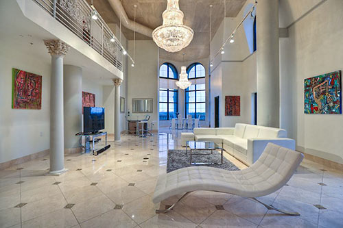
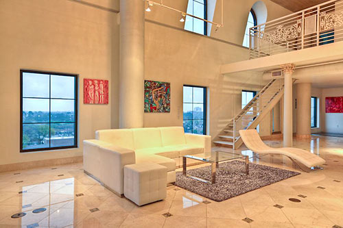
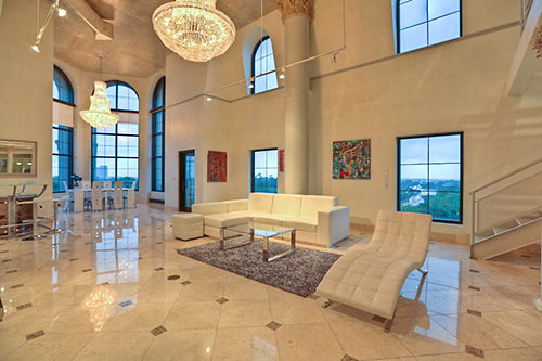
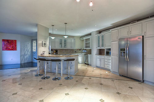
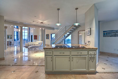
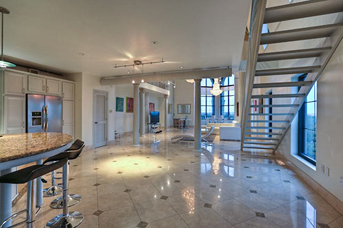
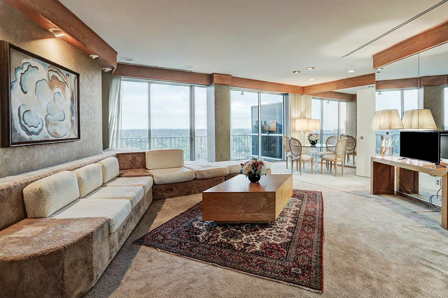
Marble floors shine all the way through the 3,468-sq.-ft. unit’s first level, in which large windows frame the color and light of a changing sky. One of the 3 bedrooms is off a small hallway tucked behind the open-plan kitchen:
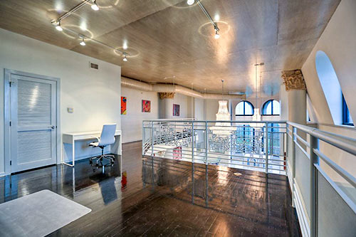
Upstairs, a lofted study area leads to . . .
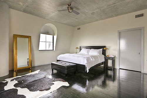
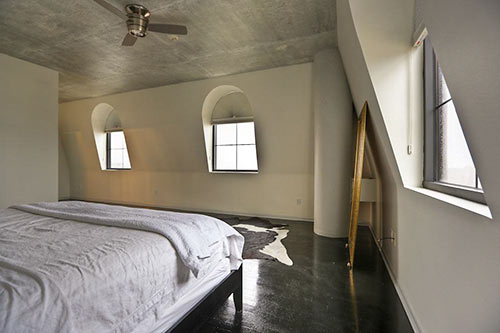
the master bedroom suite, its windows looking like something out of La Bohême (though far less gritty and consumptive):
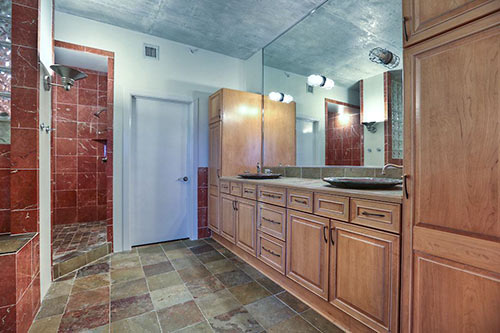
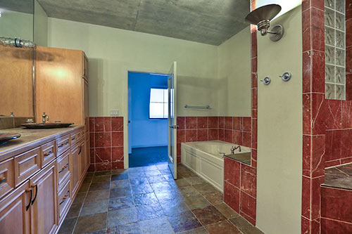
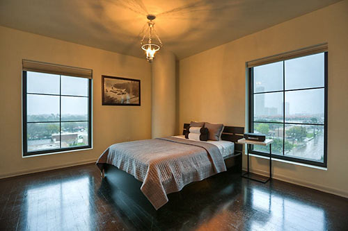
Here’s the first floor’s bedroom . . .
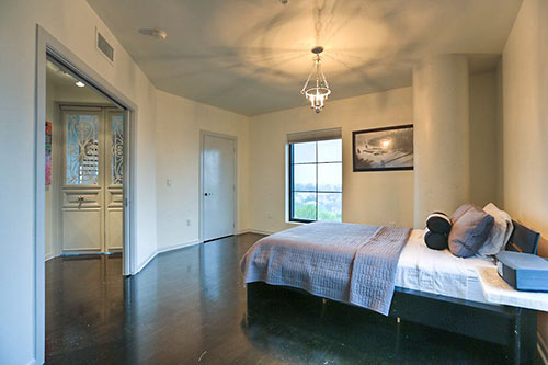
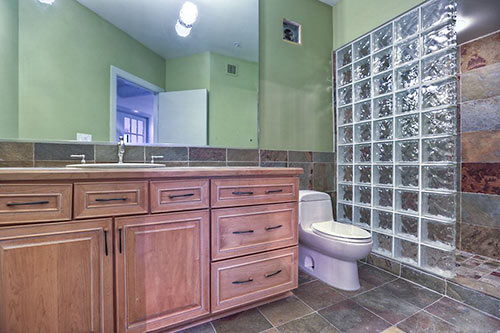
and the neighboring, second full bathroom for shared use downstairs:
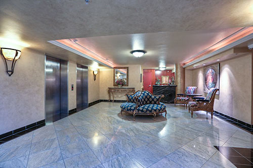
Down in the building’s lobby, there’s this waiting area by the elevators:
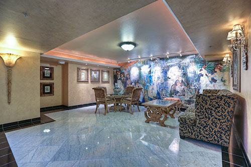
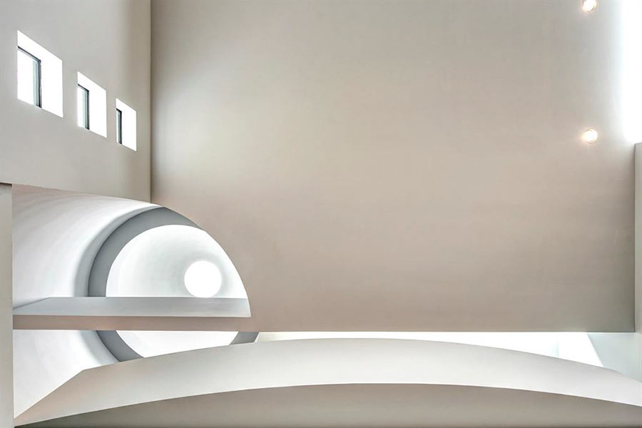
plus a mural that tries to channel the building’s namesake artist:
The unit comes with 2 parking spaces, 2 storage units, and a trash chute.


Every time someone wants to put up a midrise/highrise in a residential area, residents complain about having the building in their backyard get shouted down as being irrational busybodies. But every time I see a listing for some over the top high end unit in one of these buildings, there is a high powered telescope somewhere in the building. Given all the light pollution in Houston, stargazing is not a likely use for the telescope.
What happened to the bathrooms? Blew all their marble budget on the acres of living room space?
Yeesh. The inside is just as ugly the exterior of that monster. Randall Davis does terrible stuff design-wise.
The living room looks like a lobby. Nice view, probably very quiet but the opposite of cozy. Would make a good zen monastery.
Good point, Old School. Peeping with a scope is the multi-story residential version of “getting to know your neighbors”.
Jesus, money does not equal taste.
I love that dining room view!! The rest of the place, not so much. I can’t imagine having hard surface floors in every room. My feet need wood or cork or something that has some “give” to it.
Brrrrrr
Looks like a rapper lives there. And that”s not a good thing.
I must not have good taste because this place looks awesome to me.
Geez, how truly tacky –reminds me of one of those Persian Monstrosities I used to see in Beverly Hills—just awful
Between the distance between the fridge and the rest of the kitchen, and the hike from kitchen dining table…. I’m guessing that not a lot of cooking goes on here
Jeez the finishes are all over the place. No set style.
The echoing would drive me batty.
I am not certain that where the dining table is setup was truly intended as a dining area but rather a sitting area. I believe the dining area was intended to be closer to the stairs and kitchen. Love the main floor, bathroom finishes are hidious.
Positively ghastly… At least this condo is large enough to accommodate furniture, I’ve seen many by the builder that are not. Mr. Davis’ buildings certainly have a distinct signature.
Ewww, bathrooms and kitchen have same cabinets and hardware (although the kitchen cabinets are painted or stained with a grey wash). I’m sure it saves money, but it isn’t like these rooms “flow” into each other.
Glad to see the inside of that place is as ugly as the outside. That building is an abomination.
yikes>>>> randell davis
It looks more like a showroom than a place where someone could live. I just can’t imagine happy things going on in that glossy, empty space.
I like the design of this property except for the flooring of it. For me it’s ugly!