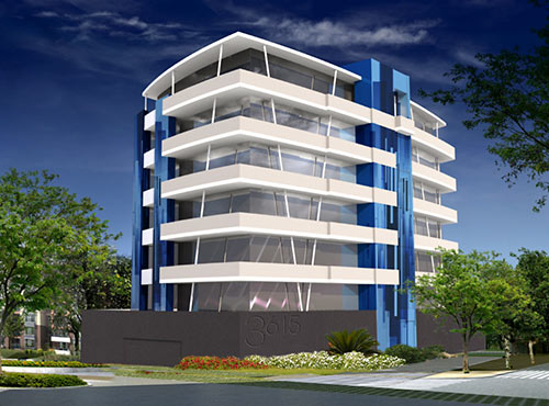
The developers hoping to build this 12-unit condo building on the former site of the River Cafe at the corner of Montrose Blvd. and Marshall St. are requesting a variance from the city so they can scooch the project’s blank-wall parking-area front 15 ft. closer to Montrose Blvd. than city rules ordinarily allow. And if they don’t get their way, they’ll make the 7-story structure even bigger, the variance application threatens. That would mean fencing off the building’s front; putting the parking garage on 2 floors instead of one, and adding “additional living floors . . . making the building much taller than others adjacent.”
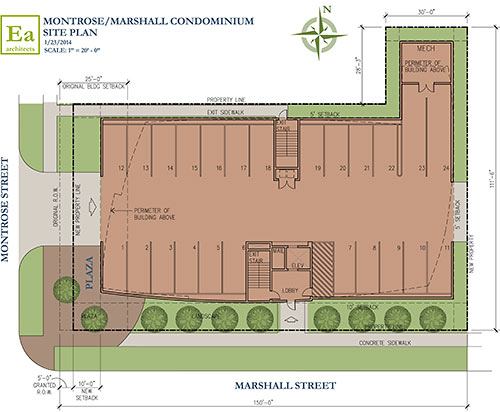
A submitted site plan prepared by Element Architects shows the existing right-of-way reduced by 5 ft. along Montrose Blvd. in addition to the setback requirement, to allow for future widening:
***
A landscape plan included with the application notes that the development is connected to Riverway Properties. Montrose & Marshall LLC purchased the land in December, and made the variance request.
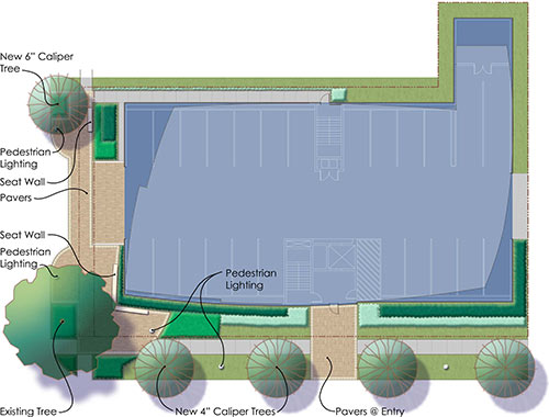
Why would this building deserve to receive an exception to the 25-ft. setback imposed on major thoroughfares? Well, the single-story River Cafe building demolished here in 2009 went right up to the street, the variance application notes. “This is one of the few truly walkable areas of the City with a high pedestrian population,” it reads. “Many existing buildings are constructed on the property line or within the 25’ setback, which adds greatly to the pedestrian character of the area. The proposed 12 unit residential condominium will have a broad veranda/balcony directly overlooking Montrose Blvd. It will be on top of the ground level parking garage, and the openings will be hidden by a ‘green screen.’ The large oak tree on Montrose near the Marshall corner is to be preserved and other large trees (4″ minimum caliper) are to be added. Sidewalks will have enhanced parking; most of the area between the Montrose façade and the curb will be paved as appropriate to an urban setting but small plant beds will add interest. There will be a seating wall and existing street lights will be supplemented by pedestrian level lighting.”
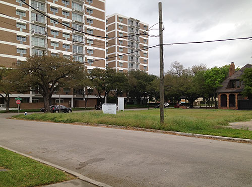
Here’s a view of the site from Marshall St., showing the Parc Towers across the street:
A condo tower called the Riparian was proposed for the site 10 years ago.
Drawings: Element Architects. Photo: Swamplot inbox


That’s about the goofiest looking building I’ve seen on here. I have no problem with goofy though.
Pretty…
The points about the ridiculousness of a 25 ft setback in regards to walkability (and urbanity) are exactly correct, but are a bit rich coming from someone who wants to put a blank wall and driveway up against the sidewalk.
ugly rendering, but i’ll hold out hope that it looks nicer when built.
Surprised a Houston based architect doesn’t know that this site is on Montrose BOULEVARD and not Montrose Street.
As for the 25′ setback rule, that really needs to be changed for urban areas like Montrose and Midtown. It just encourages suburban style development in dense areas.
So the variance request “threatens” that the project’s impact would be much worse if they don’t get their way? Why am I not surprised at such coercion tactics? *sigh*
The solution is simple: ground floor retail with no parking between the building and the ROW gets 15′ setback. Everyone else has to apply for a variance and make their case. Retail rental rates are breaking record highs in Houston. We need to make it easier to get more retail sq ft as more developments build up.
It looks like a cruise ship. And I don’t mean that in a good way.
I used to live in that 2nd floor balcony of Parc IV facing Montrose Blvd- Facing River Café was a pleasure- facing that ugly building would be HORRIBLE!!
Uh what the f##k is this–let’s hope this Miami Vice building he cropped from Sim City is some sort of a bad joke–lovely, just lovely
I like the modern look. Most Condominiums look like either a Hotel or Hospital. Concerning the set back issues, reducing the footprints would logically translate into taller buildings. After all, developers are in business for a return on their investment.
Unique look, but I liked the original plan better, it was going to be taller. Seems a waste to make this small. I had just moved down the street on Marshall St. back in 2004 when they closed the River Cafe and talk was it was to be 14 stories.
The Raising Canes ain’t looking too bad now o.O
The original design:
https://encrypted-tbn2.gstatic.com/images?q=tbn:ANd9GcRCqKwUbUy677bjoIHkX6PTxqOGc6HMgDu4XPpHRw67gBshbzrt
North elevation:
https://encrypted-tbn1.gstatic.com/images?q=tbn:ANd9GcTHWeD-nQdZiAeJOks_PfbsDPYV6-7WjquUMTHeRc4b0QjxcSAEHQ
New swamplot cateogory: ugliest midrise that never would have made it through an architectural design control committee (if we had zoning). Although this one is in the running, my nominee is: http://swamplot.com/dogging-the-morrison-heights-midrise-with-doggerel/2013-07-25/
I like the look of the facade, it’s not cookie cutter which is nice. But what concerns me is the garage shows 24 parking spaces – which I guess equates out to 2ea for the 12 units – and unless all of those are owned by antisocial types isn’t there a problem with no available visitor’s parking? Or even a spot for the pizza delivery guy?
I agree with awp. If you’re making the case that the variance should be granted because this is an urban area and should continue to be walkable then your project should be offering something more for pedestrians than a blank concrete wall.
That’s a pretty stupid argument: “The former–single story–building was non-conforming–so you should allow the proposed building–which is seven times taller–to be non-conforming, too.”
The City’s planning guidelines–though certainly far from perfect–are there for a reason. Sadly, time and time and time again the City has given a pass to big developers with deep enough pockets to pay off the right people and hire the right contractors. Most of the truly mundane variance requests from the hoi polloi that would affect virtually no one are routinely denied–while the outlandish requests from wealthy developers that affect nearly everyone are frequently granted.
It’s time to put Zoning up for a vote again.
I agree with Old School. If their argument is “adds greatly to the pedestrian character of the area” then they should actually add to the pedestrian experience, not build a blank wall.
If they want to actually make a case for pedestrians then how about they build a ramp and put retail in the front. If they dont get a variance then their parking lot doesn’t work and their building gets too expensive, so they are bluffing to build higher.
They should try playing by the rules or offer up some real consolation.
I don’t know about walkability on that stretch of Montrose because, tell the truth, I’ve never walked it. But when I drive it, I think the street feels crowded by the buildings that seem to loom. I’d be inclined to deny them that variance.
That is one of the ugliest buildings in the metro area that I know of …. wait, make it the ugliest. It doesn’t fit the area’s character at all and would be a blight. If they do build I hope they never rent a unit.
Not a fan of the design.
@fernz: NooOOOoooOOOooooOo!!! If you want ‘Zoning’ go to Dallas or Austin.
The building proposal exemplifies everything wrong with Houston Architecture and Architects. The building clearly is plan driven, with the intent of not just maximizing the site, but treating it with the sensitivity of Foie gras. The developer not satisfied with a well prepared duck, insists on making the architect prepare a meal, which he is clearly incapable.
The lack of sensitivity to the site context, environment, and general understanding of mass and proportion further delineate a lack of regional thesis with the ever practiced mimetic pedagogy of the UH School of Architecture. This polemic has burden the city of Houston for decades, with no venue for critical discourse other than this website. The opaque logic with which architects design projects like this one, clearly present themselves in a multitude of recent multi-family and commercial office building developments.
At a certain point, it becomes important that we critique our own work honestly, and challenge the developer mentality, in an effort to save the city of Houston from the future blight which it increasingly suffers. It is this type of project which exudes a sense of permanence as much as snow-flakes in Houston.
Unlike other cities in the nation, architecture in Houston still struggles with identity and understanding of contemporary thought and the design process, allowing opaque logics to rule, with no challenge to normative condition.
It should not be a surprise however, with a city not of the old western spirit of risk taking and adventure, but a city whose hegemony is dominated by risk averse oil and gas companies, developer driven corporate commercial aesthetics, and the ever present economic juggernaut known as healthcare and the medical center; all whose building typologies are so prescriptive that it becomes expected to only do the minimal.
In the end, as long as Houston Architects and Developers conspire for mediocrity, the best design commissions in the city will continue to go to the carpet baggers from the North East. Insulting as this may be, it becomes our own self-fulfilling prophecy that we end up with buildings, which aspire only to be background.
I suppose the fact that they will fix the sidewalk, add landscaping and street lights etc will be nice if this gets built, but if street retail works anywhere in Houston, this is the spot. I wish it was in their plan.
So someone finally proposes a style other than the ubiquitous brick/stucco box or blue glass sheathed tower that all of you lament about and this isn’t good enough either. So it’s different–maybe it will be like the “Googie” building on Steele Street that stands out for its non conformity. And to say it doesn’t conform to the area? Isn’t Montrose’s quirky appeal its non conformity?
I am all for condos over apts or townhomes in that so i like the project. The design is a bit much, but what do yall want blank stucco or crappy siding? At least they are thinking outside the box.
movocelot,
Thanks. Good point.
Something about the depth perception in the rendering makes me nauseous looking at it. It looks neat I guess, but the rendering actually makes me physically ill. Never had that happen before.
The building looks way cool. A good plan. We can’t have the cramming you want to do with these variance requests. You must stick with the rules of space that govern the city.
I spent 17 years at the “River” to bad the new guy could not cut it