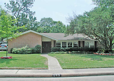
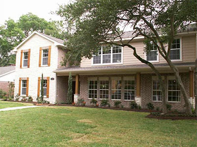
From one of Swamplot’s initial correspondents, K, comes word of a redo in Memorial Hollow she says
looks like a Mr. Potatohead gone wrong — parts and bits and pieces on a foundation that don’t really go together. It still looks to me like the bottom half of an older house that someone plopped new construction on top of.
At first, K thought the house
was being torn down like so many other 1960s-era homes in my neighborhood. It was a one-story, typical little cottage on a big lot — the kind they love to demolish and then fill up the entire lot with a three-story monstrosity. But then I realized that they were, in fact, totally remodeling it. They tore the roof off and blew out the back of the house until only three brick walls were standing.
Then they rebuilt the back wall and added a second story to the house. It looks pretty bizarre now, although I can’t tell if that’s because I was used to the little bungalow that was there before or because the house really does look weird. You be the judge.
Below: More before-and-after photos of this hollow sixties memorial in Memorial Hollow, ready for your verdict!
***
The new home at 12415 Perthshire has been on the market now for a little more than a week and a half. It has 4-5 bedrooms and 4 1/2 baths. It’s 3,632 square feet on a 8,190-sq.-ft. lot. The asking price is $799,000.
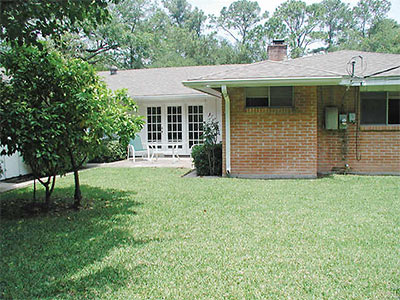
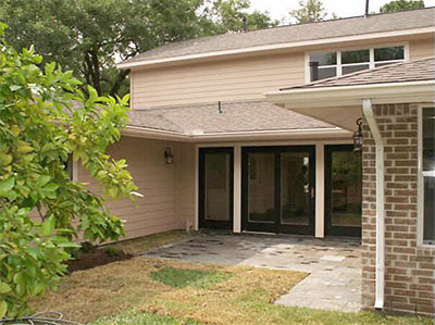
Some before and after photos of the back patio:
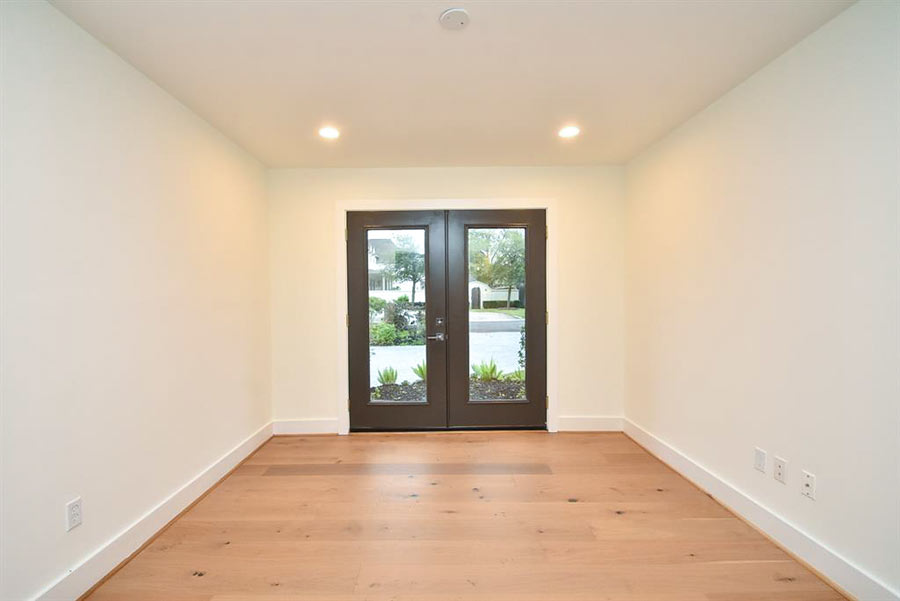
The front door:
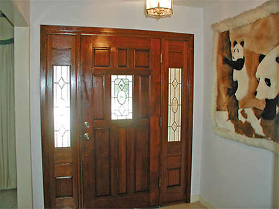
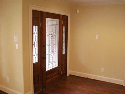
The Living Room (in the new listing, the room is labeled the Dining Room):
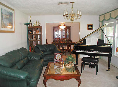
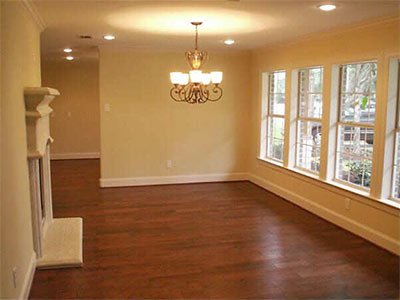
Family Room:
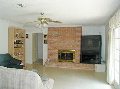
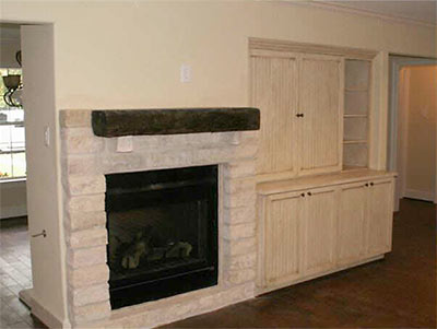
. . . and Kitchen:
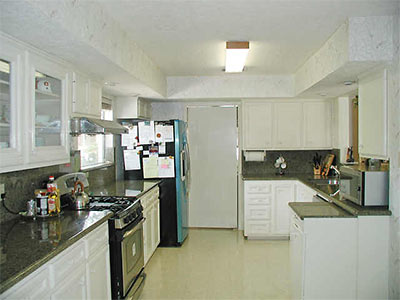
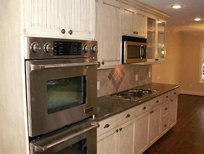
More Kommentary:
Also awesome is the constant use of the adjective “Southwestern” throughout the MLS listing. WTF?
More photos in the listings:


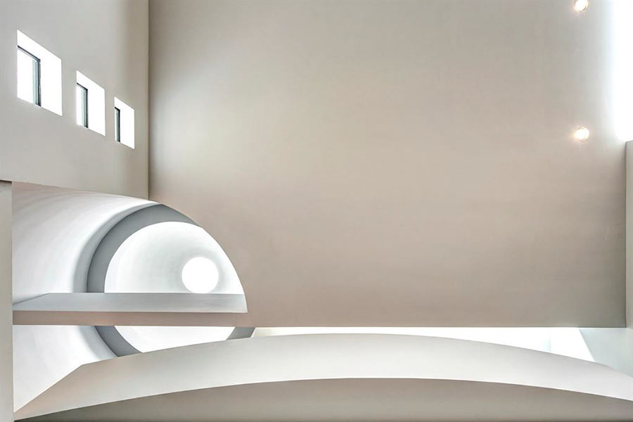
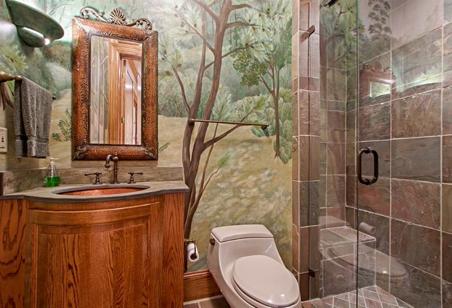
Hmm. The back looks exactly the same as before. Maybe I was mistaken there.
But I still maintain the house looks weird, and not at all “Southwestern.” Was “neo-Hill Country” what they were going for, maybe?
The two levels of windows (with shutters or whatever the hell that is) on the left front wall is not good. I can almost see casting the place in a horror movie, “The House Has EYES!”
Do not attempt to control your set…do not attempt to adjust the horizontal display. This house looks like it has the hiccups.
I live in the neighborhood and every time I drive by this house I catch myself trying to figure out what is going on with its design. The pieces just don’t seem to fit together in a harmonious manner. I prefer the before design~this one is distracting and if you glance at it while driving, it’s hard to stop looking at it…..maybe the horror film is a plan for this house!