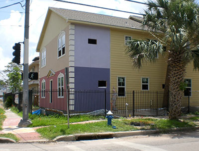
A reader writes in to let Swamplot readers know the unpublished asking price for the 8-unit apartment building going up on the ashes of The Norman apartments at the corner of West Alabama and Stanford, featured here last month. Pssst: It’s $875,000, all stucco colors shown included. The building is expected to be complete next month. And here’s one of the last pics of its hot hot predecessor, taken during a little incident last August:
***

- 717 W. Alabama [City Feet]
- Previously on Swamplot: A Bright Stucco Future for the Norman Apartments
Photos: Swamplot inbox (new building); Tom McDonald, Greater Houston Fire Buffs (fire)


This building deserves a much more flamboyant name than “Norman.”
The new Norman (new normal?) is silly. It’s not clever. It’s not even self-referential post-Po-Mo. It’s just dumb and tacky.
There’s a friendly homeless gentleman that spends most of his days camping out and panhandling on various corners of that intersection. I hope he doesn’t get rousted for not fitting the new $875,000 image.
As a nearby property owner, I must say I’m glad to see something replacing the burned-out building, but I just can’t help but feel this apartment house came out of someone’s Happy Meal.
A friend lived in the old place when I was in college. I passed by the new building last week and it is hideous. It looks likes one of the many projects around “designed” and built by owners or developers who are too cheap to hire an architect, and think that they can do it themselves after watching HGTV for a couple years. Horrendous. Makes me wish some parts of town had architectural design review boards. Well, not really, but almost.
John, I agree with your point that this is an uninspired design. But while there are good architects, a visit inside 99% of new homes in Houston will prove that “architects” are not the solution to boring designs like this (many have no real artistic vision). What is missing are owners/developers who want to leave their “mark”/brand on Houston instead of build homes/buildings by-the-numbers. That takes creativity and insight, which most people have but are too lazy to apply it.
theGman,
99% of the homes in Houston were not designed by architects. Most builders use “house designers”.
yep, I was going to comment that a lot of people specifically do want to ‘make a mark’ on Houston (with nothing but junk.)
Good design is so rare…
there oughta be a law!~!~!
Hate to break it to you Andres, but all of the townhomes and cookie cutter homes WERE designed by paid architects (unfortunately not good ones). No offence to anyone, but the word “architect” doesn’t automatically mean “creative” or “good at making great designs”. Sad but true. Good architects exist but are rare, and aren’t sought out by developers who don’t appreciate good architects. … But to imply an ugly house is not designed by an architect is silly and ignorant.
From theGman:
… But to imply an ugly house is not designed by an architect is silly and ignorant.
*********
Gman, you need to educate yourself. This is Texas, where an architect is NOT required to design single-family homes, townhomes, and some multi-family structures. An engineer is required to certify that whatever is built will be structurally sound, but hiring an architect is an option in most cases. As long as the “design” passes all relevant building codes, it doesn’t matter who designs it. Get your facts straight before you call someone else silly or ignorant.
Bravo John! You are exactly right. I have been wondering who the hell has been “designing” all of these trashy townhomes. I think I would burn my degree to find out that these were designed by actual architects.
You’d think for $800k+ they’d at least be able to afford more than a gallon of paint per color.
Well, sometimes BigLots only has one gallon of each paint color! You know, closeouts and all.
It looks more like it’s worth $87,500 rather than $875,000. Including the land.
I just walked by it a little while ago on the way back from Tommy Tech and was just amazed at how little imagination was used by whoever, or whatever, designed it.
Why didn’t they just duplicate the original? At least it was aesthetically interesting.
Hubs and I played a little game last week where we tried to see how close we could come to remembering the number of colors New Norman is before swinging by on the way home. I thought he was being funny when he guessed 3.
.
We’re just happy that it didn’t remain a burnt out hull of a building, or a dark empty lot like a dozen others in the area. We welcome you, Neopolitan Norman.
.
And PS, I’m ok with that panhandler being rousted. He’s not nearly as interesting as the guy who wears a cape, though they do share the same taste in breakfast foods. Maybe if I had a tallboy for breakfast too I could better appreciate the bums as well as New Norman’s color palette.