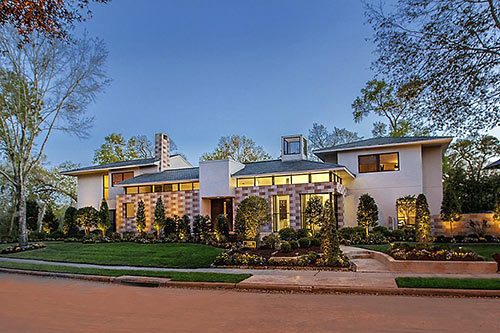
It’s big, but not the biggest home on its cushy Bay Oaks block. Bigger still are the fairways of adjacent Bay Oaks Country Club, on display behind this fully loaded property that’s located south of Clear Lake Blvd. The updated 1989 contemporary clad with stucco, stone, and tile was listed this week. The asking price of $1.399 million marks a noticeable spike from the $898,000 paid in 2011, when the current owners took hold.
***
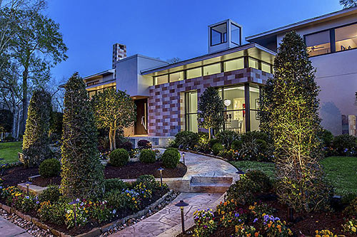
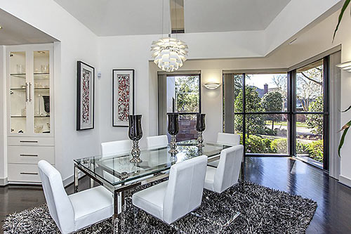
Tightly trimmed landscaping peppers the front lawn (above), located at the top of a T-intersection in the middle of the neighborhood. The leaf placement strategically screens portions of the dining room, otherwise still somewhat visible through a window-clad corner of the checkerboard finish:
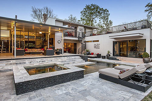
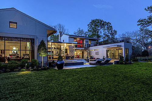
More full-height windows rise and multiply across the back of the home. The effect momentarily suggests a reflected living room — but it’s an indoor-outdoor space pairing we’re seeing in the scene below:
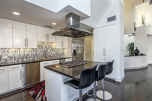
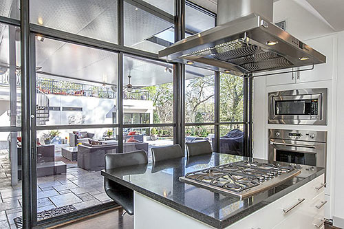
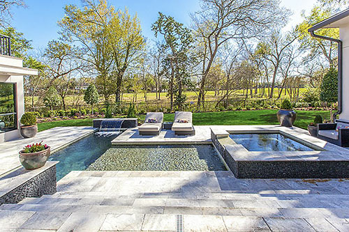
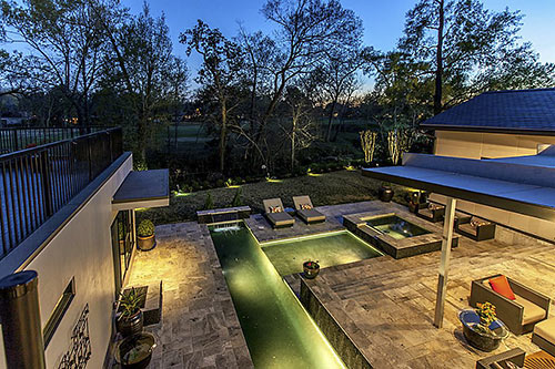
The kitchen wing also faces the mega-sized patio (with summer kitchen features) by the pool:
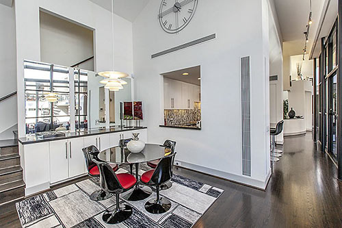
Finishing out one side of the floor plan, there’s an informal dining area between the kitchen and open-ended family room . . .
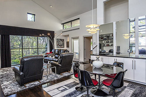
from which the course is clear:
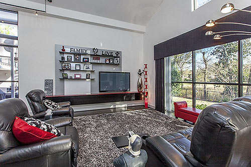
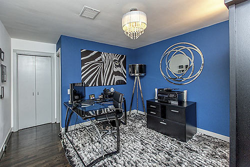
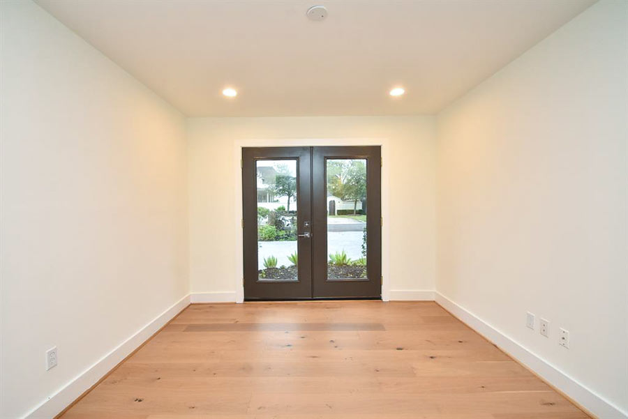
One of the 3 (0r 4) secondary bedrooms, currently a study, is off the family room:
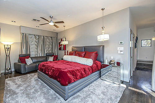
The master suite is also downstairs, in a private wing with bath . . .
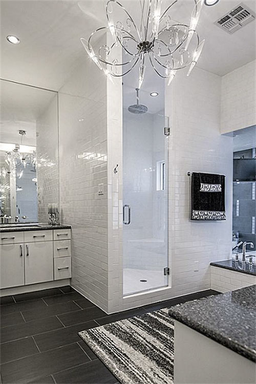
a set of closets . . .

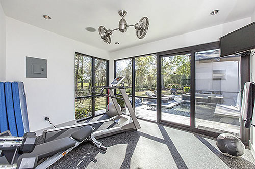
and a home gym. A sliding door leads to the poolscape:
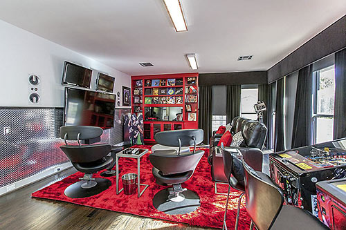
Upstairs, there’s a media room/game room . . .
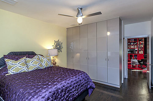
and more secondary bedrooms. This one, for example, is right off the entertainment zone:
This one connects to a sun deck that provides a quick commute (via spiral staircase) to the poolscape:
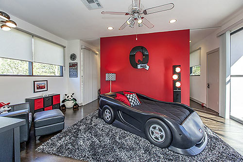
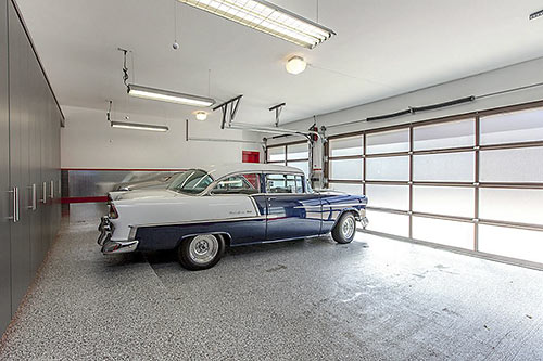
Real cars, however, might prefer to park it in the 3-bay “collector’s garage” on the ground level, behind glass panel doors:
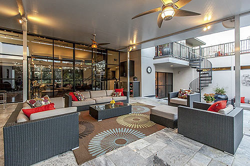
The home has 5,136 sq. ft. if you believe the listing or 4,971 sq. ft. if you go strictly by HCAD. Could the difference have something to do with the patio’s overhang flying off the back of the home?
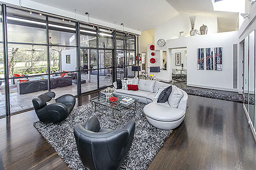
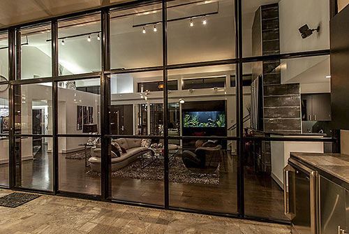
Here’s the terrarium-with-aquarium view of the steel-framed living room available from the back windows:
The golf course’s 6th green lies beyond the third-of-an-acre lot:
- 2106 Orchard Country Ln. [HAR]


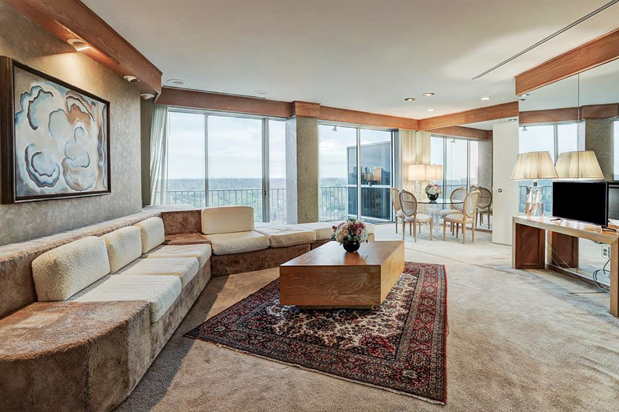
No. one red wall and one blue wall does not get you a reprieve from an Old School rant on monochromaticism. Please, please, please stop this!!! Is this guy designing everything in Houston: http://www.kathleenkparkerphotography.com/-/kathleenkparkerphotography/gallery.asp?cat=106408&pID=2&row=15&photoID=7628582
Why have all this square footage and use the same freaking color scheme for every room? It does not “unify” the design. It makes the design monotonous and redundant. Ssssstttttoooooppppppp it!!!!!
This house was originally designed by OA+D, Inc. (Jay Baker, Rob Civitello, and myself). It has been remodeled and “re-decorated” *A LOT* since the original design! It was on the Bay Oaks “Street of Dreams” when built. Interiors seem almost unrecognizable to me. The back covered patio, pool, and bedroom wing extension were added at some point and it looks like most interior finishes were changed as well.
Old School, would you prefer beige?
Is there not a rule taught in design school that bans tile from exterior building surfaces?
Small rant, but why don’t people in Houston ever think of enclosing their porches with screens to keep the mosquitoes out? I mean, that’s a nice back porch, but every time you went out there after dinner, you’d have to bathe in Off! People in the Southeastern US routinely use screened in porches, but they seem very rare in out mosquito-infested swamp we like to call home.
Those of us who are not interior designers may not mind the monochromatic scheme so much (wink wink old school).
This is a dream home, I love it.
@ShadyHeightster: I have a back porch. It is unscreened, but mosquitoes are not a problem. We burn a few citronella torches when they’re around, but most of the time there aren’t. We don’t have any standing water nearby, so they don’t breed here.
Or maybe they just know better by now.
I’ve been on screened-in porches and they reduce airflow. I’d rather have a little citronella once in a while and enjoy the breeze when I can.
@Sally: My issue is with the “mono”, not the “chromatic”. Silver is fine. Beige is fine. Gray is fine. An entire house with one color scheme is annoying.
The room with 3 flat panel TVs deserves its own “photo of the day” entry…perhaps titled “Well Monitored”?