

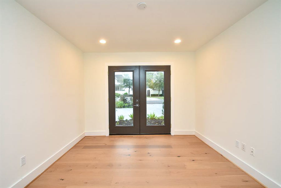
 Yes, there’s a straight shot from that outdoor fireplace in the back of this house all the way to a walled-off courtyard in the front. And it’s all lined up for you from the back patio: Kitchen, Dining Area, Living Room, and front yard beyond. If you took down that front wall you’d have a better view — past a row of oaks and some bushes — of the Rice Stadium parking lot across the street. The address is 2239 University Blvd. in Southgate.
The home was designed by Strasser Ragni Architecture’s Erick Ragni and his wife, Emily Sing. It’s theirs.
***


This long living space takes up about a half of the first floor in the 3,600-sq.-ft. house. Not shown here: the family’s own work space in the other half.
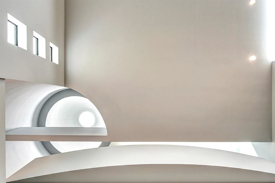
Up the stairs for the rest:


Like what you see? Or maybe just the area it’s in? You can tour both at this weekend’s Rice Design Alliance home tour of Southgate, where this home and 7 others are featured. The tour runs Saturday and Sunday from 1 to 6.
- Southgate: An Urban Oasis [OffCite]
- 2010 Architecture Tour: Rice University’s Neighbors to the South [Rice Design Alliance]
- Strasser Ragni Architecture
Photos: Eric Hester (interiors) and Paul Hester, Hester + Hardaway (exteriors)
I love this place!
They don’t have any stuff!
I love the master bath with the beautiful marble(?) wall dividing the shower and bath tub. They need some art on those walls asap! What a pretty space.
I had the same thought as marmer. Either they have a TARDIS for a closet or the evil giraffe in the playroom ate it all.
What an AWESOME place to live! The wide open indoor-outdoor thing is the BOMB! Um except not in Houston. (There’s no artwork because it all gets warped and funky in the humidity.) And not today certainly because every surface would be a particular allergenic yellow-ochre-colored.
This is a lovely space, but somehow the feng shui is off. All those sharp corners… And the flow goes right THROUGH the house. It needs softening somehow.
I’ll be providing the tour of 1925 Addison on Sunday afternoon for those of you attending. Stop by and say hi!
I love going past these houses on my daily use it or lose it walk around the Rice campus.
Sorry to post again, but considering how wonderful these spaces are, isn’t it time for architects/designers to re-imagine the bedroom?
For such a great place, the bedrooms are plebian.
Having toured that house today, it seems they did a lot of staging since those photos were taken. It looked fantastic today. I can’t say that for all of the houses, as always some good and some not so good.
This is a lovely space, but somehow the feng shui is off. All those sharp corners… And the flow goes right THROUGH the house. It needs softening somehow.
__________________
It depends on how you view the rooms – the front door as opposed to the sliding glass doors appears to be well-placed and chi is supposed to flow through the house. Gently moving around things like walls and furniture. Which is why you’re not supposed to have everything up against the walls but in the center of rooms which causes the energy to flow around as well as through.
And of course at both ends of the living area where the inside blends into the outside there is a wall that would tend to contain the energy rather than allow it to completely dissipate into someone else’s space so to speak.
The house is actually pretty much minimalism at its best. That in itself makes me wonder if perhaps Feng Shui was used in designing and decorating. What distracts the eye often disturbs the energy flow.
As for chi the reality is one man’s bad chi is another man’s good chi.
Ugh!! Everything just looks so uncomfortable! I have to say I don’t appreciate the “artistry” in this one. I’d like to see an example of minimalism that also looks livable and comfortable – certainly the two can coexist?
Ha! I happen to love this house, and would be very curious to see the work space portion. But Jessica1’s comments reminded me of the humor blog http://unhappyhipsters.com/- full of modern design populated by unhappy people.
I see this kind of thing on home tours all the time. Rock-hard floors, sharp corners, precipitous staircases, and little kids in the house. I asked a homeowner once about that (not on this tour) because I saw a sharp face-level table corner that gave me the willies in a kids’ room and she looked at me like I was from Mars.
I saw this house on the tour, and it was pretty, but that stairway behind the purple wall is as dark and steep as it looks.
Thanks for all the great comments. We are photographing the space today with all of the new furniture and art work. If anyone has specific questions, please feel free to send me an email and I will do my best to answer. ragni@strasserragni.com
I’ll add to Erick’s response. We moved in last April but had not managed to get most of the “stuff” into the house yet when these pictures were taken. I’ll put a side by side comparison up on facebook at some point. It really is amazing how much difference a little art and a few pillows makes! OK, it’s a lot more than that, but the space has a completely different feel now. If you’d like to see the space with all the “stuff” email one of us, and we’ll give you a link to the updated pics.
Emily (owner/architect, with Erick)
em_sing@yahoo.com
Mosquitoes.