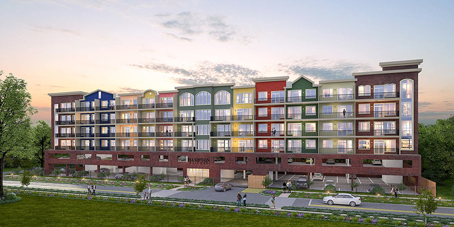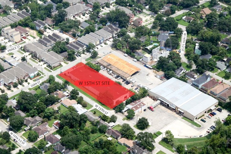

A wide spectrum of paint shades and window shapes fronts W. 15th St. in the rendering above of Hampton Heights — the 5-story residential row Surge Homes has planned just west of Dian St. in Shady Acres. Its 2-story parking podium is about the same height and length as the site’s current resident: Car Cafe, a 37,341-sq.-ft. used-car dealership headquartered in a windowless warehouse. Just under two thirds of an acre — shaded red in the aerial above — comprise the lot at 1800 W. 15th where the garage sits now.
- 1800 W. 15th [Surge Homes via HAIF]
Rendering and aerial: Surge Homes


Architect – “What style of windows would you like?”
Developer – “All of them”
The rendering looks like it’s just a facade with the sunset shining through the windows.
I could understand building something like this if it was facing a feeder road.
But it’s in a location where allowing some relationship to the street could maintain and fortify a neighborhood feeling. As depicted, it resembles a medium security juvenile detention facility.
@Big Tex – exactly my sentiments. I dislike buildings of this size/scale surrounded by homes, single or shared wall townhouses and low density side streets. Seems more appropriate if adjacent to high traffic roads. In this area I could see this being more appropriate for land between Durham and Shepherd. But that is just me. Will be interesting if this build will depend on a minimum percent pre-sales before it starts or they will just build then sell later. I have seen other developments (oddly placed in my opinion) that never start due to lack of sufficient pre-sales. Which to me tells me you can’t just build wherever you want and they will come buying.
Points for building a mid-rise condo building that provides an alternative somewhere between “rent an apartment” and “buy a townhouse” in this part of town.
That said, it’s as if they wanted to build a row of Amsterdam-style canal houses, but instead of a canal, they’re built on top of a parking podium. There’s no point in doing ersatz fine-grained urbanism if the street-level is coarse-grained. It just ends up looking dumb and mismatched.
What are these, rowhouses for giants?
They must just tell the architect to maximize the lot $ize and then play with the facades a bit to avoid any beehive comparisons.
No words, SMH. Mid-rise condos in this area, WhAt!?!? Maybe if it was directly off Shepherd, but several blocks into the neighborhood? So strange.
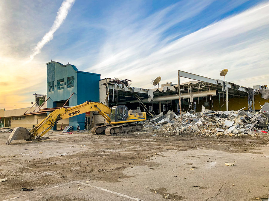
Guys, relax. Look what’s there now, courtesy of Google Street View: https://goo.gl/maps/XQ4jaBZNS722
It’s the back side of a half-block long corrugated metal warehouse gated behind chain link and barbed wire. It’s not like they’re tearing down a row of Queen Annes.
.
The new parking structure is ugly, and the buildings are too tall for the neighborhood, but it’s actually an improvement. It would work better if they put the two stories of parking underground.
@GoogleMaster
I prefer the corrugated metal warehouse.