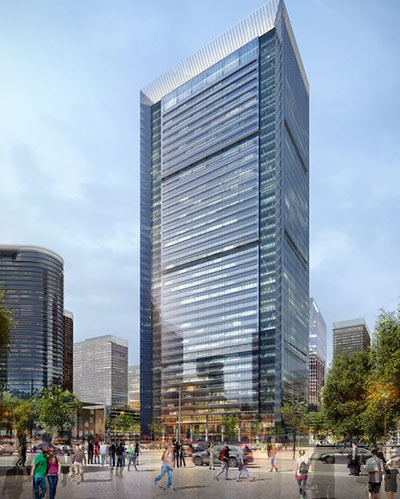
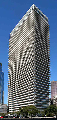
 An entry posted over the weekend to the website of Ziegler Cooper Architects indicates that the local firm has won Shorenstein Properties’ invited competition to remake the soon-to-be-former ExxonMobil Building (at right), a prominent, bristly, and standoffish figure on the southern edge of Houston’s Downtown since 1962. The redo, which will be far more extensive than a simple reskinning, removes the most distinctive feature of the building, originally designed by L.A. architects Welton Becket for Humble Oil: the 7-foot-deep shades, cantilevered from marble-clad columns, that help shield sunlight from all but the top of the tower’s 44 stories.
***
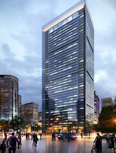
The fate of those sunshades may explain why Shorenstein selected Ziegler Cooper’s design for the building on the block surrounded by Bell, Milam, Travis, and Leeland it bought from ExxonMobil earlier this year : The airspace formerly occupied (and cooled) by the shades won’t just be surrounded by a new glass skin; the newly enclosed area will be swallowed and captured for additional floor space, according to the architects’ drawings and description. That’ll fatten up the floor plates to a now-popular 42-ft. depth and increase the structure’s gross square footage by more than 100,000 sq. ft., to 1.4 million sq. ft.
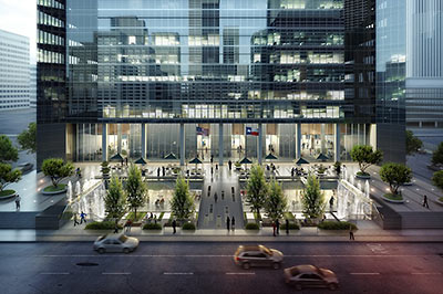
In place of those unshaded top 2 floors at the top, now home to the Petroleum Club, the new building, referred to now by its address of 800 Bell St., will show off its new fancy light-up forehead. At the base, a new plaza facing Bell St. (above) will at long last tie the building into the downtown tunnel system.
ExxonMobil is currently leasing the building back from Shorenstein; renovations are scheduled to begin in 2015, after the company moves its last downtown employees to its new suburban North Houston campus headquarters.
- 800 Bell [Ziegler Cooper Architects]
- ExxonMobil coverage [Swamplot]
- Previously on Swamplot: No, the Renovated Bell St. ExxonMobil Building Is Not Gonna Look Like This, ExxonMobil’s Humble Gift to the City?
Renderings: Ziegler Cooper Architects. Photo: Flickr user lc_db



Looks like similar plan of that new facade for that fed building down the street. Looks great.
Is that the homeless bathing in the fountains?
It’s like your friend who looked normal in high school and when you came back from college he was all juiced up. You’re just not sure what to think.
The ZCA drawing shows a large pedestrian plaza on the south side of 800 Bell, which is currently a parking lot. I wonder if that’s just to dress up the sketch or if they will actually make it more of a pedestrian plaza. I believe the Houston Press sits on a 1/4 of that block directly south of 800 Bell.
Finally! This building has always ranked highly on my list of Houston eye-sores.
OMG! We may have an architectural pulse after all. I like the redesign, it takes a bland building and gives it a shot of 21st century revival. The entrance plaza looks great connecting to the tunnel system and bringing in landscaping and fountains. I am a fan of commercial properties getting “extreme makeovers”, honestly doesn’t the Leland Federal Building look so much better that before? Although we still can’t seem to dislodge ourselves from blueish-green glass facades, Ziegler and Cooper has done a great job on this one. The litmus test is simple in these projects. 1) Does it look better? YES
2) Does it function better? YES
Hilcorp miss the mark on the Foley’s redo and this is proof that with a fresh outlook and a willing owner you can make any structure “new” again. Hey Suburbs! This is what us urban dwellers call urban renewal, this is why we should save the dome. All we need now is a “fresh outlook and a willing owner. peace
Wow – a redo instead of a demolition – IN HOUSTON. Does this finally stop all the bitching on here?
Think they’ll be able to connect this building to the tunnel system? That’s what it is missing.
I like the old building’s mod shades, but the redo certainly takes practical necessity into consideration and shows why remodeling males more sense than demolition in this case.
Typical Houston, just destroy an iconic piece of its history for more boring glass
And no first-floor retail? pass
Yeah, I like the old better. We’ve got enough contemporary skyscrapers, no need to make an iconic 60’s one look generic.
@bitching: Have you actually been in the building? No room for 1st floor retail due to the elevators. Sublevel 1 has lots of room though.
Hey guys, no one thinks the Humble building is an iconic piece of history. It is a local landmark of sorts, since it was the tallest building in Texas for awhile, but I don’t know of any preservationists clamoring for it to be preserved in its current state.
Its landmark quality consists almost entirely in its height, not its design. Save the height and I think everyone’s cool. And no, this is not remotely analogous to the Astrodome.
Walker, I believe they answered that in the article. See above in the caption under the image of the plaza. This is a very nice transformation and bringing the tunnel in makes it much more leasable.
Looks like the Hess Tower.
I have mixed feelings.
The fins are significant. This was one of the first curtain wall type buildings in Houston, and certainly has more glass than just about anything built earlier (for example, what is now known as 919 Milam – previously the Bank of the Southwest Building – and the Federal Building at 515 Rusk, both from less than 10 years earlier). Along with its contemporaries at the American General Center and First City Main, inset windows were a way of dealing with what would otherwise be a huge sun load on a big glass area in a time before people were getting insulating glass to work as well as its theory. It’s also interesting as a marker for its time. The Cheaply Thrown Up By Rookies As The Early 80s Boom Collapsed Mickey Leland Building (nee Concord Tower before the FDIC ended up with it) isn’t much of a comparison since it leaked like a sieve; thus something HAD to be done with its skin.
That said, I also get the appeal of significant extra leaseable area and a more standard sized floor plate (been there, done that, reluctantly bypassed the cool factor of the older property in favor of the more easily laid out and functional space in a bland newer building). I suppose I’ll have to find those old plastic injected models of the Humble Building and Astrodome that we got from the coin op machines that formed them before our very eyes way back when – if Mom didn’t throw them away thirty years ago.
BTW, I do like the sunken retail plaza connecting to the tunnel system – which I recall others advocating for with other sites.
I think the Humble building is an important landmark. It was designed by one of the biggest architectural firms of the era. Its construction was detailed in the book “Total Design” which profiled the work of Welton Beckett Associates. The new version is even more bland and boring and looks like every other box downtown.
@Mike not analogous?
-Both are 1960’s era buildings
-Both where deemed no longer viable by previous owners
-Both where facing redevelopment or demolition.
Perhaps your point is somewhere in their different uses but I find them comparable in the sense they offer us opposing examples on historic preservation and or restoration. One invest and renew, the other mothball and demolish. Perhaps I’m the one who sees the analogy. Now back to my own little world. lol peace
So I guess the tunnel will tie in via Wedge Tower. I wonder what the “extortion fee” will be. They really have no choice though – it’s an absolute must if they want Class A lease rates, which I assume they do.
Note that this will add over a million square feet of multi-tenant space into the market (I know ExxonMobil had some tenants, but they were contractor companies from what I understand). If Hines gets theirs going also, that should take care of things for awhile.
Hmmmmm, not sure I’m thrilled about this…I actually always appreciated the cool sleek mid century look of the building, I thought it was one of the best skyscrapers to come out of the 60’s, a real landmark. Unfortunately, there is zero respect for anything mid century. I have no doubt if the MFAH could alter the work of the great Mies Van de Rohe they would in a heartbeat. I really don’t mind the new design it’s just a shame they will abliterate a great mid century building.
“@Mike not analogous?
-Both are 1960′s era buildings
-Both where deemed no longer viable by previous owners
-Both where facing redevelopment or demolition.”
By your logic, the Astrodome would be analogous to a vacant 1960’s gas station in Sealy.
Let me help you: the Astrodome is a world engineering and cultural landmark whose fortunes have been followed by media outlets across the country in recent weeks. The Humble Building isn’t.
We had to wait until comment #10 until the first comment of disapproval. Must be a record for Swamplot!!!
I’m still convinced that there is no redesign or new build design proposal that wouldn’t at least get two comments about how they could do better.
I’m sure Swamplot would publish your proposals in a heartbeat. Let’s see some.
I think they’re threading the needle in the only way that will add sq ft, make it more energy efficient, and make it marketable in what is/will be a cut throat downtown real estate market.
An additional thought – am I alone in thinking that slapping a lit up “crown” on top of a glass box is the architectural equivalent of a WonderBra?
Boo. I understand the economics of it, but the Humble Bldg has swag. Every time I see it I want a dirty martini and a cigar and to hit the Petroleum Club with a fedora on. I wonder how many decades it will be before the first proposal comes around to remove the cladding to reveal the original beauty underneath?
@Mollusk, Wonderbra comment: While I’m more of an Agent Provocateur kind of guy, what’s your complaint?
@ Walt – For the record, IMHO the WonderBra is a dandy product when applied to the right form. Elsewhere, not so much – for example, on an otherwise gracefully aging shape that looks just fine as long as it remains true to its age.
A sillier, more out there example is the RKO Radio Tower set that got stuck on top of the Renaissance Tower in Dallas 25 years ago.
It will be interesting to see if this project really happens. They can’t start work until 2015, so completion would be 2017 or 18 at the earliest. Hines will certainly beat them to market with their tower on Main @ Texas, while the Skanska project on Milam and 5 Allen Center could get going quickly too if the demand materializes.
Remodels of high rises never end up being appreciated by posterity and this building had potential to be a classic but will instead become a classic example of a remuddle.
I always liked this building, but felt like it was too tall for its skin. If it stopped with a flat roof and no crown at the 18th floor, then the proportions would be better. Nevertheless, it is iconic. It is a building of its time (like the Astrodome) and it will be missed as such.
I wonder why the owner isn’t pursuing a renovation utilizing historic building tax credits and keeping the original architecture intact?
To quote TLo, “of course.”
@anonymous–I completely agree. Dallas developers have done a great job of repurposing the mid century First Republic Bank Tower without completely destroying the character, this design on the other hand abliterates the Humble Oil Tower, rendering it unrecognizable. It’s a pretty pathetic statement that Dallas, even Dallas, is more preservation conscience than Houston.
The promise of an increased floor area and a more marketable building easily exceed the benefit of a historic building tax credit.
No the Exxon (nee Humble Oil Bldg.) does NOT need to be “saved” in its present condition. It is UGLY. It is NOT “historic” (in Houston that is anything over 25 years old). It is a dated, tired, run down, bland,dull ,non-remarkable building. Some are worth saving; like the really OLD(read 100 + years old structures).Not this pile. Just like the Dome. They all become big ,useless,non-productive money pits. NOT worth saving in it’s current or “improved” condition.It’s to let it go people. The update by ZCA is awesome. It looks like a brand new building. Plus it way more elegant looking,energy efficient, pedestrian friendly and there is way more greenery. Those are IMPROVEMENTS !!! Thank You Shorestein Properties of San Francisco, CA. The whole process is the evolution of Houston as a 21st century city. And it is adaptive reuse of an existing structure. So all of you whiny,bitchy people who are NEVER happy with anything,get OVER yourselves. You ARE the people NO one wants to be around,because you ARE always NEGATIVE Debbie Downers!!!!
Why not keep the original architecture and just clean the awnings then maybe reface the stone looking stuff?
It’s a very cool mid-century crazy Jetsons looking building. It’s another Houston icon.
In other words, it’s doomed to be either torn down or made into an unrecognizable mediocre mish-mash. This is Houston after all.
Oh the memories of working in that bldg. Glad i had the pleasure. (1994-2000)
Will never forget the time my co worker stuck a cookie in the microwave in a plastic container and it bout caught on fire. It smoked real bad and the fire dept had to come out. How embarrassing and to this day, we still kid him about this.
Will also never forget the fire there in the early 2000’s and my co workers were there. ( we were a 24 hr group) They evacuated and shouldnt have and left the call center unmanned. Guy carried woman down 28 flight of stairs. Then claimed he was injured.
Another memory was when working the eve shift, you would see “big money” coming and going from the Petroleum Club. The view from up there was/is awesome!!!!!!! Hope the new owners preserve that!
@Mike love the sarcasm but you still missed the point. An yes if you can possibly remember some of the 1960 era gas stations compare them to the modern ones, they had style, charm and full service. Appreciate the debate, have a good one. peace
If they’re incorporating the wings into the available office space, are they solid enough as they are or will they have to add structural support to withstand the added weight?
@greggo – I don’t even play an engineer on TV, but my guess is that there will be some additional structure needed, which will get spliced into the existing framing, probably as a cantilever.
This is a horrible transformation. The original tower is a striking, classic example of the international style which we in great danger of losing to less desirable structures. This tower should be preserved, not altered. ZG is a hack of a firm who’s designers know nothing about proportion or good architecture. Considering how drastic the changes are to the architectural character of the building they might as well implode it and start over.