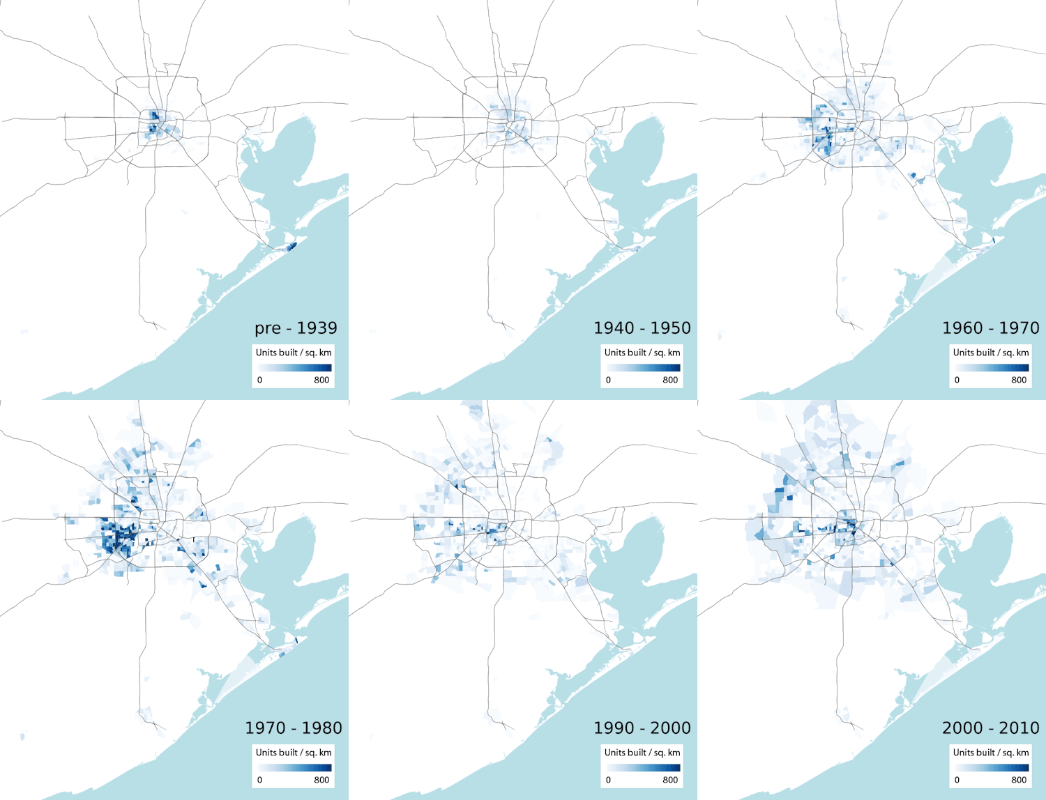
If the Greater Houston Partnership is eager to include some exhibits or animated GIFs to go along with the video footage of cars driving through imaginary barriers, shiny skyscrapers, and smiling people that pepper its new campaign celebrating Houston as The City of No Limits, it might want to look at the work of California computational biologist [and former Houstonian and longtime Swamplot reader] Ian Rees. Using data from the American Community Survey, Rees mapped structures in the region by the decade they were built, grading their concentration with varying shades of blue.  The result helps us visualize the decades-long march of Houston housing ever outward. His map, shown above, was featured in a series of articles on the Next City website on urban sprawl, a few of which compare Houston’s growth to those of other major U.S. cities.
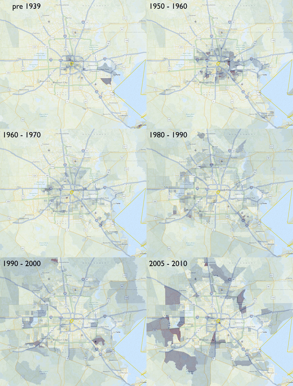
Unfortunately, the data (and the dancing blue construction hotspots) stop in 2010, and we’re left to ourselves to wonder whether Houston is still on track to continue its now-officially-enshrined core mission. An earlier version of Rees’s map breaks out the last recent decade into 2 separate frames, helping to illustrate the scale and sequence of the more recent Inner Loop construction revival:
***

- Percentage of housing units built during each time period and Visualizing the march of housing [Sanity Check]
- These 5 GIFs Show City Sprawl From Boston to San Diego; These Cool GIFs Show How 8 U.S. Cities Have Sprawled; and Sprawltastic Houston Is Densifying and the Courts Can’t Stop It [The Next City]
- Previously on Swamplot: New ‘City with No Limits’ Slogan Will Be a Catchy, Fun Way To Promote Houston’s Legendary Sprawl


The original map was a quick one-off made by animating layers on the city-data.com census data viewer. It shows the percentage of housing units built during each time period. My more recent map (shown at top) shows the density of housing units built during each time period, which I feel gives a better representation of development patterns over time. The data set I’m using, American Community Survey 2012 5-year survey, has a column for “Built 2010 or later”, but I omitted it because it only covers a few years, rather than the 10 year period of the previous frames (it’s basically a blank frame.) Thanks for the post, and I look forward to any comments, feedback, and improvements suggested.
No limits west you mean. The growth has been almost exclusively west according to that map.
@Shannon, I believe the map is based on census data, so it would only show residential growth. I would expect this to be biased towards areas lying further from the city’s industrial core.
No limits except in the eastern quadrant defined by 225 and 90 east.
I think these maps are fascinating. and mesmerizing. And then they raise a lot of questions in my mind and I wish I knew more of Houston’s history.