WHAT LANDLORDS HAVE OUSTED THE MOST TENANTS AFTER HARVEY, AND OTHER POST-DILUVIAN EVICTION FACTS 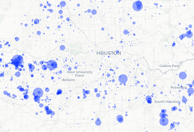 Since Harvey, the odds of tenants beating their eviction lawsuits have doubled. But their chances are still pretty slim: landlords win 94% of the time (down 3.73% since August), notes Houston data analyst Jeff Reichman. His recent report on citywide eviction trends after the storm features a ranking of which landlords have kicked out the most tenants. (Although that accounting also includes owners of storage rental facilities.) Also in the report: a map (a preview of which is included above) showing post-storm eviction density by address, an analysis of the time it takes for evictions to get through Houston’s court system (an average of 20 days), and the months during which the most evictions have historically occurred (January, with subsequent high volume between June and August). [January Advisors] Map of evictions after Harvey: January Advisors
Tag: Housing Data
THE HOUSTON ZIP CODE WHERE THE KIDS DON’T LEAVE HOME  New number crunching from the Pew Research Center suggests that around 57 percent of the folks between 18 and 34 in the 77045 Zip Code may be living with their parents. (77045 includes both residential areas and the salt-dome-adjacent industrial hodgepodge between Holmes and Almeda roads, southwest of that recycling plant that smoked out the Med Center last year). That figure compares to a 28.2 percent boomerang rate across most of Houston, which falls below the current-ish 32 percent national average, writes Maggie Gordon (who notes that the “new” numbers are based on the organization’s 2014 data). What’s responsible for the anomalously high numbers in South Main, which shoots well past even the Great Depression’s 35 percent? The difference, Gordon writes, may be rooted not only in the area’s low average wages, but also in the lower rate of folks actively pursuing college (which Gordon says is connected to low wages); the study also notes that some of the difference might reflect the smaller proportion of the Zip Code’s Millennals living with a romantic partner (which, Gordon notes, might be easier to meet in college these days). [Houston Chronicle] Photo of 3414 Ebbtide Dr., 77045: HAR
Following up on last month’s Supreme Court decision highlighting the segregation effects of Texas’s low-income housing programs, Chronicle reporter Jayme Fraser has a few observations about how the Housing Tax Credit program has been administered around here — after studying the above map, which she assembled to show the location and details of every Houston-area property involved in the program from its start in 1987 through 2013. Using federal funds, the Texas Dept. of Housing and Community Affairs offers tax incentives to private apartment developers in exchange for guarantees to keep rents on new or rehabbed complexes below the market rate.
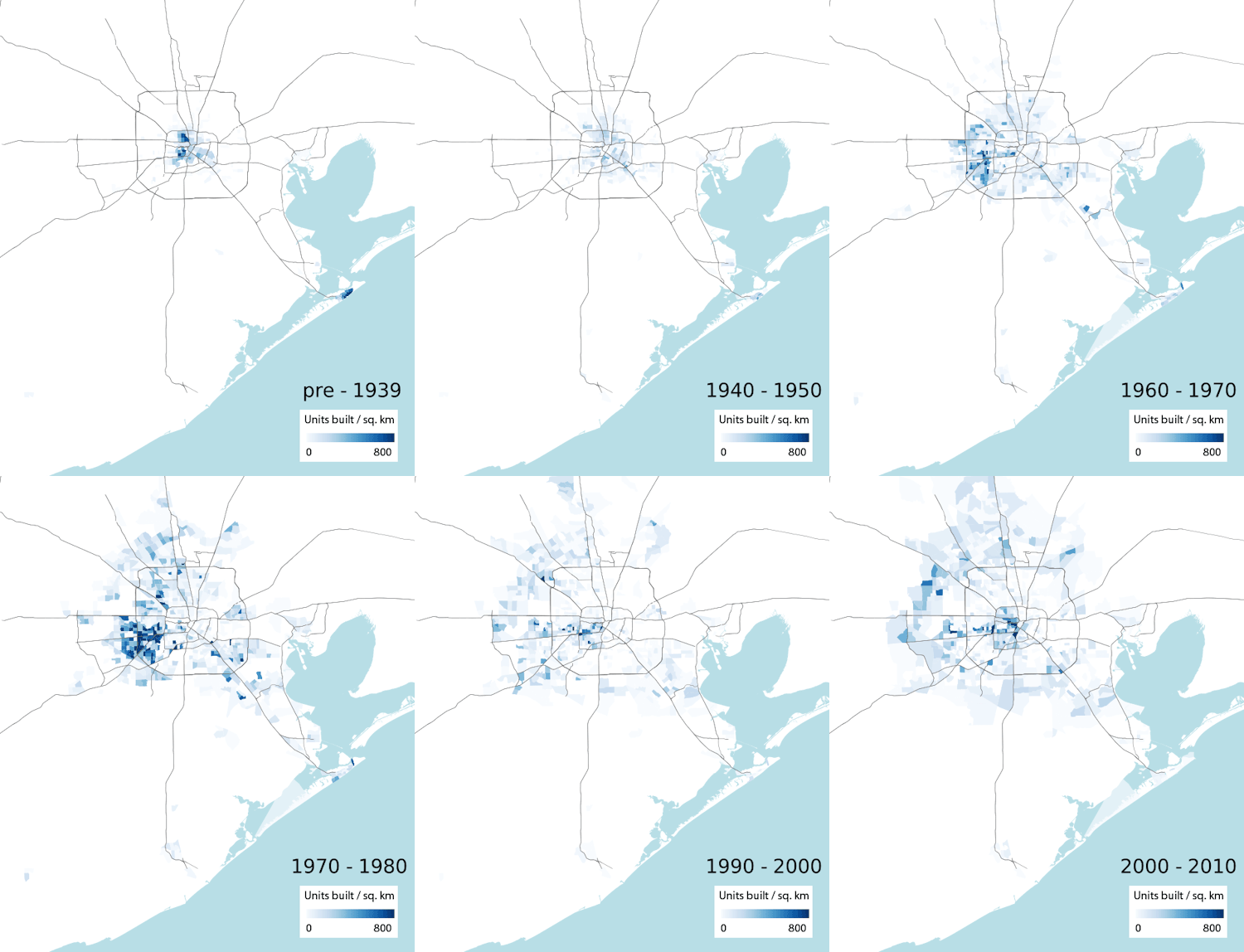
If the Greater Houston Partnership is eager to include some exhibits or animated GIFs to go along with the video footage of cars driving through imaginary barriers, shiny skyscrapers, and smiling people that pepper its new campaign celebrating Houston as The City of No Limits, it might want to look at the work of California computational biologist [and former Houstonian and longtime Swamplot reader] Ian Rees. Using data from the American Community Survey, Rees mapped structures in the region by the decade they were built, grading their concentration with varying shades of blue.  The result helps us visualize the decades-long march of Houston housing ever outward. His map, shown above, was featured in a series of articles on the Next City website on urban sprawl, a few of which compare Houston’s growth to those of other major U.S. cities.
Unfortunately, the data (and the dancing blue construction hotspots) stop in 2010, and we’re left to ourselves to wonder whether Houston is still on track to continue its now-officially-enshrined core mission. An earlier version of Rees’s map breaks out the last recent decade into 2 separate frames, helping to illustrate the scale and sequence of the more recent Inner Loop construction revival:
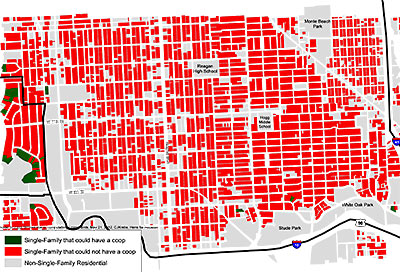
In Dallas, you have to keep at least 20 ft. between your chicken coop and your neighbor’s stuff. Here? It’s 100 ft. That’s why this map of the Greater Heights looks the way it does. Hens for Houston founder Claire Krebs, using GIS technology she learned as an engineering student at Rice, created a series of these maps (what she’s calling “policy-making tools”) out of HCAD data to show just how few Houstonians are allowed to keep hens — if they wanted, that is — because of a city ordinance requiring the 100-ft. setback.
WE’RE BUILDING MORE HOUSES IN HOUSTON 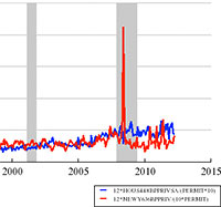 “The New York Metro areas has more than 3 times as many workers as the Houston metro area,” notes UNC professor and Forbes economics blogger Karl Smith after looking at a bunch of graphs, “but can’t keep up with the pace at which Houston is permitting new housing.” One of the several charts Smith assembled from Federal Reserve data shows that the number of construction permits issued in the Houston metro area surged ahead of the number issued in the New York-New Jersey-Long Island area beginning toward the latter end of 2007, just as the recession hit, and has stayed ahead. (The pace of new permitting in both cities accelerated in 2005, but fell off in New York a couple years later, after a big spike.) Over the last couple of years the Houston area has accounted for between 3.5 and 6.5 percent of all newly issued U.S. housing units. [Forbes]
 Sure, there’s the latest numbers out from the Houston Association of Realtors, showing a continuing decline in home sales in October, an 8 percent upswing in the average number of days homes have sat on the market, and a slight drop in the median home price compared to this time last year.
But the most blatant sign that serious problems in Houston housing have already arrived is the new promotional blitz just unleashed by the Greater Houston Builders Association — telling us all not to panic: Everything’s just rosy in the wonderful world of Houston residential real estate. Hey, everybody back in the water!
The PR push, which includes a blanketing of radio and TV spots in local markets, is designed to reassure nervous would-be buyers that now’s the perfect time to buy a home way out on the latest subdivision frontier, even though lots of scary signs have been suggesting otherwise for quite a few months now. The heart of the homebuilders’ campaign is the ominous-sounding HoustonFacts.org website, which fills Houston homebuyers’ ears with fact-filled, sage advice like this:
If you try to wait and time the market until it hits rock bottom, you are likely to lose out. Just as no one can accurately predict the peaks and valleys of the stock market (name one person who sold their tech portfolio in April of 2000), the same holds true for housing. If you sit on the fence and wait for the absolute best deal, you could end up literally waiting for years. And most likely, your guess on market timing would be wrong. But if you choose to buy now, you will not only be in the driver’s seat during the buying process, you will also reap the gains of price appreciation once you become a home owner. Remember, those who purchased homes in the early 1990s during the last big economic and housing downturn came out as big winners.
There’s lots more of this kind of wisdom available on the site, but here’s a special challenge to eagle-eyed Swamplot readers: See if you can find the comparison of a home investment to a stock-market investment on the site that simplifies all those messy calculations by leaving out the cost of monthly mortgage payments and expenses!
Keep reading for a HoustonFacts.org tip on home foundations for the Houston climate!
Some highlights from the Chronicle‘s annual housing-price survey extravaganza, published Sunday:
- Yeah, prices were up again last year, growing steadily since 1992 (a good year to start with if you’d rather forget Houston’s big busts). But price increases slowed down in the second half.
- Anyone needing proof that Houston is still a donut need only glance at this map of sales activity inside and around the Loop and Beltway. We love that creamy filling as much as anyone, but there’s more dough to be made at the edges (eighty percent of sales are outside Beltway 8).
- The front-page graphic, which at first glance appears to show steeper historical price growth for inside-the-loop homes (and a better rate for them this year), is a little misleading: Except for last year, average percentage price increases since 2001 have been highest outside the loop.
As usual, specifics on last year’s neighborhood price trends are hidden in the Chronicle‘s Homefront section.
- Houston area home prices continue to climb [Houston Chronicle]
- Homefront [Houston Chronicle]

