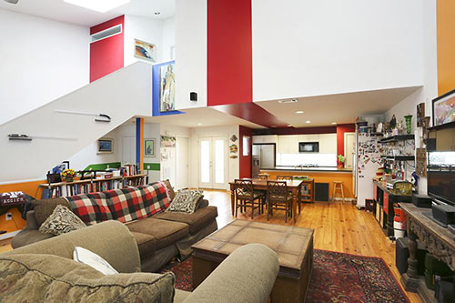
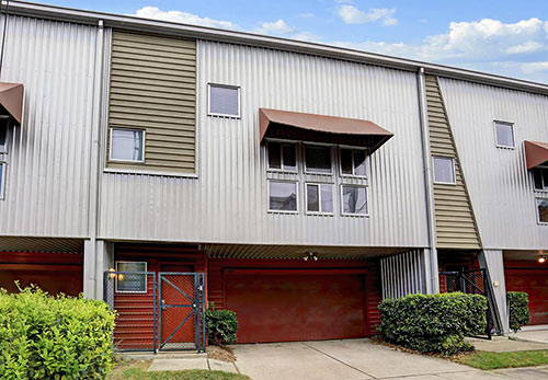
Colors a-blazing and juxtaposed vibe big time within a 2004 townhome in Crosby Place that popped up on the market a week ago. Its location is in the cluster of brightly painted townhome developments on the eastern edge of the Fourth Ward near Midtown. On listing day, the metal-clad property appears to have briefly flirted with a $330,000 asking price but reverted to its original $324,900. Today, fresh listing photos brought in crisper staging of the space . . .
***
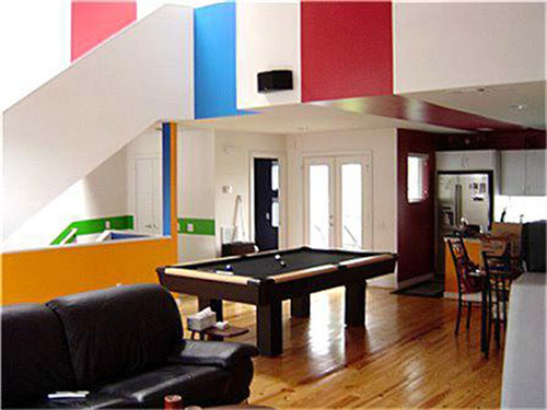
Here’s how the property showed before the decorative do-over . . .
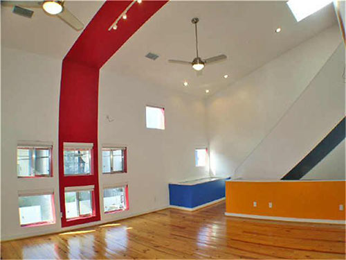
And here’s the same floor post makeover:
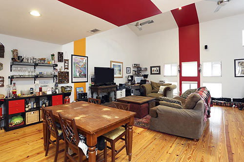
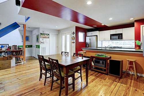
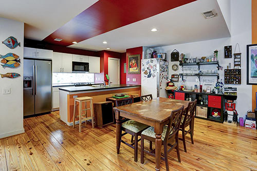
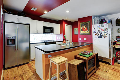
Each of the home’s 3 levels gets a signature flooring choice: carpet upstairs, stained concrete at ground level, and piney woods between.
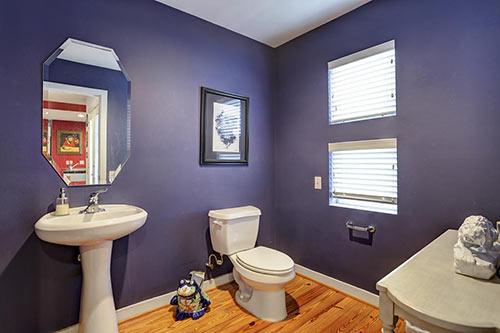
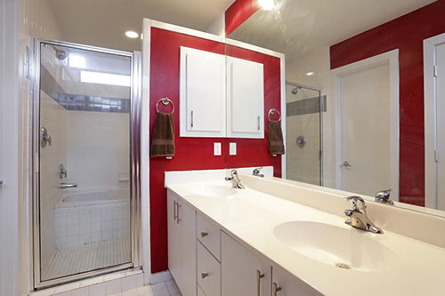
The 1,797-sq.-ft. floor plan delivers 2 bedrooms, each with a bath. And there’s a half-bath as well (above).
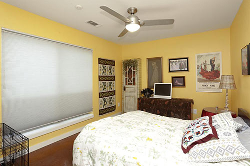
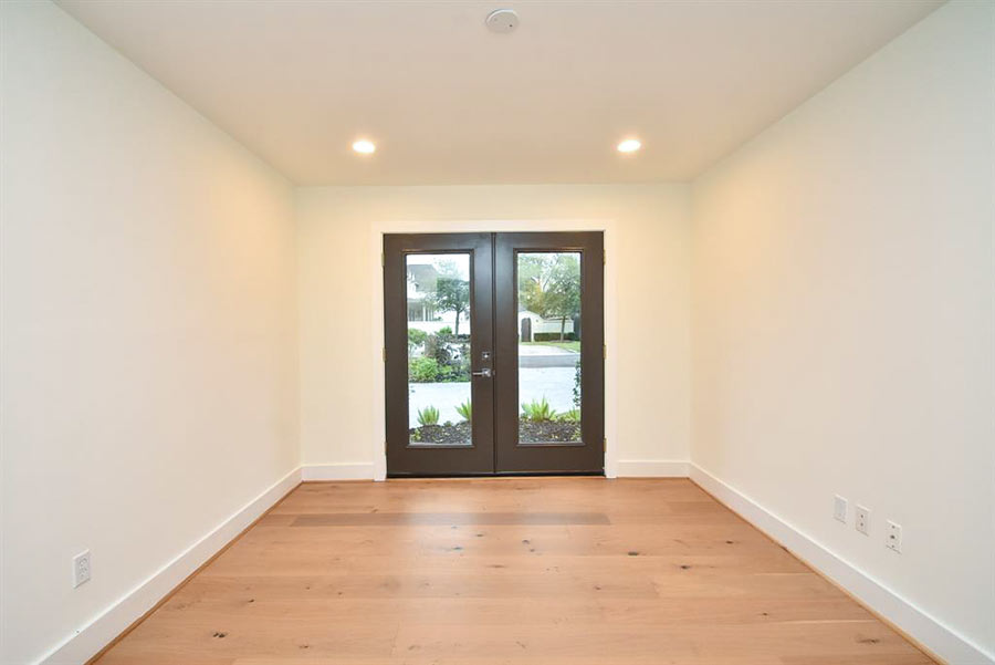
Its window suited up in the updated view, but the ground floor bedroom faces a small slice of fenced easement on the 1,541-sq.-ft. lot:
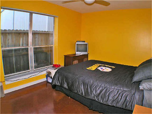
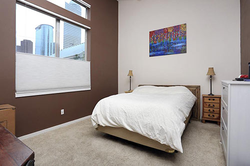
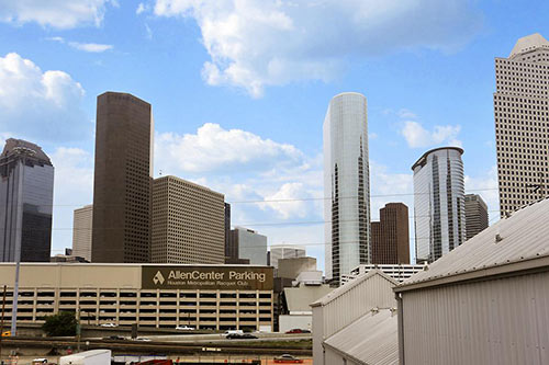
Meanwhile, the upper floor’s bedroom has a downtown view. This property appears to be in a section of the six-home development without other housing between it and nearby Heinen St., which acts a feeder road to southbound I-45 near Allen Center . . .
and its garage:
- 1211 Crosby St. [HAR]


“Colors eye-searing and juxtaposed vibe big time within a [house]”
What?
@Spoonman: Thanks. That’s been corrected.
That downtown view will be short lived. Broadstone is building their new development directly behind this property, so that view will be of a very close apt complex very soon.
new midrise apts going up behind house.. wonder how close to the fence line (shown in lower floor bedroom). at least may block traffic noise from Heiner St and I-45, and possibly, the downtown view from upper bedroom
I still don’t think “vibe” is a verb.
I’ve got one of these ubiquitous Urban Loft aluminum houses in 4th Ward. Looking at the prices, I can see why they jacked up my assessment so much. I can’t believe the valuation jumped 40% in a year, but bye-bye PMI, at least. I’ll need that extra money to pay for the additional property taxes.
That red stripe, ugh. Almost as bad as that metal exterior- awful.
I can see why they updated the pictures to the furnished version. The photo of the 2nd level, unfurnished, makes it look like a gymnasium.