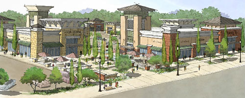
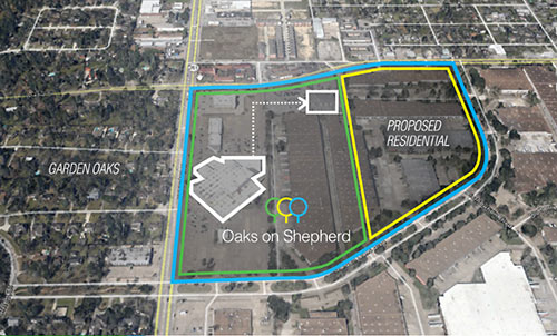
Update, 2/19: Weingarten says the brochure was a “vision book” that was released to the public in error.
“The time is right for redevelopment” of the Sears at 4000 N. Shepherd Dr., declares a brochure published online earlier this week by Weingarten Realty. The brochure, which appears to be part of a proposal to Sears, which owns the 11.7-acre western portion of the site, says the REIT plans to partner with the retailer to turn the sleepy department store and the Pine Forest Business Park directly to its east into a “wonderfully connected and designed retail shopping destination for Garden Oaks, Oak Forest and neighborhoods around it,” including a new grocery store and restaurants.
No site plan is included in the presentation, but Weingarten notes that it plans to keep “the 2nd longest operating Houston Sears” open in some form throughout the redevelopment. “Weingarten’s vision is to acquire adjacent land,” then “temporarily relocate Sears into an existing building” — the Family Bingo Center at 641 W. Crosstimbers — before scraping and redoing the whole site.
***
Weingarten’s ballsy name for the new center: Oaks on Shepherd, referencing Sears’s Shepherd Dr. frontage, which currently sports only one oak, along with a few lonely pine trees.
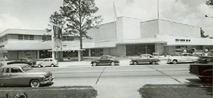
What stands out most in the 7-page brochure Weingarten produced to describe its vision, however, is its almost cringeworthy attempt to assert that the strip-center-style mishmash-y “festive” Prairie Style portrayed in its rendering of the new Oaks on Shepherd — meant to replace the late and muted Streamline Moderne trappings of the existing standalone department store — is an essential feature of both Sears itself and the neighborhoods surrounding it: “Garden Oaks and Oak Forest are the essence of ‘mid-century’ America. . . . Today, new homes are being built in the area continuing this ‘mid-century’ theme with mid-century modern, and arts and craft [sic] architecture with large lots, front yards, and open streets,” reads the don’t-know-much-about-modernism body copy, amid a slew of irrelevant images of residences designed by a young Frank Lloyd Wright in the Midwest in the early years of the 20th century.
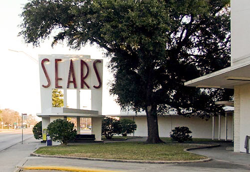
 The brochure makes no mention of the most distinctive design element of the existing 1959 Sears center, which looks nothing like most of the images peppering the pages: The almost-Jetsons combo bus-stop-and-sign on Shepherd Dr. (pictured below, next to what appears to be the lone oak along N. Shepherd on that block):
Instead, Weingarten says the center will “maintain the ‘mid-century’ Americana look and feel” and be “influenced by Frank Lloyd Wright” — though the accompanying illustrations show only his low-slung early houses, not any of his retail designs.
Although Weingarten’s assertive stylistic confusion is entertaining (and notable for the way it papers over the standout features of the existing center), the resulting jumble could very well end up jibing perfectly with the array of similarly can’t-hear-you aggressively stylized large homes now popping up in Garden Oaks and neighboring Oak Forest.
One big advantage of the pseudo-Prairie look Weingarten has in mind for its proposed center: Designers have long figured out how to translate a singular element of the style — broad, low-slung residential hip roofs — into de rigeur tall sign-bearing shopping center corner “towers” — without the whole thing looking entirely too ridiculous. That’s a little tougher to do in Streamline Moderne and Art Deco without making people laugh, though Weingarten sure did try real hard when it lifted the foreheads and added weird corner pieces to the once-stately River Oaks Shopping Center a few years ago.
- Sears Vision Book [Weingarten Realty]
- Oaks on Shepherd Redevelopment [HAIF]
Renderings and historical photo: Weingarten Realty. Photo of Sears sign: Arch-ive.org


Ugh. There’s nothing remotely MCM about that rendering. The Sears building is solid and would be easy enough to re-purpose. But, Weingarten Realty has never respected historic architecture before; so I’m certainly not surprised. Why does Houston love to tear down classic MCM homes and buildings and replace them with dreck?
sears is still in business? and the river oaks refresh sure hasn’t hurt business (which is what Weingarten is in).
Weingarten Realty is singularly bereft of architectural taste. Sears should find a developer that is willing to build around their existing store. There’s plenty of room on the site to do that.
The drawings may not be that great, but the idea of redeveloping the site is fantastic. Just keep the Sears sign. It is a landmark. It’s a wonder Sears is still in business at all. That area is ripe for improvement. Restaurants and better retail would be most welcome.
No No No. This Sears is a landmark. It is easy to have an MCM and Art Deco styled center without it being laughable. Im glad he at least plans to keep sears, but style the development as if its in GOOF not Cypress sheesh!
The Weingarten Architectural Glossary:
Prairie: Same old shitty strip center with lots of square hats and lick ‘n stick white and red sandstone siding.
Art Deco: Same old shitty strip center with lots of round hats and lick ‘n stick red sandstone siding.
Streamline Moderne: N/A
Call me an architectural ignoramus, but I don’t see anything all that redeeming about the Sears building. It’s no more a masterpiece than any of the big box stores being built today. It’s nice to have a Sears around (they are still pretty decent for tools), but the area is crying out for redevelopment. The old sign is fun though.
This proposal is better than the current dumpy Sears plus Bingo.
The addition to the River Oaks SC is an improvement to the property. (please don’t move out Barnes and Noble).
So much yuck. That’s not mid-century modern, it’s just the current “traditional” McMansion finishes and details glommed onto a shopping center. One which already had an architectural style, albeit an understated one.
f weingarten.
If they demo the building, that’s one thing. But that bus stop/sign is a treasure, and should be preserved at all costs.
Please please please keep the outstanding bus stop combo store sign!
It lights up at night. Sometimes it’s says EARS when the S is out. And sometimes it says SEA S when the R is out. For me, as a long time neighbor I cherish the whimsy of that neon sign and the lone oak tree by it. Folks are always sitting there waiting for thier bus. This is a much beloved shopping place for many people. Just because others have transportation doesn’t mean that this stop isn’t valued by those who ride the bus towards the north and east. They count on Sears for many of their big box needs. They have lost many of their shopping centers to the suburbs. I say …great- redo the center but keep the Houston charm and remember who brought “ya to the dance”.
Sears is still around? And relevant? *sigh*
The sign should be preserved but Sears itself…meh.
Cool idea, but this is the GOOF, not Katy. This rendering is not complimentary of our neighborhood. Residents of the GOOF are very proud of the areas history and, while by no means opposed to updates, would like to stay within the “look” that we currently have.
Convenient, the link to the brochure no longer works.
I live on the Garden Oaks side of Shepherd from Sears and it is a great convenience to the neighborhood that more people should take advantage of. Need an extra pair of sheets at 8:00 when you’re potty training a toddler and don’t live close to target? Sears. Winter arrived overnight and you forgot to buy a new coat for your kid, realizing the one from last year really doesn’t fit? Sears. Doing a lot of baking and see that a second kitchen aid bowl would be super useful? Sears! Need a cheap radio to plug an old ipod into so you can play the same dumb song OVER AND OVER so your kid will sleep? Sears!
Granted I would LOVE some extra development around it. Not sure how much of a draw the residential area would be for anyone with kids though.
Funny, I am a Frank Lloyd Wright fan and have toured many of his buildings. I don’t recall “Prairie Castle” being one of his styles so it seems odd for Weingarten to reference his designs in their proposal. If they put any more turrets on this thing, it will become a fort or a copy of the Great Wall. Also, MCM……really?????? There isn’t a single element of MCM in that design. Just like RO Center where we were told the design would blend in to the Art Deco architecture. There are samples across the US of reuse and blending of old and new that have been done successfully. Weingarten is just lazy and cheap.
Weingarten Realty regularly makes unsolicited offers as a developer to land owners. We made an unsolicited proposal to Sears regarding its building and surrounding land. The vision book referenced online was intended as an internal piece to showcase this proposal. We regret that the documents were released to the public in error. Weingarten and Sears have no deal in place, have not agreed to any terms for any redevelopment and plans are not imminent.
So people would rather have a big box store with a huge surface parking lot instead of mixed-use street-facing retail?
Make up your minds, swamplot commenters.
As someone who lives in the area, the drawing doesn’t fit the area. Way too suburban looking. But, Weingarten has never cared what the community thinks.
A HEB added in the new center would be Wonderful!! The neighborhood of Oak Forest has been in big hopes of one opening near the neighborhood.
Ms. Carrie done put all of us in our place!
NOOOOOOO!!!!!!!
Keep the sign/stop, make it say BEERS and open some cool beer and food place. Build what’s in the picture, but in the style of that remodel down the street where Pink’s is. Close Sears and burn it. Bingo is fun, but disgusting building. Burn it.
Renovating the exterior and surrounding property is not enough to save this particular N. Shepherd location. The Auto store is shabby but I have had nothing but great experiences. I have pretty much given up on the main store as it has some of the most incompetent management I have ever experienced. The interior is shabby and always in disarray which is amazing since staff seem to have more interest in walking around than cleaning or arranging stock. I have complained a couple times on Sears.Com. Shocked to receive follow up calls (once even on a Sunday) from the store manager but less than amused when I realized the follow-up call is nothing more than a “check the box†for show to Corporate Sears.
By the way, the design is horrible, unoriginal and looks like a replica of one of the many strip malls along 1960. Bleh!!!!
You do realize that your distant offspring will be fighting to protect what’s being built now long after you’re gone in the name of preservation. And while you’re fighting for hope and change…. While screaming against it….. You’ll be not forgotten as that one off fart in a fan factory.
This is a great idea I hope this happens! I love that this neighborhood is growing for the better.
Who cares what they do, we need retail and another grocery store in that area. Sears was a great store, a long time ago. Houston is a garish mess anyway, what’s one more nonsensical piece of crap, look at what happened to oak forest.
Isn’t that Sears the demarcation line between Garden Oaks and Independence Heights? Is this the beginning of a turnaround for that blighted pocket?
@ Carrie Murray of Weingarten: Most people aren’t particularly concerned about the prospect that this Sears might disappear as an architectural landmark. The structure isn’t considered to be very important except to a small and inconsequential number of the people the live nearby — but most don’t give a damn. The problem that Weingarten has is that they have again demonstrated to a far more vocal and well-connected set of people that they clearly don’t understand the issues surrounding the River Oaks Shopping Center. Those people are using this Sears building as a sort of proxy war on Weingarten and Weingarten doesn’t seem to understand or doesn’t want to acknowledge what is going on. Either way, it makes you look stupendously brash and inconsiderate. Y’all would be well-advised not to talk out of your asses regarding architectural styles; and it is absolutely true that that’s what you’ve been doing. You also shouldn’t apologize to the community at this point, because the damage is done. In fact, you probably shouldn’t say anything further and your ‘internal’ communications should be more carefully guarded and shouldn’t reference architecture at all. Stick to the numbers. Most people can respect a good business decision, and those that cannot are irrelevant unless you behave more stupidly than they do (which you are). What most people do not respect is disingenuous pandering; and you’re shitty at it, so do not do it.
This is my advice. Ignore it at your own peril.
So, GOOF is now officially the Bermuda Triangle of retail development in Houston. Berryhill and Biskit Junkie went through hell just to open a simple restaurant. The best the area is seeing is a few old strip malls getting spruced up a bit and a couple a fast food chains on Ella.
Toby, your comment made me laugh. I completely agree. Just because something is old doesn’t make it historic or necessarily worth saving. That said, I like the old Sears sign and think it would be cool to repurpose it as they say these days. However, the store itself is awful. Customer service is non-existent, they have very little of anything, and the place is shabby and dirty. And, as long as I’m addressing multiple comments here, not everyone that might like to live in the neighborhood has children, and I think the residential element is a good idea if done right, i.e. doesn’t end up looking cheap. It would be nice for a small gated community of patio homes. In fact, nothing would please me more than if a developer would make an offer on half the streets between Brinkman and Shepherd on the north side of 43rd and turn that entire hodgepodge into a gated patio home community. The trailer parks are really unsightly.
Oh no he di-nt! TheNiche just went southern on yo ass, Weingarten and whipped out a “y’all”!
TheNiche for comment of the day/week/infinite.
Weingarten has removed the link – but hopefully not before some Sears executives actually got to look at it. I certainly hope Sears finally realizes that *something* needs to be done with this property. I can’t imagine it is a hugely profitable location for them at this point, and that land is incredibly valuable. Sears, please either recognize the potential in the site and do something with it yourselves, or sell it and let someone, even Weingarten, put it to better use. Oh, and you should probably leave the cool sign/bus stop behind to keep the locals from rising up against you, fists held high with angrily shaken lattes. Thanks.
“roadchick: Why does Houston love to tear down classic MCM homes and buildings and replace them with dreck?”
.
The better question is why do most people prefer “drecks” to MCM, as evidenced by the market responding to this consumer demand by replacing MCM with drecks? It costs $ to replace a building, and it wouldn’t be done if the new properties were not more successful. They’re more successful because that’s what people want.
.
So why do people like different stuff than you? No idea.
.
If people wanted to buy buildings painted black and shop in buildings painted black, what do you think would happen with the color of buildings in the area?
“Kendra: Cool idea, but this is the GOOF”
.
noooo. Saying “The Montrose” is bad enough. Don’t start with “the” in front of “GOOF” :-)
Oh gawd, don’t make GOOF a thing. Please.
Cody -yes it’s either “Montrose” or “the Montrose-area”
Devil’s Advocate – Unfortunately “GOOF” is already a thing, but the “the GOOF”?!?
I think people use the article “the” in front of places to make them sound more exclusive.
Please stop this silly nonsense.
I’d rather have a blinking neon S_ARS sign on my drive home. Message to Weingarten’s: the past and future is in groceries.
The current Sears store looks more “Frank Lloyd Wright” than the proposed shopping center.